


NancyGormezano
-
Posts
7,863 -
Joined
-
Last visited
-
Days Won
15
Content Type
Profiles
Forums
Events
Everything posted by NancyGormezano
-
I like the poster - makes me want to see the flick!
-
Getting inspired by all that terrific modeling going on - so started a new project - not sure where it's going (I never know), maybe I can make something for the next mini-movie contest if there is one. Meet Mutha Naycha. To be joined eventually I hope by her "Gurlz" Comments welcome.

-
Excellent tutorials - very well put together - I should think a new user would find them incredibly useful - (even an old user as well can benefit for refreshers) - Thanks, Alonso.
-
This is a hard one for me to critique. I like the camera dynamics & angle - very interesting - but as for the run? I can almost hear the feet go flop flop flop - the hands/fingers have weird bends - can't really see the run enough to analyze it - it's almost a surrealistic type run - it seems it would fit in a 'dream or psycho' sequence, basically because of perceived distortions - but I would have to know the character and story better to assess wheither this style fits. So what were you trying to accomplish? (other than testing tsm). If I were to know your objective then maybe? I could offer more feedback as to how it comes across.
-
That is quite beautiful - sort of a bonzai reading room? I love the stressed metallic texture, & fuzzy mossy rock - I would say the bark is a bit too "blurred" in contrast to the crispness of the other textures, the blue cushion a bit too saturated? bright? also in contrast to the other colors. Have to wait to see what else you have planned to see if those comments are relevant. As the wip stands now - I'm not sure I would have known what it was had I not seen the sketch, nor read your explanation. Perhaps you are going to add a character sitting on the couch/cushion reading? or something else to indicate reading room? i assume the lantern is to be added as well - that would be a nice touch. I love the feel so far & how it is starting out, looking forward to more.
-
I am so impressed by the quality of the renders that are being produced with radiosity - amazing stuff. I love the reflections and the feel you have going there. Some thoughts: - I would think the "stress material texture" you have on the helmet should be a bit more deliberate. The stress marks should indicate a believable pattern of wear & dirt accumulation. It seems a bit too random now. And some areas are too "stretched". It doesn't tell me "how" it got banged up, why its "dinged & nicked" - you know need some laser residual burns, grime around joints, pizza stains , etc. The dirt should tell a story. I might also crop it closer to the subject, for higher compositional impact - tho it's a personal perference. And I repeat, the image has a wonderful feel.
-
I wonder if using an all white image as a camera rotoscope in the chor. & making each model a front projection target might be quicker, easier? Then one doesn't have to create any variations on the models. All done in the choreography. Not sure if this gives the same results. However, I don't believe hair will get "front projected", do not know about other materials, as I only use decals & patch images & hair.
-
Thanks for the explanation - quite effective & fascinating to watch - I shall tuck this technique away in my How-to file. Muy Bueno!
-
That is Very, Very impressive. Question: Was the sequence of "blob particles" forming the e47 logo done with A:M? or post ? I'm very curious as to how that effect was created. Thanks for showing.
-
I just got it downloaded - I like the movement and transitions - it is the kind of piece that needs sound - and I agree with Charlie that the logo would probably work better with a more dimensional look - more specularity? to fit with the "space gallactic look" of the background. It wasn't clear to me what the significance of the hearts & dollars signs were - I suppose they have something to do with the games you make and would become more apparent with follow on scenes.
-
Revisiting low spline mesh
NancyGormezano replied to Grafikimon's topic in Work In Progress / Sweatbox
I'm all for low spline count (as I am very lazy). But I have found that for animating - I usually have to add splines (particularly in the face) so that the face deforms well, for the phonemes & facial expressions without creasing. But then again, if there are too many splines, it's also harder to setup the facial poses for animating. Looks like a Jim Talbot rotoscope ? -
Yes indeedy - I like it better - I think toning down the floor worked well. I am a loss at what else to suggest. As I believe Fabrice found out - it's easier to get the illusion with a simpler composition. I can offer no more, I am out of my league.
-
The arrangement of the flap definitely reads better. As for the plastic on the boxes - perhaps you might want to introduce some waviness, or creases in the clear cellophane? or even some tears? As it is now - it's very pristine. (Obviously I didn't open these boxes ). I don't have any cellophaned boxes handy so I can't really address the reflections - but are you using a closed set ? - that is with something for the boxes to reflect ? I would also think the cellophane would have some glare, preventing a clear view into the box. some Fingerprints maybe? Reality is tough. I stay far far away from it in everything I do. And that includes A:M But I'm really intrigued by trying to figure out what makes imagery look real. I'm guessing it's lots of imperfections, and lots of noise. Good job.
-
Excellent effect John -
-
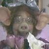
That's a terrific looking cow (I love cows) - would be great for TWO movie. Like butter! (as Streisand & probably Charlie would say)
-
Saturation is better (ie more believable for me) but is higher than Yves's photoshopped image. I would say it's in the realm of believable wood flooring possibilities. So I think it's now a matter of taste. And of course, Yves would be best to judge in terms of accuracy. What is now bothering me & I should have mentioned before, is that the position of the "flap" of the box nearest to the car seems to be inducing an optical illusion - sort of Durer-esque. Box appears to be floating or "standing on the flap" - yet of course it isn't. It's difficult to make out just how that flap is folded out. Perhaps it should be rearranged?
-
New Character I'm working on
NancyGormezano replied to cfree68f's topic in Work In Progress / Sweatbox
I prefer the hair that doesn't have specularity - also would prefer it to go up higher on the body - (personal taste - I like my demons more modest , more classical minotaur). Not sure what's causing the scintillation - Are you sure you "combed" all guides? I sometimes found that I had to go back and tweak them, and would get rid of the flickiness. Dynamics are off/on? Like the new hunch, looking forward to the big scary head. Good stuff as always... -
What seems a little funny to me is that the floor has "hot spots" & the color saturation (in the floor) appears greater in the distance (from the viewer). Also perhaps the floor texture is a bit too blurry for a natural wood floor - might need some extra bump to give the illusion of ridges - unless you're going for a wood vernier or synthetic look. I love the scuff marks. It's a wonderful image, the way it is. I only offer the above on what I perceive is your goal - realism.
-
wow - that is looking really good - and even tho you said it needed tweaking it has a very polished, accomplished, engaging look - lots of good expression - love the interaction between eyeball & main character - I assume the story is about the adventures of a boy & his "eyeball"?
-
oh yeah, he is a fun goofy gull. Me gusta mucho
-
Nice bear - LOVE the clay look. To continue with the clay look: Perhaps the eyes & nose bob should be blobs of clay stuck on? rather than looking continuous. And perhaps the fingers should look like additional rolled logs of clay? I also think the separate arms/legs work - but if you're going for the look that an accomplished clay sculptor created him - then I guess a continous body limb design is best. (IMO)
-
nice actions Mike - one thing that felt a little funny was the transition from running & then jumping to the pole - perhaps both feet should touch the ground first - knees bend, then spring to contact the pole ? The dismount was great. The run was a bit stiff (not sure what to suggest) So is this animation leading to a complete Pole dancing routine?
-
Fun animation Joe, fun style, good artwork, modeling - have to agree - very well put together - loved your timing & pacing, terrific choice & blending of music & sound effects - good story concept - crack in the wall was great, frustrated/mad facial expression was excellent, set/furniture design was terrific - loved the hat on the guy - (tres Nu Yawk) - what else can I say? Good Job!
-
Mountains, Trees, and FOG!!!!
NancyGormezano replied to ericsh6's topic in Work In Progress / Sweatbox
I think the image is quite nice. My only complaint with the foreground is that there's not enough variation in the tree imagery & density. What you do is dependant on wheither this is for a fly-thru? or is it just for a still? Either way - try using multiple emitters and varying size properties (length, thickness percentages), as well as density - can also vary "toning of the emitters" by letting a decal (on the terrain) drive the diffuse color. Maybe even adding kink. Play with all the properties that allow for variation. If it's just for a still - how about adding some 3D trees in the foreground? -
xtracd character on simcloth with
NancyGormezano replied to johnl3d's topic in Work In Progress / Sweatbox
makes me laugh, John - and also looks like Thom can relax - now that you have a bunch of new models to torture -
