


NancyGormezano
-
Posts
7,863 -
Joined
-
Last visited
-
Days Won
15
Content Type
Profiles
Forums
Events
Everything posted by NancyGormezano
-
heres another wild guess - I just noticed you said it works correctly when you render to screen - I experienced something similar with sprites - would render correctly to screen but not in final render - turned out I had to set some parameters in the Sprite system properties even though I had set them in the emitter property - it might be the same problem with hair - try setting all the hair system properties by just keying in what is already there..
-
I wish I could help - best to post the picture - but also unfortunately I don't think hash will be doing anything more to fix any of 10.5 bugs as they seem to be deep into ver 12..I can't say that I've experienced any hair length problems, or hair spec probs in 11 in the reflections - if you don't want to switch versions in the middle of a project - some workaround might be the only choice...
-
Just edited my previous post - don't want to steer you in the wrong direction: "just rechecked the project that was giving me trouble (in 11.1c) - and I was doing a combo of toon render with hair (using an image emitter) & reflections - the reflection was wrong - when I did it without toon, ie normal render (no shadows, final render, no multi) - the reflection looked strange - but was probably correct - was showing the dark side in the reflection, and confused my poor little brain) " Are you perhaps seeing the "dark side" also? (not sure how things worked in 10.5)
-
yum - beautiful - looks to me like you have found a wonderful new toy that truly inspires you ... (or is it the cold medicine?)
-
very appealing style - should be very cute when finished
-
I wish I knew. Obviously for me, I had to move the inactive model when I didn't want the hair to show the shadows and bring it back to position when I did want to see the model. As for when its active - I have no idea what to do... I had to change my plans and shoot from a different angle - so that one didn't see the reflections... in another shot - I just lived with the bad imagery. - not a good choice. EDIT - just rechecked the project that was giving me trouble (in 11.1c) - and I was doing a combo of toon render with hair (using an image emitter) & reflections - the reflection was wrong - when I did it without toon, ie normal render (no shadows, final render, no multi) - the reflection looked strange - but was probably correct - was showing the dark side in the reflection, and confused my poor little brain)
-
yes it is a bug - I also experience it in 11.1c - reported it a long time ago. you will also find if your model is made inactive the shadows and reflections will still show up from the hair. like a big hairy ghost... doo do doo do (hum to theme of twilight zone)
-
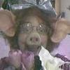
oooooooo....pretttttyyyyy....
-
it occurs to me that one might be able to get the stitches lined up along the path using emilio's new sweeper plug-in - although the path itself looks tricky to setup. regardless - amazing effort mr. bigboote! - something a lazy person such as I would run screaming from.
-
I just love this character sooo much. Just makes me laugh everytime I see it.
-
I like the second one - camera shake adds alot - also think the toon render is a nice enhancement - good job.
-
some beautiful stuff, Josh - only suggestion might be to have a "next" and "previous " button when viewing the images - rather than having to go back to the "thumb page" to get additional images But overall very nice clean design of site - something I seem to be incapable of...
-
hee hee... what Fun fun fun - looking mo' better, mo' funky - love the earring - excellent touch. Perhaps he & one of Mr. BigBootes' Babes can have a rendevous ? - or perhaps a umm...working relationship?
-
Then his undies need to be purple silk. He's looking really good, great character - but whats that thing by his belly button?
-
Love it - character is great! animation is very fun - even with the language difference - the personality comes through- Just what is he selling? I'd buy it. I want whatever that bird's having!!
-
is this too worth developing
NancyGormezano replied to johnl3d's topic in Work In Progress / Sweatbox
also might be more interesting if you could make 3 -4 different emitters that are slightly out of phase with the shaggy animation - -
is this too worth developing
NancyGormezano replied to johnl3d's topic in Work In Progress / Sweatbox
I think its a great idea to finish - only thing that bothers me now is the horizon - would prefer to see it against either a 1 color background or gradient background from blue to green. Or could also change the position of the shaggie crowd to be higher so that the top of them is not coincident with the horizon - good idea. -
web-portfolio of our studio-max
NancyGormezano replied to serg2's topic in Work In Progress / Sweatbox
enjoyed immensely - terrific style - thanks for posting -
I loved this image - I voted for it - and I agree about bringing out the characters a bit more - also would like to see the stars have more of a design pattern to them (as well as more variation in size) - like I said: really really love the look
-
One frame from a clip about bags
NancyGormezano replied to serg2's topic in Work In Progress / Sweatbox
Fun characters - imaginative - looks like it will make an interesting animation - you will have to post it when & if you can... -
ohhh - I thought the stiches were an excellent touch, would hate to see them go... more intriguing to me than an eye patch..don't sell out just because something is difficult (even tho that's what I do all the time) Perhaps you might make the stitched eye area more flat - when someone has lost an eye -I believe the socket sinks, ....perhaps the area should have a darker, "greener" discoloration as an indication of unhealthy tissue? But to me the image/character is GREAT just the way it is.
-
Cooper F evolved to the Martian.
NancyGormezano replied to cfree68f's topic in Work In Progress / Sweatbox
again - looks terrific - better & better - It just seems to me that when one is inspired, knows & is in love with the subject that the art just naturally oozes with personality & appeal. -
Cooper F evolved to the Martian.
NancyGormezano replied to cfree68f's topic in Work In Progress / Sweatbox
fantastic !- looks like a terrific start to a new character -
Didn't make the contest but...
NancyGormezano replied to Paul Forwood's topic in Work In Progress / Sweatbox
Nice mood, colors, lighting, excelent fairy lady modeling - Composition wise - it works - but would like a bit more dynamic line - fairy-lady on the right could be higher to lead the eye a bit more - also the vegetation on the left is too repetitive - looks like all the leaves are the same - could use some more variation - too bad you didn't finish it - good job! (just noticed you said this wasn't the final view - so don't know how relevant my comments are) -
I don't care if he looks like Oden or not - it is an absolutely stunning model with plenty of sinister, creepy peasant-type sorcerer personality.