


NancyGormezano
-
Posts
7,863 -
Joined
-
Last visited
-
Days Won
15
Content Type
Profiles
Forums
Events
Everything posted by NancyGormezano
-
Another new friend for the Pwofessor: - Ms Marlene D'Eeektrick (lampost, cigarette courtesy of Hash free models - thank you, Tom - whoever you are)

-
That is so wonderful - what a fabulous character & fantastic animation - I just can't find anything wrong ... Sorry - I looked & looked. Nothing ... not a thing to suggest. Pure absolute delight.
-
It is a scary image - but then so is the subject. - An obvious thing that occurs to me (if one is really trying to make a photo-realistic model of a real person) - is that the modeling & the decal should not be symmetrical - a definite give-away, best to modify the cps after the copy paste flip for the inevitable irregularity of the face
-
Hey Mike - I love the "Hellraiser" - it works wonderfully - thanks for sharing this - should be part of the standard rig
-
As an image it's interesting - makes me wonder what's to come, I like the composition and don't feel it's missing anything - I find the cards intriguing. Some funnies I might see is: 1) the texture of the desk looks too pristine, & regular in contrast to the wonderful texture on "tart paranormal Investigator" and 2) the placement of the object by the "i" of "Investigator" is confusing - it looks like it might be floating? when I think you want it to appear to be laying on the desk. The other thing to consider for deciding whether it needs anything more is how this image will be used (which might be part of your dilemma) - if it's for viewing as a still, then more detail involves the viewer & gives them pleasure in discovering new elements - if its for an animation - then how long does the viewer get to look at it? - more detail might be wasted and frustrating to the viewer.
-
ok - I now see what you are referring to as a problem - but unfortunately I don't know what may be causing it - other than perhaps the resolution of the image that you're using for the decal? or perhaps you have some extra splines in there (wild guess). As for the UV editor - it's in ver 11.1b, c (not sure if earlier) - and I'm on a pc- One still applies decals via the old method of "apply decal" but once the decal has been applied, the UV editor can be used for precisely modifying & controlling the placement of the stamps. Right click on the stamp - and choose edit - the UV editor will come up and show you exactly which splines are "stamped" - you can then fool in the UV editor with the splines to vary the stamp Will Sutton has a mah-valous tutorial explaining it much better than I. http://www.zandoria.com/uv.htm
-
I can't quite see the problem, but since you say there's a problem: Have you tried looking at the mapping of the decal via the UV edit to see if your stamp is aligned with the splines the way you want?
-
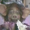
Oh yes - and now meet the Professor's new friend: Heidi Fleece - Proprietor of the Local Cat House. Madame.mov
-
Thanks again for the comments y'all John - good idea to change the angle - I wondered what that was all about - I like the hair a bit colliding with his body, stylized sorta - but maybe its a bit much the way i have it - I tried collision detection and couldn't stand the render hit - tho I did use it for his top locks - and it worked relatively well Mr MM - thanks for the links - Color palette is a very subjective, emotional thing - My paintings (when I was exhibiting) were known & loved for the explosive color palette (and bold expressionistic style) that I used - tho those who were more reserved hated them for the very same reason that others loved them - As artists - We each have to choose what speaks to us personally & hopefully there are others out there who speak a similar language. The further out we get - the smaller the audience - If we want to make a living at it - we sometimes have to sacrifice personal taste for "more familar & commonly accepted imagery". Lucky for me, I'm not trying to make a living at this... JL - No I don't currently have a particular animation in mind (tho, funny enough I I did do "Alice in NutcrackerLand" on AMFilms). I usually never know where my characters will lead me - eventually something clicks - never know when... Dagoos - you're right - I will have to learn patience - but, but ...that would take time -
-
FUN FABULOUS characters!!
-
Hair - the hair material color will be determined by the surface (patches) to which it is applied - eg if you make the surface property of the patch red, the hair color will be red. If you want the hair color to be varied (not just along patch lines) then you can apply a decal (that you've "Painted") to the patches that you want to have hair and set the properties of the decal to drive the hair color - There is a better explanation of how decals drive hair color in the online html help.. I've just provided a very scant intro. BUT be forewarned hair is processor intensive - so you'll have to play with the density (and other properties) of the hair material if you want to be able to render in this lifetime. You're young, so that might not be as important to you as me....
-
This is where I eat my hat
NancyGormezano replied to balistic's topic in Work In Progress / Sweatbox
Looks terrific - tho I must say I would have a very hard time picking which one I liked better - the first (2005 new) one that you posted has a different - more dusty feel to it - this new render looks cleaner - crisper - Love them both - also can't decide on which orientation is better - must mean the composition is PERFECT. -
Great Great fun character - The soles look a little strange - but we'll just have to wait - also wondering how he's going to blink? or is he permanently in a hypnotic trance? Great job on the clothing
-
That is looking reallly goood - excellent progress
-
Mr Fwuffy has grown up...Shall we say: More manly, More of a Pwofessor - here is a FatCat walk test with hair (developed for Bootcamp ex 6b) - will have to work on tail action - still working on facial expressions, phonemes, smartskin (cp weights). Yarn Cat type will transform into some other creature eventually... catWALK6b.mov
-
This is where I eat my hat
NancyGormezano replied to balistic's topic in Work In Progress / Sweatbox
It is a wonderfully gorgeous image - (Chris - I think Brian said 6 hours, in first post) - Speaking of rendering times - given that these images take so long to render - Brian: What is the process that you go thru to tweak your settings ? I haven't tried this photon stuff as I have a hard enough time when an image takes 1 minute to render... -
I believe for IKARM off - you can set the "lock" for the forearm bone while animating - that way you can move the arm bones as you like -
-
Dandy DNA! Really big version...
NancyGormezano replied to heyvern's topic in Work In Progress / Sweatbox
Great stuff Vern, amazing amount of work - Large image is gorgeous - knew the entry was yours as it had your wonderful trademark goopy-dna-humor smeared all over it... -
Animation - Good taste.
NancyGormezano replied to John Keates's topic in Work In Progress / Sweatbox
I think it was Bill Clinton -
Animation - Good taste.
NancyGormezano replied to John Keates's topic in Work In Progress / Sweatbox
I loved the grey painting bit - I thought it was really clever - I mean - how many times have I been to a gallery and there's a 1 color painting? (usually red) - I thought the gag was a parody of a cliche... -
I love the coloring! don't change it - I think it's the way some peoples monitors are calibrated - He shows up wonderfully here...Also I think his motion is terrific & well suited to the character...I'm really looking forward to seeing the completed piece -
-
Animation - Good taste.
NancyGormezano replied to John Keates's topic in Work In Progress / Sweatbox
It's hard for me to suggest fixes on the "floaty" as I tend to have lots of that in my animations, & have been criticized for "lack of snap". There are so many more qualified animators than me, who could analyze it and suggest where snap might be appropriate (if at all - since that is a style - a pixar? style - and this is an individualized piece) - I hate to see everything look the same - (think anime) & love when someone does their own style. I'm conflicted in that the character lends herself to being "dangly" in the way that she's constructed - but in one of the shots (where she is looking up at the 1st painting and walking away) - her arms are moving mushy - (again maybe thats the way she's supposed to move?) - also when she's looking at the gray painting & turning towards camera - motion is a bit wobbly mush again - BUT the running after shot is fantastic!, along with the slip -great! Also forgot to add - love the camera work - great angles As for the last shot - maybe you could zoom in (real fast) with the camera from the previous shot, when she's lying on the floor - and swing around to her face from above - and have the credits rolling inside her black pupils - and zoom up close to the pupils - love the lighting as well - tho something funny with the lighting happens in the scene where she falls to the ground. This has been hard to describe without showing - so hope I comunicated ok -
Animation - Good taste.
NancyGormezano replied to John Keates's topic in Work In Progress / Sweatbox
Wonderful John, wonderful! - I love the character - very imaginative, clever use of squiggly stuff - the paintings on walls are terrific (yours? I imagine?), playful appropriate color scheme - expressive animation - obviously could tell what was going on without sound - has universal appeal - cute little story, made me smile. Improvements, maybe...: 1) some of animation is a little floaty, 2) didn't quite understand the implication of the last scene after she faints on floor - (other than we're just viewing her?). 3) Titles go by a tiny bit fast All in all - It's a winner - thanks for showing -
stack of cardboardboxes tipping over
NancyGormezano replied to agep's topic in Work In Progress / Sweatbox
I like the test with the bird - this I can believe! The boxes seem to fall & interact appropriately for the perceived relative weights of the boxes (compared to bird) and for the direction and speed of bird at impact - looking good... -
wow.....look at this.....
NancyGormezano replied to Newbert_Zero's topic in Work In Progress / Sweatbox
I think it looks warm, terrific & believable - and I'm all for doing things the simplest way
