NancyGormezano
-
Posts
7,863 -
Joined
-
Last visited
-
Days Won
15
Content Type
Profiles
Forums
Events
Everything posted by NancyGormezano
-
No, the spelling is: chameleon
-
What a pleasure. Loved the patterns you created for the fountains & and the syncing with music - beautiful - also enjoyed the combination of Debussy with Renoir? paintings. Very nicely done with the hand sync, and emoting of the pianist. Hopefully you will contribute to the TWO movie - there is a fountain there, crying out ... nay ....begging for your water artistry. And yes, I agree some displacement waves on the water would be lovely. EDIT: - ok I see vanGogh, and chagall? - still lovely
-
Short Film in Production: Ballet Pour Ma Fille
NancyGormezano replied to Dearmad's topic in Work In Progress / Sweatbox
Thanks for the wonderful answer - I always struggle with skirts - you have made it look effortless - Very well done. It's the secondary motion that adds a real special quality. -
Short Film in Production: Ballet Pour Ma Fille
NancyGormezano replied to Dearmad's topic in Work In Progress / Sweatbox
Very nice again - I am fascinated by your handling of the clothing - are you using cloth in 8.5 for the head scarf, or are you doing it by hand? Such lovely light delicate appropriate movement. Also am curious if the dress movement is handled with extra bones for the skirt that you are also "hand animating"? -
Much funnier! I love it. Even with still letting the kid get away.
-
So how come you let the kid get away so easily? I thought for sure we were going to be treated to some mean tricks by the big Bad shaggy-monster. Fun stuff!
-
Short Film in Production: Ballet Pour Ma Fille
NancyGormezano replied to Dearmad's topic in Work In Progress / Sweatbox
Yes must agree - quite nice - loved the curtains & the breeze as well - nice touch. -
attempt at fountain using smoke material
NancyGormezano replied to johnl3d's topic in Work In Progress / Sweatbox
Hey John! Took a look at your amplitude responding thing - that works really well for something that is to be done more automatically - but I was thinking of doing something deliberately choreographed - changing the spray patterns to form artful designs that would be animated to music (by hand) - eg changing the path to twirl or to sway, maybe even trace a heart. Along with changing amplitude of the spray. I was imagining there could be multiple thin "spray spigots" emanating from the sides of the lower bowl and aimed towards the center to form graceful arcs to reach the other side that would form interesting patterns as they crossed each other, in addition to fountain types that bubble whused (whoosed?) straight up as in your first example (which also formed nice spray patterns). I seem to remember you doing something with blobbies? in a pipe? - Blobbies are so computationally expensive. Perhaps a sprite emitter that looks like a blob for a thin stream following a dynamically changing path might suit the situation. I really like the "water pipe" geometry you had in the first example. All in all - this is so far off in time (for when it would be needed) & it's not really clear if there really will be an opportunity (or need) for fancy water pattern dancing in the movie - so I look at this as something neat that would be interesting to figure out. But I could definitely see using thin streams of water coming from the sides along with refined central gushers in the bottom, as well as thin delicate streams in the top basin, as the characters pass by. (Yikes! maybe it's really sparkly oil - or glitter streaming as after all, we are in Tin-can-rust land) Thanks again, Tinkering Gnome Guy -
That is just plain beautiful, gorgeous. Love the sky, fantastic texturing, color palette & bee-yooo-ti-ful lighting. Can even hear the crickets. I prefer the first image. Perhaps there will be a cricket in the grass in the foreground watching the eventual occupant of the cushion? I assume you're going for a still? not an animation? If animation, then the 2nd shot is good for establishing the grandeur of the location. Tho, I feel like it could use something in the valley - perhaps a more obvious, irregular brighter cloud/fog layer? As for the first image: One thing that bothers me is the consistent same flat round tops on the book cases and that they appear to be the same size, height - might be good to introduce some variation in shape & height, size. I love the rock with candles - but feel it is too centered (in this still). Move it closer to the "sitting tree"?, move it to the left some?, make it larger? Maybe adding a cricket (or something more clever) to sit by the rock, also reading, might help offset the symmetry. Again have to wait for the occupant of cushion to be able to assess composition. Beautiful. beautiful. beautiful.
-
attempt at fountain using smoke material
NancyGormezano replied to johnl3d's topic in Work In Progress / Sweatbox
Just had a look at your project - I really like how you have geometry & a controlling pose for the central gusher - I would not have thought to do it that way - much better than what I had in mind - I always learn something from you - thanks again! -
attempt at fountain using smoke material
NancyGormezano replied to johnl3d's topic in Work In Progress / Sweatbox
Yes indeedy - looks like a fountain to me - thanks John! - I shall have a look at your project (I'll probably play with the emitter, and paths) but found it very interesting that the smoke emitter makes a good bubbly effect for a certain kind of spray. Neat! Muy Bueno. -
New model & a series of questions
NancyGormezano replied to cstanton's topic in Work In Progress / Sweatbox
nice skate - glad to see - (Also have to report the double invert selection on 5 pt patches seems to be working very reliably for me! yayyyyyyy! even on adjacent patches - No more fear... Life is good again) -
Star Trash II ... Trailer A =^.^=
NancyGormezano replied to nyahkitty's topic in Work In Progress / Sweatbox
I thought the trailer was pretty funny - cracked me up. Liked it. Alot. As for the "leaving the space dock" clip - I could see a lot of good editing - but felt overall that the pace for all those space ships floating in space was just too too slow, and too too many - not enough whiz bang or comedy to keep my attention - BUT - big BIG disclaimer: I am not a sci-fi fan, nor star trekkie - so no matter how much whiz bang - not sure it could keep my attention - I would prefer to see more spoofy-iness introduced - was played way too serious-straight to be a parody based on the excellent funny tone of the trailer. The trailer had the look of an intended "home made low budget flick" - that's what made it funny in parts, as well as the great text. The clip also had the homemade look - but it wasn't clear that it was intended - play that up some more (IMO) - go over the top hokey-brokey. and that's my not even $.02 worth -
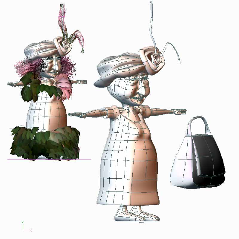
Each feather is simply two identical rectangular strips (3 patches each) placed closely together but that their normals face in opposite directions. I created the feathers first in an un-deformed state (straight up vertical). The strips are decaled, and the hair is combed into a feather shape. One could play with the length of the feather-hair splines (in brush mode) to more accurately create a feather shape. I didn't care. The feather patch geometry was deformed after combing to make the shapes I wanted. Did it this way because it was easier.

-
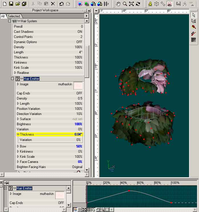
The petal shaped ruffles use a hair emitter that is a colored pink rectangle - that I shaped using the thickness & bow properties of the hair material. I probably didn't need to use an image emitter but I felt the slight pink color added another dimension to the color of the ruffles
-
The same decal drives the color for the Head hair, dress & ruffles on dress
-
Material for Head Hair with Emitter
-
Aaaack! You want to see her Nekkid? No one's ever asked to see my splines before. I'm thrilled! I must say her immediate ancestor for the body (arm, hands, legs, feet, start of dress) are from Ricky the Rat's genetic material off the wonderful A:M Extra CD (thank you Alain Desrochers). Hat too started from Alain's Hat (casquette) off of CD. Best money I ever spent. Oh wait...umm...er...twas FREE! (I will upgrade). Here she is with & without hair - details of hair to follow
-
FADE DECAL ON MODEL TO REVIEW SOMETHING
NancyGormezano replied to johnl3d's topic in Work In Progress / Sweatbox
Very nice Mr. Johnl3d AS USUAL! (The very one person whose experiments get me to upgrade every year. Watch out everybody - he's a shill, I just know it! - and if he's not, he should be.) -
New model & a series of questions
NancyGormezano replied to cstanton's topic in Work In Progress / Sweatbox
Okey dokey - thanks, Phil - I will add that to the trick list - I believe I have tried that - but can never be sure ... -
More like a cross between Betty White & Bette Midler. Dingy dainty with brazen Brooklyn sassy. She might even live in apt 2c across from Mrs. Goldberg. Yoooo Hooooo Mrs Goldberg? (Oy, am I old or what?) (Betty White is an actress - broadway, tv - who performed in US sitcoms: Mary Tyler Moore show, & Golden Girls. Mrs Goldberg was a very very early black & white era tv character. And Bette Midler is the one & only Bette Midler)
-
New model & a series of questions
NancyGormezano replied to cstanton's topic in Work In Progress / Sweatbox
I 100% agree. This is an extremely frustrating problem. I really wish there was a reliable way to conquer these stubborn 5 pt patches. I too go through all sorts of dances & incantations - and then maybe...finally, the green patch donut shows up. It is not always the same trick that works, which is really frustrating. And sometimes its just a matter of time. The same dumb action I had been doing repeatedly to select the cps and not working then decides to eventually miraculously work. I try not hiding, then hiding everything but the 5 cps. Then try selecting cps clockwise, counterclockwise, with the lasso, with the rectangle, starting on different cps. Close the model, open the model, blah blah blah. I do not know how to document this problem to A:M reports, in a way to help isolate the problem. But I can't believe that Hash doesn't know about it. Sometimes I just have to recreate some of the surrounding splines - looks the same but I guess it eventually resets something. And maybe it's not really the same? Sorry for pouring my sad pitiful heart out here ... I live in fear of 5 point patches. I too, want to know what the secret formula is. -
Expression link 2 decal image repeats?
NancyGormezano replied to heyvern's topic in Work In Progress / Sweatbox
very very nice - interesting style -
Thanks all for your comments - I appreciate it very much. Stian - yes her skirt is made out of hair, along with her eyelashes, feathers, and head hair. I love hair. I want cloth. I will upgrade. Paul - I went for exagerrated size in the purse as I was thinking I wanted to use it as a comedic element when I animate her. She will be a dainty lady (in her mind only), with more than enough strength (she is Mutha Naycha, after all) who wields this big clumsy inappropriately heavyweight styled purse, out of whackly flinging it all around - probably knocking stuff down with it in the process. It will be her bag o' tricks. It will go wherever she goes (reminiscent of a dear nutsy cousin of mine). I'm still thinking of designs/characters for her potential Gang of Gurlz - Tree, Cloud, Fire, Trash, etc. Unfortunately I started this before Hurricane Katrina - what I originally had in mind doesn't seem so funny any more. Thanks again all.
-
very definitely a fun character - looks really like a sketch - terrific