MJL Posted February 5, 2010 Author Share Posted February 5, 2010 I love the raku feel as well and design of the vase - beautiful! And I love the flourishy organic thingies poouring out of the vase - wonderful! But my feeling is that the neon green flat coloring and look of the "ribbons" doesn't match the coloring, 3D dimensionality of the jar. Perhaps a more unsaturated copper tarnish or antique gold or malachite or brushed tarnished silver for the ribbons (if you want contrast with the jar) might look good? Or even making jar & ribbons same material? Love the designs. Thank you, Nancy. I'll play around with your suggestions, and probably make other versions as well as this one. I'm going to need more than a few images for the website. I'll post them when I get them done. These were meant to look somewhat plant like. (albiet in a surrealistic, abstract, old hippie kind of way) Quote Link to comment Share on other sites More sharing options...
NancyGormezano Posted February 5, 2010 Share Posted February 5, 2010 These were meant to look somewhat plant like. (albiet in a surrealistic, abstract, old hippie kind of way) Ahhhh...of course! The vines are trippy - yes indeedy. Then it works. I thought you were going for straight 1920's-30's Art Deco - didn't realize the intent was to go nouveau 1960's art deco.. Rock On...Peace...Make Love Not War... Burn ALL Yer Bras (PLEASE before someone finds them)! Quote Link to comment Share on other sites More sharing options...
MJL Posted February 5, 2010 Author Share Posted February 5, 2010 Too late, they found them. It was so embarrasing. they missed the lacy ones, though. Quote Link to comment Share on other sites More sharing options...
higginsdj Posted February 6, 2010 Share Posted February 6, 2010 Wow these are great. I see wonderful book illustrations here.... Cheers Quote Link to comment Share on other sites More sharing options...
Darkwing Posted February 6, 2010 Share Posted February 6, 2010 if it was art deco, made dad would just love you, being art nouveau, he'll like you, just not as much as if it was deco, as you can guess, he's a deco fan, I myself prefer the surrealist movement for some reason, and then after that, it's a tie between the neo-classical and renaissance Quote Link to comment Share on other sites More sharing options...
Hash Fellow robcat2075 Posted February 6, 2010 Hash Fellow Share Posted February 6, 2010 Lovely stuff! Quote Link to comment Share on other sites More sharing options...
MJL Posted February 6, 2010 Author Share Posted February 6, 2010 Here's another version trying to adapt Nancy's suggestions. I bet she could come up with something........well........... Nancyish. Quote Link to comment Share on other sites More sharing options...
TheSpleen Posted February 6, 2010 Share Posted February 6, 2010 it has that "Greatful Dead poster" feel to it. Quote Link to comment Share on other sites More sharing options...
ypoissant Posted February 6, 2010 Share Posted February 6, 2010 Just found this thread. Very nice work. I love everything about it. Quote Link to comment Share on other sites More sharing options...
largento Posted February 6, 2010 Share Posted February 6, 2010 Myron, I think these are great and could really catch on big! A really cool update on that look! Quote Link to comment Share on other sites More sharing options...
MJL Posted February 6, 2010 Author Share Posted February 6, 2010 Wow! Thank you everybody! After 30 years with my future x-wife, I'm not used to this sort of positive, encouraging response to the things I do. It has been my hope that these images will impress prospective employers (read gigs) and customers (CD Sales) that visit my website. Ergo: If this website looks cool, maybe the music is good too. (You know, the ol' bait and switch ) Seriously, though, thank you , it means a lot Quote Link to comment Share on other sites More sharing options...
MJL Posted February 14, 2010 Author Share Posted February 14, 2010 Something That's the Same but Different: Quote Link to comment Share on other sites More sharing options...
TheSpleen Posted February 14, 2010 Share Posted February 14, 2010 looks great! Quote Link to comment Share on other sites More sharing options...
steve392 Posted February 14, 2010 Share Posted February 14, 2010 That would make terific hair for a artsy charector Quote Link to comment Share on other sites More sharing options...
higginsdj Posted February 14, 2010 Share Posted February 14, 2010 I can see a face in that artsy hair........ Its faint but its there (isn't it?) Quote Link to comment Share on other sites More sharing options...
MJL Posted February 14, 2010 Author Share Posted February 14, 2010 LOL, Thanks guys. Yeah, David, I was after a "suggested" face, and judging by your reply, I got what I was after. I'll play with more refinements over the next while, and spruce it up some. Quote Link to comment Share on other sites More sharing options...
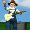
MJL Posted March 8, 2010 Author Share Posted March 8, 2010 I've been waiting for a clear day with no interruptions to Rig McKnuckles, so I put this together for the page on my website for music clips. The image is only half done, there will be "Music" flowing out of either the headstock or a guitar chord. Quote Link to comment Share on other sites More sharing options...
NancyGormezano Posted March 8, 2010 Share Posted March 8, 2010 fabulous! Quote Link to comment Share on other sites More sharing options...
HomeSlice Posted March 8, 2010 Share Posted March 8, 2010 Oh yeah. Great guitar Quote Link to comment Share on other sites More sharing options...
MJL Posted March 9, 2010 Author Share Posted March 9, 2010 Got the full image completed. I'll probably tweak it some more, but the concept works. sorta Quote Link to comment Share on other sites More sharing options...
TheSpleen Posted March 9, 2010 Share Posted March 9, 2010 Very Unique! Quote Link to comment Share on other sites More sharing options...
fae_alba Posted March 9, 2010 Share Posted March 9, 2010 I feel...inspiration....must resist or my short film project will never get finished! Really...I'm going to have a go with trying the same sort of thing with some celtic knotwork...won't come close to this 'cause man that is way out cool! Quote Link to comment Share on other sites More sharing options...
serg2 Posted March 9, 2010 Share Posted March 9, 2010 It beauty! Quote Link to comment Share on other sites More sharing options...
MJL Posted March 9, 2010 Author Share Posted March 9, 2010 Thank you everybody. I did some tweaking last night that I liked but I lost it trying to save. I'll redo it and post later Paul, Laphroaig usually ties me in knots. Quote Link to comment Share on other sites More sharing options...
fae_alba Posted March 9, 2010 Share Posted March 9, 2010 Paul, Laphroaig usually ties me in knots. Aye, and well it should! I'm fixin' to open a new bottle of Balvenie...maybe the Celtic Spirits will provide some inspiration! Quote Link to comment Share on other sites More sharing options...
MJL Posted March 9, 2010 Author Share Posted March 9, 2010 I'm calling this one done. May refine farther down the road. Quote Link to comment Share on other sites More sharing options...
HomeSlice Posted March 9, 2010 Share Posted March 9, 2010 You're outta control man! Nice work. Quote Link to comment Share on other sites More sharing options...
Gerry Posted March 9, 2010 Share Posted March 9, 2010 this stuff is way, way out there! Nice! Quote Link to comment Share on other sites More sharing options...
itsjustme Posted March 10, 2010 Share Posted March 10, 2010 Very cool, Myron! That is poster material. Quote Link to comment Share on other sites More sharing options...
Paul Forwood Posted March 10, 2010 Share Posted March 10, 2010 Beautiful, Myron! You should rig that sometime. Quote Link to comment Share on other sites More sharing options...
NancyGormezano Posted March 10, 2010 Share Posted March 10, 2010 Lovely, indeed! Quote Link to comment Share on other sites More sharing options...
MJL Posted March 13, 2010 Author Share Posted March 13, 2010 Thanks You, Nancy. You too, Paul. I've actually thought about animating "growing the Music ribbons" from the guitar. I'll put that on my list of things I'd like to do in A:M. It's item number 4,723. Very cool, Myron! That is poster material. Thanks, David. As you can see, I tend to respond to the slightest bit of encouragement. Here's the "Poster". Quote Link to comment Share on other sites More sharing options...
itsjustme Posted March 13, 2010 Share Posted March 13, 2010 Very cool, Myron! That is poster material. Thanks, David. As you can see, I tend to respond to the slightest bit of encouragement. Here's the "Poster". Good things should be encouraged. Very nice work! Quote Link to comment Share on other sites More sharing options...
TheSpleen Posted March 13, 2010 Share Posted March 13, 2010 Love the formula Quote Link to comment Share on other sites More sharing options...
mtpeak2 Posted March 13, 2010 Share Posted March 13, 2010 Looks cool Myron. Quote Link to comment Share on other sites More sharing options...
NancyGormezano Posted March 13, 2010 Share Posted March 13, 2010 I like that you've added some complementary textures on the guitar, love the equation - but not quite sure about the crossed red lines, seems to disrupt the composition (for me) - perhaps try the lines horizontal and parallel ? perhaps about 1/3 down from top ? Beautiful stuff ! (Do I have to keep saying that?...YES!) Quote Link to comment Share on other sites More sharing options...
John Bigboote Posted March 13, 2010 Share Posted March 13, 2010 I think I've seen that before...on a 'Yes' album or painted on John Lennon's Rolls Royce or sumthin... COOL! Quote Link to comment Share on other sites More sharing options...
MJL Posted March 13, 2010 Author Share Posted March 13, 2010 Thanks again, everybody! Gene, I bought a ball cap once that had "E=Fb" on it. I thought it was cool, but thought the formula didn't look 'Scientific' enough, so I made this one for the poster. Nancy, in prehistoric times back when I was in high school, I would get bored in class while the teacher was explaining for the 12th time for folks in the back of the room that 2+2 did indeed equal 4. I had been sketching for some time and was attempting to develop my "own" artistic" styles. (I've posted below a re-visitation of one of those styles done a couple of years ago for my friends, Sneakin' Out ) the lines were a composition choice to balance out, with their straightness, all of the curvature. These red lines obviously come from that. They weren't, however meant to distract from the image, and be that red and obtrusive. However there are differences from progressive and final renders. I've re-rendered with softer lines. I like them angled as they are, rather than a more 'geometrical' approach. That's what's cool about art, everybody sees thing a bit differently. Matthew, my man, back in the 1900's (during the last year of the sixth decade to be precise) when "Yes" was still "Maybe", I undertook a year or so of serious, independently funded Pharmacological research at laboratories conveniently located at various outdoor musical events up and down the West Coast. During my research I saw many images of this style, but alas, I find that I remember none of them. Stanley Mouse was a hero of mine, and his poster work was an inspiration for starting these Nouveau Images. Quote Link to comment Share on other sites More sharing options...
largento Posted March 14, 2010 Share Posted March 14, 2010 Myron, I'll say it again, this is incredibly original! Bravo! Quote Link to comment Share on other sites More sharing options...
NancyGormezano Posted March 14, 2010 Share Posted March 14, 2010 the lines were a composition choice to balance out, with their straightness, all of the curvature. These red lines obviously come from that. They weren't, however meant to distract from the image, and be that red and obtrusive. However there are differences from progressive and final renders. I've re-rendered with softer lines. I like them angled as they are, rather than a more 'geometrical' approach. That's what's cool about art, everybody sees thing a bit differently. Never meant to imply there were any formulas to composition that had to be strictly followed (that would be boring) - I definitely understood that you were trying to balance the curves. I like the softer lines. This works better (for me) - and you are absolutely right - it's all subjective and a matter of personal taste. The sketch is also terrific Quote Link to comment Share on other sites More sharing options...
MJL Posted March 23, 2010 Author Share Posted March 23, 2010 I'm wrapping up the imagery for my website. On the link to the video's page I have one image for the animated videos, but I wanted something different for the link to the "Live" video section. I wanted to do something with the ribbon style that has evolved, but my time (and perhaps creativity) is running out. So I put this little "concept " together. Not very Art Nouveau, but kind of interesting in it's own way. Quote Link to comment Share on other sites More sharing options...
fae_alba Posted March 23, 2010 Share Posted March 23, 2010 I'm liking that! Quote Link to comment Share on other sites More sharing options...
steve392 Posted March 23, 2010 Share Posted March 23, 2010 Yea thats a good one ,differant Quote Link to comment Share on other sites More sharing options...
NancyGormezano Posted March 23, 2010 Share Posted March 23, 2010 wonderful ! Quote Link to comment Share on other sites More sharing options...
itsjustme Posted March 23, 2010 Share Posted March 23, 2010 Another winner, Myron! Quote Link to comment Share on other sites More sharing options...
MJL Posted October 16, 2010 Author Share Posted October 16, 2010 Updating my Promo pack with some photos from my concert. I'm using some Art Nouveau frames to continue that "Retro" feel. Quote Link to comment Share on other sites More sharing options...
TheSpleen Posted October 16, 2010 Share Posted October 16, 2010 I love that! The whole style looks great. Quote Link to comment Share on other sites More sharing options...
MJL Posted October 16, 2010 Author Share Posted October 16, 2010 thanks, Gene, its gonna be a theme throughout my website and my promo material. Quote Link to comment Share on other sites More sharing options...
NancyGormezano Posted October 16, 2010 Share Posted October 16, 2010 Excellent! Quote Link to comment Share on other sites More sharing options...
Recommended Posts
Join the conversation
You can post now and register later. If you have an account, sign in now to post with your account.
Note: Your post will require moderator approval before it will be visible.