-
Posts
2,728 -
Joined
-
Last visited
-
Days Won
4
Content Type
Profiles
Forums
Events
Everything posted by Zaryin
-
That character turned out great.
-
Break (using "K" on the keyboard) all those splines in that area and redraw and reconnect it to smooth out that area.
-
If you want to detatch the hand...? I think that's what you want. I would grap all the CPs fromthe wrist and hand. Copy (ctrl+C) and then Paste (ctrl+V) to get a second copy of the hand. I would then go back to the attatched hand and select all the CPs for the hand, but not the wrist CPs, and delete the hand. Any left over splines attached to the wrist area can be gotten rid of by grabbing them and hitting "K" to get rid of it. Hope that helps.
-
-
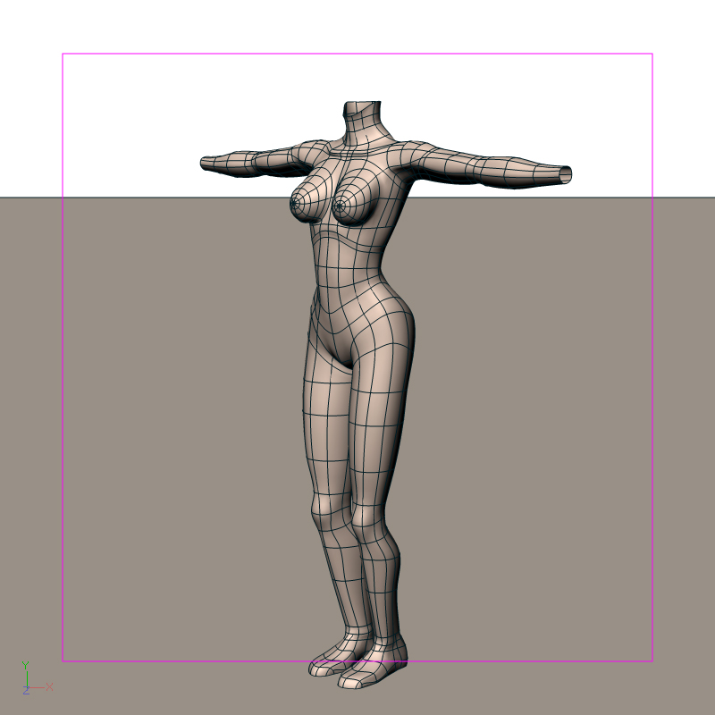
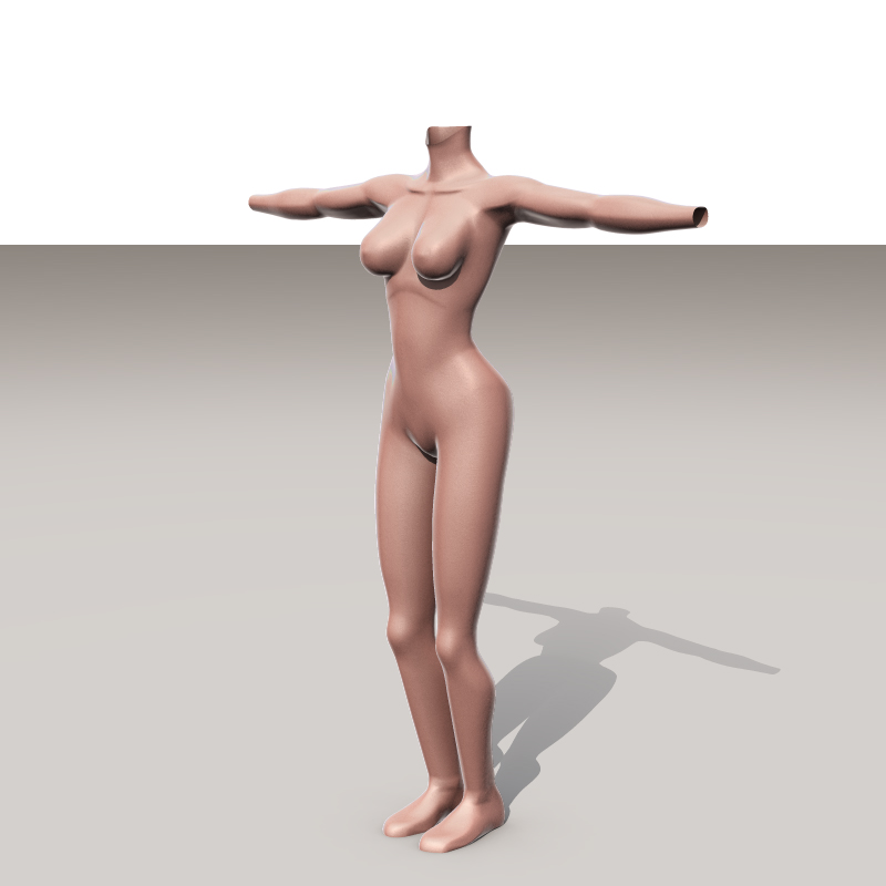
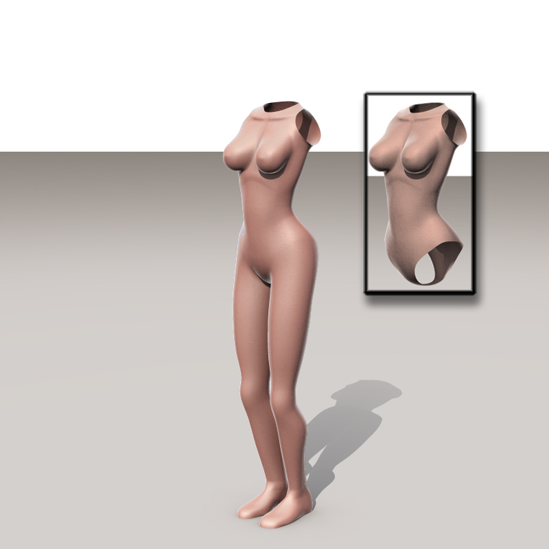
Well, in the chance that I will actually get more replies I will keep posting my WIP. I have the arms and neck done. I refined some of the knee CPs to make it look a little better. The arms have more detail than the legs for the simple reason as they might be seen more than the legs. Although, in the first female character I make, part of her legs will show. That Skin shader is great, but it really increases the render times. It takes about 38 minutes to render 16 passes.
-
Thanks for the link, John. THose bullet hole look crazy. I have an assignment. Make them bleed .
-
Ok, I got my base legs done. I won't be adding anymore detail to these so I can use them for multiple things. I also didn't do the soles of the boots for the same reason. I decided to try out Yves' Skin Shader. I love it. Since I don't know how to use it I left it at it's default settings. Because of this, I had to change my "skin" color to a very light tan, nearly white. Any tips on how to use it better would be appreciated. So I have Yves' to thank for the shader and the lighting (his skylights). Thanks Yves. Now onto the arms. I don't know if I will be adding hands to this model. Since it's a base I think I might make four sets of hands. One with fingernails, one without. One with five fingers, one with four. Thanks again everyone. And I hope noone got too drunk last night. EDIT: Forgot to add the pic, haha.
-
That explosion is cool, so is the multi-model...Where is the plug-in?
-
That turned out real nice.
-
That Openening Sequence was awesome. One day I hope I can do nearly so well.
-
Great character. Are you going to add teeth and a tongue?
-
LOL!!! That has got to be my favorite so far, John. You seem to be completing these things more and more. Great Job, it's perfect.
-
Nice looking material. The thing I always loved about your mats is that they're native A:M and you can look into how it was made to better your own skills.
-
Thanks Glenn. For some reason when I posted my last message your message was there, but all it showed was "Jeff," that's it, haha. Now I read your whole message and agree with it. I fixed it as much as I could. I can't seem to get it any better than that. Hope it passes.
-
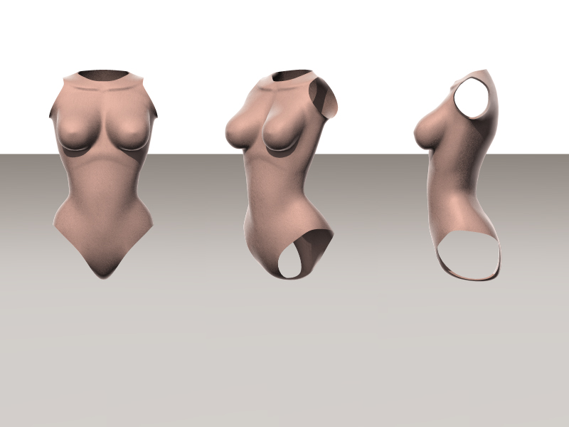
Hey Glenn, wish your message got all they way through . Well, I raised the ribcage, fixed the sternum (which was way out of wack) as much as I could, I decreased the size of the breasts (sorry to you out there that liked the larger ones). I'm still trying to get the ribcage better, but it works for me for now. Thanks for looking.
-
He's looking great. Are you planning on eyelids? THey will help add alot of emotion to him.
-
I like that bounce and roll. Now do with the wine in it .
-
Thanks for the comments and help again. Jim and Yves: I'm not up on the correct termes for body parts, so thanks for that. I see what you both mean about the ribcage and sternum. Just to make sure though, you are saying I should move it into a higher position beneath the breasts? I'm pretty sure that's what you mean . Yves, about that side view look any suggestions on how to make it look better? Do you think just some tweaking will do it, or do you think I might have to add extra splinage? I'll see if I can improve this area, but I can see where I will have problems with this. John: I will not be adding a bellybutton to this model. I don't want to add too much detail to this model since it will be a base I will use for other female models later, including clothing. The reason I am modeling the breasts exposed it that I might have a scene sometime where I will be using a bare breasted female. Although, I usually have clothes on my characters . Thanks again, guys.
-
That's what I was thinking, Doug
-
LOL, thanks guys. The breasts are modeled with the slightly weightless look because the whole body is a base and the breasts will be covered by clothing. So it's taking into account undergarments and the like. Jim, not to sound like an ass, but what's a sternum?, haha. Is it the collar bone area? I will see what I can do with the slight concavity in the middle spline. The low detail in the model is also because I will just be using this model as a base. I won't be making feet, but boots. Things like that. And I just like woman with wider hips. It's a realistic size so I wouldn't think those were stylized. Fixed that sharp line in the rib cage, that didn't look exactly right to me, either. I will probably be keeping the gap between the breasts. All the breasts I've seen are not pushed together, even when wearing a bra, unless it's a Wonderbra. I want to thank you all again for your comments so far. Next update will probably be after the New Year. Enjoy it everyone!
-
That turned out great. The specular seems a little to flat with no bump or anything in it. Other than that it's nearly real.
-
Thanks Xor, I'll get right to work on giving this torso some appendages .
-
Well, it's been years, but I finally started on my first female character. Let me state first off that the character I am supposed to be modeling is supposed to be small breasted, but for some reason they got modeled bigger. I am quite serious when I say I tried to model them smaller and ended up with her looking slightly more voluptious. I will be working on reducing the breast area when I make the actual character. This version will be my female base for later use anyway. This isn't done yet so please keep that in mind. I had trouble getting this far with the model. I think modeling only males has hampered me in this area. Comments and suggestions always appreciated.
-
The timing is a little off, like you said, but it is going to look pretty good when you get it down.
-

First attempt at making a character
Zaryin replied to paulmcg1's topic in Work In Progress / Sweatbox
For your first character you are off to a good start. I couldn't connect arms and legs for months when I first started. You are going to have to do a whole lot of tweaking to get rid of lumps and deformities, however.


