Dhar
-
Posts
3,862 -
Joined
-
Last visited
Content Type
Profiles
Forums
Events
Everything posted by Dhar
-
Whoa The optical illusion makes it look like it's forever shrinking.
-
Cartooning is basically changing the proportions of a subject to illustrate a certain look that expresses a character, emotion, attitude etc.. If you want your goat to be appealing to children, for example, a small body with a large head, small snout, big eyes and tiny horns would be one way. Ya know? Cutesy look Your goat's head is cartoony enough, but the body, especially the belly doesn't seem to fit. Fatten up the belly a bit and see what happens.
-
For a still model it shouldn't be too hard to do the paint. I thought you wanted to animate it, that's where the challenge lies. The car's bad ass
-
What a beautiful concept. This is the kind of work that makes me think "Why didn't I think of that?" I've been to the Bellagio many times, not as a guest, just to use the VIP restrooms in the lobby (gold plated handle faucets, marble floors, huge mirrors), fit for a king. As impressive as Bellagio's real fountain chor., you did a very nice job choreographing to the choice of music. And adding color to the sprites was a nice touch. As I remember, the fountains at Bellagio were lit with more of a golden color lighting than simple white. Also, something about the girl's front bangs that didn't move quite right at the end. Very nice work overall. Present it to Bellagio! Who knows, maybe a paid job will come out of it
-
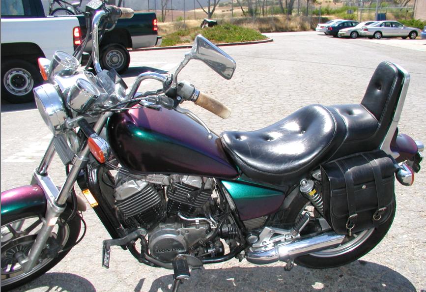
Mirage distributes this paint in cans. I painted my motorcycle with that color. I don't know how you're going to duplicate that paint's characters in A:M. The reflected light changes color as the angle changes. The paint is an irridescent paint with different reflective qualities to get different colors. This will be a challenge.

-
Nice! Surreal! Will you be texturing the ground or mapping it or both?
-
Try these render settings next time: - Sorenson 3 compression - medium quality - 320x240 - 30 fps - no key frames
-
WIP Desert Pool & live footage composition
Dhar replied to KNBits's topic in Work In Progress / Sweatbox
I think there's a message in the color of the blood being black. It comes from a darkened heart, a heart filled with evil. Could you get a translation of the script? -
WIP Desert Pool & live footage composition
Dhar replied to KNBits's topic in Work In Progress / Sweatbox
Wow That was Armenian? Sounded Hebrew to me, especially with the first word being "Elohim" (Oh God)! All I can say is: WOW -
What render settings did you use?
-
13 megs for a 2 minute is better than my 605 megs for a 3:30 minute What were your render settings if you don't mind me asking?
-
Looks great. Are the eyes separate? From the back, he looks like a burly soldier with helmet on
-
Hi David. I appreciate all the work you've put into this project for us to use as we please. You mentioned in a previous post about working out installation instructions? Do you mean that this isn't a simple download - plug & play model?
-
Hey... nice pants Could you please post a mesh?
-
Looks great! Is that a polygon model car? Where can I find your tutorials?
-
Your car is gorgeous. The one thing that stands out to me is the blue windscreen. For some reason, blue windscreen looks too cartoonish while the rest of the car looks realistic. Replace the blue with black or grey may do the trick. As for the illusion of chrome, if you already set the chromed area to high reflectivity, then, maybe, you can place a couple of black objects (rectangles, stripes) off the camera that will reflect on the chrome surfaces and thereby giving that illusion.
-
To make anything 'pop-out' of a page, one way is the use of contrasts in light & dark. In your model's case, since it is dark to begin with, a black (or darker) background coupled with some hi-lights on the model just might do the trick. Give the black leather enough shine to reflect some light. This is just a suggestion. With trial & error you'll get what you're looking for.
-
Bad Engleezi is no problem akhi, your work is worth a thousand words. Hey, forget regular tires, how about the wheels that turn downward and anti-gravity light comes out of them and the Carrera flies away? Kinda like the DeLorean in Back to the Future Great work!
-
The blue guy says "What time is it?" But I can't figure for the life of me what the pink guy said.
-
Animate them to the song "Riders on The Storm" by The Doors !!! Wow dude, what an awsome sight... Hell's Angels in year 3000
-
Job well done. The quality of this piece is something I expect to see on a TV ad. Go trajc go
-
So... what time is it anyway?
-
Oooh! That looks good. Love the shininess. Much better
-
Very short short Tarzan sequence
Dhar replied to TurboGorilla's topic in Work In Progress / Sweatbox
LOL You must have been really bored Tarzan was STANDING on water? Still fun to watch though. -
The movements look good. Nice anticipation. The hiding part didn't seem convincing to me. It looked more like that's where he wanted to go rather than someone going there to hide. If bot looked left, then right, then a small blip to indicate "ah! there's a good place to hide" and then proceeded would have been better communicated. Appealing design overall.