-
Posts
1,064 -
Joined
-
Last visited
-
Days Won
59
Content Type
Profiles
Forums
Events
Everything posted by Wildsided
-
Automated opening/closing of topics
Wildsided replied to Rodney's topic in A:M Users's A:M User Club Banner
Well lets be honest with ourselves. It was never a matter of 'if' I would disappoint the forum and always a matter of 'when'.- 9 replies
-
- deadline
- lock/unlock
-
(and 1 more)
Tagged with:
-

Automated opening/closing of topics
Wildsided replied to Rodney's topic in A:M Users's A:M User Club Banner
Aaaaargh the pressure!....I got nothin'- 9 replies
-
- deadline
- lock/unlock
-
(and 1 more)
Tagged with:
-
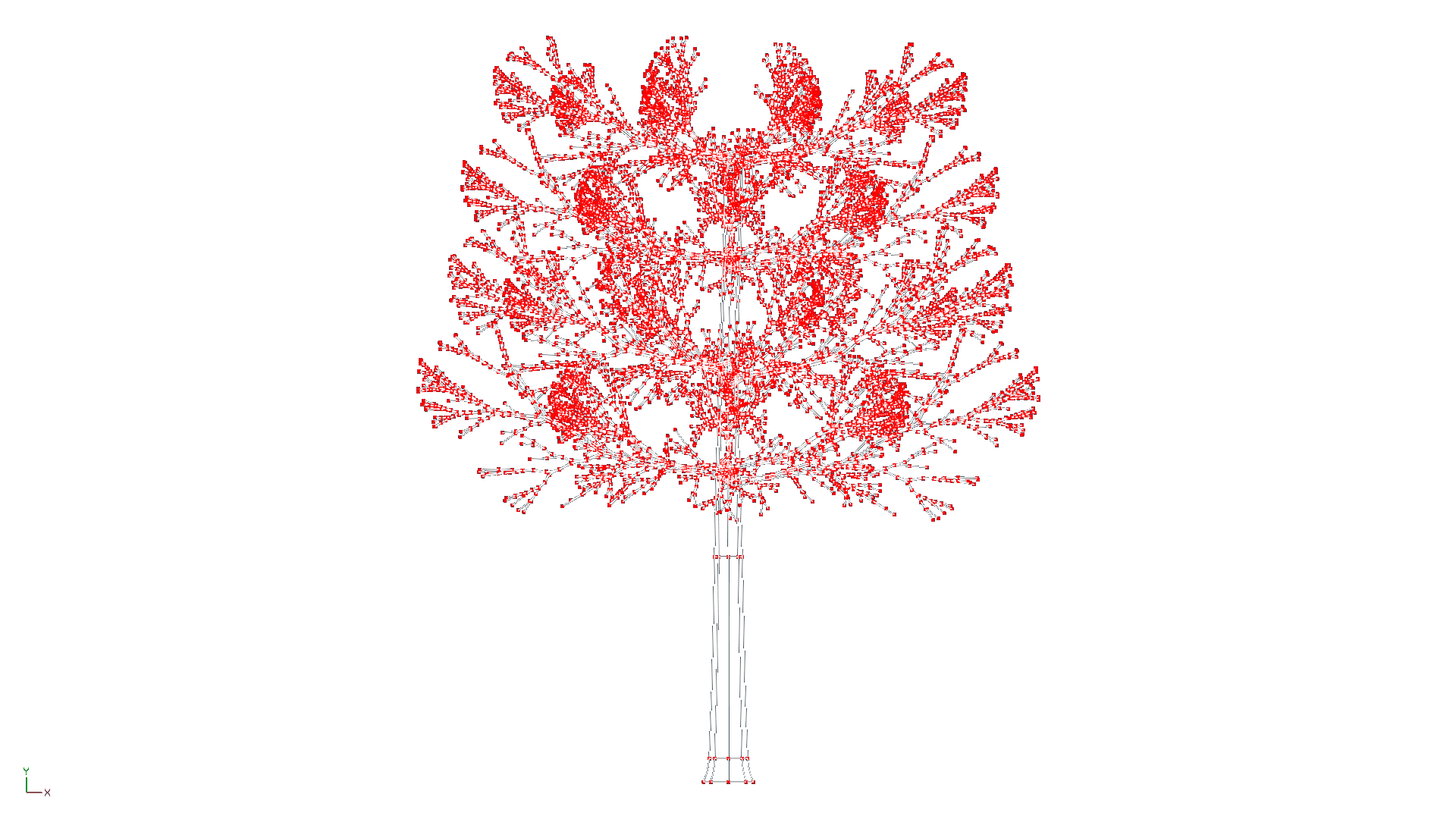
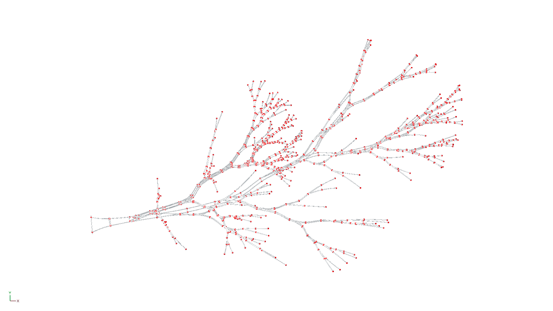
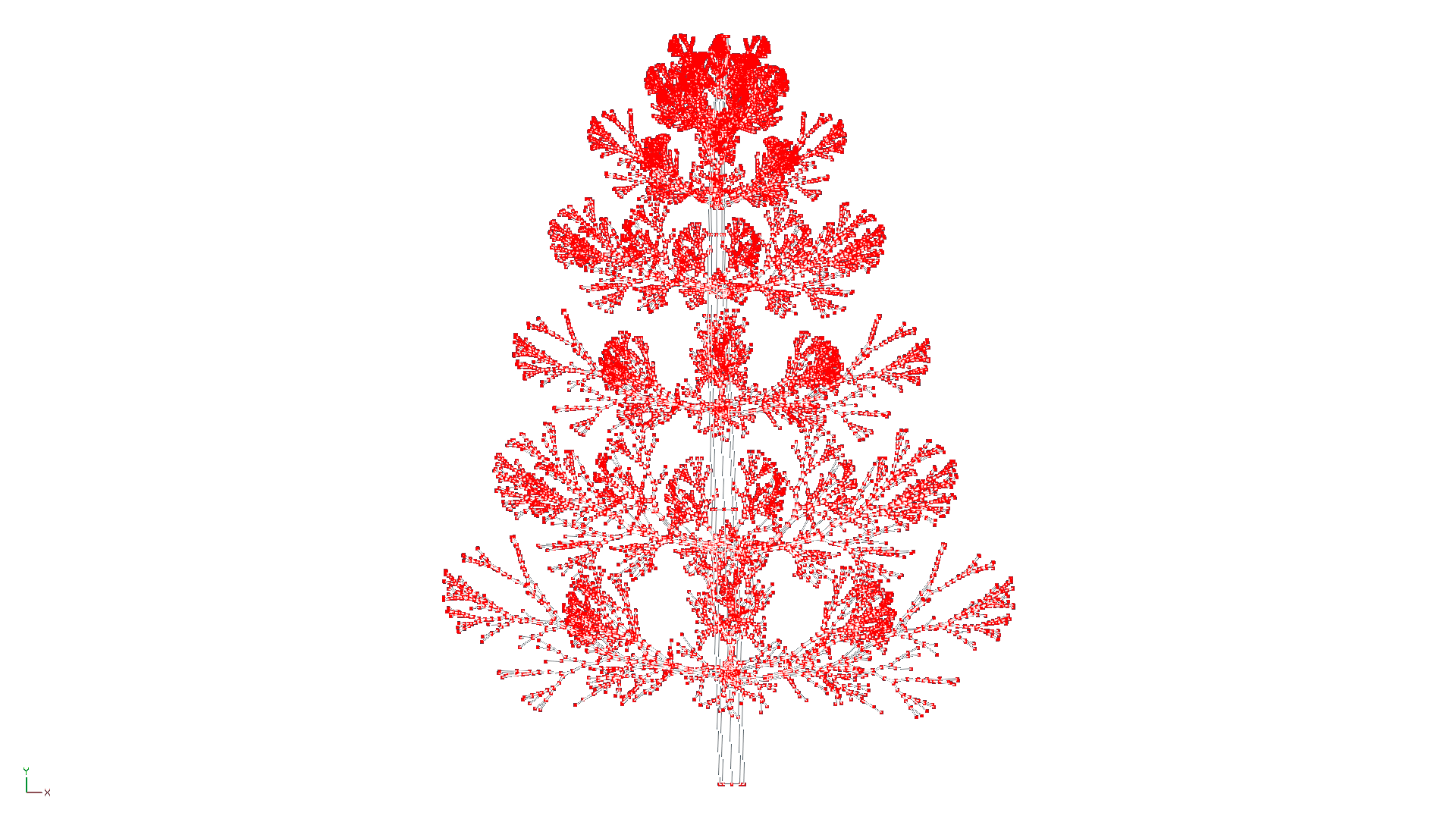
Cheers Steve. I don't know how efficient it is, but I have 1 group called 'needles' made up of key points along each branch. I'd had it where each branch had a needles group of its own but it felt like over kill so I consolidated them all into 1 group.
-
-
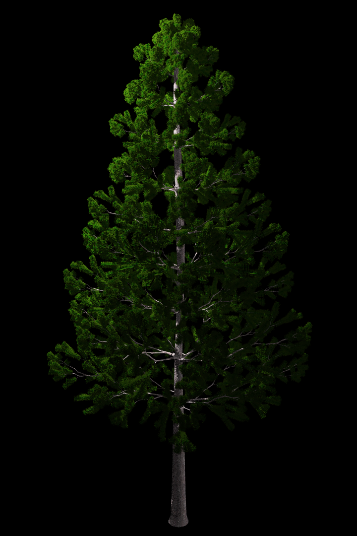
I tried treez and although I'm sure you could make something similiar with it I kept making trees that looked more like branches. So I made a trunk and a 'branch' and then manually assembled a tree branch by branch. But the more branches I added the more A:M or my system or both struggled to cope with it. To the point it became totally unworkable. So I spent a couple of hours removing 50% of the CP's in the 'branch' and started over. Even that didn't manage to get me a full tree. So in the end I chopped the top off the trunk and made the top of the tree in a separate model.
-
Thanks David. It had to be made in 2 parts and assembled afterward because my PC couldn't cope with the whole thing being 1 model.
-
-
If it's a good picture isn't centered properly?
-
Heck yeah! thanks for the tip off. $25 US for around a $1000 worth of software? Don't mind if I do.
-
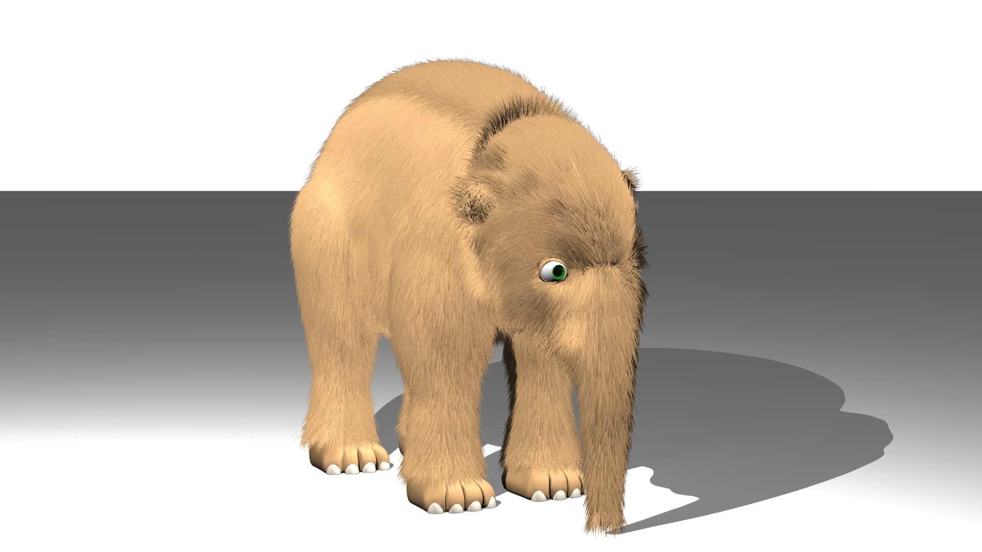
I saw that the prehistoric contest had been extended so I started working on a bit of something. This is the start of Tiny the baby Mammoth. He's a floof.
-

Thoms new look ...start of an idea
Wildsided replied to johnl3d's topic in Tinkering Gnome's Workshop
Oooh crystal Thom -
That's pretty awesome. I love when people make cool things using something totally not intended to be used for what they've done.
-
Have you tried clicking on Help and then reset setting. Then close and relaunch A:M
-
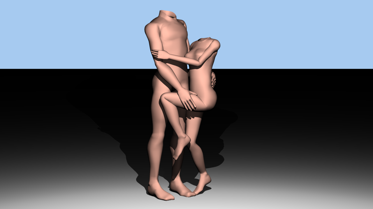
I finally got around to making a base male body. I've had a female one for a while and had been using a pretty crappy male for way too long. This new one can be manipulated a lot better than my old one.
-
Thanks Jason, I appreciate your hard work. Also had a wisdom tooth removed last October and that was no fun so two must suck royally.
-
Speaking of the store, are we ever likely to see things like A:M paint back on there? I asked (in a direct message not on the main forum) a little while ago and you (Jason) said you'd look into it but it hasn't reappeared so I just assumed that it wasn't. Just thought I'd ask.
-
Looking good Paul. I love a bit of animatronic goodness. (also Tailspin Baloo stumbling upon the body of Mr. Incredible in the background gave me a giggle.)
-
My name is Maximus Decimus Meridius. Husband to a murdered wife, father to a murdered son and I will have my vengeance, in this life or the next. (Looks great by the way)
-
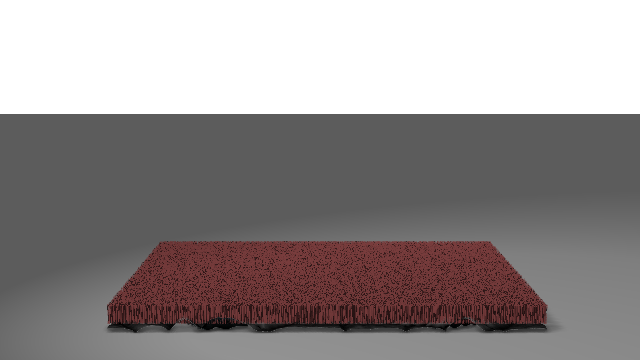
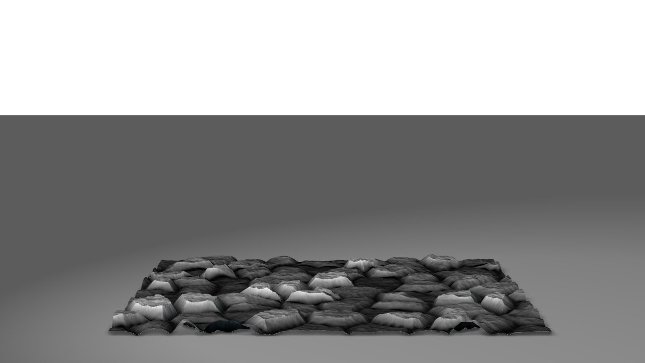
For anyone who didn't already know (like me) or might have been wondering. Hair is not effected by a displacement map.
-
So I had a rethink and made the inner portion of the lid totally transparent but left the inner edges slightly visible in order to keep a sense that the lid has thickness to it.
-
Hey Chris, I just gave the short a watch and there's a lot of promising stuff going on there. I love the overall concept, although I was unsure if it was meant to feel sinister or maybe melancholy. You've got some nice looking particle effects going on, did you do those in A:M or in After Effects? I'm no expert but for what it's worth I'd say you could make the hair on the characters much more lifelike by using a different texture, the current one on the girl doesn't seem to work as hair. I totally get where you're coming from about becoming impatient when animating, but as you said yourself the animation would benefit from some more time being put into it. It looks like you've used a combination of a texture and hair for the grass. It might look better if you crank up the density of the grass/hair so you see more of it than the texture. Although that would increase render times. Also I love the wind blowing through the longer grass, that looks great. Anyway, If you either plan to go back to this one and tweak it or to move on to something else, I look forward to seeing more of your stuff. P.S Did you write the music for the short? I saw you played the piano in the credits. If so, hats off to you.
-
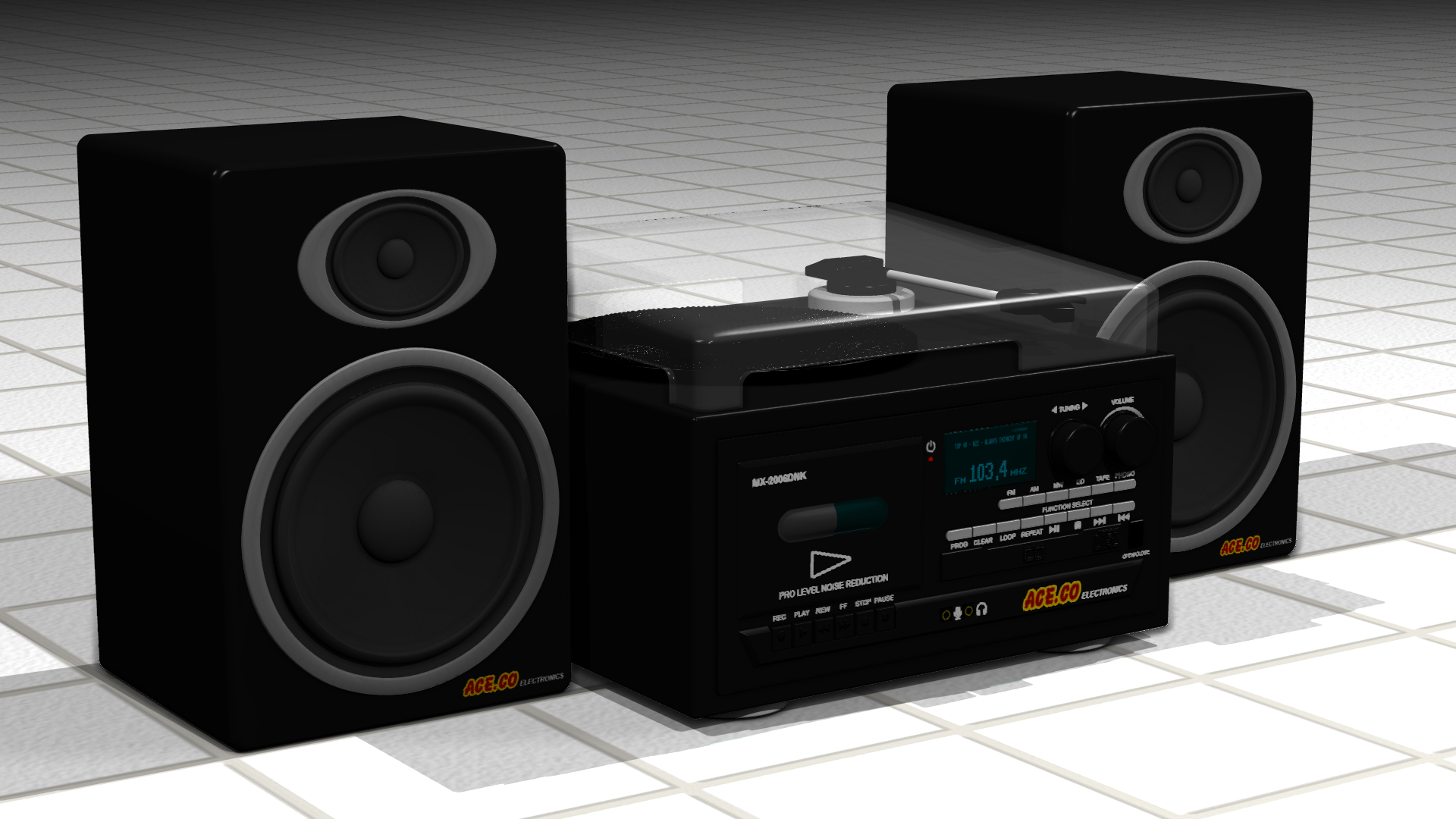
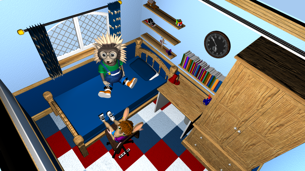
I was working on the décor for Bernie's room and decided he needed a sound system. At roughly the same time I remembered that this Special Topics section is called Ace.Co Entertainment. Sadly A.C.E has been defunct for quite a while now but I decided to let its spirit live on as an electronics manufacturer in the Bernie series. Introducing the Ace.Co Electronics MX-2006DNK
-
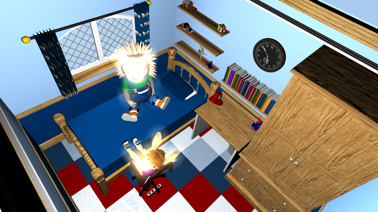
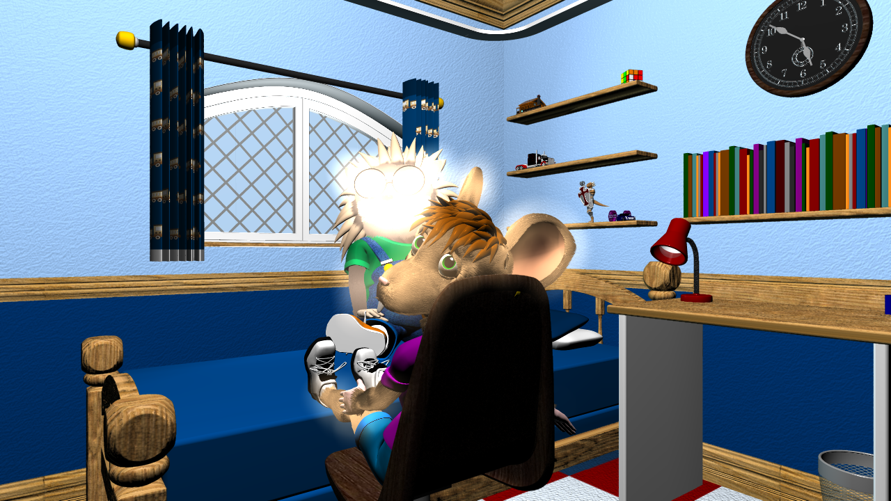
Never mind, I fixed it. the choreography's glow value had somehow been set to 200% and when I set it to 0 the bright aura went away. This doesn't explain why models that didn't have any parts of them assigned to glow were glowing. But at least it's fixed for now.
-
Does anybody know what I might have done to cause this? To my knowledge, I didn't change any settings and now all of a sudden Bernie and Nellie's faces are glowing. I think it must have something to do with hair because without it on things look fine.
-

Why doesn't this render? [sort of solved]
Wildsided replied to robcat2075's topic in Animation:Master
Just checked and it renders fine in 32bit as well. Must have been a glitch, glad it's working for you anyway.


