-
Posts
2,728 -
Joined
-
Last visited
-
Days Won
4
Content Type
Profiles
Forums
Events
Everything posted by Zaryin
-
Looks great. I think maybe a little staightening of the legs, then curling them again, in the middle of the flip might give it a little more snap.
-
Yeah, I like the painterly one a little better. For some reason the new one look too "empty" for some reason. I don't know why. I do like both of them, however.
-
Holy Crap! Thanks, Jody. I really didn't think anything was going to be able to be done. I just couldn't figure out what was wrong with it. Really, thanks alot.
-
If anyone knows how to debug models could you please take a look at this model and let me know what the hell is wrong with it? I can't get it to open in any version I have so if someone could figure it out and let me know what the problem is it would really be appreciated. I don't really feel like remaking these bastards if I don't have to. Thanks Armor_Shoulder01.txt
-
Haha, that's a good one, John.
-
Great! You are the king of breaking things down.
-
Thanks Robert. The patch count with the armor in the same model is -- and this is a guesstimate -- a little less than 10,000 patches, haha. So once I finish the shoulder armor it will probably be around 11K. Not animating friendly, but it's for a still image so I'm not too worried about the patch count.
-
I think the Color Decal has to be applied before you put the hair on the model. I might be wrong about that though.
-
Love the landscape! I wish I could put out a landscape half as good.
-
I also like the painterly feel of this one, but I would like to see a tweaked render too .
-
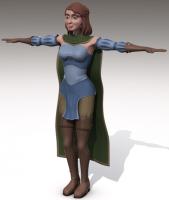
Thanks for the comments. David: Yeah, I probably could have used the cape I made for the Tin Servant as a base, but I modeled it from scratch. I like wasting as much time as possible, haha. I was going to make a specific character for learning animation that I was going to install the squetchy rig in, but I got sidetracked when I decided to make this Image. I might go with the that rig, or I'll take the easy way and use the Setup Machine, haha. Trajce: Thanks alot . I can't even animate a ball, lol. At least for now this character will be used just for the image I am making. I might animate her later -- when I actually know what I am doing. Thanks again. PS: My next image post will have the finished armor.
-
What a great character. Excellent design and model.
-
It's really coming along. I was going to mention the nipples, but jon beat me to it.
-
Thanks everyone! Matt: I was actually thinking of giving her a waist leangth cloak since she'll be riding on a griffon, but I liked the longer version. Doug: These are supposed to be just base colors (although they might end up final depending on where I do with her), but I could add some yellow as "embroidery" work in the cloths later on. Charlie: Haha. They might not be anotomically correct, but they sure are sexy, lol. Thanks again.
-
Ooooh drool! That is looking awesome. I love that walk.
-
Thanks alot, Ethan. I just had a look at your website. Beautiful drawings. If I do add weapons they will probably be sheathed. At least in the final image. Here she is with different colors. These are probably the colors I will be going with. I added dimension to the cape and a border the same color as the pants. I still have tweaking to do and to add the hood, but I haven't decided if I want the hood now. It might save me some energy not to try and model it, and it will probably not even be seen in the final image. Oh, and I should add that I adjusted the shoulders a few images back. They were way too long so I shortened them. Thanks again.
-
I really like the added shaky limbs.
-
Ahaha. That was great!
-
Thanks alot everyone. I purposfully made her with pants, because without pants it was just pushing it, haha. The color scheme I was going for with her was the shirt represented "sky" and the greens and browns of the boots, pants, and gloves would represent the "earth" since she is a griffon rider. I will post a darker green and a lighter blue and see what everyone thinks. Thanks again.
-
That is pretty cool looking. You helped alot of people who want to make ice for still images. Might be a render hit, but at least it's only one frame that way.
-
Collar bones. Other than that I think he is looking awesome. I love pirates!
-
Just thought I'd post this publicly. I meant my last post as a compliment. It's hard to get meaning across on the internet. I think you model is great so far, Dhar.
-
I got to agree with Dhar here. Excellent toon shading. The splash screen is great. I just wish your links were set up .
-
I thought it was great. I hope you have a higher quality version though for when you send it out. I got a lot of artifacting the one I watched.
-
I also like your texturing work here. Nice job.


