Zaryin
-
Posts
2,728 -
Joined
-
Last visited
-
Days Won
4
Content Type
Profiles
Forums
Events
Everything posted by Zaryin
-
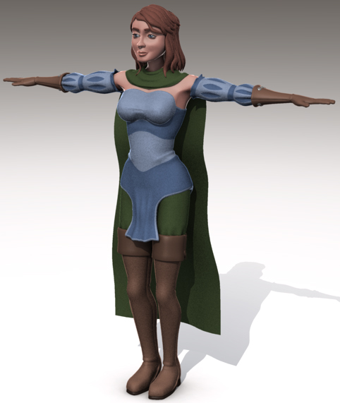
OK, I got the basic shape of the hooded cape done, sans hood, but here is my problem. I love the forest green color of the cloak, but it now totally screws with the color of my pants. What color should I change my pants too? I was thinking just a darker shade of the green I'm using now, then trim the cloak with that darker color too? Any opinions appreciated.

-
Thanks alot, guys. I mean it, thanks alot. Without you she wouldn't look nearly as good as she does now. Noah: Thanks very much. Coming from a modeler like you that is a compliment.
-
Hey Noah, since you're not looking for critiques at this time I won't tell you how awesome this project is looking, even at this early stage.
-
Just remember to go with what you want. All we offer is opinons. It's your that matters the most .
-
Here she is with added faux hair-do. I still don't know how I will do the final hair, but I'll leave that until much later. Now to the hooded cloak. Matt: Forgot to add that this is just for a personal project for me. The model was made for this project. Thanks again.
-
I have ot agree with some of these other comments. I think the wings should be at leasst twice as large, maybe 2 1/2 larger.
-
Love the hair. I hope I can get mine to look as well. The breast area seems a little boxy right now. That could probably use a little smoothing.
-
I'm liking it so far. Don't forget to give some thinkness to the glass and reflection and refraciton to really make it look good.
-
Thanks for the comments again, guys. Matt: I really don't know if I will be adding texture maps to her yet. I probably will. I'm still trying to decide if I am going to go for the cartoony real look, or a real look with a little cartoony . Dennis: Yeah, I love this community. If you really need help, people are willing to. Thanks again.
-
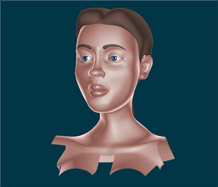
Here she is with her face fixed. I also fixed the jawline to the ears, that was bothering me. And the neck to shoulders was smoothed out more. I also changed the color of the hair since it was too close to the color I was using for the "leather" (plus I like it better ). And I darkened the color on the pants to give it a more "earthy" tone. I also added eyelash placards. I will also post a closeup render of the model from the modeling window. Now to get a better hairstyle. I'm going to try Frank Silas' method. I haven't decide if I am going to go with hair or decals for the final version of the hair, so Frank's method will do for now. Thanks again.
-
Man, I didn't think you were going into this much detail. And now you are doing even more, man! Looking goos.
-
I don't know why, it's a great model so far. Maybe they were jealous .
-
Thanks alot for the comments once again. John: You are quite welcome. If I can help anyone by posting that, that's great. You have done alot of help yourself. I even used your cloud blur trick for an image, so thankyou . Ken and oakchas: Yeah, I noticed that neck thing myself. I commented that I would fix it in an earlier post. Thanks for mentioning it though. The more people that say it looks wierd the more I know I need to change it. oakchas: Don't worry about it. I couldn't even see what was wrong with her until Will posted that pic. I was just concentrating so hard on the parts of her I liked I didn't pay attention to her overall proportion. Temka: Thanks
-
a kids room for a personal animation!!!!!
Zaryin replied to pelonppp's topic in Work In Progress / Sweatbox
Excellent lighting. I have to add myself that it's too clean though. Other than that, it's great. -
IBL stand for Image Based Lighting. You'd have to ask someone else for an explanation though .
-
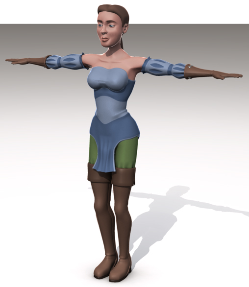
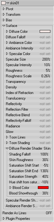
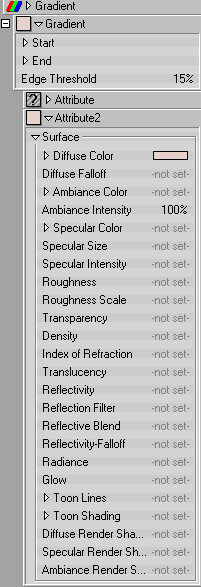
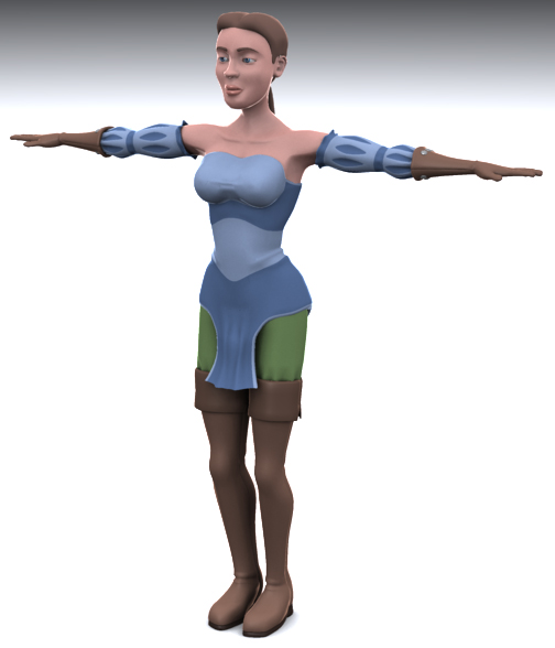
Since I got some commnets on my skin setting I thought I'd post some screen grabe of the materials. I am alos posting the model in my original chor. Nothing has changed with yet though. Thanks,
-
Thanks, Frank. When I make a better hairstyle for mine I'll go with that way.
-
That ain't no lie . Mike: I was going to add aybrow placards on the next version. Thanks for reminding though.
-
It was a fun little game. I congratulate you on actually finishing it. I never seem to be able to finish anything *sigh*.
-
Excellent model. It's great that we are going to get renders like that. Of course, most of that is your skill. I would probably have a little more trouble with it, haha.
-
Ugh! THis is one area I don't think I'd be much help with. I love where it's going though. Are you building eack lock and then putting them down, or are you placeing guide splines then putting the locks down?
-
Nice work on these. I love the anime style.
-
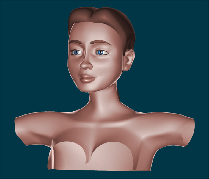
WOW, thanks everyone! Thankyou for taking the time for helping me with this. I am now going to take all this advice and fix the face. I noticed that neck area the other day and wasn't sure about it, but now I'll smooth out that transition. Thanks, Will. That visual really helped me see where I was going wrong. The advice of the others helped immensely, but the visual really brought it home. I don't know why I didn't see it now that I am looking at it. I did have a ref I was using, but it had an open mouth. I think that's where I went wrong with the nose, mouth, chin area now that I see it. Thanks again, everyone. You support on this is greatly appreciated.
-
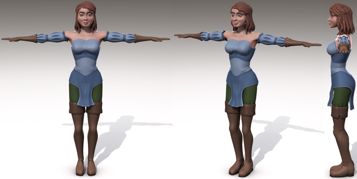
Thanks for the comments Dhar: Thanks. Yeah, I just can't seem to see what look "masculine" about her. I just don't see it anywhere in her. There alot of worman with stong jawlines that still look feminine. Hmm... I just can't see it, and that's what's bothering me. Well, we'll see where she goes over the life of the project. Maybe I'll see it later. I just wish I saw it now. Thanks, Frank. I used a nearly white base (peach, but very light) then used the skin shader by Yves with a pinkish color. I then used a gradient material for the rim look. It's the same material in all the images. Just the lighting changes and the rim gradient wasn't in the first image. Here is another render with the rim gradient toned down and the colors on the shirt flipped. I think it looks better this way. Thanks, oakchas .
-
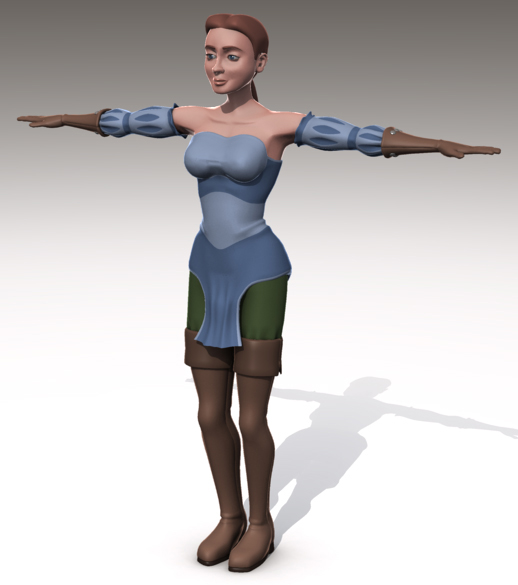
Thanks again for the comments. Please don't take what I am about to say as anger or anything, I really want your opinion. It's hard to get the right feeling through just words on a "page". Here it comes... What exactly makes you find her unattractive? I myself find her attractive. Except from the side. I'm not worrying too much about that since she won't be seen fully side on in the finished pic. But otherwise I think she's attractive. I might be missing something though since I've been staring at her for awhile . I'm posting a quick, 1 pass rendering of her from the modeling window. If you could point out exactly what you find unattractive I'll take a look and see if I can fix it. Thanks again. PS: She's not based on anyone, haha. EDIT: Might it have something to do with the way my rimlight gradient material is set on my character? Maybe thats distorting her features?