robcat2075
-
Posts
28,390 -
Joined
-
Last visited
-
Days Won
422
Content Type
Profiles
Forums
Events
Everything posted by robcat2075
-
Without spending alot of time with other rigs you won't know the difference. TSM1 was great, TSM2 is even better. However most animators are not at the level where they can discern the advantages of them. They don't understand what rigs really do. And most modelers are not at the point where they can properly assign CPs to bones for character animation. It's something you learn to do by experimentation. No rig, even one you make yourself, will do that correctly automatically. What step would you not have to do with your own rig that you have to do with TSM? It is easier to make bad animation with simpler rigs. A lot of the stiff, floaty, weightless animation we've seen over that last 20 years is the result of rigs that make it hard to put the character where it needs to be. Show us the bad result. then we'll know what the problem is.
-
I can't really tell what it is about from the trailer. The "handcart" reference suggests something to do with the Mormon's trek across the plains to Utah. But the dress of the characters doesn't look to be from that period. So I'm stumped.
-

Need to brighten up this guy's eyes
robcat2075 replied to Nosferatu's topic in Work In Progress / Sweatbox
AFAIK, light lists work on objects, not parts of objects. If the eyes are separate objects from all else then you could do light lists. -
Need to brighten up this guy's eyes
robcat2075 replied to Nosferatu's topic in Work In Progress / Sweatbox
How about adding two lights to the model that just shine on the eyes? -
Hey, that was charming! Everything I always wanted to know about snowmen but was afraid to ask. I enjoyed watching that. And the music was fun too. Burn it on a DVD and send it to friend and foe alike for the holidays.
-
In the Pose Sliders window, remember to turn "TSM Constraints" ON. My TSM models come out with it "OFF" for some reason. I really like TSM and TSM 2. I'm not sure I'd be animating without them.
-
First Animated Short Film Complete
robcat2075 replied to flashawd's topic in Work In Progress / Sweatbox
Congratulations on finishing your first movie! I like the fact that it's a "silent movie", meaning it's all told thru the visual. There were several moments where the exact intention of the interaction between the characters eluded me. It might be something as simple as a different camera angle to fix that. If martial arts conventions ever have film festivals (like anime conventions sometimes do) you should enter it. -
Fine looking helicopter! Looks good enough to be in a movie.
-
Bigger head? Bigger eyes? It looks like you did the reverse.
-
Looks Great! If you don't want to do white, a light blue gradient background would be wintery.
-
you might have something... if you filtered the audio file to smooth it out and just leave the basic vowel sounds you might use that to generate the action, then swap the origianl audio back in...?
-
Welcome to A:M, the most powerful animation software in our world! Both are possible. For best results convert your video to a targa sequence and import that as an "image sequence" into your images folder. After that you use it like any other decal.
-
OK, it finished downloading. One problem with the jumps is that he leaves the ground before he's finished stretching. that means any force he's applying to the ground never really gets applied, making his flight in the air look impossible. that stretch should happen in one or two frames at most. Boing! take a look at theses bounces: http://www.hash.com/forums/index.php?s=&sh...ndpost&p=143990 compression: http://www.hash.com/forums/index.php?s=&sh...ndpost&p=145375
-
ooohh... CalArts!... I am envious! If I could start over as an embryo... oh, well. What is meant by that?
-
ouch... 38 megs for only 22 seconds? That doesn't have to be. still waiting for download to finish....
-
Actually, it occurs to me that since I'm using my TSM-rigged Shaggy, I could probably just swap him out for the AM2001 Shaggy. Did you animate that run, Robert? yes.
-
There was one in the Stereoscopic Anijam. It's A:M 2001, but you could copy/rotoscope it.
-
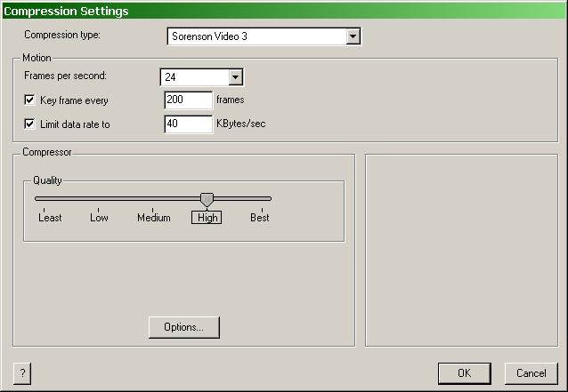
Fine looking Car! try this. raise the data rate until the image quality becomes acceptable.

-
Good looking models! I think for your one-year anniversary you can be as cheesy as you want. (something is amiss about the transition around 0:30, however.) If you're going to spin the models, I'd spin them slower and just do one rev in wireframe and just one in rendered. It's hard to examine a quickly spinning model. I hope you're working on TWO!
-
Looks cute! One thing... the upper left box is creeping. Probably a non-zero-slope spline thing.
-
Another kitchen table masterpiece! Congratulations, Zach! And getting on the Cleveland Festival is getting into pretty good company... their animation winner last year was "Ryan", the Oscar winner for Best Animated Short.
-
Presuming that this is an accurate depiction of the event, I'd say the green car and the truck are at fault here. In this state they would be guilty of following too closely since there was only about 1 second between red car and green car and between green car and truck. Looks good. So who is actually getting sued in all this?
-
Is there a scarecrow rigged yet? Not to rush anyone, just wondering.
-
BBC New Animator Competition
robcat2075 replied to gazzamataz's topic in Work In Progress / Sweatbox
Hey, that was cute, Gary! Sorry I didn't catch it before this. Yeah, six weeks isn't much time to put together a minute long short. I don't even get 10 seconds done in six weeks. I'll be looking forward to seeing the next adventures of Bella Bear! -
a .rar inside a .zip? post it in regular ol' quicktime. I can't open it. Make it easy for people to see.