Heath_Naylor
-
Posts
207 -
Joined
-
Last visited
1 Follower

Recent Profile Visitors
556 profile views

Heath_Naylor's Achievements
Journeyman (4/10)
0
Reputation
-
Contest Animation - April Fools
Heath_Naylor replied to Heath_Naylor's topic in Work In Progress / Sweatbox
Thanks Phastso. I am currently behind in the competition. The animation doesn't really relate to anyone as the characters are actually balls I guess . Thanks for the nice words, I still have a long way to go. I took a week off animation for spring break (naughty me, I know). -
Contest Animation I Made
Heath_Naylor replied to Heath_Naylor's topic in Work In Progress / Sweatbox
Hate to beat a dead horse, but this Animation got featured as a Video of the Day today, three cheers anyone? -
Contest Animation - April Fools
Heath_Naylor replied to Heath_Naylor's topic in Work In Progress / Sweatbox
LOL Rodney, I used the same test! She did get it, got a chuckle out of her. I agree with all of you on the points you made, and looking at it now, it lacks character in a lot of ways. I am glad that people let me know this stuff, I will work hard on it for new animations. I have been watching a lot of animated films for inspiration, and I think it has worked. I seriously have watched about six animated films about 3 times each, evaluating scenes, facial expressions, basic body movements. It is amazing to watch what kind of actions go into resting animations alone. Well, back to animating! Keep the comments coming, -
Contest Animation - April Fools
Heath_Naylor replied to Heath_Naylor's topic in Work In Progress / Sweatbox
Lol, I know what you mean. I will go back and change that if possible, I sort of changed on of the models and didn't save it as something different, oops Thanks for the comments guys. -
Thanks guys, yeah I have never used the handles in my life, they make things so much easier! I am sitting in my 3D animation class right now, so back to work for me .
-
I found a good ball bounce tutorial, followed it, and learned a lot more then I expected. I am beginning to break some bad habits, blocking out the animation ahead of time, and manipulating timeline splines. One thing I have noticed, A:M doesn't have spline manipulator handles, how can I get these? Without them spline in the timeline is cumbersome. I know it must be something I have missed. Anyways, here is the ball bounce test. Ball Bounce Tests.mov (Under 1MB)
-
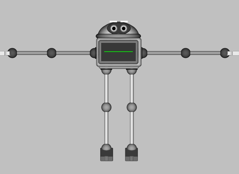
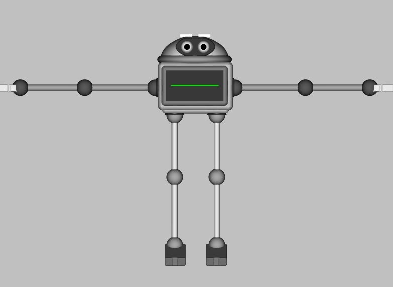
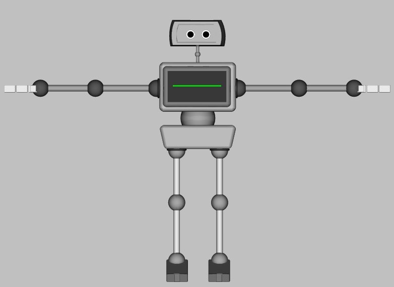
Yeah, I need help, what is wrong with him. Below is a picture of skimpy 1.0 and 2.0, I am making 2.0 better with hips and such, but I must know what is wrong with him before I move on with rigging.
-
Contest Animation - April Fools
Heath_Naylor replied to Heath_Naylor's topic in Work In Progress / Sweatbox
I would really appreciate some input on this, it is my first ball animation with a story and I would like to know if there are any major problems with it. -
Hey guys, I have entered Revver's next film contest, this one has the April fools theme. I started out to do a basic ball movement test, but as soon as the contest was announced I changed my whole outlook on the animation. Let me know what you guys think, thanks! Maybe I can get first this time around? April Fools - Flash April Fools - Quicktime
-
Alright, I am making a website for my animations, http://uberanimator.com/ . The layout it has right now is what I like to call a bare bones layout. It has all the declensions set, but basic images. I will be able to change the images as I see fit. I use black dividers to separate major features (banner, navigation, background) and then I use different colors to suggest a boarder for the side sections. Notice I NEVER use white (except for the images I will replace at a later time with non white ones). I can't afford Dreamweaver so I use Nvu, it is a lot like it, but you need to know some HTML to use it properly, and it doesn't have templates that I know of . I spent the last few hours on the site so I have to hit the sack.
-
Unique Approach To Storyboarding?
Heath_Naylor replied to Heath_Naylor's topic in Work In Progress / Sweatbox
Right, I also have the story board on foam core to present to the class. I will see if I can change some things up, such as silhouette poses. -
Hey guys, this storyboard is actually for a class I am taking, but I decided that what better presentation then a video? Let me know what you guys think. Storyboard - 'Unexpected Headache' Crits please, it's due Thursday.
-
As a student graphics designer I can tell you that http://www.crumblenet.com/ is a site in need of redesign. It is lacking a steady theme. Here are my suggestions. 1: Text Size: Keep it universal for example: ' why Subscribe To Nunsofamerica on youtube? ' is far to long for a graphical text title. It Should be more like ' On Youtube ' or something that draws the user in quickly and effectively. Then in that section have a clear link to the youtube page (ex. http://www.youtube.com/profile?user=nunsofamerica ) Also, it would be better if you had a Mario Film specific youtube, not that I don't like seeing snowdays . 2: Fonts: Your Sub Font is NEVER bigger then Intro font, example: ______________________________________________________________________ Bad Way: Welcome To CrumbleNet WOW! The about us page is now up and working. check out the workers! ______________________________________________________________________ Good Way: Welcome To CrumbleNet WOW! The about us page is now up and working. check out the workers! ______________________________________________________________________ Next, no one will take you seriously if you site is grammatically incorrect. After periods you MUST capitalize. The about us page is now up and working. check out the workers! SHOULD BE The 'About Us' page is now up and working. Check out our members! 'About Us' should link to the 'About Us' page. Try never to use double words, such as working and workers. Members/Staff/Team is much better then workers. 3: Navigation: This is a big problem for the site. Navigation MUST be left side or top, no one wants to have to scroll down to find the navigation. Bottom navigation is optional, but the first thing you want people to notice is that they have a choice where to go. 4: Boarders: The page has major problems with this. At first glance it looks like you have a top boarder, a bottom boarder and just EVERYTHING in between |__________| Current Site Layout |__________| |__________| |__________| |__________| |__________| |__BANNER_| Suggested Site Layout |=navigation=| |_|Updates|_| |_|_______|_| |_|_______|_| |_|_______|_| |=navigation=| |___________| If that doesn't make since I will whip up an example. Basically you need to define where a section ends and the next begins, otherwise the user will get lost. 5: Ease on self: This is important, never do things like 'Picture of the week' instead make it 'Picture of the moment'. This way people don't expect to see a new image every week, just to be let down if it doesn't change. If you don't update that weekly then people begin to think you are lazy or a dead film, they leave and never return. _______________________________________________________________________________ I'll end it there, all I have done here is stated the problems, suggested fixes, given examples. Please take the criticisms in a constructive manor and decide if you want to look deeper into them. The site works as it is, just sloppy.
-
Basic Ball Bounce - Crit Please
Heath_Naylor replied to Heath_Naylor's topic in Work In Progress / Sweatbox
You guys are right, my approach is a ball that is alive, and jumping up. I will change the animation name . -
Funny story behind this. So I am taking a 3D Animation course at the college I am going to, and the program we are using is Cinema 4D. We are doing a bouncing ball project, and I decided to do it in the program I am familiar with as well as C4D. I will compare the two when I am done and upload a comparison video if I see fit. You can also see the animation in Flash format BallBounce.mov - Quicktime BallBounce on Revver - Flash