robcat2075
-
Posts
28,393 -
Joined
-
Last visited
-
Days Won
423
Content Type
Profiles
Forums
Events
Everything posted by robcat2075
-
There might be a toon setting that works, but this one look more like "solarized" photography than toon. It's too fragmented.
-
Wonderful looking character!
-
If you were open to a compositing solution, you could render the refraction (with no color, 100% transparency) as one pass, another pass to create a mask and use those two to composite you r refraction with some tint onto your scene. I've done this is the past when volumetric lights created impossibly bright intersections.
-
In my example we're looking across the diagonal of the cube so the edges would be the thinnest and the center would be the thickest. The coloration of the cube doesn't indicate that, however.
-
he really meant 1, right? there is no zero IOR in A:M. To eliminate some variables I set all the lights to white. What I find incongruous is that even though the sky and ground are white behind the cube on the left, they don't get the same coloration from the transparency. [attachmentid=16253] IORZerotest.zip

-
that'a cute one
-
It may have something to do with how you have set "UseSettings from:" "This dialog" or "the camera" on the Options>render tab
-
render it as a quicktime, less than 2 megs. Use the "File Attachments" section of the Reply page to add it to your post. The "Animation:Master" forum is the only one that can't do that.
-
hey, that looks dangerous!
-
Is it off in the Render to File panel? Are you using the default "Animation" codec? Don't. What are you watching them in?
-
You mean in A:M or in Quicktime?
-
Stitch mode. Search "Stitch" in the Help docs. Has sample movie. To keep the old curvature, you hold the Shift Key while adding the the new spline .
-
Good pose. I like that better than the one in the book!
-
Fine looking stuff! The bases of the wine glasses look dark, I suppose because they are "reflecting" the dark background, but I'd think more of the light table top would come thru.
-
Hey, fine looking stuff! That's a feature-quality looking character! I hope this is a pilot for a series or something because I can totally see that. One ani-bit... around fr. 22-23 his feet are leaving the ground flat-footed. If he pushed off with his toes leaving the ground last it would look like a more forceful jump.
-
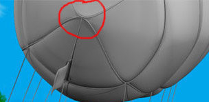
Good looking scene. the lack of tension you are showing in the lines here [attachmentid=15861] is rather at odds with the tension you are showing elsewhere in the balloon.
-
That's the old displacement that only subdivides a patch. the per-pixel displacement is new in V13
-
Bellisimo! Quello è meraviglioso!
-

Is there a tutorial on how to bring items forward ...
robcat2075 replied to Lucine's topic in New Users
Layers are objects in space like any other model. Choose an ovehead view and move one closer to or farther from the camera to arrange it in relation to another layer. Does that help? -
Nice looking sets. Great character! Good discussion! -I dont know the story so I don't know why the character is looking directly at the camera. But in most cases it's a rather ambiguous tactic unless the viewer has been explicitly prepared to understand it as the POV of an established character. -One small animation note... the head rotates as if it is perched on an isloated axis on the top of the neck. You could loosen up that up greatly with accompanying motion in the neck bone. Try moving your own head without any neck motion at all. Bet you can't do it! And since your character has a pretty substantial neck it becomes all the more important to not leave it locked in place. We could extend this concept to the whole body. You really can't move your head with out some shoulder movement too. And once yo move the shoulders the hips have to move also to balance the body. It's just a hair of motion but it keeps the character from looking stiff.
-
a search on "Nissan Skyline" maybe? http://maxworld2000.narod.ru/graphs/cars/n...skyline_r34.jpg (loads slowly) http://images.search.yahoo.com/search/imag...r=sbcfp-imp&b=1 Hopefully , you've done the modeling tuts in the book that came with your A:M CD. That will get you started on the "how". If you haven't done them... do them first.
-
Yup you don't need that extra spline onthe top face (red). Make the end (green) out of one single spline loop, extrude it twice like the arrows show, peak everything, and then neither the ends nor the middle will show a patch. If you made this by first creating the L-shaped cross section, then extruded that down, that will almost certainly create internal patches since the ends and middle would be made from more than one spline.
-
Internal patches. This is a sign of improper splining when building the model originally. Show a wireframe of the model and someone will be able to point out how to avoid that.
-
how many times do you need to do this on one model?
-
Wouldn't bump/displacement/normal mapping eliminate the need to model each board separately?