robcat2075
-
Posts
28,276 -
Joined
-
Last visited
-
Days Won
406
Content Type
Profiles
Forums
Events
Everything posted by robcat2075
-
There's a small book that came with your CD called "The Art of Animation:Master". Do the tutorials in it. The questions you've asked so far have answers in those tuts. Like-wise with the questions you are about to ask.
-
the new pose you created needs to be turned ON in the properties for the model. It's under "User properties"
-
You have bone 17 as a child of Bone 15, even tho it's a different leg. In fact, 17-24 are all children/grandchildren... of Bone 15, so if you move 15 they will all move too, where ever they are in the character. In the PWS, Click and drag Bone 17 onto whatever is the parent of Bone 15. that will make it a sibling, not a child of BOne 15. Make thing easier.... rename you r bones to somethig meaningfulful like leg Left 1 innner leg left 1 outer leg left 2 inner leg left 2 outer...
-
In the ProjectWorkSpace the bones folder for your model has the whole bone tree. you can see what bones are children of other bones. You can drag them under or over other bones. You can also rename the bones to something useful there. Not sure I understand, but remember, after you apply these constraints, close the window and test it out in an action or in chor. don't move things around in the constraint (AKA pose) window or you'll mess things up. Also, I've found that if I've just applieda new constraint, I need to close the action or chor I'm testing it in and reopen it before the new constraint takes effect.
-
My first guess is that the heirarchy of the bones is not right.... some bones are children of bones that they shouldn't be children of. So when you move one bone it takes a bone with it that you didn't want to go with it.
-
Welcome to A:M! You mean the eye target? you can add a null with rightclick>new>Null while in bones mode Presuming your eye bone is pointing out of the middle of the eye already you can make it point to the null with New>Pose>ON/OFF select the eye bone rightclick>new constraint>aim at click on the null make sure this pose is ON when you use the character in a chor or action. But read colin's tuts anyway, they're good.
-
When you say "it's not right yet", what do you mean?
-
Far away land would have a much flatter horizon line. And have less saturated colors due to "aerial perspective." try "fog" for that. I think the poses in general might be rethought. I don't have a solution right here and now, but I think the silhouettes are overlapping too much
-
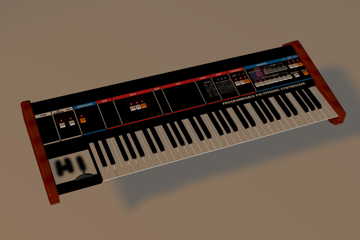
OK, i tried the gigantor patch and it has trouble rendering my "hi" decal. I bet Vern is right Stil consider submitting an AMReport, the zip is certainly within the 5 meg limit.
-
nice model. I just added a quick sloppy decal inthe lower left. It seemed to stick, I can't see that any thing else has been dropped because of it but I'm sure you'll notice if I missed something small. ??

-
Don't know anything about Vaughn Bode, but I like the look! Not sure I understand the lighting in the two set shots, the shadows are confusing.
-
Welcome to A:M! Here's a thread in which joining actions (or not) was run thru the mill a few times. http://www.hash.com/forums/index.php?showt...hl=choreography A more specific answer http://www.hash.com/forums/index.php?s=&sh...indpost&p=45032 and a picture
-

Keyframes changing during final render
robcat2075 replied to arkaos's topic in Work In Progress / Sweatbox
Will it load in V11.1? How big is big? How big is it zipped? -
www.hash.com/reports zip up prj with needed decals. Include screen shots to show differences. Explain situation. Explain/show the circumstances in which decals show and the circumstances in which they do not. draw on screen cap to show exact example of screen cap I submitted, to show exact area of a problem:
-
I can't identify any specific text on the renders since they are resized down, but if you have a case where two renders of the same thing are getting different results, make an AMReport of it. Include the project and the steps to repeat. As I look at the model, I imagine quite a few of the decals could be combined, but I don't know how they are apportioned now, so it's difficult to make definite suggestions. Any difference if you don't run Photoshop at the same time?
-
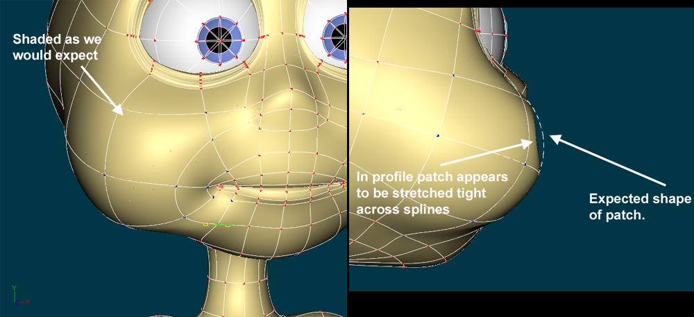
You seem to be using the same image over numerous times, stamping the whole thing onto parts that are much smaller than the image. In a case where the blue line doesn't appear, is it possible that you've stamped the blue line on and then later inadvertently stamped a gray portion of the decal over it in a later pass?
-
How/where are you applying them? Can you show a screen cap of them not appearing?
-
Light aberration: not volumetric, not lens flare...
robcat2075 replied to Kelley's topic in New Users
How about a kleig light? it's directional, it shouldn't make any hot spot at all on the wall behind it -
That was cute! but so small!
-
If you just want to test it out to see how things are moving, choose "shaded" instead of "Final" You can set "Final" to Multi-pass ON at 1 pass for quicker previews. You can choose a smaller render size than VGA. Turn particles off unless you actually need to see some you have put in your scene. Are there lights in those street lights? DO you need them? A ten second aniamtion is 240 frames. If all those lights are on, if they're invoking ray tracing, or if many of the above parameters are used... yeah you could get to 45 minutes per frame. 45mins x 240frames = more than a week
-
Featured Artist of the Month....
robcat2075 replied to DarkLimit's topic in Work In Progress / Sweatbox
Congratulations! Fine looking stuff. And you're a chef too... hope these fish don't show up on the menu! -
You needn't be cautious about using TSM rigs. If animating is your goal, you want to start that journey now, it's a long one. You don't want to delay with any more of a side trip to rigging than necessary. TSM rigs don't make the skin around joints deform automatically when you move a bone. But no other rig does either. That's what "fanbones" and "smartskin" are all about. Those are relatively easy tasks compared to designing and executing a whole character rig that controls the body well and doesn't stand in the way of the poses you want to make. You may learn much making your own rigs, but that knowledge does little to inform the task of character animation. And you'll still have to learn to fanbone and smartskin anyway.
-
I recently visited Mike Sanderson, one of our forum members at his job at DNA where he's working on the feature Ant Bully. Based on what I saw, the animators there work in completely default shaded gray, no texturing is done until after the shot is finaled. But that's big-time production pipeline stuff. For an independent animator it may make sense to have the character as finished as possible. You can see if your animation is weirdly distorting a decal, for instance. Coloring and decaling is pretty flexible in A:M, you can do it anytime in process and it won't physically alter your animation.
-
A real LED has a tiny little spot inside the glass that glows. try making the bulb transparent and refractive and put a tiny 100%ambient spot inside it.
-
My first animation "Crazy 4 Daisy"
robcat2075 replied to rago's topic in Work In Progress / Sweatbox
Congratulations, that looked good! Link so people can get to it easier: http://amfilms.hash.com/search/entry.php?entry=1083