-
Posts
2,099 -
Joined
-
Last visited
-
Days Won
1
Content Type
Profiles
Forums
Events
Everything posted by agep
-
Great looking model Ken And congrats on getting a paid gig. Any chance we can see some wires? Regards Stian
-
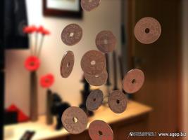
Thanks for your comments The funny coins are an norwegian 1krone (worth 1/6 of an american dollar). Actually there is no storyline, its more like a test. the clip however is inspired by an norwegian tv channel commercial vignette where all sorts of object flies up in the air and shapes this two
-
I just had some sparetime so I redid the clip. Take a look and let me know what you think Stian [attachmentid=16970] tv2kroner_480.mov
-
now, thats a beautiful render!
-
Sometimes having to many codecs might cause the problem.
-
I most prefer the shaded version. Nice model btw
-
LOL. That sure made me laugh Great stuff
-
Those models are amazing! Nice work. I especially like the cuffs. Any wires? Regards Stian
-
Absolutely beautiful!!! Love the colors
-
Much great stuff in your Showreel! Especially the robot They worked for me. Have you tried to "Right click" and "Save target as..."?
-
Hi Welcome back Great looking car so far. The sidewindows looks a bit weird though, looks like they are to much sunken into the body? I would love to see more angles, and perhaps a wire? Regards Stian *edit* Very smooth and nice grill
-
I've tested motion blur, but the result ended up to become to much blured overall
-
Thanks for your comments Its the image you mean? if so, I was thinking the same thing, but I was afraid I would loose all the details since they are so small and the fact that the background also is blured. Lets just say the coins have been thrown up in the air and is now midair microseconds before they starts to fall down (standings still in the air) just kidding. Il do a new render to see how it turns out. Regards Stian
-
Thanks guys I rendered an new still of the coins, and ps blured the background, I'm pretty happy with this one. Regards Stian [attachmentid=15678]
-
This is just an test in doing photo comp. The clip is inspired by some norwegian tv vignette, where all sorts of objects hovers to create this two. It is however a bit of work behind this, I took approximately 60 images of my livingroom that i stitched together to make an environment map and IBL image. I had to go back to "global color" instead of IBL, since the IBL gave the groundplane an unwanted colorburn. The coin is made by coloring a coin with a felt pen, and the rubbing its surface with some paper to get the patter showing, then I scanned it. scanning the coin without the coloring gave me just the highlights. The scanned image got some ps fixing, and then was used as v13 displacentmap. also attached is an image with larger coins (and IBL). I'm not sure why I made this, but I was aiming for realism, eventhough I'm not sure I achieved that The coins do overlap eachother, but its just an test Regards Stian [attachmentid=15674] latest version: [attachmentid=16970] [attachmentid=15676] coins_720.mov
-
HOLY! I'm just speechless! the models are outstanding!
-
Hey John Great accomplishment! The shadows are very well done (only a bit to bright when crossing the shadows of the host) and it looks like the model do have some ambiance intensity added to it but that might be due to the resolution of the clip or me? The animation is great! Regards Stian
-
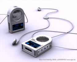
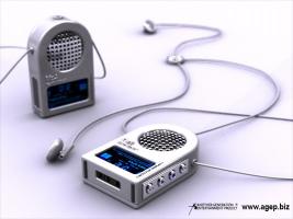
Thanks for your comments. I agree with you about the DOF Paul, I didn't like the "jagginess" the A:M DOF made to much, and I think I also used to much DOF. Perhaps I should try to make some fake DOF in PS... Anyway, here is an clean render of the player, no DOF Regards Stian [attachmentid=15263]
-
Thanks for your comments Is it to much DOF, or to little, or do you feel the image would be better without DOF at all? Actually it is the Hash team that deserves credit for the lightning, since it is basic mostly AO settings. Thanks Hash That was my intentions atleast (se the decal right beside the display Thanks The screentexture is an PS edited screencapture of an player application I have installed on my cellphone called "UnrelPlayer". The texture is applied on a 1patched grid, with ambiance intensity set to 100
-
Hi all. I have tried to visualize an Mp3-player design that I had in my head. This is yet another retro design attempt (I kind of like retro design). While I tried to make the player function as an traditional ear-plug player with an necklace, it is also given an little speaker so it can function as an small table player (not an powerful one though ). Hope you like it. btw, The DOF does give some artifacts on the earplug in the background (this is an 25 pass render with soft ON). Regards Stian [attachmentid=15204]
-
Thanks Teresa and Gerry yeah I agree to that, but most of the stills are to time consuming to render as animation, and I also havent found the time to set up new renders (read: a portion lazyness ) Thanks Regards Stian
-
This is awesome work. Very inspirational!
-
Impressive work Colin
-
That was what I was aiming at, without killing them with boredom. My last version had a very fast duration that made it hard to examine the the models My idea behind the zoom is that first you'll see the project then you'll see the finished project (like the others; wire to final) Thanks for your comments guys
-
Thanks guys. Glad you liked it. I would like to get more input regarding the rotate duration, if it is to long or not.


