-
Posts
401 -
Joined
-
Last visited
-
Days Won
2
Content Type
Profiles
Forums
Events
Everything posted by LeeAnderson
-
This is an amazing production Satyajit! Everything is so professional. The first models are looking great too! Lee
-
Nice work! For your first character ever, you should be impressed, and so am I! Keep it up! Lee
-
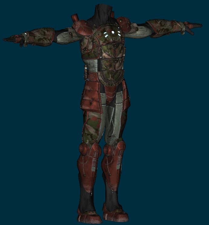
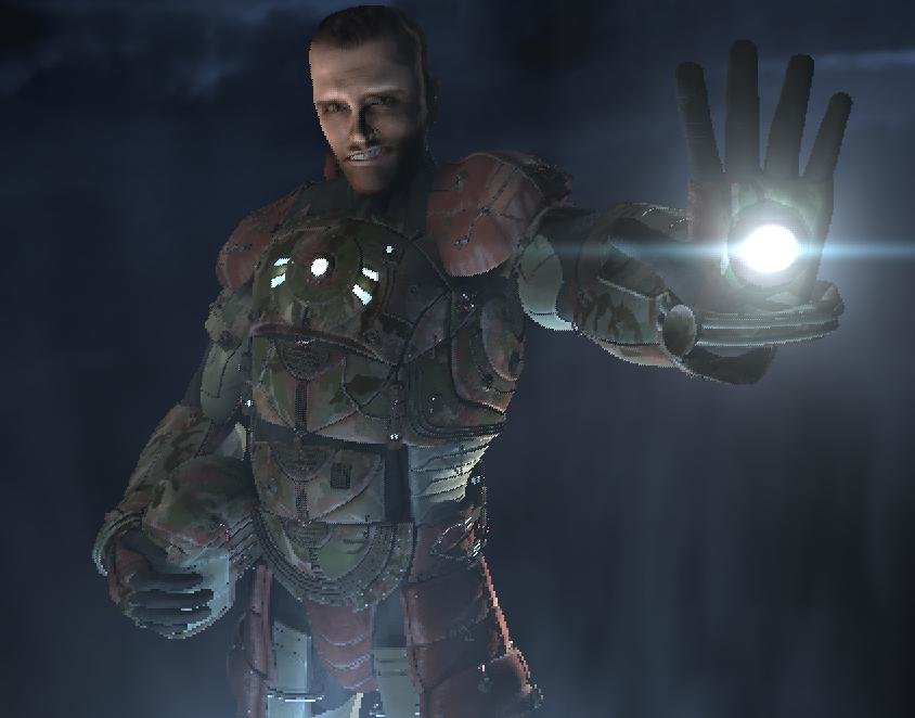
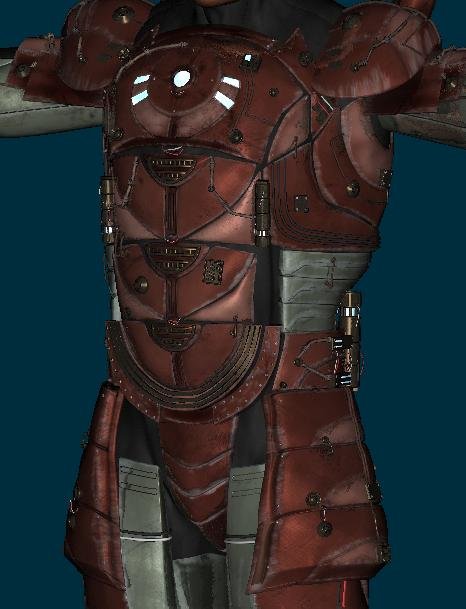
Hey everybody! I took Will's advice and added some camo--I think it looks great! It adds that military edge this character needed! Here's another final render test--this time without reflections What do you think? Lee
-
YES! Why didn't I think of this before?! In addition, perhaps his face should be painted like a mime...or maybe a doll Haha! Can't go wrong with the duckies...maybe bunnies on top and duckies on the bottom? :D That's one of the first times when I was truly laughing out loud at the something that someone wrote! Careful though, I hear that song is copyright material Thanks for the laughs everybody, I needed that! Lee
-
Hey all, I still haven't talked to Martin about this issue, but I figure that I'd switch around some obvious things, if for nothing else than to have a little fun! Here's the corny story I came up with: Cameron Keene, part-time marine, was enlisted by the shadowy group Nightrun Inc. to be the soldier inside their latest covert program, Project Brimstone. Reluctantly, Keene agreed and found himself in the laboratory of Dr. Walter A. Buchanon (later to be his the Keene's evil nemesis Dr. Canon ) being hooked to a rugged suit of armor loaded with every kind of fire arm possible. Wires extruded from his body, sensors monitored his vital organs and soon he became a living weopon! ...How's that, aside from waaaay campy? Here's the WIP: Here's the final minus tint/bloom post effects, DOF and hair What do you think? Lee
-

Mascot Contest Entry - BigDaddy
LeeAnderson replied to Eric2575's topic in Work In Progress / Sweatbox
Great work here Eric! The modeling seems very clean and precise, well done! Lee -
Those updates are awesome Mark! You're killing me! I love it! One note about the backlight (smart people correct me if I'm wrong): it's general pupose is to seperate the character from its background. I know it's just a test but I'd consider darkening up the background a little on the first pic. Henrietta is coming along very well! I'm impressed. The style reminds me of a model that Sze Jones did. You may find some inspiration from it (be warned, some of her stuff is a little too risque for my tastes...not this one though). You're modeling is getting more crisp all the time. Congrats! Lee
-
Great tests Mark, I like it! Haha! Is this the one where they go into a dark cloud at sea called Veeger? Here's your first picture (a_muted.jpg) rendered with bloom in A:M...I hope you don't mind me posting this here... You're running v 14 right? Bloom is a post effect. There are two ways to use it (that I like to use, anyway). With either way, you'll need to either import the bloom post effect from libraries or create a new post effect and right click/change type to/hash inc/bloom. If you want to put it right on top of your scene you can just drag and drop it onto the camera...usually the settings are a little strong at first...for this I used 20% strength and 20% threshold with the defaul 6 radius. Or, if you want a little more control you can render your whole scene out first without bloom and then use your animation as a rotoscope and apply your bloom to the camera then (it will render out the same way). I use bloom whenever I want that old movie kind of look. Sorry for hogging your thread. I hope that helps and it will look good no matter which way you go! Lee
-
Great work Mark! I love it! Your style always impresses me, it's so clean. Henrietta is also looking good, the modeling is really smooth. I look forward to seeing her with that same sassy look as in your drawings! I agree, that's a cool look. Something that occured to me is that you could tone down the specularity and then add some bloom as a post effect, that could make it easier to control...it's hard to get things right the first time. With bloom, the overexposed effect could be more uniformly distributed across the frame. Keep the spec size though, it's great...just lower the intensity a little. Whatever you go with, I'm sure it will look great! Lee
-

Captain America from "The Ultimates"
LeeAnderson replied to LeeAnderson's topic in Work In Progress / Sweatbox
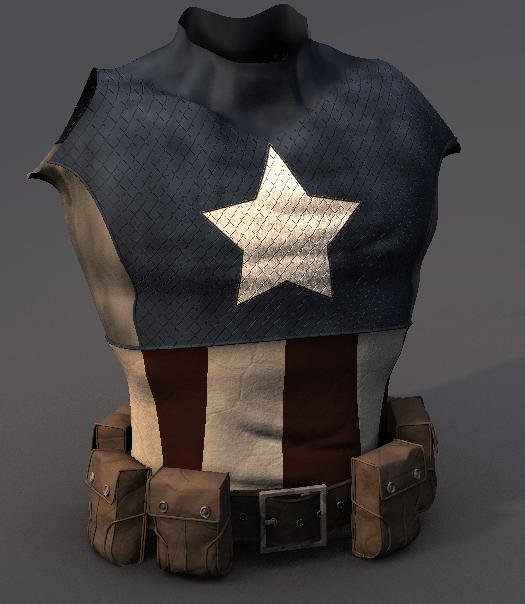
Hey everybody, I found an hour! Not much of an update, but I finished the belt and placed the pouches in their final positions. Lee -

Captain America from "The Ultimates"
LeeAnderson replied to LeeAnderson's topic in Work In Progress / Sweatbox
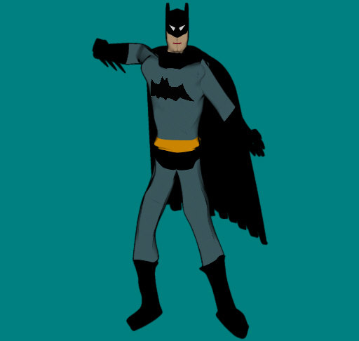
lol...I know what you mean.... this was my 3rd model EVER in A:M...yup...I'm a comic junky through and through...but look at how terrible it is. See? You shouldn't give up yet. I don't think that this model is too complex for you at all! You're just about the most knowledgable person out there at A:M. Tell you what, if you want some good comic book/anatomy model sheets for your first try, just let me know. They're easy, all you have to do is follow the lines. Don't give up! Lee -

Captain America from "The Ultimates"
LeeAnderson replied to LeeAnderson's topic in Work In Progress / Sweatbox
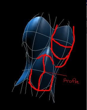
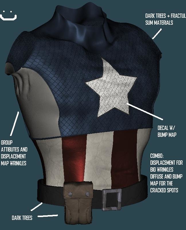
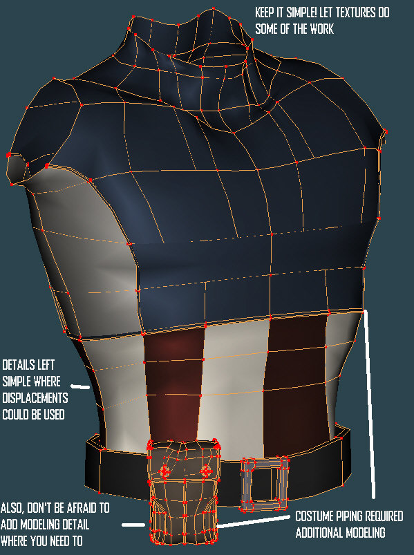
Wow! Thanks everybody... I wasn't expecting this kind of feedback for a simple torso...but thanks just the same. You're comments were really generous! Haha...I can see that scenario being bad either way it goes. My companion's wondering why I spend so much time by myself and walks in to find a computer on my lap....yikes! HOWEVER, you can send me one when I get back (so I can work with the production team that you'll have by then) Just keep going with it Mike! You start to find things to get around and things to get through quicker... just takes a lot of practice, which is awesome when it's something like modeling. Hey Matt it's looking good! If you don't mind, I made some critiques on your picture: There's a lot of cases where the natural curve of a spline just won't work. For the knee, you should tweak the horizontal bias handles until it looks more square like you said. Also, your muscles don't seem to have any weight to them (I mean, the models muscles, not yours personally ). So for the quadricep on the right I drew in how I would make the splines. See how they sag so that it appears the muscles are being pulled downward? This makes the characters more beefy and less balloon-like. The spline that says: "profile" is the way I would make that spline look, you guessed it, in profile. See how in your reference picture that it kind of bends inward at the spot? I would pull that spline back and then use the bias handles on the vertical spline to create a similar effect. It's a great start though! You can keep posting here if you'd like! Thanks a lot! At this point there actually hasn't been too much unwrapping, and what there has been has been very similar to the way that Will Sutton describes in his great tutorial. A tutorial like the one that I would write would involve a lot of cross A:M/Photoshop work. Since I don't feel like I have the time or the motivation for that: here's a quick texture breakdown of Cap. Remember, these textures are temporary, and I will (or would) unwrap it all later and use this as a base for the final textures. Also, here's some modeling tips and a wire of the torso, the belt and buckle are temporary, btw. Thanks again everybody! Lee -
Hey everybody... As the time with my family gets shorter and shorter I find myself with little spare time. One day after work a friend of mine wanted to go to the comic shop. As you might have guessed I picked up 2 volumes of "The Ultimates" by Mark Millar. If you're a comic fan, I would highly reccomend it. Anyway, I was inspired by the style (which is really groundbreaking) and decided to make this quick little "doodle" in a rare free afternoon that I found. Chances are, I won't be able to finish this...but here's the torso. Modeled from scratch except for the temp belt buckle and the textures are a combination of materials, dark trees and maps. Hope you like it! Lee
-
Hey Dhar, I know it's a little late in the game for this, but I really like this model! Great work! Watch out 11 second club! Lee
-

An update of my showreel for Sept 2007
LeeAnderson replied to Paul Forwood's topic in WIP (Archives)
Good work Paul, it all looks great! BTW, when did you do that super-cool Bruce Timm-style Penguin model. I'm such a comic nerd...I know... Awesome stuff! Lee -
Wow, great work on the gut sack! I think that the term gut sack is great in and of itself...but nice job! lol...thanks Kevin! Nancy, the lighting is Yves 89 light skylight at a light yellow color set at 2.5 percent. I then used two klieg lights, both z-buffered soft shadows. I used one as my key from the right to help make details stand out and I used a blue-ish one in the back to simulate a kind of moonlit look. For a realistic model like this I used really desaturated colors on all of the lights. Again great work Kevin! You're modeling has improved a lot...but this old one isn't too terrible Lee
-
Hey Kevin great work! The level of detail here is great! If you really want a colder color for the WIPs try changing the skylight color to more of a blue and put the intensity back up to about 2.5 (or wherever it was at). The backlight could then be a warmer color or even a green. Great job again! Lee
-
That looks awesome Kevin! You have such an eye for this stuff. The wrinkles around the eye look especially good! Lee
-
lol...yeah...and the even more required: "is it more stable?" question. If it wasn't stable, there would have been no way to finish this picture... Thanks Jay, I actually made it wallpaper sizeable from your request... I hope you enjoy it too Darkwing! Thanks Luis! Well I'm actually working on the tin head now...getting him rigged and ready for the mascot contest... Lee
-

something I've been playin with
LeeAnderson replied to jirard's topic in Work In Progress / Sweatbox
Looks great Gary! Is he modeled in that pose or rigged? It looks really natural etiher way... When do these kids get textures? Lee -

something I've been playin with
LeeAnderson replied to jirard's topic in Work In Progress / Sweatbox
Awesome Gary! Looks great! Hahaaaaa YEAH! You kill me man! If I make you a background I get the card? Yeah, I'll do it! I'll even help you with lighting! (I have a feeling if I actually tried to use the card I'd be beat up even quicker...it would still be awesome though!) Keep up the good work! Lee -
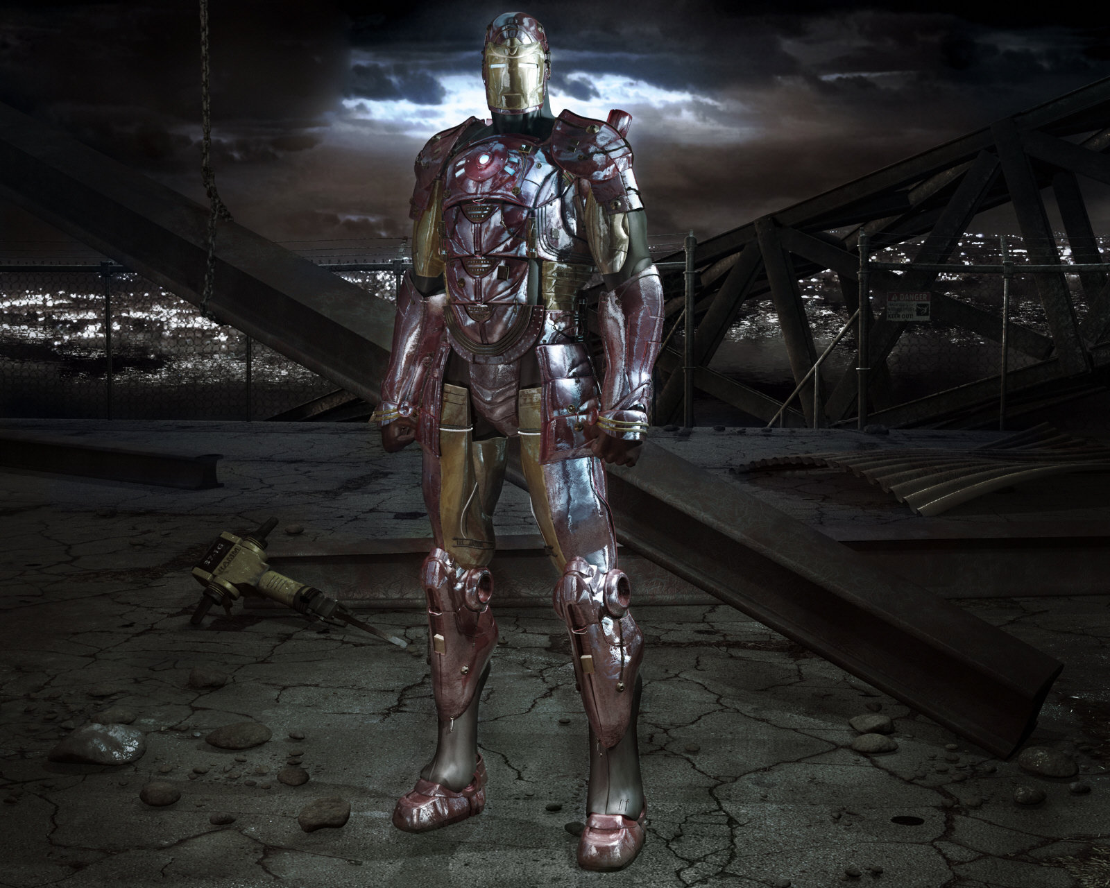
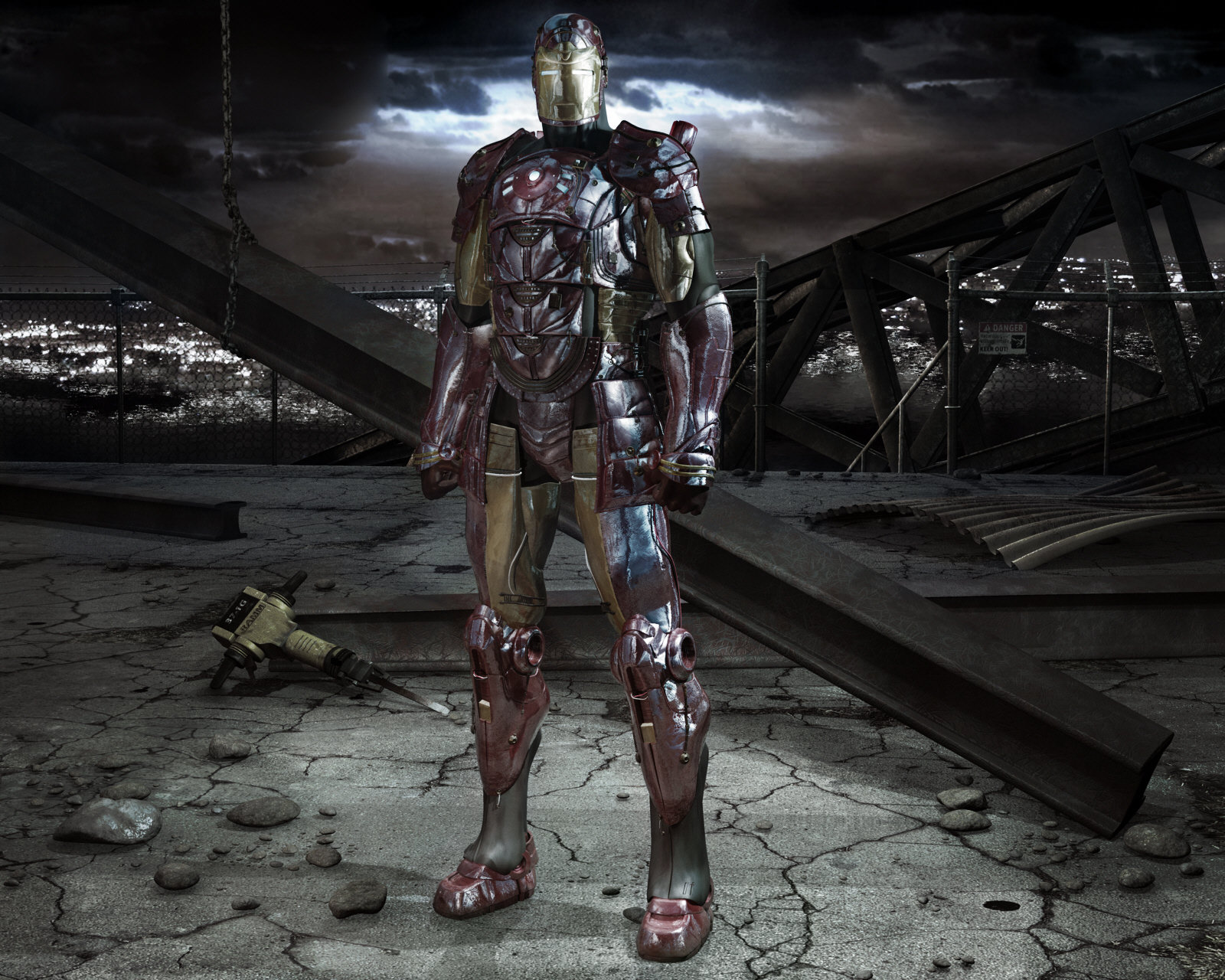
Thanks Mark, and I am proud of it! Thanks for backing me up Yves... I figure if it looks good on your computer then my gamma settings must be pretty close. UPDATE Hey everybody Iron Man is on CGTalk --it's a shameless plug, I know... so eveybody go give it 5 stars... I mean...uh... eveybody go see--thanks again for your support! Lee
-
That looks really good, well done! Lee
-
Haha! When you're right you're right... (and when you hit the refresh rate every 2 minutes, that's downright obsessive) I'm submitting now... Thanks Dhar Lee
-
In the options tab on the render to file box, click on the word "Final" at the very top right and change you can change your options from there. Thanks again! Hmm...that's interesting...this one was my favorite (maybe I went overboard). Also what is messed up by the feet? On Iron Man or on the ground? lol, dang Eric why do have to wait until my poor computer has rendered for 9 hours to point out these things In all seriousness though, I appreciate you looking into this so thoroughly. There could be something wrong, but I'm not sure what it was. Modeling the chain was tricky and it was easier to focus on trying to get all of the links to match up than to think about the physics of it. Does it need to be straighter? Thanks for the suggestions everyone, keep 'em coming...here's a new one-- #5 EDIT: #6 (lol...I can't stop playing with it!) Thanks a lot guys! Lee


