-
Posts
401 -
Joined
-
Last visited
-
Days Won
2
Content Type
Profiles
Forums
Events
Everything posted by LeeAnderson
-
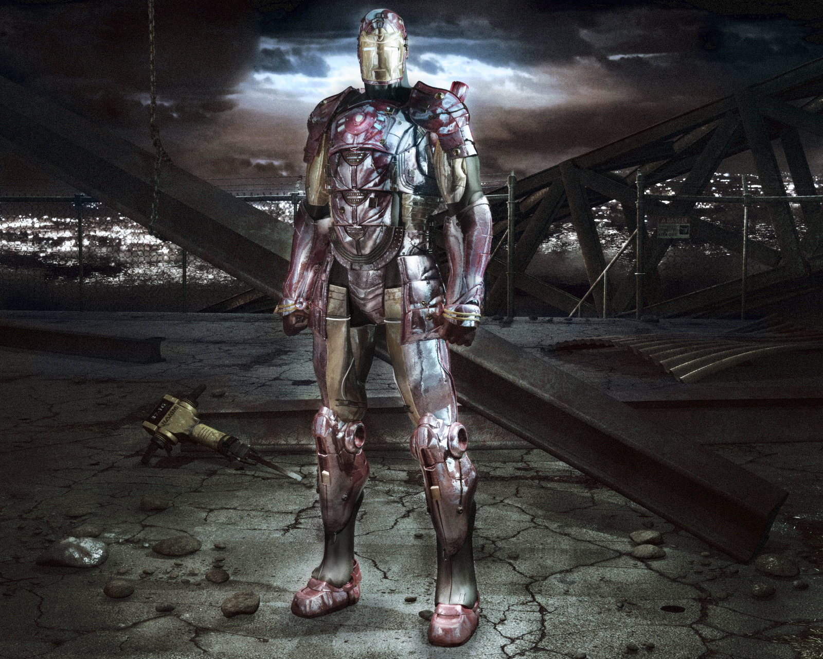
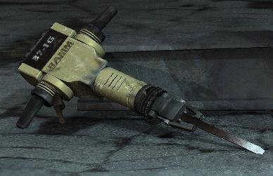
Nice look John! I'm all about pushing this as far as it can--I used several of your suggestions in this next "stage" Are you guys familiar with the work of Alessandro Baldasseroni? He's a character modeler but his post work can't be beat. Thanks Al! I don't know either, and the entry wouldn't legally be able to have any of these post effects Hey thanks Darkwing, those are some hefty compliments your throwing around and I appreciate it! Thanks! Modeling is a lot of fun and I hope that you continue to find ways to get pumped about it Thanks for pointing those out Eric! The sheet metal has 3 or 4 other points where it touches the ground, but if it's confusing to you then if will probably be confusing to everyone else. The jackhammer is touching the ground I swear! It doesn't look like it though...maybe I'll double check. You're totally right about the bridge girders! I did fix all of these things in the post version though. I may go back and fix them in A:M later, but I think they look good this way. Alright here's another post--I love getting your input! Is this almost ready to submit to CGtalk? Lee
-
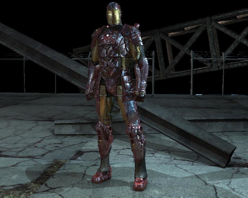
Wow Matt! Between the two of us we're bound to come up with something good--I'll play around with it more tomorrow. I agree about the highlights in back, they do look better, the backlit effect was nice as well. The Role Model is pure awesomeness--fix that up a little more...add a bad print shop border and there you go Lee
-
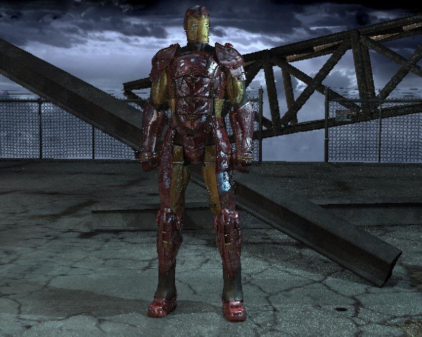
Ahh...I see, how about this one...best of both worlds? I took a few of your suggestions but then traced over the character in white and added it as a multiply. EDIT: changed just a little bit...I can't stop playing with it! Lee
-
Wow, Matt, that looks great! I'll probably end up using a lot of your ideas. The city lights seem a little too muted still, but I see the look that you were going for. Thanks a lot! You bet it was intentional! I spent a lot of time thinking about this. Just about every object in here has a symmetrical answer. The "X" shape you're referring is to make the eyes "fall" towards Iron Man and then he holds up the center. Thanks for noticing! Lee
-
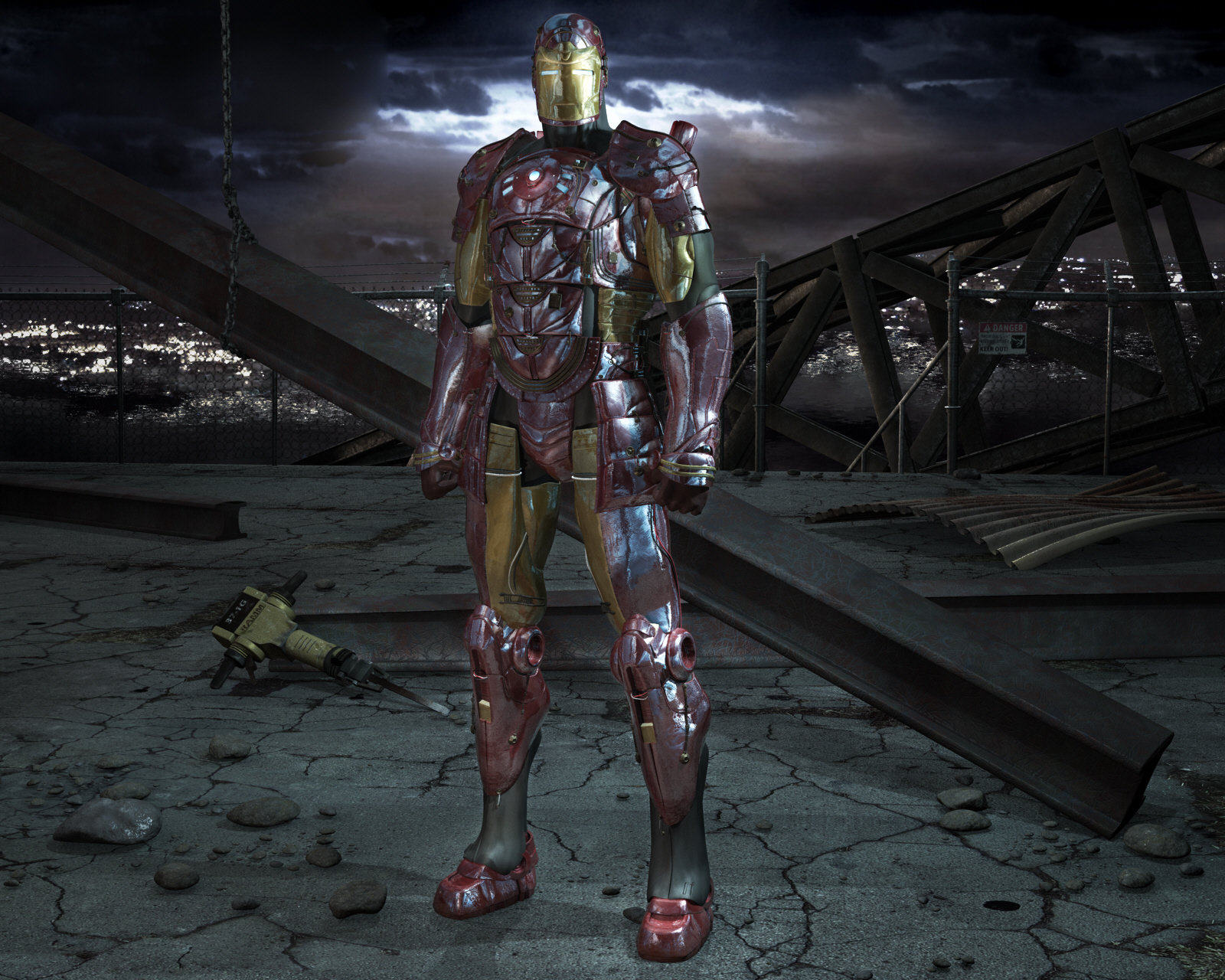
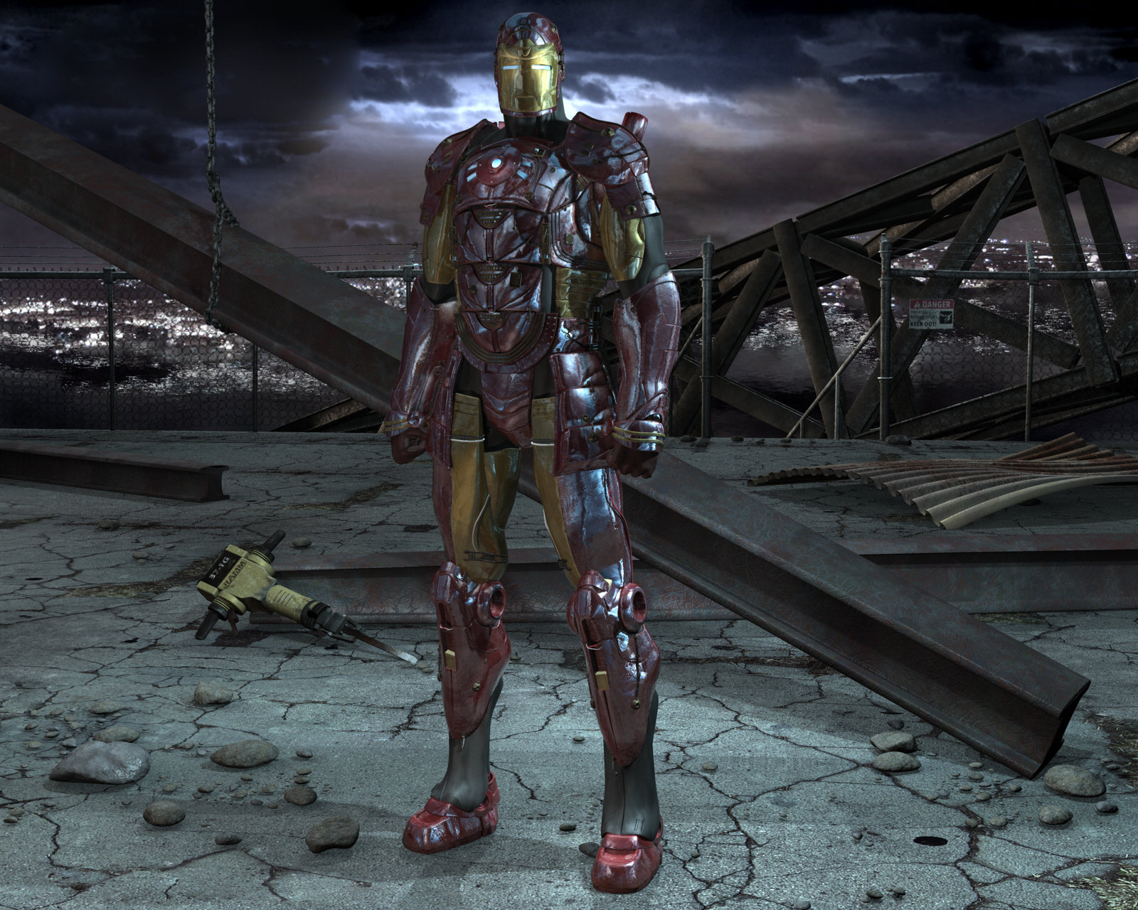
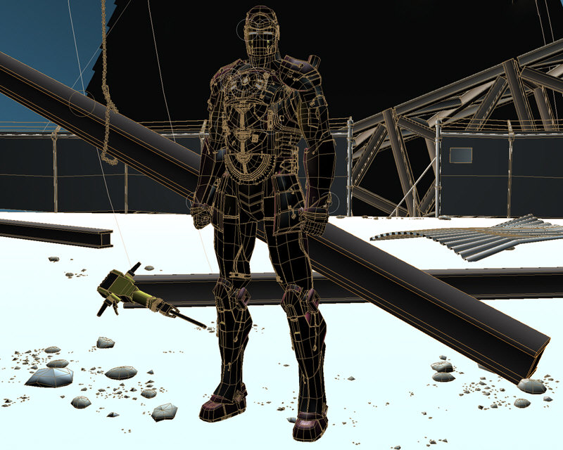
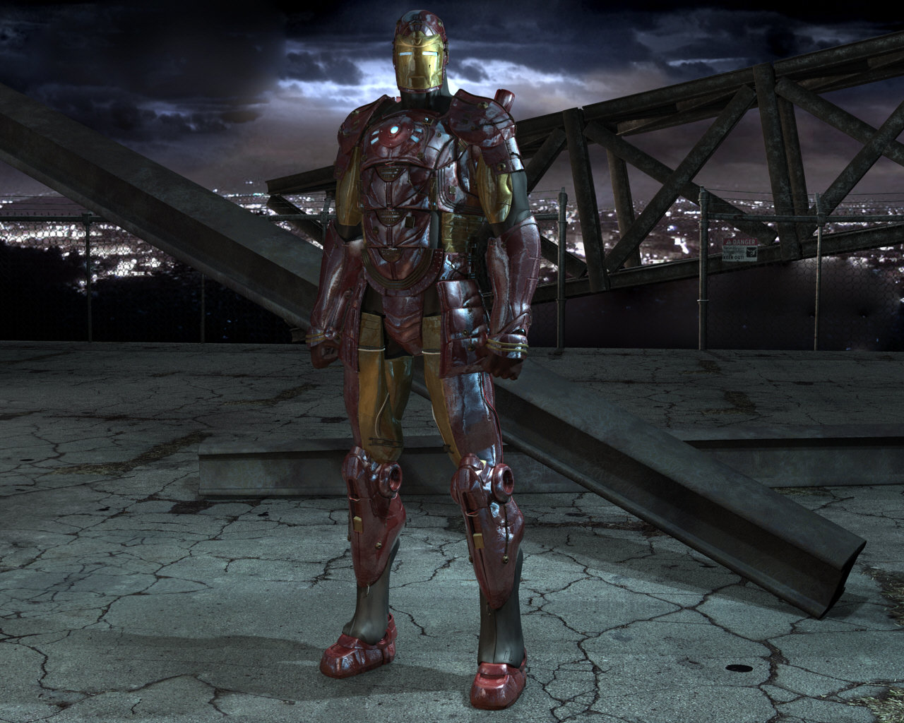
Thanks for the compliments Eric, Paul, Rusty, David and Mike! I don't know if it quite deserves it, but thanks the same! Thanks Robert, I'm planning on it! Hopefully it'll get some good attention! Thanks John! I think the problem in the eyes is being caused by perspective. Looking back on it, the forehead might be a little too high... Well, I'm not sure if I want to mess with it too much. You had me going Matt! UPDATE Well, this could be the last update. Here's the finished render: 1600 X 1280 (wallpaper size ) Multipass 16 X 16 AO, Relfections, Patch counts well into the 100,000's (yes, I modeled the pebbles) Time: 4 hr 24 m And the wire: If you have critiques on the model itself this is the WRONG time to give them What I need advice on is post stuff. Do I need to do any post? So far, all I did was correct one black spot on Iron Man's face, the rest is straight from A:M. I'm thinking I'll call it good though, and post it to CGTalk. Just wanted to ask your opinions first. Thanks, couldn't have finished it without all of your support! Lee
-

something I've been playin with
LeeAnderson replied to jirard's topic in Work In Progress / Sweatbox
Awesome Gary! Your characters have so much attitude! Is that rendered with AO? It looks nice, now all he needs is somewhere to drive around in! Lee -
Awesome work Stian! Your splinework always amazes me...great work! Lee
-
Wow, thanks for the positive response everyone! Yves, Stian, Jeff, Matt--you guys are like my heroes, thanks for making my day! Oh and thanks for the great compliment Darkwing...just be sure to clean up afterwords. Yep, you do now, I made it this morning: More to come! Lee
-
No problem Andy, there's a better one coming up: You bet, it always has been! Getting feedback helps keep my projects out of animation limbo. Well, I rendered a high-res version to see what could be improved (I also played around with my background matte). Here's what I see: 1. Add stones/pebbles around the front 2. Put Dhar's jackhammer in the back left to cover up some ground texture pattens. 3. Maybe some curled sheet metal in the back right to cover the same problem. 4.Crimson Dynamo aromor? 5. More stuff behind the fence. Basically it needs more stuff. See anything else, any ideas? Let me know! Lee
-
yeah looks like texturing can be minimal too... Youch! This hurts my ears...materials certainly have their place, but this model has so much oppurtunity for cool textures! Um...yup...what Matt said Looks great Eric! The main model was done by Ian Joyner. Hope this link can help! Good luck! Lee
-
Thanks--lighting and the pose are probably the weakest points right now... I wonder what he could be doing though. Dhar, that's the best compliment I could ever get! Boris is by far my favorite fantasy artist. I was looking at some of his artwork when I was rendering this last image! He and his wife(?) Julie Bell are so good! Awesome idea Mark! Maybe I could put some one or two chunks around his feet...that would add some story to the picture. Lee
-
Good call, Dhar! I just got some reference on my computer for it. Thanks, and I agree about the ground. I'm hoping that adding more details will improve this, but if not, then I'll have to model some more. That was just a screencap from A:M, the finished render will have 16X16 multipass activated UPDATE Here's a quick update on the background, I'm ready for this beast to be done! I added details to the fence, cleaned up the ground map and added a quick sky matte. Would I be overstepping my bounds if I said this looks like a snowy facility, or should it still be in the city? Also, After I rendered this, I noticed that Iron Man's pose somehow got tweaked--so the lighting on him will look more like the last two pictures. Here's a closeup on the fence Thanks for looking! Lee
-
Thanks Dhar, you da man! Thanks to you to Al...you know, from what I've seen from the new movie (I really don't know that much about him either ) it looks like it's just the chest piece he needs to survive. That's a big compliment coming from you Rich! The reflections aren't blended, the effect you're seeing is caused by my texture maps. The "punch" of the old red is nice, but I don't think it would have fit as well into the world that I'm putting him in. Thanks Jeff! The maps really aren't all that exciting... I guess I could let you take a peek though. UPDATE Well, I thought I'd give you guys a quick preview of what the background is shaping out to be... I decided to go with a construction type area that looks like it's just been busted apart. The ground map needs LOTS of work, the shadows need to be softened and I'll be modeling in rocks, pipes, the rest of the fence, maybe a chain and whatever else one would find at a place like this. Comments and critiques would be great Thanks everybody! Lee
-
Thanks a lot Rusty! Another quick update for today (man, I love Saturday) I desaturated the textures and made some specularity maps (noted especially in the tarnish on the face). I also changed the lighting around dramitically in the final image to something I like a lot more. Now, on to the background! Thanks a lot for all of your kind words! Lee
-
Thanks Mage! UPDATE Well, the model is now textured (at least mostly ) I also updated the lighting: I'm not sure if this lighting setup showcases the model like I'm sure it could...any thoughts? Lee
-
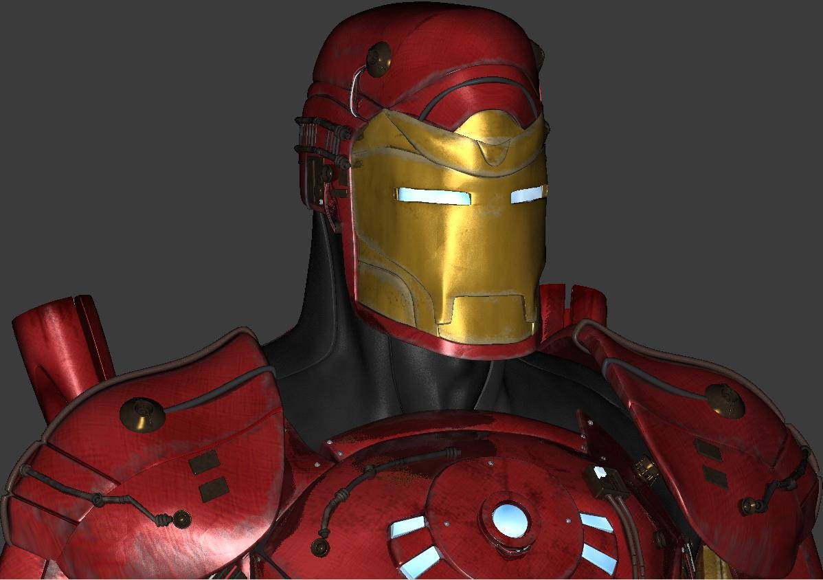
Thanks Gerald, Robert, Bill, Stian, Mike and Rodney! Those were some pretty shiny reviews! That's a good start, thanks for the suggestion Mark! Thanks Jay, and don't worry I plan on doing a wallpaper as soon as I come up with a background! I sort of have my own version of IBL going on in the image as it is now, I'm sure the real stuff could look better, but we'll see... Thanks, glad to know that Iron Man fans appreciate it! As soon as the background is done, the wallpaper is yours! Alright Greg, no fair teasing! The whole purpose of me doing an update was because of this little post. Are you serious? (I hope this isn't a really cruel joke) If it isn't, I need LOTS of details, please? That made my day/week/first 20 years. UPDATE I updated the detailing textures a little bit (note the multi-colored wires), before this is over, I'll probably end up unwrapping all of him and making the armor worn. Thanks everybody! Lee
-
Great Caleb! Looks just like him! It seems like the toon lines might be able to be a little thicker.. but other than that, I love it! Lee
-
lol...prepare your computer for some crazy render times Thanks again Mark! I don't know how copyright laws would work in with that, but it's certainly a good way to make a little on the side! I think you're right--there's an aweful lot of reflecting going on in this shot. The finished still of this pose and lighting is the main purpose of the model at this point, so I'd like to focus on it with this setup. Geez thanks Mark! That's a HUGE compliment. I think the Stan Winston costume looks great! lol...tell that to Pixar...thanks for the comment! Alright, now you guys are laying it on a little thick...thanks Caleb! I don't know where I plan working at this point... doing animation at all would be a huge blessing. Thanks Paul, would you like that to be your job? UPDATE Alright, I did a quick 8-pass render at low-res, the modeling is done: Here's a question for you smarty-pants out there: I have several images placed around the model that cast relfections...however if I am adding a background, then I don't want to see them (I erased them in this pic). Is there any way to have them cast reflections and not be seen? How do you guys feel about the textures? Should I add some scratches or keep it clean (the easier route)? There are also loads of little bundled wires and I'm thinking they should all be different colors (the details are all one color right now). Time to start thinking about a background. I was things about him being in his computer lab with a big opening in the wall the shows the rainy city that he's about to fly into. What do think? Sorry, long post... Lee
-
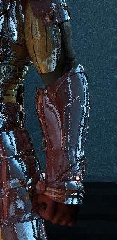
Wow! Thanks Jay, I don't mind at all! No way will I hit you Mark! That's exactly the kinds of things I WANT to hear! I updated the lighting a little bit in this update, but I'm not sure if it eliminated the leather look. Does it need to be brighter? Here's a quick preview of his arm as it is finished. It's back to work tomorrow so not as many updates as today... Thanks for the comments! Lee
-
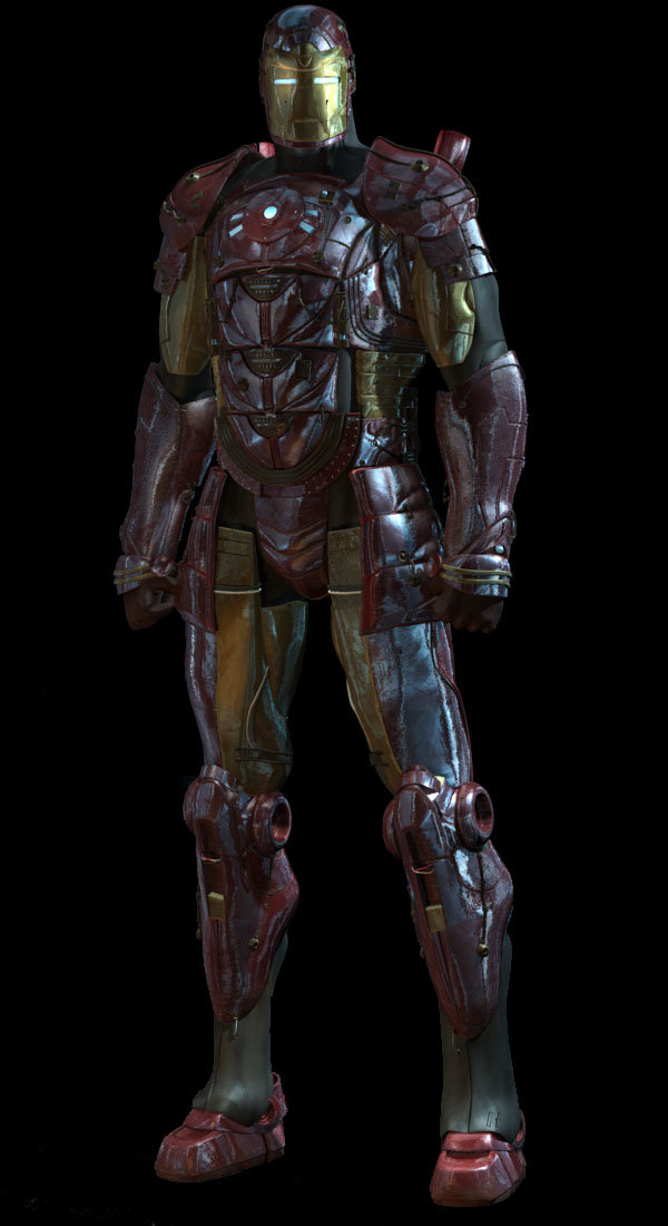
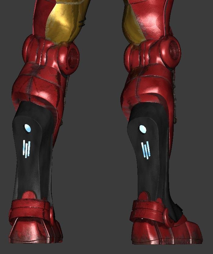
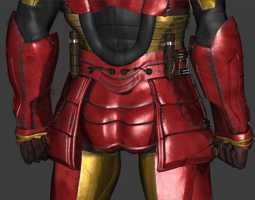
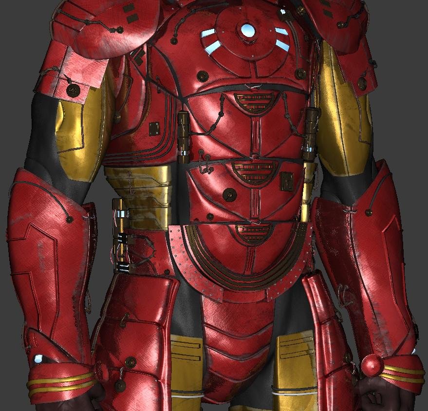
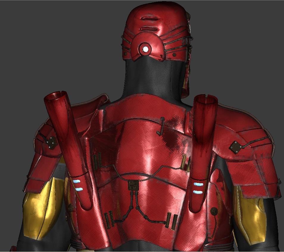
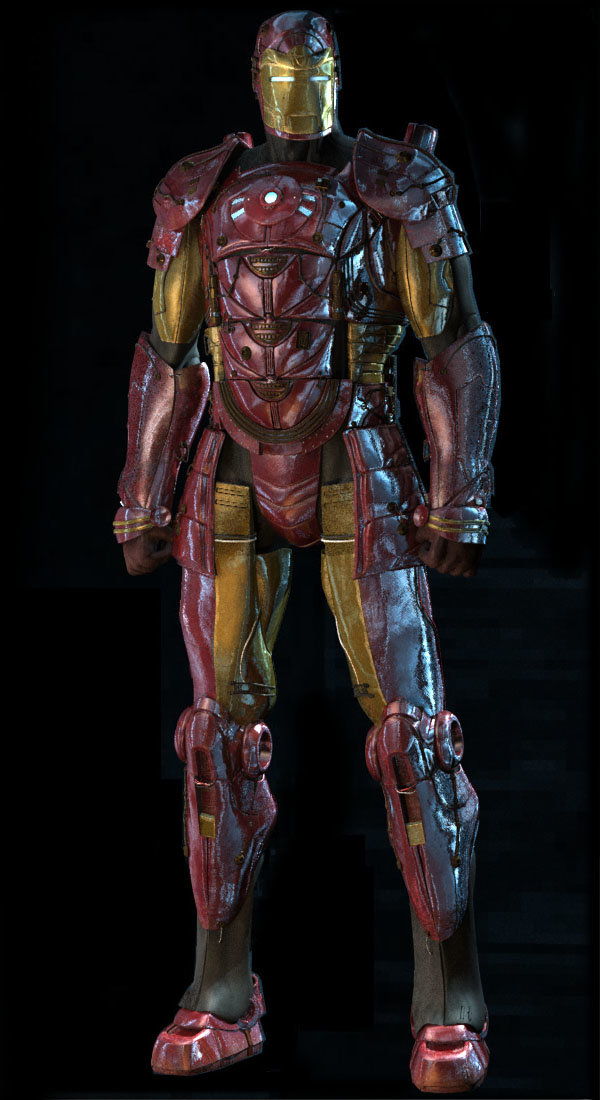
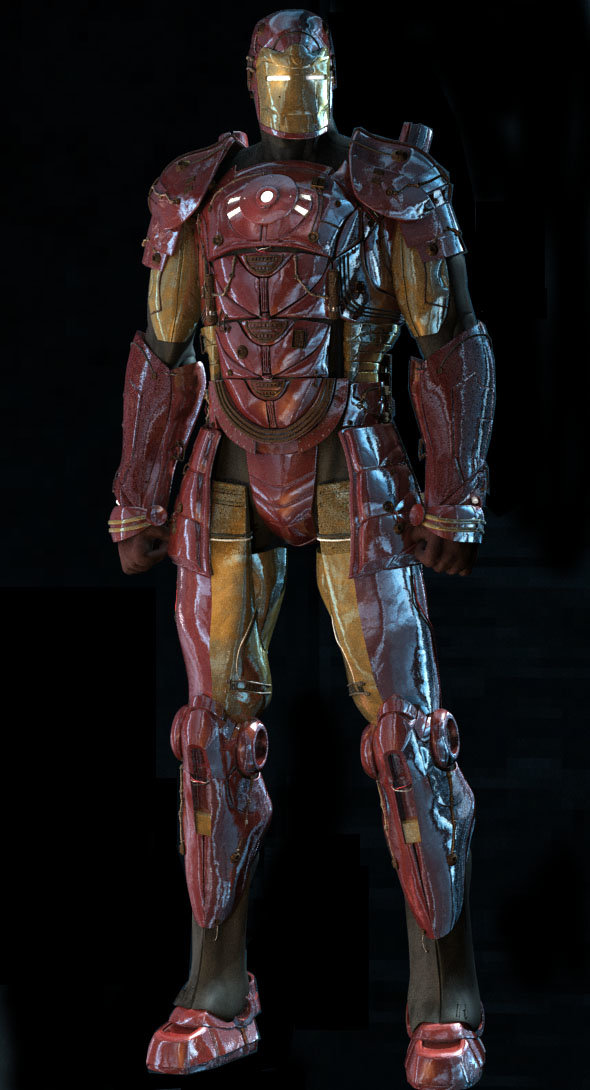
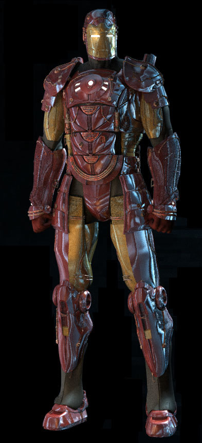
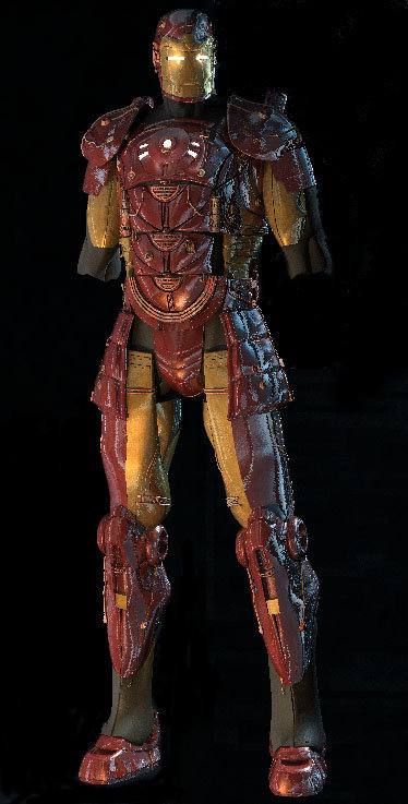
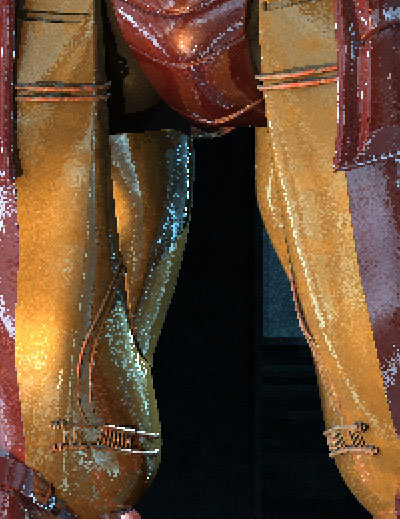
Thanks Matt, Andy and Caleb! Thanks Mark, it wouldn't be as cool without a great design-so thanks again to Jamie Egerton at Activision for letting me use it! The patch count is currently at 28,178 and yes, my computer hates me right now. It'll probably get up to 35,000 by the time I'm done... UPDATE I've finished the detailing on the legs (always the fun part) and began working out some more lighting on the finished picture: I'm also continuing to work on my materials (I may or may not decal the whole thing). The atmosphere I'm going for is stormy, city night: Here's Red And here's gold (I apologize for the render quality) And last of all, here's a shaded turnaround of the complete model at this point (no arms) rotate.mov Thanks for reading and for your support everyone! Lee
-
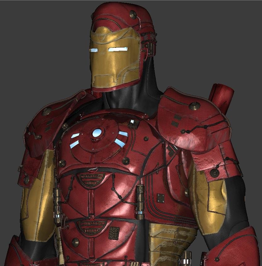
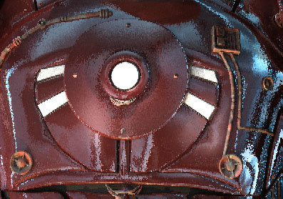
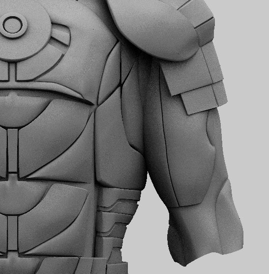
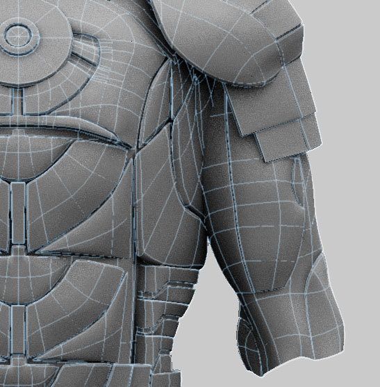
Thanks Gary and Al, I sure hope Mr. Stark approves lol, Thanks for the suggestions Joakim! I really would like to incorporate a city in there somehow A "wow" from you sir is one of the highest compliments one could get! Thanks, here's some wire for ya! This is a close-up of the chest panel on the high-res model. Now, you'll all see how sloppy I am The cylinder is a personal favorite of mine. Here's the start of the arm. Below the elbow will be covered, which is why it doesn't look as good as it could. Thanks for any comments! Lee
-
Okay...so correct me if I'm wrong, but the top one is the new one, right? If that's the case, then WOW! You got it man! I scrolled down and thought: "Shatner". You're modeling has come so far, I love it! You're stuff is really inspiring to me...you really need to write a tutorial. Lee P.S. "Mall girls" huh? I love it! I like to use the term "butter face" (everything "but her face").
-
Yes. Okay, okay... I mean the one from six months ago, in your avatar. Just the sculpt itself though...it made him look more "spunky". Does that make sense? I'm thinking that perhaps the nose is a little too cartoony. It's like you see a pretty girl walking down the street towards you, but then when she passes, you see that she has some ghastly nose in profile. The rest of it looks awesome though, especially the hair curl; I like how crisp it looks! Keep it up! Lee
-
Great work Mark! I think you should keep on honing your skills (although they're already great). Modeling wise, this one is more accurate than the old one. However, I think that the sculpt and personality of the other model is more Shatteresque. Hope that helps, otherwise keep it up! You da man! Lee
-
Cool lighting, I like the new clothes too! Any chance we could the new duds more clearly? Lee


