-
Posts
401 -
Joined
-
Last visited
-
Days Won
2
Content Type
Profiles
Forums
Events
Everything posted by LeeAnderson
-
That looks awesome Candice! I hope one of those stills was a wireframe, there appears to be a good amount of detail in the first pic Is there a story behind this character? Great work! I'm impressed! Lee
-
That looks great Kevin! Speed modeling mechanical stuff like that is quite an accomplishment...when are you going to write a tutorial on your mechanical modeling process ;) Is that an original concept too? Great work, keep it up! Lee
-
That looks awesome Gary! What project is this? ...maybe some bump mapped wrinkles will take it even further? Very cool! Lee
-
Shoot Mark! This is awesome! It looks like the start of an internet phenomenon to me. I'm really excited to see the animation but it almost looks as though you could get away with a 3D comic strip in between animating. Great stuff (Krok's tunic looks great too)! Lee
-
Oh yeah! Spott's tunic looks really nice! As far as keeping the decal seperate, there's no way to do it that I know of...aside from modeling it seperately. That woud be a pain after all the work that you've done though. Not sure what's happening with Krok's shirt either...just from the picture, it looks like the material isn't showing at all, come on material, get your head in the game! Looking good! Lee
-
Haha! That's EXACTLY what I was thinking of. He kind of hunches over like some kind of football player...almost like Han Solo running from the Stormtroopers in Star Wars but really really funny looking. It's an option on the material gradient combiners: attribute one controls your basic color and attribute two controls the edge, almost like a velvet material. It's on page 22 of the tech reference. You may or may not like the way it looks Lee
-
Man, this is gonna be great! I love the way the characters look--you got "Spott"s body type down great! Is he going to hunch a little and move really awkwardly like Spock did in the show? I don't know how final your textures are, but have you considered adding a little roughness and/or gradient edge threshold to the character's shirts? It might make it a little more authentic, but I think it's great as it is! You're flying through these models! Keep it up! Just out of curiosity, how are you planning on doing the voice acting? (enter 100 people saying: "You know, I do a pretty mean Bill Shatner") Good luck! Lee
-
That's beautiful Daniel! It brought a tear to me eye That's most certainly the walk of a tyrant/crime boss! Thanks, Lee
-
This is looking better all of the time! That last Kirk render is great! For the longest time I had a poster of William Shatner in that exact pose in my room! "Spott" is also looking great, I love those little slits that he has for eyes. I wonder if they'd look better if they curved downwards a little (like a Leonard Nemoy's eyes), that might lose the cool cartoon style, though. Keep it up, for all our sakes! Lee
-
Hmm...okay, I was only talking about that last one, you used radiosity on that one, right? Maybe I'm a little confused...well, I'm always a LITTLE confused, but maybe I'm REALLY confused Lee
-
Great work Mage! Have you ever seen the TV show "Moonlighting"? This scene reminds me of it, especially the way you have it lit now. I would imagine this as a night scene (maybe I'm wrong) about 20 stories up. You've got the cool blinds casting shadows on the wall, I like that a lot...but just as a personal choice, I would make them horizontal...for the film noir kind of look. Also, if you added strings between them, it would make them more believeable. I like the simplicity in the furniture, that looks good. As far as the lighting itself goes I have a few suggestions: Try lighting the scene without radiosity...set it up with spotlights and some soft shadows...eyeball where the light would bounce. This would give you more control over the outcome. As this does look like a night scene, I would suggest using multiple outside yellowish lights, at different heights and locations--and then throw in some blue for a night sky. I hope you can get something out of this Great work! Lee
-

Jupiter 2 - From the classic TV series
LeeAnderson replied to Tralfaz's topic in Work In Progress / Sweatbox
Awesome stuff Al! You've really captured the style perfectly! Keep it up, I can't wait to see the rest Lee -
Ooh...that looks better to my eyes. Maybe go for a little bit more intense, like 75% or so. Just play around and see what you like! Are you going to add reflections? Great work! Lee
-

Texturing Common Assault Marine By Dark_Jedi
LeeAnderson replied to LeeAnderson's topic in Work In Progress / Sweatbox
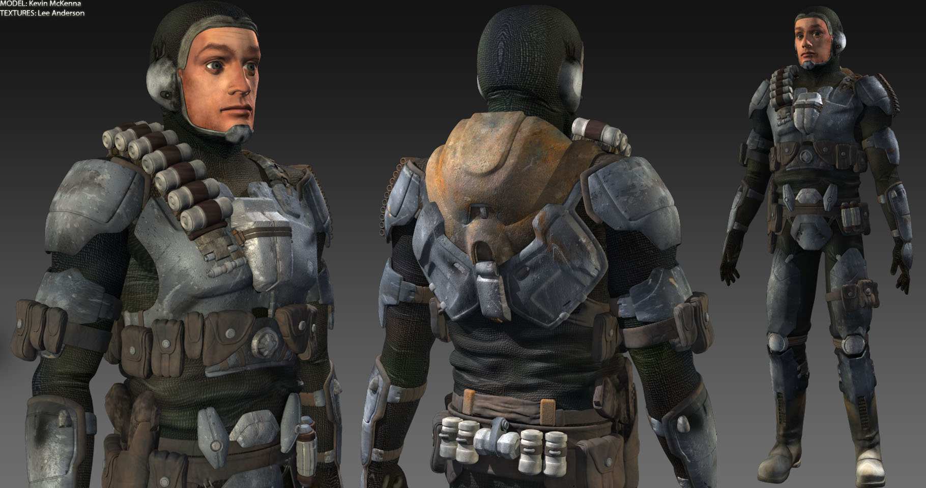
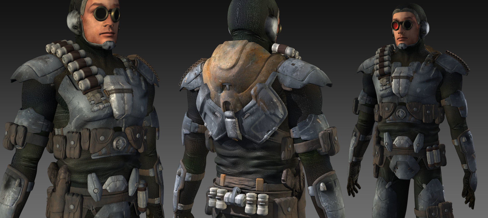
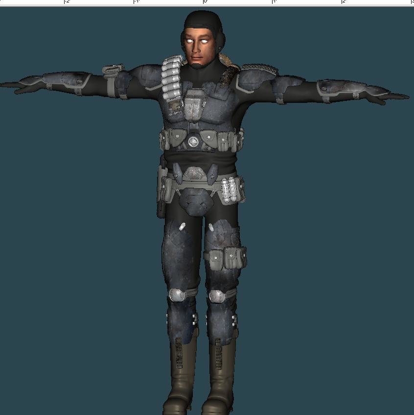
Thanks Mark! Also, thanks for helping me talk Kevin into the stuff around the face I really like the idea of just a face shield--like something that clips into mask. We were thinking of a helmet....oh yeah, way too bad to wear it! Thanks Trajce! I certainly would be up for it...I mean, up for whatever that disembodied voice just said Kevin really needs to come in here and take some bows Here's the final beauty shot, yup no goggles : Lee -

Texturing Common Assault Marine By Dark_Jedi
LeeAnderson replied to LeeAnderson's topic in Work In Progress / Sweatbox
Thanks a lot Mark! Putting the cloth pattern there was way too boring. Plus it just didn't look like it fit. You can change it when I send if back if you'd like. Thanks Kevin! Lee -

Texturing Common Assault Marine By Dark_Jedi
LeeAnderson replied to LeeAnderson's topic in Work In Progress / Sweatbox
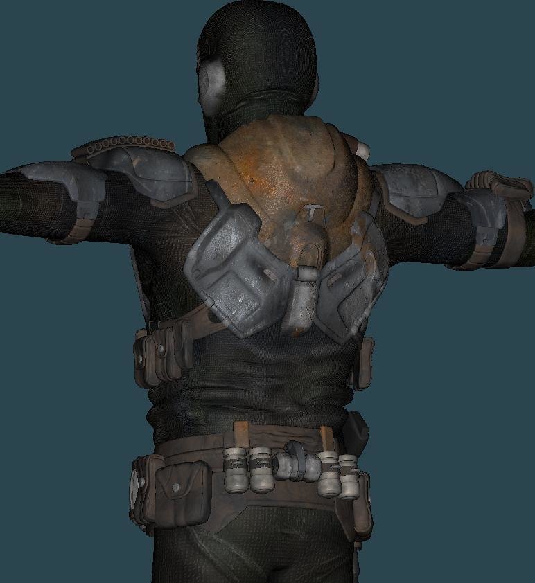
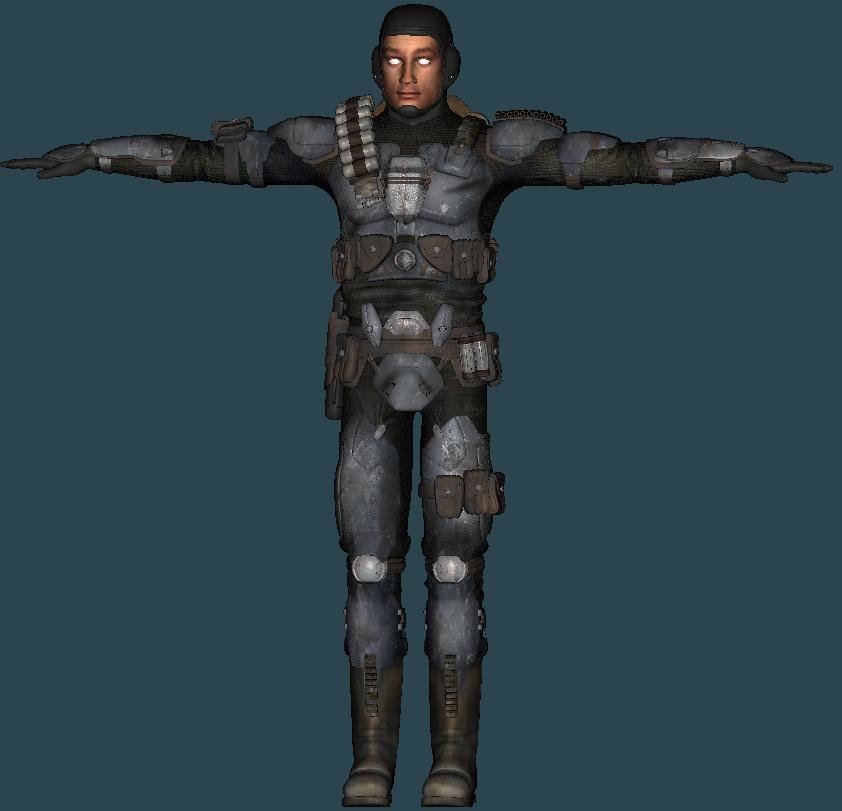
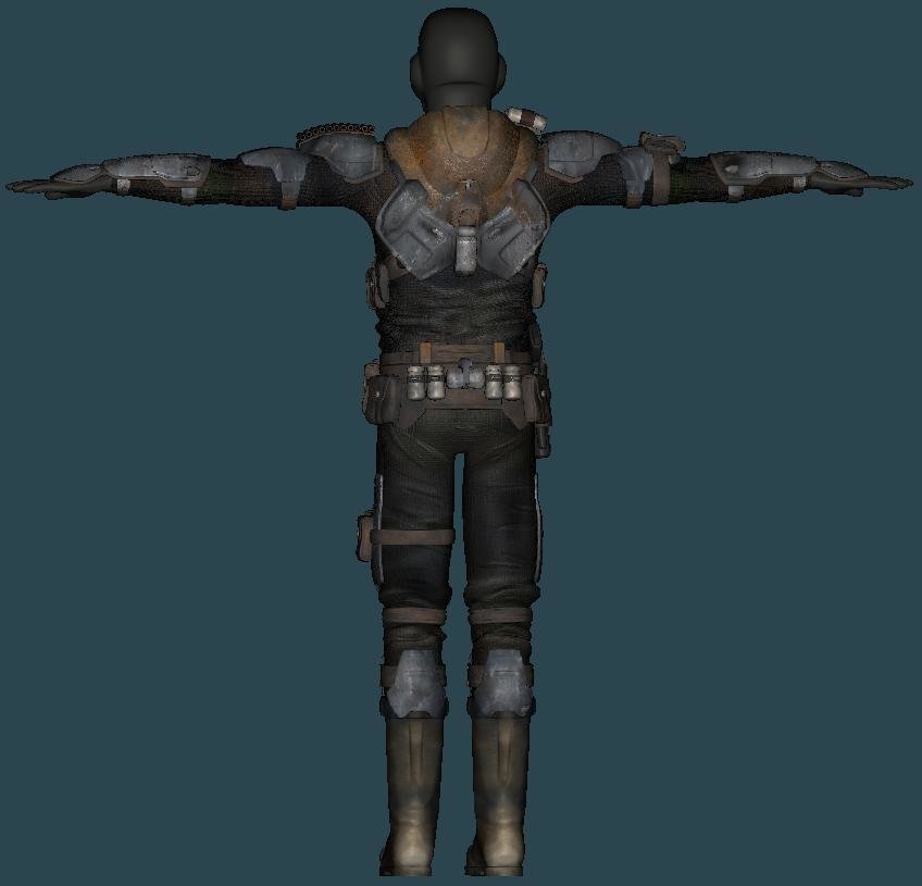
Hey again! This will hopefully be the last update--here are three glamour shots that I rendered last night night. I'd say it turned out pretty darn good. Oh, the goggles were a personal touch of mine, they probably won't be in whatever Kevin does with this. Lee -

Texturing Common Assault Marine By Dark_Jedi
LeeAnderson replied to LeeAnderson's topic in Work In Progress / Sweatbox
Thanks Kevin, I was thinking he had some bad puppy dog look about him, but I couldn't figure it out Thanks Ken! This is really Kevin's project than it is mine...but I believe that animation is planned some day, at least it better be Some of each, but mostly decals. Everything except for the leather and the amunition on his shoulder and back belt are decals. Thanks guys! Lee -

Texturing Common Assault Marine By Dark_Jedi
LeeAnderson replied to LeeAnderson's topic in Work In Progress / Sweatbox
-

Texturing Common Assault Marine By Dark_Jedi
LeeAnderson replied to LeeAnderson's topic in Work In Progress / Sweatbox
Almost there! It's nice to see that mostly everything is textured... I'm on a countdown now: 1.Mask 2. Hands 3. Eyes 4. Gun Lee -

Texturing Common Assault Marine By Dark_Jedi
LeeAnderson replied to LeeAnderson's topic in Work In Progress / Sweatbox
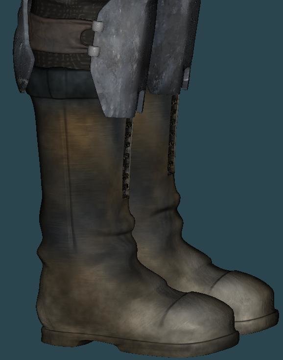
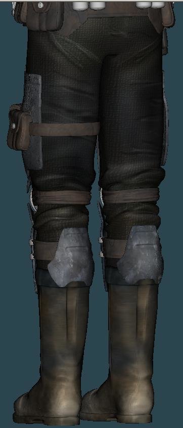
Thanks for your comment Ben! The boot texture resolution is 1000 x 1000 Here's a side view if that helps Lee -

Texturing Common Assault Marine By Dark_Jedi
LeeAnderson replied to LeeAnderson's topic in Work In Progress / Sweatbox
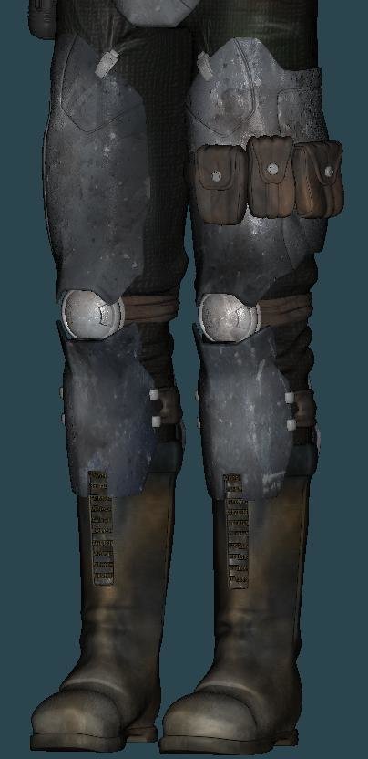
Thanks again Eric! And thanks for keeping interest in this thread alive Here's another quick update-- The lower body texturing has been completed -
That's looking great so far! There is one big thing that stood out to me. I found myself squinting trying to see the details in the side of the head (which are looking really good). I don't know what you're thinking as far as texturing goes--but I would reccomend bringing up the black color just a little to a dull grey. Also, you've gotten a good start on the sliminess with the spec settings, however, I think the intensity could be toned down and the size brought up just a little bit, and also try adding some reflectivity (if it's not already there). Looks like a great start! Lee
-

Texturing Common Assault Marine By Dark_Jedi
LeeAnderson replied to LeeAnderson's topic in Work In Progress / Sweatbox
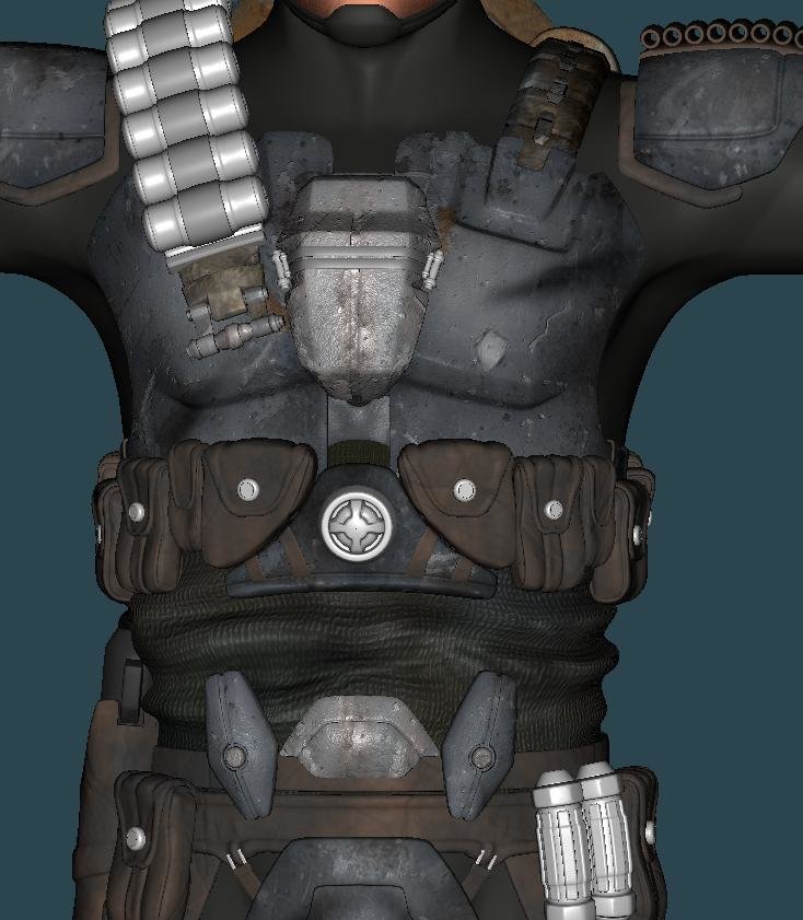
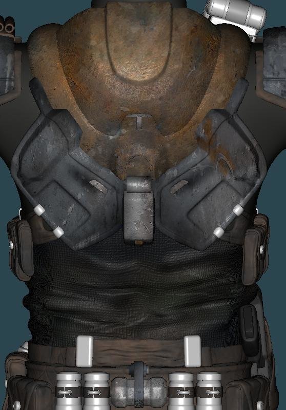
Thanks Eric! Despite my last thread, this guy has nothing to do with Star Wars (even if he may look like it a lot). The design (and model) are original works by Kevin (Dark_Jedi). lol. Sir yes sir! Hey, shouldn't the guy giving commands be telling me that I should clean up my boots? Here's the midsection textured--hopefully the whole rest of the body suit will turn out this good. Also, I added some "close calls" thanks to Eric's suggestions. Any comments would be outstandingly amazingful Lee -

Texturing Common Assault Marine By Dark_Jedi
LeeAnderson replied to LeeAnderson's topic in Work In Progress / Sweatbox
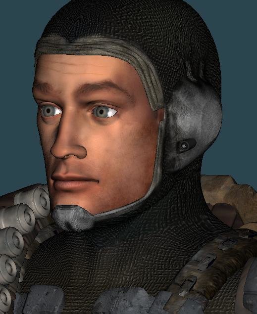
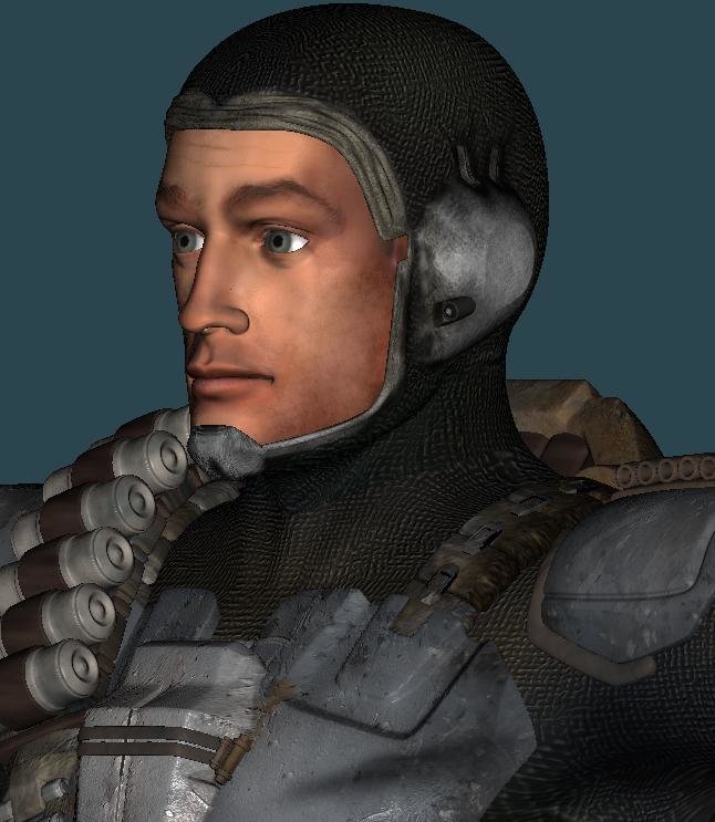
Thanks Eric! I mixed it up alittle bit, tell me what you think Here's the first WIP of all of the basic armor done--crits welcome! Plus a face WIP (based off of Robert Mitchum ) Lee -
Thanks Caleb, Stian and Jay! It's nice to get compliments from such accomplished fellas like you! Man Colin, how far back did you have to hunt to get that quote from me? I actually didn't rememeber saying that until it showed up. Good luck getting all of your stuff done! You're just waiting around until you can blow everyone away, right? I agree--and in the post before that it was not pointed enough...oh happy medium where art thou? I don't have that book--but I'm already set up with tons of Ralph McQuarrie art. Thanks! I'm going to try to keep going with this project while finishing up the others that I have going. Whew! Lee


