-
Posts
21,630 -
Joined
-
Last visited
-
Days Won
114
Content Type
Profiles
Forums
Events
Everything posted by Rodney
-
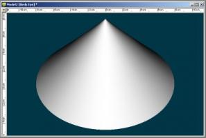
You'll find you have a lot more success if you create your model with a decently sized hole in the top and then... Zoom in and make the hole a little smaller. And then... Zoom in again and make the hole a little smaller. You can do this several more times but at a point it gets ridiculous to scale the hole any smaller. Just scaling the hole to a really small size without out zooming in tends to create those pinching artifacts. Here is an example of zooming in multiple times and making the top hole smaller with your model. I also attached a revision of your model where I've extruded one more time while making the top of the cone smaller. For some reason there was minor surface discoloration before that and I suspect the Bias/Magnatude of the splines might have been off. Model2_fixed.mdl
-
Bugbots! BUGBOTS! BUGBOTS! More bugbots! err... sorry, wrong topic. Happy Birthday Gerry!
-
I tried a couple different approaches in A:M but didn't have time to close the loop. Denoise worked pretty well though and better than just Blur alone. As I see it there are two issues: - Shimmering - Due to high frequency of the surfaces (i.e. lots of surface noise) - Strobing - Due to movement/rotation of parallel lines (grids and girders) I had more success with the Shimmering than I did with the Strobing. I recall reading an article about dealing with high frequency surfaces before that suggested not simply burring the images but rather feeding a lot of noise back at/into those surfaces. I thought perhaps this is what the Denoise process does but it appears to blur and blend the results also. If the Denoise settings are set low enough that it won't smudge the detail out of your images, I agree with Holmes that Denoise may be your solution.
-
Make sure you have particles turned on! (It sounds as if you do though) You keep this up and one of these days you are going to accidentally tinker yourself a feature film!
-
Matt's suggestion is great on several levels, especially if used as a lead in. As I see it would immediately complement these areas: Staging It establishes the scene for the audience. Everything after this is compared to this initial revealed reality. There's the earth... like the sun rises every day, it's still there... nothing special... that's life... just the same as it always is. Clarity - It provides a known reference that cues the viewer in - grounds it into contextual reality with an established element of foreboding (the audience will either get the reference immediately or they will by the end of the sequence) Timing - The time it takes to read the title build up the audiences' tension in anticipation of the action (an anticipation before the actual anticipation... twice the value in anticipation!) - The timing itself sets the mood and pace- the audience calmly prepares within the safety of silence for what may follow (They begin to consider possibilities based on their experience and interpretion... then the anticipation of the main attraction gets the viewer's attention... then the tale is told) Rhythm I do think an anticipatory beat of music would further augment the anticipation but consider your options well. There are many to choose from and its an artistic decision. The timing may be set but the movement (motive and emotive) in the spacing. In anticipation before we go one way we go the opposite way first in order to maximize and enhance the anticipatory effect. Example: If a steadily increasing beat suddenly goes silent... we take notice... and tend to wonder what beat will happen next. Perhaps silence could be the anticipatory agent that immediately precedes the end of all things. Just having fun exploring the possibilities that your animation presents and trying to better understand why it works so well!
-
Nicely done John! Not only is the models exploding very good (lots of detailed destruction there to look at) but that anticipation really sells it. Now if you can find some appropriate music... dum dum dumdum... DOOM! The general rule to apply is: "More entertainment value can be created in the anticipation of the primary action than in the action itself." You are getting mighty good at this destruction thing. While watching again I noticed a few more things: 1) I really love that gaseous mass that recedes slighty into the distance. That's nice and it's something I think even the big boys in Hollywood don't get. 2) If you could use a sequence of images for your decal you could get rid of the blue that stays with the chunks as they fly out into space. (You might be able to get away with only two images; one with the water blue and one ith it a subterrainean brown - whatever color that is!)
-

HASH WIKI OLD What happened to all the info?
Rodney replied to UNGLAUBLICHUSA's topic in A:M Tutorials & Demos
That was Matt Bradbury's wiki which was for a time officially hosted by Hash Inc. I'd guess it was dropped for a number of reasons to include Matt heading off to college, Hash Inc moving to different servers, etc. Matt did a fine job putting those write-ups together didn't he! -
Very nice John. I like both but if I had to choose I'd pick the one on the right. The size of the pieces makes them seem more irregular in shape. The larger pieces (on the left) seem a bit too similarly shaped. As I said though... I like them both!
-
Happy Birthday Mark! Here's to another great year. I want to take a moment to thank you for all the things you've taught me. I don't always take the time to say 'thanks' but you've helped change how I approach animation. The latest and the greatest in a long line of discoveries and innovations... shaded onion skin rendering... wowwee!!! I didn't think it was possible but with that one you've make rendering fun for me. Happy Birthday!
-
I know this is a tall order but I'm thinking more of a one way street here. You are right... but (I think) are viewing this from a singular perspective. Artists need discipline. They may balk at this while yet inexperienced but they absolutely need it. So to refine my thoughts... You direct. (I personally think you'd excel at being a director) A modeler, animator... gag contributor... all hands on deck... then helps create the content you dictate. If it meets your standard, all share in the experience. If it doesn't meet your need you either direct a change or affect those changes yourself. In order to successfully reach your intended destination, they do it your way or they walk the plank! This isn't about money. Many a wayfarer signs on board simply for the ride or the adventure. Everyone needs direction.
-
Yes indeed, this does tend to beg the question, if you aren't that into pirates what is it that you are into? If you count both Starbucklers and Wannabes you've been into pirates for pretty long time now. You can extend that back even further if you count your backyard theater days. Perhaps you are just in need of some fresh perspective. Personally I feel you need to get yourself into a place where you can collaborate with others on a daily basis. That interaction can be frustrating but it can also push the creative juices to a whole new level. I do not think you should set "The Wannabe Pirates' too far away. Even if you were to pursue other projects I think you should post the occasional strip (farm out work to others if need be!) It's a body of work you should be proud of.
-
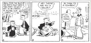
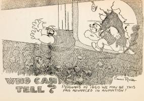
Mark, I've been noting several classic comic books and animated films that have reminded me of you and 'The Wannabes' lately thoughts on what I've see. This isn't to distract you but perhaps to inspire you and suggest there were others who have paved the way and been through similar experienced. There have certainly been many. Here's a fun one from Frank Frazetta: http://cartoonsnap.blogspot.com/2011/03/fr...-daffy-and.html ...and not quite a pirate but the origin of Popeye reminded me of Flemm's initial quest to sail to sea. I find it fascinating that he originally appeared as only a secondary character in the Thimble Theater comic strip. It sure didn't take him long to become the main attraction. I've also uploaded a drawing/prediction from back in 1936 on what the state of films might be like in 1960. I find that image rather appropriate given the current emphasis on 3D in theaters. (Your characters would fit right in) Note: I think the drawing is from 'Fleisher's Animated News' the mimeographed newsletter that was circulated in the mid to late 30s. Boy would I love to have copies of all those newsletters! All this to say, you come from a very rich tradition in comic books, comic strips and animated pictures. Be proud of your contributions to it.
-
Wow Nancy, that's working great. That latest music was really catchy as well. I do have a favor to request... (I know your concentration is on the animation) The flat plane for a ground and the flat color sky really doesn't do your work justice. Please tell me you are planning the final environment with a foreground, middleground and background. It could be something subtle that doesn't distract from the characters. I don't know... throw in some flowers and plants! For what it's worth your characters really plus up the current environment! They are awesome. Oh drat. I should read more carefully! This is not the final set. I only changed the sky color because the default/standard one is so boring. I have been playing with potential backdrops, and toying around with simple prop/set ideas in my mind. I don't know what the floor will be yet. I would love to do something with them dancing, splashing thru water - but I don't know if I have the stamina to twiddle with that - maybe I can do something like that for a short segment of the dance. Press on, press on, Nancy!
-
A few years ago J Griffin shared the gems with caustic effects that show up in the A:M demo video. He was too busy at the time to create a tutorial (still is) but hoped the settings could be useful. See attached project: JewelsCoverFinal.prj
-
Steve, I'm curious if you or anyone else has a good recipe for dealing with the lighter areas at the nostrils? I've used a negative value white light before to good effect but don't think I've tried that with SSS. Is this a by-product of the mesh being opened at the nostrils?
-
She's looking great Steve! That SSS effect looks great on her. A little voice is telling me to make note of this 'error' because it may be very useful to me someday.
-

Would there be interest in a Bouncing Ball Bootcamp?
Rodney replied to robcat2075's topic in Showcase
If I ever leave the realm of the bouncing ball just shoot me and put me out of my misery. There is no practical end to the bouncing ball... it just keeps on bouncing. (The keyword in that last sentence is 'practice'.) -

Would there be interest in a Bouncing Ball Bootcamp?
Rodney replied to robcat2075's topic in Showcase
Please count me in! -
I thought I'd seen your drawing somewhere lately in animated action. Sure enough, it was Shaggy doing the 'Bus Stop'.
-
Thanks Robert, it'd been so long since I'd used an IK constraint I was lost. Your simpliest IK leg was just the thing I needed to jog the memory. Still not quite where I need to be but getting there.
-
Excellent Note Robert. You've captured the essence in those drawings. What I find of particular interest here is the importance (and difference) between drawings and computer animation. In essence they are the same but practically they are so very different. For example, drawing the movement of a character as you have in the third image takes a few seconds when drawing whereas creating the same thing from scratch on the computer can take hours (modeling, rigging, posing the character). This is why I think it's important to plan animation out via drawings first and then follow that plan. Regarding the subject of Rigging with regard to this side to side swaying: I made a few attempts at modeling and rigging that character in the third image and learned a lot in the process. (At least I feel a little better oriented in my approach to animation than I did yesterday!). If it isn't too far off topic I'd love to hear the experts weigh in on how they would approach rigging that guy so his feet would stay in place while the hips move around and rotate. Such a simple thing to convey in a drawing... but not so straightforward with the constraints of CG characters. Obviously, when just animating, one would hope to be working with a character rigged with that functionality already in place. Not trying to drift off topic from animation but I seeing even more clearly how the rigging of a character can make such a critical difference in computer animation. Where I'm currently hyper-focused on in animation can be found within that area of in-betweening you've illustrated in points 4 and 5. I find that while the Extremes may tell the story via the Key Poses (so very important!) but it's those in-between frames that convey the personality and spirit of our animation. It's like life itself, where we begin and end may be key'd for us but we must choose the paths we take. This is fun and educational. You have a gift for teaching animation.
-
Hear Hear! Happy Birthday David!
-
Woohoo! Ticker tape parade time! Congratulations. Well deserved recognition.
-
More Kapsule Klones... http://vimeo.com/21438369 (It's a rather cute commericial in a language I don't understand... Vietnamese.) Are you rich yet John???
-
You've been holding out on us Mark!!! The Adventures of Elliot Wangley? Very *HICCUP* intresting.


