-
Posts
7,863 -
Joined
-
Last visited
-
Days Won
15
Content Type
Profiles
Forums
Events
Everything posted by NancyGormezano
-
hey....That doesn't look like a red cocktail dress to me... Yup - she'll get attention - no one will notice her face. Might as well put a paper bag over her head.
-
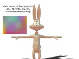
I'm not sure why you're not getting shadows from the rim light - should be z buffered, and ground plane must be set to Flat shaded. Turn off all lights except rim - make it white, make sure shadows is on And Eric - easiest way to make something white is to front project - front projection will also cover color decals (but will show bump maps). AO will produce the diffuse shadows. When you fool with IBL and want to change the environ map, to see how other imagery will look - you will have to do a trick for the change to show up - which is to toggle the AO value to some number and then back to the value you want. Again - hope you saw prev post on IBL: http://www.hash.com/forums/index.php?s=&am...st&p=299417
-
I hope you've spotted my post above - IBL or Image based lighting (different from rotoscope being front projected onto targets to turn them white) is a way to make the lighting look like it has different colors - instead of choosing global ambiance tpe = global color = white, choose global ambiance type = image based lighting and then choose an environment map that is some image with lotsa colors, or could choose an image that is white SO to sum up: camera rotoscope - front projected changes the color of the models, Global ambiance (with AI settings, and type) changes the lighting.
-
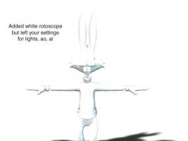
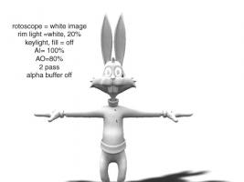
It appears that you don't ALSO have a rotoscope for the camera - which is what gets front projected onto the ground & models. Make a tga, jpeg image (any color - in your case white). Right click on camera, choose NEW/Rotoscope. I changed lighting, and values as well. EDIT - noticed text on image was wrong - corrected to say - key, fill off (instead of key, rim off)
-
Red Cocktail dress? - Walking on the street? ummm...uh...ok. (yup, I sez to meself...definitely a professional working class girl - hee hee) She'll work with your hero. Her face is attractive, feminine - However the Hero is more stylized than she, as she looks now. Even her sketch has more realistic-ish proportions than he. But really doesn't matter, as body proportions, slinky red dress and flirty hair can finish up the package to sell her as stylized, sexy, love interest.
-
Part of the impression of floatiness could be attributed to the fact that many of the arms/hands/fingers positions changes appear to "float" into their next position (ie, they move with torso) - Try some extended holds (which will produce a tension) and then quickly snap into next position (ie - take less frames to change position to move over a greater distance). Try not to have everything move at once.
-
Most compression algorithims count on the fact that all the image data doesn't change within the frame (pixel to pixel differences), as well as from frame to frame - In the 2nd clip (side view) there is a higher percentage of the frame that is background color - less change, therefore - less data to store to recreate same size image, same # of frames. If you have "busy, noisy" frames - they will not compress well, and same as if frame imagery changes abruptly from previous frame.
-
Much better - more feminine. However she still looks like "going for realistic" rather than stylized. For stylized - something/proportions need to be more exaggerated, characatured - eg - perhaps eyes bigger? smaller mouth? bigger puffier lips? Did you start with a sketch - or are you winging it? Tell us more about this character - what her personality is ? age supposed to be? role she will play? eg House Frau? Love interest? Smart? dumb? That might help you in knowing what features to over/under play As she is now - I get the impression she could be a "business suit" type - or a serious, educated mother of young children. It's all about stereotypes as defined by marketing. Unless you're already planning to "puff some parts up" on her body, or give her crazy wild hair, or tatoos, I don't read her as "disco chick" or "airhead" (ps - NICE, clean splinage!)
-
Ditto. He looks great!
-
I'd buy my drugs from him. Very trustworthy & earnest looking. That's how I like my pharmaceutical men. The gloves and shorts (and boots) look like they're made of rubber - kinda strange - is that on purpose ? Perhaps he will be blonde, with a buzz cut ? I like him.
-
Argh, matey ... I hear them parrots make mighty fine eatin'...for an anorexic... Best wishes on your new adventure!
-
Nice. How about putting the names of people on their clips?
-
yes - I could see it.
-
another blank file for me - but I was able to see your video in the other thread when you exported from qt pro
-
Thanks - I have blend set to 50% now - but the reflective filter is set to 0% (will try 50%). I wonder what it's filtering? Also fall-off is set to 0" Also - not clear to me where the particle hair bakes are going - looks like in document & settings in a file with the material name and extension par- that seems weird - I would have thought it would go in a file either with the chor or projects name, in the same folder as the chor or project. I only use chor - so maybe I need to make a project as well. EDIT - yay! 50% filter, 50% blend seems to reduce bright reflections - falloff still 0" - anything else made reflection go away. Tried soft reflection - didn't like
-
Yes that works - using QT 7.1.6 winxp pro I found if I had upgraded QT - then it produced other problems - but that was 7.2? I hate upgrading qt, not only because it then forces paying for a new qt pro - which seems ridiculous, but because invariably - it causes other problems, elsewhere. 7.5.5 already - wow am I behind As for lassoing - it doesn't always work with complicated meshes for me - sometimes need to do the dot dot dance.
-
Semi-Realistic Girl Character "Lany" (Nudity)
NancyGormezano replied to Fuchur's topic in Work In Progress / Sweatbox
I really don't think there has been a change in porcelain material - but here it is anyway Porcelain.zip -

Semi-Realistic Girl Character "Lany" (Nudity)
NancyGormezano replied to Fuchur's topic in Work In Progress / Sweatbox
You have probably found it by now ...but for others - it's material/Procelain/attribute/Normal Weight I believe default is 100% for normal weight I actually don't know where the original material is from - I was looking at the porcelain material found in the database on the svn for Scarecrow of Oz -
1) This works for me - select the 5 CPs (any order) - if the green 5 CP patch maker doesn't light up - then hit hide - leaving just the 5 points. Re- lasso the 5 points and the greenie thingy shows up 95-98% of time. When it doesn't - usually means there is something funny about a neighboring hook, or discontinuous splines. In either case - have to respline something usually. 2) The other thing to try: select the 5 cps (any order) - and if greenie doesn't show up - hit . (period) TWICE - to deselect and reselect - greenie should show And yes, I can't see David's H264 video either - I just get all black
-
funny ! & very good - not too slow - not too long
-
very impressive - very good portrayal of "heavy, tired" movement. Looks like you've got rigging resolved. Whats going on at the very end - with stray hair? or something? (never mind - I see its hair attached to end of sword - need better lighting perhaps, even for a test?)
-
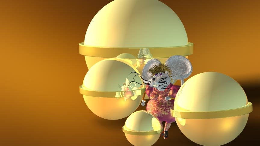
hmmm...Floaty you say? Uh ...in Meeska clip? or the others? or all? Can you give me more info as to where ? (sorry I didn't put a frame counter in) When I said I might tweak - I wasn't thinking floaty tweaking ...The problems I see (with Meeska Martha Mouska clip), which bother me are : 1) penetration of ear with tail, and tail with ball 2) tail movement is non-expressive - didn't put any effort into it. Movement needs to be more deliberate, more lagging with body, more changing of shape as Meeska turns - Tail movement should be more interesting. Finger, hand positioning needs more interesting poses. 3) The ball movements also need more expressiveness - might require some additional rigging - to suggest a head/body. I don't like how the final lean in of the balls towards the mouse is done, needs anticipation and a better coordinated "ganging up" on mouselady. Balls don't always look like they make good contact with the ground. Not satisfied with portrayal of differing personalities of balls based on size (sluggish, frenetic, etc) as they creep up on Meeska. I was getting uncomfortable about the length of time of the clip...as I think it's about 12 secs? - They are supposed to be in range of 3-9 secs. 4) Hair penetrates ears & movement of head hair is too springy. Maybe this gives the feeling of overall floatiness? I'd like to solve the penetration issue without using collision detection - things seem to go wonky with CD. Might try isolating groups of particle hair - and assign bones to move the groups. 5) Don't like the texture mapping on her sleeves and legs. The color & type of shoes needs to be changed. 6) reflections are too bright (don't know what to do about that) 7) Dodo brain did this at 24 fps, rather than 30. But FLOATY? You saying my bal..er the balls are floaty? Eh Jesse? (thanks Luuk)
-

Semi-Realistic Girl Character "Lany" (Nudity)
NancyGormezano replied to Fuchur's topic in Work In Progress / Sweatbox
I believe that there is a difference with porcelain in the way it looks with a final render - compared to an on-screen render. Have you tried a final render? and does it still have the artifacts? I believe I have found that porcelain looks better in final, but always produces very icky artifacts with on-screen renders. And definitely scary artifacts with on screen progressive renders on surfaces that have decals. -
Nice-a-big-jawed superhero - fun character PM? umm..er...Pest Meister? ...uh....um...Praying Mantis?...umm...Popular Mechanic?..Politely Mannered???
-
weird - I just answered this here: http://www.hash.com/forums/index.php?s=&am...st&p=298299


