-
Posts
7,863 -
Joined
-
Last visited
-
Days Won
15
Content Type
Profiles
Forums
Events
Everything posted by NancyGormezano
-
Nice feel and yes - tis better with the sunlight - would also be fun to see the tree sway to the music
-
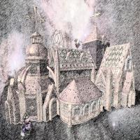
Yup - reminds me of the 1900's era story engravings - typical of Alice in Wonderland, Oz series illustrations, etc. As for the sketch materials in A:M - I have never had much luck. I could never figure out how to have real control over them, to get something I was satisfied with. PS is just too easy, quick. Or perhaps I gave up too easy. Would love to know some settings to try for the sketch type materials in A:M. St. Stian: Hee hee ! - Glad you noticed, as I thought you would see a resemblance. Not funny at all - since I started with the photo of Nidaros in 1857 that was at the wiki link that you provided. I was loving your work on the current Cathedral - but of course - I thought you totally insane - until I started getting into this - I could see what fun it would be to add more and more detail - and perhaps I will someday. Unfortunately I don't have the patience to work with 400,000 plus patches in A:M. So I cheat cheat cheat whenever possible. My version (approx 5000 patches) needs a graveyard with some tombstones, at least. And perhaps a stone fountain/statue of King Krewel counting his money. Thanks all for your comments. Much appreciated.
-
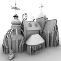
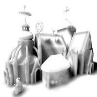
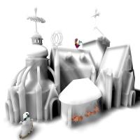
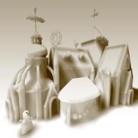
Ah yes - up to the same ol' same ol' - experimenting with render styles. I was inspired by Jinxland (Scarecrow of Oz) - so I took the textured model seen here- and played with rendering 1) Had to try a white render (everything is front projected with white) - AI=100, AO =100 - took 27:12 mins (AA) 2) Then I did a white render with just AI=100, 1 rim light, everything front projected - BUT I made everything flat shaded as well - hee hee - got this melted look - neato - took 11 secs 3) ok - then I added splashes of color for giggles - took 21 secs with with hair - no big whoop - but has possibilities 4) then I went into photo shop and started playing with filters - did a sun faded photo effect of Meltyville - interesting 5) Couldn't stop there - so I had to apply the sketch filter to the original color (did it twice - 2 different settings - applied each 50%) - to get an engraved look 6) then I overlayed the filtered sketch version over the original colored version to get this oldtimey tinted lithograph type image
-
I have to agree - definitely a nice clean terrific style
-
Amazing...just plain ol' amazing.
-
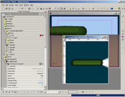
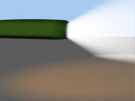
Your model does not have a light in it. I added a light (it only shows as a "bone"), changed it to klieg, turned volumetrics on in light properties - closed A:M - brought it back in - and it was still there - 15e, pc jakeproject.prj
-
Nice Matt - I like the new sound track, and the T-shirt looks great - I think I'm gonna get me one or two. I noticed some people's names are their forum names - Steve392 & Johnl3d come to mind - is that what they want? (the MySoti site is flash-awful slow for doing commerce ...but it looks good)
-
Review your settings that you are using for the hair material, and post them. Most likely when you do that - you will figure it out. Be sure to let us know, so everyone can learn. My guess is that you have specularity values (size, intensity) or brightness? set too high somewhere - in the hair material? in the emitter surface properties?, in the render shader? - and/or are using too unbalanced a color for the spec or diffuse... er...yup...there's another clue...
-
-
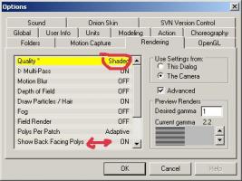
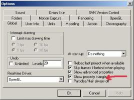
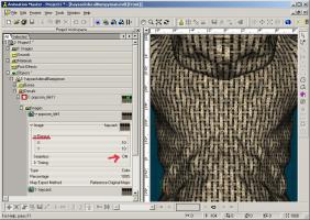
You may want to first change to "show properties triangle" so that it's easier to locate properties (rather than have a separate panel) - This is not required - but makes life easier. Then change the repeat count for the decal image and set Tile seamlessly to ON - it will not show as seamless in real time view - but it will render as seamless.
-
Yeah...I guess it would. Perhaps not much more than decalling? Probably better to get an answer from one of the experts up in here. I don't know that much I'm afraid. Maybe a material or a displacment map might be the way to go without taking too much render time? Decaling does not hurt render times as much as materials usually (depends on complexity) - displacement is also another render hit - as well as being sometimes unpredictable in behavior. Thin (length to width aspect) Hair has its problems as well. Better to use thicker type emitters, with sparser density. Emitters with intricate alpha channels (lots of edge detail, varying levels of transparency) also has render hit implications/problems.
-
Have you thought about using a hair material? would that hurt their rendertime? I am trying to make it a fast render, that mov file even with smoke was just 3 secs per frame. Some thoughts from the Queen Mother of Doing Her Own Thing, now doomed to a miserable, lonely life in the Shadows of the Land of Misfits & Finished Work Outcasts. Interesting concepts you have going on there - but perhaps too many all dumped into one (been there - done that). The house now looks like it has sprouted a potentially movable observatory hitched to a train. The Oriental-ish house concept was very whimsical, and fit for Jinxland. A mystical Sorcerer type observatory would also be nice for Jinxland. A whimsical choo choo train would also be nice. Whichever ones you do - try to remember they are going to be background usually- unless absolutely stunning and/or are integral to the story. And even then, that gorgeous Bumpyman house (a spline heavy marvel where every damn roof tile was modeled) - didn't get the air-time it deserved. It got lost in the background. For this house (original one) - I would think some ornate golden tiles (bump maps, texture, maybe some smartly sparsely modeled detail) on the roof, with ornate fanciful patterned golden dome would be more consistent with architectural style. If for another "poor peasant" structure you want to make straw roof - hair is okay to use. The settings for the hair would depend on where the structure is located and how close up we see this structure. One could do a thatched type roof with a sparse density for hair - with image emitters, combined with decal texture on the roof, that probably wouldn't be too much of a render hit. Love that you do tend towards "creative, whimsical" - so I don't want to squash that. (ps - you should compress your animations, especially when they are just tests and not final, when uploading to the forum - 12 mb is waaaayyyyy tooo much for that short little ditty. Do you need to know how to do this?)
-
Hi Nancy, Invaluable hints! Just followed your advice and started to play around with these options and it opened a whole new world to me. (Though AM tended to get a bit touchyon me, probably because I wasn`t really knowing, what I was doing..... Thanks a lot! Does the Image have to be HDRI to influence anything else but the color? Why leave Ambient Oclusion alone? Just because of rendertimes? Jake - glad it helped - it's so simple - makes even me look like they know what they're doing I've never played around with HDRI - don't need it for Image based lighting. I don't know how it would impact IBL. It would be great if you ran some tests - and then tell us what your conclusion is. I don't normally use AO with what I do - because 1) of increased render time and 2) it has a style that doesn't always enhance certain looks (introduces a dirty noise), and I don't like to render with more than 5 passes. AO (Ambiant Occlusion) does look great if one is just using simple colors - but I tend towards more variegated abstract washes of color - which I don't normally want to get 'dirtied' AI (Ambiant Illumination) is super-dooper quick render time. More my style.
-
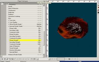
You will probably have to play with the settings for the Muhair specular render shader (rather than in the surface properties for emitter) - try lowering the primary strength - not sure if you will also have to revert suface properties for specular back to default (leave color set) - In this case I left everything as default except changing the properties of the Muhair specular primary strength - brightness was also default 100%. Muhair can be tricky, sometimes - I have found that I sometimes need to start from scratch with settings. (haven't fooled with it in a long time)
-
that's terrific - love the whimsical design (a window or two would be nice)
-
Perhaps your monitor is not calibrated? - How do other people's images look to you? Too bright ? Too blown out?
-
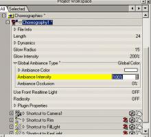
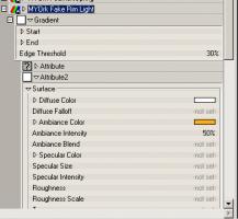
Ummmm...probably because the lighting/contrast didn't work? - it was not contrasted enough with surroundings, not lit very well - I had to now replay the video to see where it was used - I missed it before. And I still could barely make it out - even with looking for it. (it went by pretty fast as well for something not lit well) The lighting/contrast is very important for most everything - if ya can't see it - it don't matter how good it's animated, modeled, textured, etc But I meant to say before - loved the blue-jay as well - And what was that hopping creature thing at the end - kangaroo? (also potentially very cute - but hard also to make out due to lighting). Simple trick for you to try is to use expand property triangle for chor - choose Global Ambiance type=Global color=white - just try it! - it's so simple - play with the Ambiance intensity (AI) to 50-75% (if you leave your other lights in) and leave Ambiance Occlusion = 0%. Play with the color, play with using an image instead for lighting (eg use a blue image for night time) . Another trick for just isolating characters from their background is to create a "fake rim light" material - a gradient material that has an ambiance color, set in the second attribute only - drop this material on your character (whole character) - and see how it gets highlighted...(this trick courtesy of Holmes , courtesy of Matt Campbell) - play with the edge threshold, and ambiant color, intensity. Try it on your mouse - it was not well contrasted with the background of the train - so it could use something to bring it out. All this is info for you to try for your NEXT animation (or this one if you are inclined to re-render)
-
No holds barred - that's just plain fist clenching, blood-curdling terrific, Stian ... I'm glad you said that - because that's exactly what occurred to me...but I didn't want to be a ghouly gurl.
-
Nice - and a great use for a Material effector - so I thank you ! I've always wanted to do a "3D paint stroke" type animation - and this would be a good technique to use for some aspects - I had been thinking of manipulating CPs instead - but this would work better for some situations ... Thanks for the inspiration. Neat!
-
That's an excellent, endearing character ... Are the feet lost in the mail ? or shall he remain feetless ?
-
Jake - I have never really played with material effectors - but what I just did was make a simple test case: 1) create a material that the only attribute set is transparency = 100% 2) create new material effect 3) drag material onto material effect 4) create chor with model to be made transparent 5) add material effect to chor, moved it so it partially covered model 6) played with size, fall-off and type (cone, sphere, box, cylindar) of material effect (in the object - not the instance) to see how different params affected the effect. Each type behaved differently (so you will have to play with params) - In the image the cone shape made the model transparent where it intersected the model. (Cone doesn't really look like a cone to me) The material effect will impact everything that it touches (intersects) - so you will have to play with size, shape, etc. I deleted ground plane in this case. What problem did you run into? transparentmaterialEffect.prj
-
oooooooo....EXCELLENT! The clips are terrific ! Matt - You did a fabulous job on sequencing & stringing the clips together, the music track is perfect & the sound effects are absolutely FUN FUN FUN - Super Wondeful! Bravo all!


