-
Posts
7,863 -
Joined
-
Last visited
-
Days Won
15
Content Type
Profiles
Forums
Events
Everything posted by NancyGormezano
-
I double click on the image file in the images folder (to open it up in a window) and that seems to get it to reload the new version.
-
hee hee - Hoisted by my own petard, eh? Whatever a petard is, that is. I'm sure I need to be hoisted by it Actually there are at least 2 balls that enter from the left, not counting the first one that enters left half of screen. And there is 1 that exits right. So technically - it follows that rule. When I put all 3 of my clips together - Ballarama-lama-ding-dongI think it works ok. In the 1st "pass the ball" - it seemed to work with all different balls, and even 1 clip that entered right and exited left. This is just for fun. It don't really matter. Except I think my comment was directed at Vern - and if ya don't keep Vern in line, he's liable to Newtonize us all. So he needs to follow the rules. The rest of us can do whatever we want. Thanks all for your comments. (and well lookee here - the topic is back for viewing by the unwashed masses - well, just the contributing unwashed masses - as it appears the unwashed drug pushing guests can't see this topic at all, unlike the other special topics - where drug deals are being made on a continuous basis, ad nauseum)
-
Are you sure you have an alpha channel for this file? - it will be a 32 bit tga versus a 24 bit tga. Jpg does not have alpha, I believe png's can have an alpha. And are you sure your alpha channel, if there is one, is correctly selecting the area you want? And if the alpha is correct, perhaps the groups to which it is applied is white? and therefore the back ground shows white. And Gerry is correct - if there is no alpha, then you should be able to set the key color. But if there is an alpha, you will not be able to select a key color (I think, not sure)
-
They are both excellent, but I have to tell ya - I had a hard time trying to figure out which one is supposed to be the villain. I thought it was the guy with the beard - but then I went back in the thread and saw he was supposed to be the good guy. We're talking stereotypes in modeled appearances now. They both look young, handsome, appealing with their big doe-y eyes. As it is now, the one on the left (without beard) looks even more innocent. Perhaps the bad guy needs beadier eyes?, less of a litheful, wispy body, more beefy brawn? Taller? Or, of course, you can distinguish the bad guy further with sinister colors, texturing in outfit, wrinkles, imperfections, scars... Or as an interesting twist, have the bad guy be even more handsome and appealing than the good guy, he then would be even more threatening to the good guy. However, even as the way they are now, the bad guy's nastiness could just be distinguished by the script dialog, the voice acting, and animation acting choices.
-
It looks good - nice start The color when drop hits the green goo should be green - ie different color for the splash, different than the drop - You could try adding specularity to the drops, and splash - and make sure your lights have spec turned on. The ground in the back ground could look slicker as well - You could make some wet looking areas using transparency & specularity as well Probably could play with spec colors, intensity, size for all of them, lighting from different angles to see what enhances best. Some reflectivity in the drops, splash, liquid goo could help also in the illusion Bump maps could help the specularity showing up - just some pattern that has enough variation. EDIT: Has it stopped raining yet?
-
Interesting new character. How do you feel about him? Are you happy with him? As my gran'pappy use ta say "You can lead a Spleen to splines, but you can't make him dink"
-
He's a very good model - but he looks too friendly, appealing (maybe it's the smile)
-
Again I say - That's terrific! Makes me smile. I hate cars. Well, hate is such a strong word...more like I find them uninteresting in real life. Soooo - for me to be excited about some dumb ol' trucks tearing up the landscape - is a measure of how REALLY terrific this looks. AND it sounds like you're coming up with a very useful, elegant, reusable scheme. Well done!
-
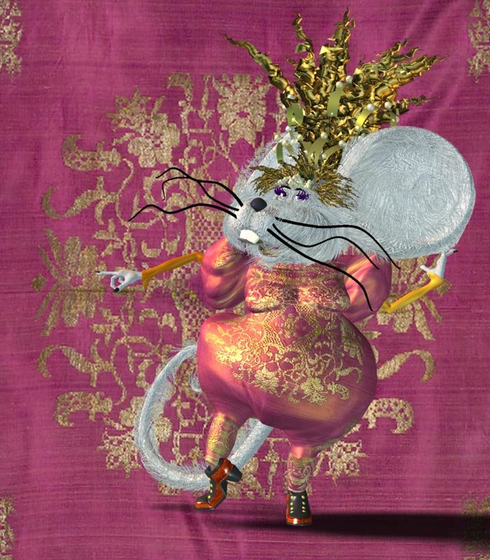
Not sure if the topic "pass the ball" will be made public again - & right before it got hidden, I had posted a new clip starring Meeska Martha Mouska. Meeska's a variation on the witch in Scarecrow of Oz (witch originally designed by me, modeled & rigged by Ken Heslip, textured by me). I replaced the witches head, with Meeska Mouska's (modeled by me) & modified the body. The still image is her in her long haired state. The movie clip shows her in her short haired state, Not sure which I prefer for animation. I like the long hair better for a still. The clip is a concatenation of the 3 clips I've done so far (ChineseHippoDragon, L'Orkerella, and Meeska) - I was wanting to see how they all looked strung together. The new clip of Meeska is at the end. AND noooooo, that isn't me singing. HippoOrkMouseMediumLoopLOVE.mov
-
I thought it was Rodney. But I really don't know. I had sent him an email (via forum) originally remarking about the "spambot" and that perhaps guests shouldn't be allowed to post. It was right after that that the topic got hidden. I had assumed he had done that. And I also assumed he had originally made the topic "special" in the first place, as it had been in the WIP forum. I also tried to contact him a 2nd time at his gmail account after the forum got hidden - but so far no response from him either time. That is why I said I sure hope Rodney is OK
-
Yup - looks better - As for the eyelids - you're on your own. Bon Chance!
-
That's really absolutely terrific - absolutely great !
-
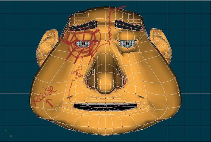
Better. The nose looks great. Note how clean it looks as it transitions into the face because you've got a "ring" around it. You could (& probably should) end the hook coming from the nose sooner. Theres no reason to continue it further into the face. Hooks, 3 pt patches, have a tendency to produce anomalies when animating - so its best to hide them in areas that won't matter. Which brings us to the eyes - There's no rings for the eye area. It would help reduce all the pinching. It's hard for me to suggest what to do to correct, as I can't really see the spline layout well enough from the images. So I just drew a general ring lines. You would need to rework it into your spline layout for the nose. The eye area is very important for expression in animating. And it will make your job easier when rigging the face for animating. The other things with the mouth is the hook ending too soon, and the corner of the loop around mouth should probably be raised some. It also looks like your models face center line is not centered at 0 on x axis? Did that give you problems CFA'ing? You did an amazing job on the ears - that's one of the hardest parts to do. (ps - I ain't no expert - so this is kinda ridiculous me giving you advice)
-
Stunning! and sure to get stunninger...er...more stunning! EDIT: I just went to the wiki and saw the photo - YES - you are a crazy person! And that's why I don't believe the part about you "not knowing" how much work you're getting into...only a madman...
-
I don't see why not. I sure hope everything is ok with Rodney ???
-
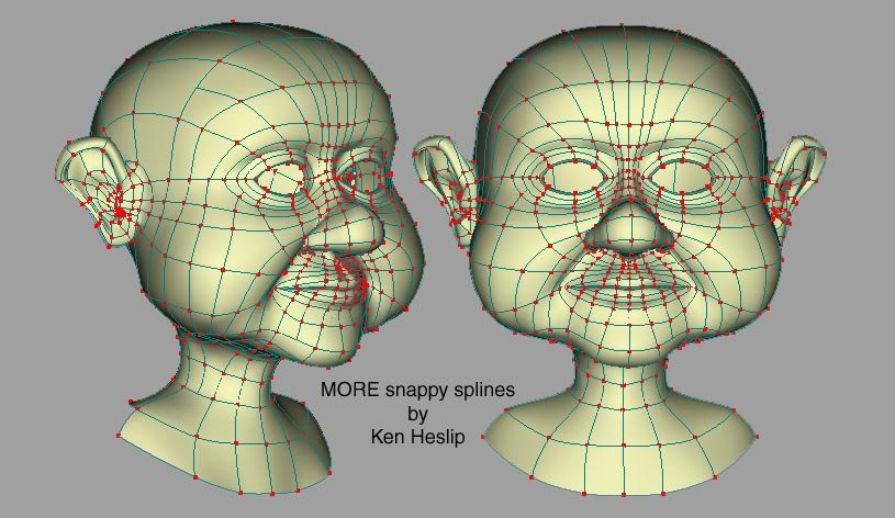
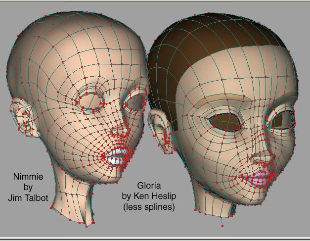
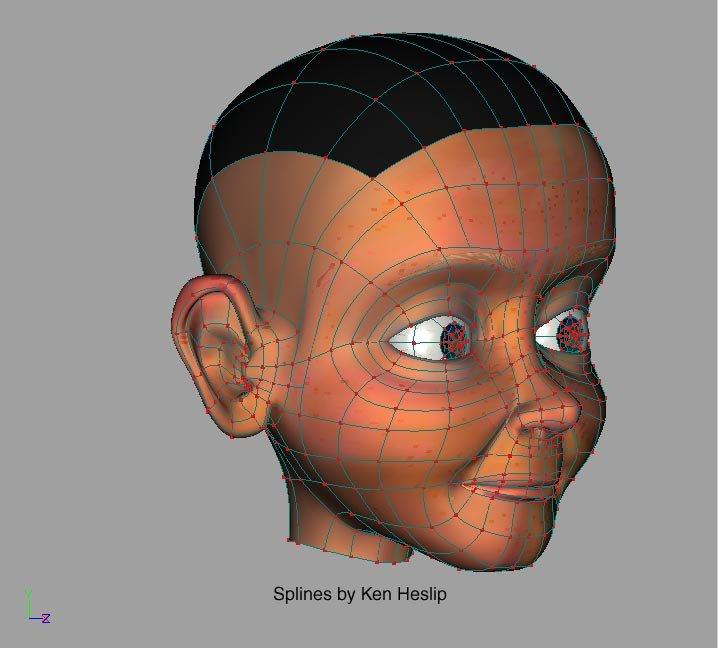
Not necessarily - What you've got going is better - less creasing for sure. The problem is around the nose area in that you carried the splines of the nose to continue around the head. Again that brilliant boy Jesse and his brilliant cousin Matt have given you good advice - there are rings around the eyes and rings around the mouth (as well as rings around the ears, and nose holes) - It does seem to produce smooth faces, that are definitely made for "talking" Again I upload images from the masters - Ken seems to follow this pattern/formula. (AHA! his secret sauce has finally been discovered and is now being manufactured in Cupertino, CA ! - I'll be RICH...RICH...RICH ...bwa ha ha ha...oh but I digress...) Note Brautigan's spline pattern - very close to Pon - rings around eyes, mouth Note how Nimmie is heavier in splines (not needed) - and Ken refined Nimmie to produce Gloria - less splines. The more splines you have - the more likely to have unwanted creases (unless you're a master). The other thing to pay attention to is that splines are used to produce creases/indents when needed,wanted - ie from the nose to mouth area - laugh lines, wrinkles, etc
-
The original NCC 1701 Enterprise
NancyGormezano replied to Eric2575's topic in Work In Progress / Sweatbox
The clouds are wrong. Flip the clouds. -
Man...You is dealing with one lame, prone to misinformation giving, not using correct terms, and mistake making rubbish modeler here. The "y" key inserts a control point along a selected spline - This is an old command (check out customize/keyboard/insert) that I just realized isn't shown as standard anymore. Try it - create a spline with 2 cps - select the spline with mouse (not the cps) and hit Y. A new cp will appear. I am now not sure that it maintains the curvature precisely. You are correct about 1,2,3. As for 4,5 - If a CP is intersected by 2 splines - then when you select the cp or one of the splines intersecting - note that half of the spline defined by 2 cps will turn green to tell you which spline you have selected. 4 will constrain the cp along the "green" spline and 5 will constrain it along the other or intersecting spline. Now if Rodney were here, he might say something like perhaps you forgot to do "Exercise 11: Modeling a giraffe"? in TAOAM - as that is where the defs on p.136 are hidden...(I had to go look it up)
-
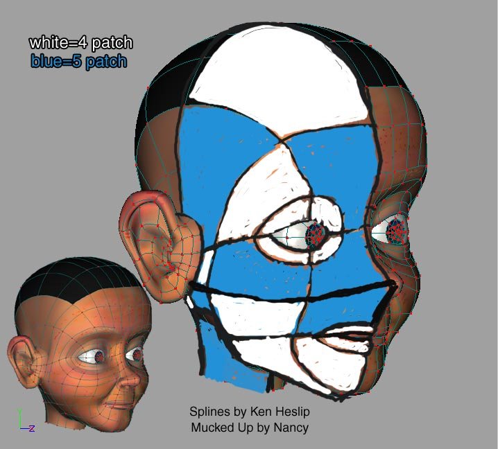
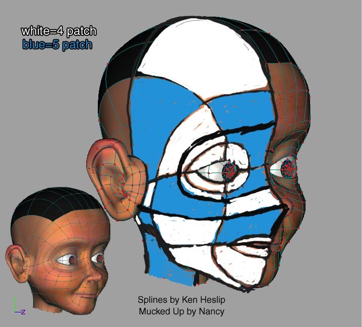
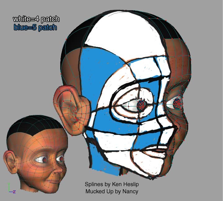
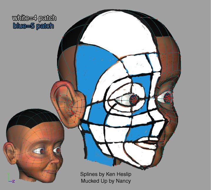
And I hope you caught my mistakes when I colored in the blue/white (in images 2,4) above - I did this in a hurry. This is one way to think about layout of splines - and one could also use extrusion (following rotoscopes), after analyzing. Or one could start simply, and then use binary subdivision of the splines using the Y key, to maintain spline curvature. Make the 4,5 keys your friend- to restrict movement of cps along the spline, or a cross spline, as well as 1,2,3.
-
Another interesting character - that has...um...Spleeny CHARACTER. I love how you make such interesting characters. BUT your spline layout doesn't do them justice. It's not too late for the next one to do with less creasing & make more animatable. (maybe even not too late for this one?) Jesse gave you great advice. I am a rubbish modeler. So, do not use my models as an example - but use Ken Heslip's or some other modeling master. Just recently, I have distilled for myself what one "ought" to do when laying out splines, to minimize creasing, and for good facial animation (a la "Stop Staring"). The first thing to think about for face splines is the placement of the "holes" (eyes, mouth, ears) and where the 5 point patches will be. Any human face can be layed out this way. Asymmetry can be introduced after 1/2 the face is modeled (and copy, flipped, attached if appropriate). And then - after the basic layout of holes and 5 point patches - do as Jesse says - refine, refine, refine Here's a potential path of how to layout splines - using Pon from Scarecrow of Oz as an example. I did not take the refinement to completion. (I hope you don't mind me posting these images in your topic - if so I will delete it or perhaps someone can move these to its own thread)
-
really, really nice modeling - I'm envious...very, very envious.
-
Hmmmm...I'm logged in - still can't see it - I suspect it's a problem with my "rights". I tried from another browser (IE). No go.
-
-
ok - the title says it all - The "Pass the ball" special topic appears to be gone..or I can't see it... Am I having a senior moment? Or...er...worse ?...
-
Meet Martha Mouse. Because I'm a lazy twit and hate to rig, I borrowed some DNA (body, rig) from the Witch (in Scarecrow of Oz) - Head/face modeled, rigged by me (not finished), texture, hair by me. Original Witch was designed by me, modeled by Ken Heslip, rigged by Ken? using Squetch (ver 2) by David Simmons. Squetchy ball by Robcat. 4 pass - ave 23 seconds/frame - Global color = white, AI=50%, AO=0%, rim 20% (zbuf shadows), 2 suns (no shadows), reflections - 1 level, dynamic hair, dynamic constraints. I may tweak some. mouseballmedium.mov


