-
Posts
838 -
Joined
-
Last visited
Content Type
Profiles
Forums
Events
Everything posted by nimblepix
-
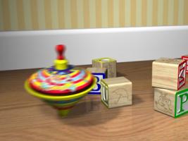
Thanks for the comments Charlie. Quotes in italics. I think the top used in the original was like one of those that you wrapped a string around and launched by hand... Yep, I didn't think kids would be able to understand that. And changing to a metal top makes for more interesting sound possibilities. However, I think the top should have jumped when it hit a groove in the floor (the seam between two boards). And, I think it should have bumped into the walls in the corner. Yes, that's part of the new plan. I would like the original to have a feeling of conflict ... Is it just chance that it bumped into those blocks just right, or does the top have a mind of its own? To me that (mystery, unknown) would have been more entertaining. I'm going to try and make it more obvious in the beginning that the top can think. Now, given your change in the top... these are hollow tin. There will be a bit of tinny echo when it hits something. In the original, the sound of the top is identical to the sound of the block falling. The sound of the top hitting the floor needs to be "sharper" (it has a point to spin on) and heavier (it must have more mass than the block to affect it so). Since the block has a flat side which it lands on, it needs a bit more muffled hit... this is tiny... but it displaces air when it approaches the floor (kind of a whump instead of a thump) Actually, I don't think that's too picky. Good points all. In order for this to be prime, I need to be concerned about every little detail. I look forward to getting the details right. All the sounds will be recorded live. The new top is bigger, and though hollow probably has more weight than the blocks. However because it is taller, the top will strike the blocks on its underside... this could make for some interesing gyrations. Yes, indeed! I remember a skater from Canada that would do routines that would take him to the edge of disaster. I loved to watch him because there was so much tension. I think the top can have this edgyness in some parts. I'm thinking about making the top a little bigger, about 125% of what it is now. I'm a little worried about making it too big, because then we start getting into metaphor. But maybe that's not a bad thing. Two levels of story, one for the kids, one for adults.
-
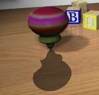
[attachmentid=15451] Here's the newest top. It's not spinning in this shot, just moving. It does have a twisted screw thingy inside. [attachmentid=15452] I plan to have it pump itself up to get going when it spins down a bit . . . probably just before it starts rearranging the blocks. I'm going to try using the spin rotation accelerator as used on the propeller in Pixmite's post. http://www.hash.com/forums/index.php?s=&sh...ndpost&p=144633 If someone has a better way to speed up and slow down a spin, please let me know.
-
beauties! Looks like you used a dome reflection of a dome?
-
Now it's mine too! Thanks Colin.
-
Thanks to all that voted for the BUMP" animation in the mini movie contest! http://www.s1.hashmirror.com/ftp/pub/movie...nimovie3/02.mov Now on to the next stage, final tweaking. The market is children's television in the 4 to 6 year old range. I've gotten a lot of feedback from a bullpen of about 30 people. The following list is what they and I came up with. If you'd like to help me out, please add to, or subtract from the list. I'm looking forward to making this into a prime little spot. By the way, everything is built from the ground up, using the toys scene that comes with the A:M CD as inspiration. The top isn't actually spinning. I put random blurred horizontal lines on it as a bump map movie, and preblurred the color texture. Rendering time averaged 18 seconds per frame on my iBook G4. EDIT: I'll put the dates of the changes next to items on the list. TOP Animation Work on curves, leans, timing, speed. Lots of tweaks need to be made here and there. The top needs to wobble and vibrate more, and react to its movement over the rough surface of the floor. Make the "vitalization" less abrupt in the beginning. Slow down top before it gets into position to bump the "U." Have the top bump the walls too. Bump the "E" block as it comes around, turning it so that it's not noticeable at the end. Have the top jump twice to make the "M" drop. A little pause between the two jumps. All the blocks (and perhaps the camera) move with the landings. Have the top do a little victory dance before it moves out of the scene. Have the camera swoop in at the end so that the work "BUMP" fills more of the screen and is square with the screen. Have the top move across the word one last time after the word moves up to the camera. Color/texture √ 03/26/06 Recolor the top more in line with existing tops. Brighter, primaries. √ 03/26/06 Put stripes on the bottom of the top too so that it's reflection shows up better. Shape √ 03/26/06 Turn it into a metal top so that there is a contrast in materials. √ 03/26/06 Put a little handle on the top, sitting on a bulge, so that it needs to pump itself up now and then. √ 04/02/06 Scaled it up to 110%. ROOM √ 04/02/06 Put a brighter yellow on the walls. Right now it matches the floor too much. √ 04/02/06 Put paint texture on the baseboards. Put texture on the floor, especially between the floor boards. This texture will affect the top's motion. BLOCKS Animation Have all the blocks move a bit when the top lands after its jumps. Have the "E" block turned by the top so that it is no longer readable at the end. Have the "M" not come off with the first top jump. Have it move a little like the other blocks, but needing a second try to make it work. Color/texture Make the "U" easier to see. Try a less saturated yellow. Make sure to use broadcast safe colors. Check to be sure all are casting shadows correctly. LIGHTING √ 04/02/06 Brightened lights, extended their angles to cover a wider area, took out two lights. MUSIC Think about using something more up beat that is appealing to children. I'll look into this, but I do like the idea of introducing children to different kinds of music. Make it lower in volume so that the sound effects are more noticeable. SOUND EFFECTS, FOLEY Change the top from a wooden one to metal. Make the spinning more of a whirring sound. I just bought a new metal pump top and have recorded the sound. Make the contact sound with the floor higher pitched. Record actual spinning sounds of metal top on a wooden floor. Record the various wood on wood, and metal (tin) on wood sounds. Record the "crank up" sound. Make the "M" have a louder sound when it hits the floor. This should be the loudest hit noise because it is the most significant and because it hits the hardest. Record kid's reactions as they watch. These may be added throughout. Kid/s' voice "BUMP" at the end. Have kids say "bump" at the end in unison. CAMERA Have the camera shake a little with each top landing. Have the camera crane in to the blocks at the end.
-
WOW!
-
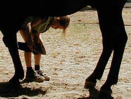
How about making the ring on his bicep round, compressing it a bit. How about making his lower leg just above the hoof have move of a "wrist" or "heel" type bone. Like those on a horse or bull. [attachmentid=15131] Yeh, demons should have nipples. They're much sexier that way.
-
I love these crazy creatures. Yeh, laughed out loud, watched it several times, showed other people, etc. You've got a hit series on your hands here. I think part of the attraction for me is that they are ugly, but attractive in their alternate universe sort of way. And the timing is wonderful! Over the top sound effects. The list goes on. Little problems in slippage throughout, but those will be easy to fix. Thanks for making this!
-

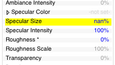
What the heck is nan% for specularity?
nimblepix replied to nimblepix's topic in Work In Progress / Sweatbox
Just solved it. Right click on specularity and go down to "constant." What a great program! It has what I need, I just don't know where to go to get it sometimes. -
I just rendered my mini movie that is due tonight and keep getting seemingly random black renders on one character. There are about 5 bad renders in a 960 frame movie. Attached is a picture of one part of a rendered frame and the setting for that frame. I change them, but they change back to nan% when I render. Is there a way to change all of the settings at once for a particular property? I'm on a Mac, running 11.1 (latest version). [attachmentid=14915] [attachmentid=14916]
-
Wonderful!! Looking forward to seeing his misadventures!
-

ZachBG's Awesome Olypic Animation
nimblepix replied to Atomike's topic in Work In Progress / Sweatbox
As the movie reviewers say, "laugh out loud funny." You have awesome skills! Your timeing is spot on. Wow! -

a new animation: scope bot explores the plank
nimblepix replied to jamagica's topic in Work In Progress / Sweatbox
jam, I love this. Here are a few more things to consider ... Keep him balanced above his tire. Don't let him lean forward unless he's moving in that direction. So, if he's leaning forward while in one place, put more weight behind the tire with the middle part of his body. As a unicyle rider, I feel the balance issues as I watch this. I think that tire should be moving back and forth more. So, the lean back before the stop needs to be more pronounced too. I'm looking forward to seeing more of "his" adventures! -
Super!!!! I wanna be (animate) like you hoo hoo. : )
-
Thanks for the strokes Vern! Glad you liked the tuts. I love Snapz Pro. When my students e-mail a question to me about doing something in a particular program, I usually just record the solution with Snapz Pro and e-mail it right back, then drop a copy of it in our folder for that week. For me, many times its a lot easier than trying to type out the instructions. If I talk too slowly, they can push the fast forward button. I also usually half size it and it's still very readable. I did post them on your A.R.M.site in the beginners section. : )
-
Wow, talk about nostalgia! Great job on the Vaughn Bode' models, and your set. I still have his comics from the hippie days. Too bad he died so young. I'm looking forward to what you do with this.
-
Are you moving the underlying CPs after you apply the decals?
-
He's bloody stuffed, and I want my money back.
-
I'm betting something is wrong with the way you created your alpha channel. How did you create it? There are lots of tutorials over in http://www.lowrestv.com/arm/ Here are some technical manuals and such. http://www.hash.com/htmlHelp/index.asp and of course your disk came with a technical manual on it.
-
Prime cut!
-
Thanks for the very practical link. Although I did spend too much time playing experimenting with it.
-
Beautiful work! You've really put together a cool character here. I'm betting the no pants thing is going to be controversial at school. : )
-
You can apply multiple layers of different types of maps. Sure, you can put on the color map twice (or more) and use one of them as the bump map. You don't necessarily have to use a gray scale map for the bump. The percent of perceived bump height is right below type. You can go over 100%, I'm not sure how far. Now, get to that technical manual. : )
-
Click on the plus sign to the left of the star to see the rest of the heirarchy. Hey, pretty soon this stuff will be like riding a bike for you. Edit: Oops, I see you found that out.
-
Snapz Pro X on my Macs.


