nimblepix
-
Posts
838 -
Joined
-
Last visited
Content Type
Profiles
Forums
Events
Everything posted by nimblepix
-
Hey Daniel, I especially like what's going on with the A. Kerning looks good overall too. Good font choice. . . lends authority to the design. I have a little problem the first lower case n hanging down. I recognise its design intent, but can't relate to it concept wise. Would you consider actually putting the earth in place of the metalic button shape? Did you do some post in Photoshop (or other)? The blue looks out of place in some places, like in between the letters. The reflection doesn't look quite right either. I think it's the lack of side edges. Gotta run. DanRJ
-
Yep, wherever edges touch.

-
Gar, These are wonderful! I love the gentle humor! And, the animation ain't bad either! DanRJ
-
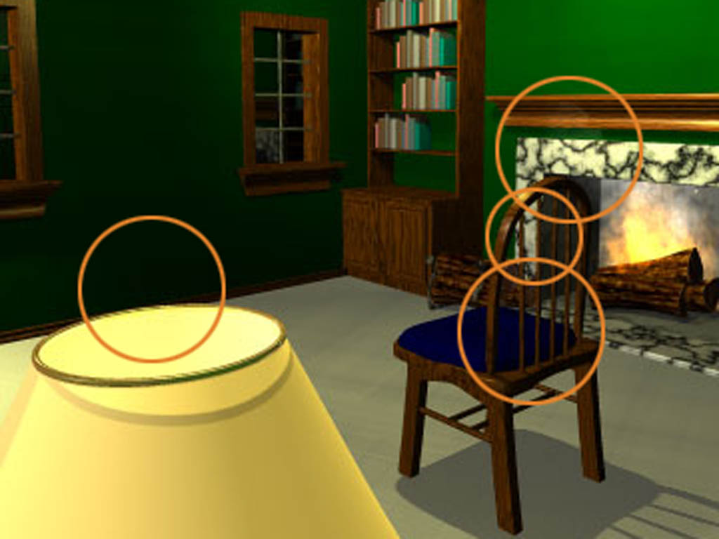
Daniel, I know these are in progress shots, so you may know this, but watch out for aligning object edges. Will you have the fireplace cast a flickering shadow? DanRJ
-
Daniel, I don't see a forum on the linked page.
-
Delaney, Well done! It's going to be fun watching this develop. By the way, I'm a Mac guy, and I could see it just fine. DanRJ
-

Making Your Presentations Zing!
nimblepix replied to D.Joseph Design's topic in Work In Progress / Sweatbox
Daniel, That's amazing! The integration of your 3d elements into Keynote looks seamless. Glad to hear you have recovered. Lung problems can be very scary. -
Are you going to copy and paste them all into one model, arrange the parts and add bones?
-
Are you going to copy and paste them all into one model, arrange the parts and add bones?
-
Stefan Pruss has one that might inspire you in his modeling gallery. Sorry, no direct link. http://www.nutcorner.com/
-
Ken, Wow, this is super! I'm mesmerized by this guy. He definitely is walking with purpose. I think he's headed over to talk to the dude that's been messing with his girl. How about a little snap under as he pushes off on his right foot.
-
A beginner's trials... and errors. ;)
nimblepix replied to showson1's topic in Work In Progress / Sweatbox
Steve, Nice job! Are you using stride length on the run? He seems to be slipping. -
Really good Numaer! I'm sure we'd all like to see the wireframe of this bad boy!
-
Nice job Ernesto Esteso!
-
Jimmy, Comin' along very nicely! How about curving his back a bit, he seems very stiff. It's difficult to interpret his attitude right now. You could also put more weight on his right arm while he's curved more forward. Perhaps tilting his head down more too. He seems to have very little weight on his feet. I think it's because he has to reach so far down to get to the floor. The note is a very nice touch. The penmanship indicates sophistication on the writer's part. Nice backstory building up here. DanRJ
-
Very cool Dan! Now you're the go to guy for this effect.
-
Roboy Rocket is very cool!
-
Hey Jimmy, nice work! There are a few things you might want to tweak. The first thing I noticed was the guy's shadow on the wall to the right. It doesn't make sense to me. There is really no light source other than reflected coming from the head of the bed. And his back is darker than his front, so what could be causing his shadow on the wall? Odd reddish hair. T-shirt around theshoulder looks odd, squared off. The guy needs to bend the mattress more, not go through it. Love the camera angle! Love the mood! This is going to be great! Best wishes, DanRJ
-
Matthew, Beautiful work! I love the pace and restraint. Great job on the palette. Wonderful voice acting! There are so many things to appreciate! Beautiful! Thanks for making this film.
-
Freakin' incredible John. I especially love the little weight shifts on the legs in the animation. Tons of good stuff goin' on here! How about throwing in a size reference.
-
superbe d'animation!
-
Some character studies for a new short
nimblepix replied to Raf Anzovin's topic in Work In Progress / Sweatbox
Raf, At first I didn't like the style, but the look is starting to grow on me. I think what I like most about it is the uniqueness of the design. You have avoided some of the stereotypes and easy answers with his tapered face, high forehead, minimal detail in the dressing, stylized/simplified hair and the long pony tail. I love the proportions of elements. I know it's a stereotype, but I would like to see higher boots though. It's great to see you taking such a big departure from your previous work! Were you inspired by something, or is this some sort of epiphany? DanRJ -
Check out Mark VanDeWeghe's cover art on Creation Engine's catalog V.2 2004. If you don't get the catalog, here's a link to a similar picture. http://www.murc13.homestead.com/files/robocar14.jpg DanRJ
-
Great job Charoensak! O.K. I'll be the guy that asks for a wireframe image this time.
-
Super! How about a painting inside the dome!