thefreshestever
-
Posts
821 -
Joined
-
Last visited
-
Days Won
2
Content Type
Profiles
Forums
Events
Everything posted by thefreshestever
-
keep weapons separate. if you animate constrain the characters hand to the sword and animate the sword instead of the hand. it would be difficult to animate the hand with such a long weapon like a sword since every little movement of the wrist will mean a big movement of the sword. you don´t have to use smartskins on the hands, you can get them to move smoothly only with cp-weighting... I have my sword in the same model as my ninja mainly because it rests on my ninja's back where i want it. Would i be able to do that if it was in a seperate file? sure, just constrain the sword to the back bone, when you want him to take the sword in his hand you´ll have to set the enforcement of the sword to the backbone to 0% and then constrain the characters hand to the sword. it´s not that tricky as it sounds.... you can take a look at the "the door´s stuck" tutorial in the TAOAM for reference.
-
keep weapons separate. if you animate constrain the characters hand to the sword and animate the sword instead of the hand. it would be difficult to animate the hand with such a long weapon like a sword since every little movement of the wrist will mean a big movement of the sword. you don´t have to use smartskins on the hands, you can get them to move smoothly only with cp-weighting...
-
nice... keep going... here´re my crits: the nasal bone looks a bit tapered, especially at the upper section between the eyes... his right hand has some creases in this pose, looks like he´s got some "flesh-engagement-rings" on his fingers. my tip for the the kimono (is a ninja dress called kimono? i don´t know i have to admit...)...: make it a little brighter, it will still look black if you choose a dark grey, but the folds will be more noticable and your poses will be easier to read...
-
here it is, something went wrong with the upload before....

-
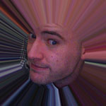
Radiosity is the way to go imo. Put a half dome colored blue with 60 percent trans around the entire thing, one kleig light on the outside shining through the window. The light should be slightly yellow and about 80 percent intensity, with 0 percent width and falloff softness. 180 degrees and put it just on the inside of the sphere. This will give realistic ambient lighting from the atmosphere, and everything looks better with radiosity thanks, sounds good, i´ll give it a shot.... here´s a little update, chairs, table and trashcan added...
-
all right... table, chairs and some accessories still missing, but i thought it´s time for a post... i´ve never lit a indoorshot yet and i´m really not sure about the lighting at all... what would you guys recommend? i need something that renders quick since i want to do a short in this kitchen, so radiosity is to be ignored, i only have 2 computers for rendering... any suggestions? right now i have two rims outside the room, one causing z-buffered shadows, two low valued fill lights inside the room and one bulb light under the ceiling causing shadows too...
-

Another TV Commercial
thefreshestever replied to John Bigboote's topic in Work In Progress / Sweatbox
that´s very impressive matt... how long did it take to make the spot? -
this looks pretty natural... wow! can you tell how you´ve done it?
-
ha! i´m making a kitchen by myself right now, and i noticed you did the sink exactly the same way i did it..... and you also have the problem that the normals of the five-point-patches at the top of the sink flip randomly without no reason... i figured out that i just have to correct them every time you add some splines to the model, even it´s not connected to the sink... but very nicely done, your kitchen is a bit more complex than mine, more a reduced 70´s-design kitchen. i´ll show it when it´s done...
-
only four threads ago there was exactly the same question where i put a link to a tutorial... it´s calles "cgi in film", take a look at it...
-
http://www.hash.com/users/ed/tutorials/fpm/fpm.htm
-
i´m getting even 34 and 36 fps, mac book pro 2,33 ghz dual...
-
i don´t really understand what´s the point of turning legs ik on and off during an animation....can anybody explain that to me? if i like to animate fk i animate fk, if ik than i do ik, or am i missing something here?
-
do you really mean a:m 05???? or do you mean a:m 15??? since you are new to the forum i guess you mean v15... if not i would recommend a update, you won´t get lucky with such an old version on (i guess) leopard. even v12 doesn´t run propertly on tiger!!! here´s a general tip from mac-user to mac-user: save your projects multiple.... always save before a rendering-attempt.... a:m for mac likes to crash sometimes if you hit the render-button, it also will crash almost every time you abort a render... that´s no big deal if you save your work before hitting the render-button.
-
HERE's what I've had success with: Make a new material...fluid...under it's properties/Droplet physics window, lower those values to 1-20...or 5 and 5. (Pressure Force=5, Surface Tension Force=5) Then, raise the viscosity to 125-150%. If you want a 'spray' or lots of droplets-lower the viscosity to 50-. You will also want to play around with the SIZE...and here's the BIG thing about A:M Fluids: The smaller the SIZE, the more the fluid looks and acts 'fluid'...the TRADEOFF being that you will need to have LOTS and LOTS more particles, and THIS is where the computational concerns will arise. More particles equals longer renders. Use the 'Shaded' render quality for your tests to keep them quick, and plan to render overnight/over weekend. There's really not much more to it, A:M Fluids are NOTHING to be intimidated by...HAVE FUN and be sure to show us what you are making! ui... i have to try that low pressure and surface tension force values.... i always set them much much higher since the default values are pretty high (ok, things like vomit or a waterfall need a bit pressure though..)... never tried that low, but i will try that when i play around with fluids next time... is i really that much quicker when you render it shaded? i always rendered previews final with 1 pass, since the actual rendering was pretty quick, i thought what takes time is computing the particles, and that has to be the same in shaded mode? or am i wrong here?
-
that´s much better... i would think about taking the nosesplines where you made a hook one or two cross-sections up to a more flat area, you may have problems with those hooks later causing creases when you make a sneer-pose... i always try to use hooks on flat non-animated areas...
-
there was a thread on fluids a few days ago where i posted a creek with a waterfall and also some vomit made with fluids... the creek i made looks almost like a continuous flow, if it comes close to what you want to achieve i can give you the project-file or simply the settings... but i have to take a look at it first, i might have changed the settings later on as i tried combinations with fluids and sprites (what simply doesn´t work, a:m only renders one of the two emitters...), i hope i still got the material with the original settings... i can´t take a look on it right now because i´m rendering at the moment...
-
You mean Robert George oh... you´re right, must have mixed it up with another thread i´ve read before, sorry robert, sorry largento, thanks george
-
looks like a handmade drawing... as largento mentioned you will like to redraw it in a vector-app like illustrator or coreldraw, save it as .ai file and then import it to a:m. you can add bevels if you want to, extrude it and color it in a:m.
-
maybe it´s a brazilian thing, my exexex-girlfriend was a brasileira, and her mother had those giant chickens from brazil, i was a bit frightened when i saw them the first time but again, i really liked the first one better, but that´s just my personal opinion. i think it all depends on what personality he will have... if he´s going to be funny, a bit clumsy and messes things up i would definately go with the thinner version... but if he´s going to be a world-class athlete and nothing goes wrong when he´s kicking the ball the muscle-packed version might be better. i´m really looking forward to the animations!
-
change the length in the choreographies properties to the desired value...
-
this is exactly the way how it works in a:m, don´t know why it doesn´t work when you´re trying... select your group in the pws, then the cps of this group are highlighted. then hold down shift and select the points you want to add to this group. you can do this by just clicking them, drawing a box around them with the cursor or with the lasso, it doesn´t matter...
-
i liked him better without the feathers i have to say.... maybe they´re just too long, especially on the arms and hands, they look too big now...
-
very nice!!! looking forward to see the animations....
-
thanks. this helped a lot, i enjoyed visiting your site, much utilizable information there, i would have never figured that out by my own with the signs i guess..