robcat2075
-
Posts
28,253 -
Joined
-
Last visited
-
Days Won
401
Content Type
Profiles
Forums
Events
Everything posted by robcat2075
-
I remember Martin once saying dynamics had to be simulated from the front view, but I couldn't find that it made things any better when i tried it. If any one can find more on that I'd be eager to read more about it.
-
In the Choreography properties, under plugins, there is a Simcloth option to turn "Use Chor Length" OFF and set a start and end time.
-
That looks real good Gerry. In my test case the birdseye view was still a perspective view so I'm not sure that perspective vs. non is the issue but perhaps it also is. In further testing I'm beginning to think that different birdseye views may have more or less success but that's hard to confirm since birdseye views can't be saved and reused. I found this because I had an old project aht worked in v16 and was going to add some more cloth, but now in v17. But that didnt' work, and even just the original cloth wouldn't work so figured it must be a new v17 bug and went back to v16. But it didn't work in v16 now, even though it had worked before! Eventually I just happened to run a simulation after I had turned out of the Camera view and that whizzed right through. A-ha! However, I still haven't got my new added cloth to work yet.
-
That's lovely and beautiful! Well Done! My only suggestion would be to have some way that the text was not readable at the very outset but I'm not sure how that would be done.
-
I've found a case where running a simCloth simulation while looking in the Camera view is a problem. A simulation that would run in a reasonable time if I started it from a Birdseye view would get bogged down with many tens of thousands of "collisions" (see lower left corner of the screen shot) to try to solve if I started it in the camera view. My experience is that anything more than a few hundred collisions is a sign of a simulation going bad and 30,000 is pretty much crazy stuff that has gone off the rails and will never finish properly. For simple situations like "Wave the Flag" I don't think Camera View will be an issue, and if you have created some genuinely unsolvable circumstance in your model or animation, BirdsEye view wont' save you, but just be aware that Camera view may not be ideal while running simulations.

-
PurpleGirl, I gave the "I've got a secret" tutorial a try and since i haven't done it before with this version of A:M I got the same message as you, but then it spun for a bit and continued on, apparently having created the new index.i file that Steffen referes to above. Two ideas to try: - get out a simple text editor and create an empty file and save it as "index.i" to the location that A:M was looking in (should be the same dir that A:M is installed in). Then try the tutorial from the beginning again or... -unzip this index.zip file and put the index.i file that my A:M just created to dir your A:M is in, then see if that works... index.zip (I had to put it in a zip because ".i" isn't an uploadable file type.) Try those and let us know what happens.
-
Thank you! I enjoy interacting with everyone on the A:M forum and hope we can continue for a long time to come. (I should note that I'm not actually 29 like it says at the bottom of the forum, it just looks better than 52, and I think I'll be 29 again next year)
-

Why does this happen when using arrow keys to move an object?
robcat2075 replied to Roger's topic in New Users
I have been caught by that dual functionality occasionally. The other one that I a reminded of is the fact that the 7 8 9 0 keys can either set a view mode or set a channel interpolation mode depending on what window you are in. -
The eyelids do help defuse that stunned look.
-
Why does this happen when using arrow keys to move an object?
robcat2075 replied to Roger's topic in New Users
If you select a Group or other element in the PWS then use the cursor keys you will change your selection to whatever is listed above or below in the PWS. Re-click on the selected thing in the model window after you select it from the PWS, then the cursor keys will nudge in the model window. -
Help - installed TSM2 but its not listed in plugins
robcat2075 replied to Roger's topic in TSM2 - Rig
As far as I know, the 64-bit version should install to... C:\Program Files\Hash Inc\V16.0 and the 32-bit version should install to... C:\Program Files (x86)\Hash Inc\V16.0 It's possible that the installer could get confused and that's why I recommended examining the address that the installer says it is planning to install to before you let it go ahead and install, but i also dont' know if it really matters that they be in proper folders since it is technically possible to install a program to any folder anywhere. I like to have them in their different Program Files folders so that the different 32 and 64 bit versions of the plugins are not getting put in to the same folders, but i dont' know if that really matters either. But in the case of TSM2 it does need to be put in the plugins folder the 32-bit version of A:M is looking at for plugins, and that's easy to find if my 32-bit A:M is in the 32-bit "Program Files (x86) folder" -
Yes. Master.exe is the 32-bit one. In my Start menu they appear like this so it's easy to pick the one I want...
-
Here's a longer render, from 32-bit A:M... Swarm000.mov
-
I noticed it will also crash if I scrub the timeline, so I've AMReported both those problems.
-
Well, I was going to try to render that for a longer stretch but I get an instant freeze if I try. Are you on 32 or 64-bit John?
-
Welcome to A:M Purple person! Some mac person will have to chime in on the simbiont related error But I believe the dictionary file you need is really "dictionary.dic". I'm not sure why it's looking for a .i file but if you can change that to "anything" or .dic perhaps you can see the file.
-
Here's an alternate idea that overlaps the motion for a bit more suggestion of spitting something out... Bulb.mov PoseSlider_BulbTest06.prj
-
That's cool. Did you paint the nebula?
-
I like it. It's actually a 3rd-party product but it works well. I did a very brief video demo of it for the curious here: http://www.hash.com/forums/index.php?showtopic=40548
-
testing cloth with simbiot and sprites
robcat2075 replied to johnl3d's topic in Tinkering Gnome's Workshop
It's like one of those clown ballons you punch and it comes back up. I notice that some of the sprites die on contact but others linger for a moment. I wonder why that is. -
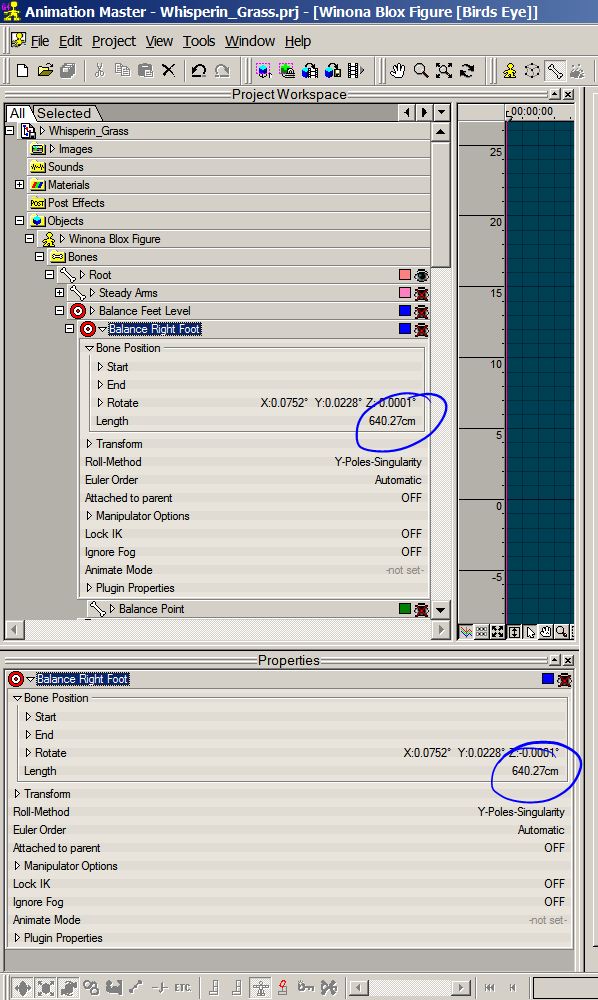
Ah-ha... The model bone is also absurdly long. Fix its length property in the properties for the model.
-
Sometimes a bone gets set to an absurd length. I'm not sure why. Select the bone (or Null) in the model (not in the Action) and change its "length" property to something more normal. If you have the show-properties triangle enabled you can see this property in the PWS, otherwise you can see it in the Properties Window.
-
AM Compatable Wrinkled Cloth Map Tutorial?
robcat2075 replied to UNGLAUBLICHUSA's topic in A:M Tutorials & Demos
Any finds on this one yet? -
Help - installed TSM2 but its not listed in plugins
robcat2075 replied to Roger's topic in TSM2 - Rig
And when you run the installer, make sure its install path really is to the (x86) folder. -
Help - installed TSM2 but its not listed in plugins
robcat2075 replied to Roger's topic in TSM2 - Rig
download it http://www.hash.com/forums/index.php?showtopic=40637