KenH
-
Posts
13,816 -
Joined
-
Last visited
-
Days Won
1
Content Type
Profiles
Forums
Events
Everything posted by KenH
-
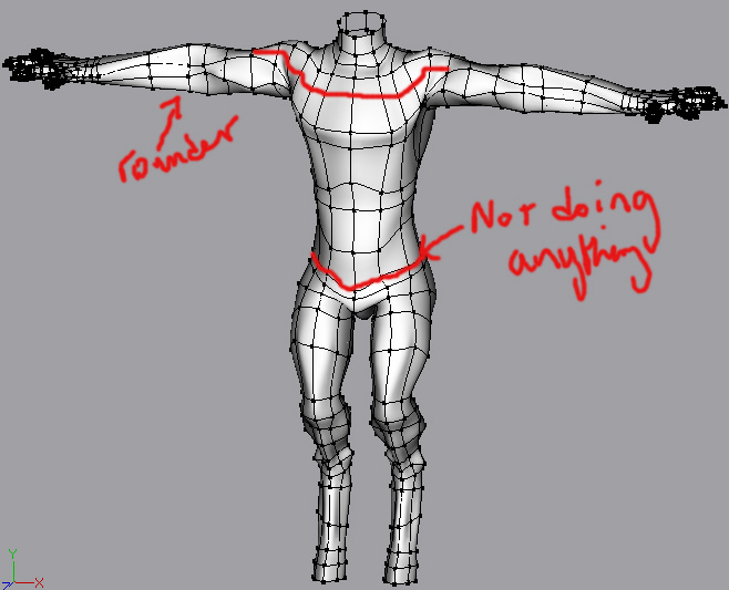
Not a bad start. The arms need abit more work on them. The spline round the waist doesn't seem to be doing anything right now...maybe it could be brought up abit? Don't forget to look at the cd characters for reference.

-
1) http://www.hash.com/forums/index.php?showtopic=16884&hl= Also check the thread on the second page link in that thread. 2) I think the minimum is about 5x5 passes. (Don't sue me if I'm wrong!!!) 3) Don't know.
-
If you look at the second last frame you'll see the wireframes of the two are different. The one on the left is correct. Do a final render and you'll see creasing on the right and animation will create further creasing.
-
Good idea for a tutorial, but it's not the right way to do it. right hand side patches still has a problem patch in it. You've just placed a non continuous spline in there to get rid of the crease. That's baad. To correct it, you should break the splines and re-make them.
-
That's real nice. Very imaginative. Crits...em...maybe a more saturated sky? Is that a burnt out car in the middle ground?
-
I think there is, but you can get the idea....I'll correct it if I get a chance.
-
This tutorial describes how to fade from one image to another on the surface of a model. 450kb. Image_transition.zip
-
Thanks Stian. He's coming on. Still a few lumps which will be "ironed out" with time. I'd like to see the base of the ears abit thinner so that they have a taper to them.
-
You don't have a brown texture like the blue one do you?
-
That's a gorgeous eye. It's a shame you can't change the colour. A character needs great eyes to being it alive....though this eye is abit human for a dragon. Real eyes have a similar reflective coating round them. This is probably abit exaggerated though.
-
Normally you don't need so many splines in the eyeball. Also it's not necessary for the back of the eye to have "flesh" behind it. Just flesh around the front of it. Look at the cd characters for a clearer idea.
-
Good start. Yes it's probably too wide and flat. Also you're right about the snout.....only abit too long though. But then there are lots of styles of dragons.
-
Ooo...snazzy. Good to see you're making money with AM...and enjoying it.
-
You worked on all those movies?!? Very cool.
-
Welcome back! Very nice modeling. Those hips look like they're to die for! The close up on the hair looks abit strange to me too. Maybe it's the lump head....it looks like a decal.
-
The abyss creatures are alive and well! Nice find. Just a note...because of the angle, it seems it's bending away from the camera. A side view would rectify that.
-
Good to see you're back on track. And nice model!
-
Excellent. I particularly like the ear design. I would suggest adding a decal to mark the boundary of the beard though.
-
Absolutely stunning! I feel like getting out the footy ball and having a kick around now.
-
That's a great idea. It'll be a cool reference once it's done too. Don't forget to search the forum as you learn. There's lots of information packed in here too.
-
Press PageDown and it should right itself. It's a realtime issue. Video drivers?
-
I just saw this in AM:Stills. Wow! Imagine getting that for the city! http://www.hash.com/stills/displayimage.php?album=1&pos=-123
-
Yeah, actually, how is the water and sky done in that? Looks great.
-
Here's where you can download the model: http://www.hash.com/forums/index.php?showtopic=16762&hl=
-
Pretty damn good. Looking forward to the windows!