KenH
-
Posts
13,816 -
Joined
-
Last visited
-
Days Won
1
Content Type
Profiles
Forums
Events
Everything posted by KenH
-
Looking good. You may have trouble around the corner of the mouth when animating. I'd advise you take a look at Colins tutorial and see how he's laid out the splines. Or some of the models on the cd. Keep at it! PS Right at the side of the head, you have some dead end splines making up a 4 point patch. I would continue them through to meet each other. Unless they're going to be covered by hair....maybe so.
-
transparent prop (continued from A:M forum)
KenH replied to guilded's topic in Work In Progress / Sweatbox
It sure is transparent.....it's not included in the project file. You have to embed the models. Don't know if it works for props though. This will make the project file 7mb in size. -
Too minimalistic. I would have put in more stuff. But I appreciate you were on a time limit. Shaggys voice got on my nerves after a while. Maybe altering the pitch abit might have helped. I wonder whose voice it is? The traffic light layout seems to be fairly random. ie three traffice lights on one junction. The guy looking for a better signal's hand goes through the ground when he lands after being hit by Shaggys car. Wrist twisting. That's as harsh as I can be I swear!
-
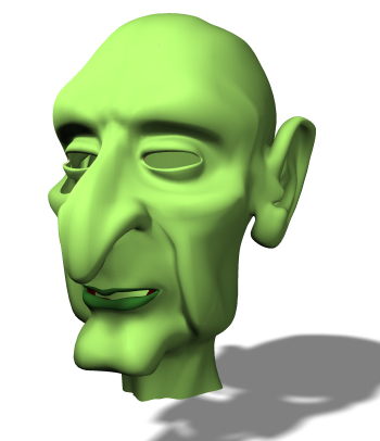
Nicely done. The ear is a good job too. It seems like the hole needs to be brought back...or something.
-
Short Film in Production: Ballet Pour Ma Fille
KenH replied to Dearmad's topic in Work In Progress / Sweatbox
Definitely improved. When I look at it still though, I think to myself.....Why didn't he see the little girl? She's right there in his line of sight! Is he shortsighted? A possible solution might be her coming out from behind something...maybe a "trashcan" as you yanks call it. -
Short Film in Production: Ballet Pour Ma Fille
KenH replied to Dearmad's topic in Work In Progress / Sweatbox
What about a double take?..... Looks at the marble Looks from where it came Looks straight ahead Then quickly registers the girl and looks back at her. I too noticed the plants swaying in the wind. I love those little details. I also agree with the path crack comment. -
I'd like to help in this project (where time permits...can't guarrantee alot). And I'd be prepared to donate this character if you want him. Maybe for the school bus driver... http://www.hash.com/forums/index.php?showt...aricature&st=30
-
I really love his hair. Round his muzzle seems to be different though. IMO it would be nicer if it looked like the rest of his body. How many emitters are in that material?
-
Kevin: The toes are much better. Still a tiny bit at the base of the little toe but not much. Edit: How did Martin sneak a post in there? I didn't see his name. I'm starting to think he's in stealth mode.
-
I'm not sure I understand what you're adding there....."face count"? You still have to do the exporting to AVA first still right?
-
Well applied. I would suggest though that those specific wrinkle areas are fairly easily done by modeling the natural splineage flow. This method would be more ideal (IMO!) for the crow's feet area at the side of the eyes.
-
Nice start! I'd advise that you make complete seperate spline rings to create the hole for the headlights.
-
Short Film in Production: Ballet Pour Ma Fille
KenH replied to Dearmad's topic in Work In Progress / Sweatbox
Take pleasure in the fact that this difficult bit will make all the other bits left feel so much easier to animate. Maybe this is the year of the end! Looking forward to it. -
Just another small point: His finger and toe nails are very different. But there might be a reason. Nice mesh. Can't wait for the short!
-
Kewl! I'm not sure I like the stubble on the skin areas. I think having long hairs come over the side would be better. I have to know....is he a modified chewie? If not, you have an individual style. PS Rounder toes would be good too. PPS How is that background done?
-
Thanks for the nice comments guys. And Paul, the top isn't as high as you might think. I decided to continue the witch (albeit slowly). Here's her latest incarnation. I don't know....she might be abit traditional evil looking.....

-
No way that's your first! It's just how it should be....this should be printed in the manual! No crits...love the crease at the side of the nose. Looking forward to your future work.
-
Good point Jam. I don't know if they have weight or not.... Here's a quick morphing of another character into the witch. It's inspired by a sketch by Alain in the fellows area. If there's any interest, I'll develop her more.
-
Feature Length Screenplay for review.
KenH replied to jpiazzo's topic in Work In Progress / Sweatbox
I only skimmed through it. But what I saw seemed good. -
Hmmm you know, you might be right. Ah well, it'll do for now.
-
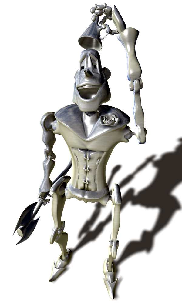
Yes, simple ears are the way to go I believe. I'll stop hounding you now. Nice environment there. Is that a bell at the back of this hat?
-
And just for completeness, here's a final render of tinman:
-
Uh-oh. Now I see his ears. But no...his nose looks fine from that angle.
-
Yes, I figured he was spline lite. If you're doing more stuff with him I'd like to see it. I don't know if your stopping posting will make anyone else contribute if they're not going to already. I'm stopping doing my characters because I've brought them up to the point I wanted for the contest.
-
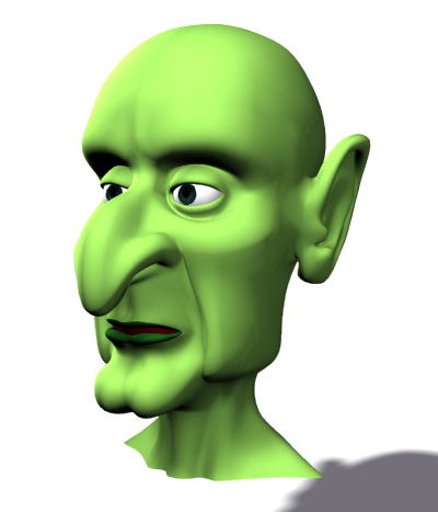
I just noticed now.....the sides of his nose seems quite wide and undefined. I think a cute little button nose might do wonders for him.