-
Posts
5,112 -
Joined
-
Last visited
Content Type
Profiles
Forums
Events
Everything posted by Paul Forwood
-
Lots of bones but not too many keys. Looks great, Serg!
-
Very promising! I love the colour variation in the hair. The video that you posted causes me some problems on my laptop. It wouldn't scale or play properly and then I had trouble closing QT. Strange!
-
Well done on all of these macabre meanderings, these nursery crimes! I liked the art direction, style choices and thought that the sound was very good too. The narration and pace were excellent. Congratulations!
-
Looks great, Will. I haven't seen anyone do a convincing heat haze yet but that would be cool...or hot, rather.
-
Woohoo! Another one for the collection and still improving. Great work, guys!
-
Ha ha! Grim but amusing.
-
Well done! Very good promotional piece. The game looks very tame by comparison.
-
Grim. It must be getting close to Halloween.
-
Looks like the genuine article. Reporter or sleuth?
-
Terrific! Very nice render and well done on the pin-stripes.
-
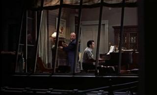
As far as I can see there is no clear direction on this project at all, yet. I think Mark is just asking for suggestions and complying with requests regarding further modifications of the set. Personally I think that allowing events to take place at any time of the day or night is just complicating things for no logical reason. I would lock it down to just day and night. Here is the penthouse suite that you asked about. In Hitchcock's Rear Window it is the home/studio of the pianist who is struggling to write a piece of music:
-
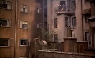
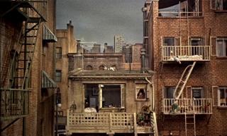
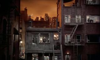
More nice work, Mark! A few shots that may answer your questions, Nancy: This shows the balcony on the building to the right. A comparison of Hitchcock's day and night lighting. Yes the windows could use some dressing such as curtains, blinds and nick-nacks.
-
That should be enough. It will certainly help. If you like the results you should do the same for all the joints. After that you can tweak more if it needs it.
-
Nice models! It looks like you could weight the central spline, at the elbow, to 50% upper arm and 50% lower arm to ease that distortion.
-
Just a dynamic constraint on a chain of bones.
-
Ha ha! Very good! I do like a bit of spontanious creative banter. Just getting his old bones oiled and moving. Working on the weighting at the moment. There is no real narrative in there, except what your imagination conjures up.
-
That's great, Gene! Congratulations!
-
AMD Athlon II X2P340 ATI Mobility Radeon HD 4250 4 GB DDR3 RAM A:M 16.0b (32 bit) 8:47
-
That looks stunning, Mark!
-
-
I prefer this comic book layout to previous versions, Mark. The artwork looks very good and story flows much better in this format. Very professional all around.
-
Looking great!
-
All of these interiors are superb! I look forward to that.
-
Very nice indeed, Mark! Of course the building in which the camera, and James Stewart, are situated should be casting a shadow too. Just some simple geometry to cast the shadow would be enough. How were render times?


