-
Posts
2,728 -
Joined
-
Last visited
-
Days Won
4
Content Type
Profiles
Forums
Events
Everything posted by Zaryin
-
Everybody did awesome! Congrats to the winners!
-
Just looking at the contest entries has inspired me to start making something again. I say leave it the way it is -- if my vote can be taken seriously .
-
Ugh! That was definately not an easy choice. Congrats on all those entries. Every one of them is fantastic.
-
Thanks alot, guys. I really haven't had time to do anything lately, but I still do a good job of lurking . Thanks again for the best wishes.
-
The Passing of a Titan (Paul Forwood)
Zaryin replied to Paul Forwood's topic in General Announcements
I'm so very sorry to read about this. God bless your family, and let them know that we're all thinking of them. -
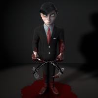
Haha, thanks Gerald. I've finished the floor, but for some reason it's affected my bloodpool reflection so it won't reflect the bricks anymore. Not that big a deal to me though, just wish I knew why. I also changed the wall a bit and Photoshoped the shadow again. What kind of crud and garbage could I add to my alley? I don't want too much stuff, but it's looking a little plain right now. I know the character is primary, but still -- Thanks for looking everyone.
-
Yeah that's pretty awesome. If you add more turbulance and change the opacity, maybe add some reflection, you might have a good "mirage" effect going there.
-

IBL HDR environment map projection map Tutorial
Zaryin replied to jason1025's topic in A:M Tutorials & Demos
Must...have...next...tutorial!!! -
Thanks for the comments again . Ah, ok, I see what you're talking about. That's just the red of my eye decal which I just thought I needed to have peaking out a little. I originally had it hidden so the eye was more white. John: Yeah, I don't know if it's good or bad that the blood is turning out so good, haha. Here's a new one with what I have of the back wall so far. I didn't alter the shadow at all in this one.
-
That is freakin beautiful. I wish I had this kind of patience.
-
Portal rocks! And so does this thread.
-
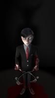
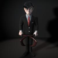
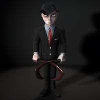
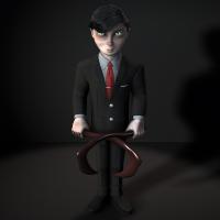
Wow, thanks alot for all the replies! I don't really have any idea how long I've been working on this guy. I also don't think I'll be making a tutorial. I just simply suck at it. I've tried a few times, and each time it turns into a horror show. I might give this scene away when I'm done though. This character, and this scene, were made just to be viewed from this angle. From any other angle he looks crazy bad . I am also horrible at rigging and animation. So I will never animate him, but if I do give the scene away you can give it a try. I really don't know what fold you are talking about Nancy, but thanks for the crit. I probably won't change much about his appearance if it would require remodeling. Once again, thanks alot for the comments. Here is a new version of the camera and lighting setups. I think I went a little overboard in Photoshop by adding such large horns, but I think the main idea is getting across. THis will most probably be my setup for the final image when I finish creating the backdrop. I'm thinking about an allyway for the final scene...
-
Thanks for the comment Paul. I was thinking somewhere a little more spooky, but that might be something I go with. I still haven't decided what I want to do. I've gone and ruined a perfectly good suit by bloodying it up.
-

IBL HDR environment map projection map Tutorial
Zaryin replied to jason1025's topic in A:M Tutorials & Demos
Just watched the videos. Very informative. I never even thought about the -100 because you're inside the sphere. -
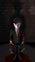
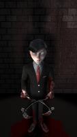
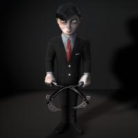
Here he is with the most probably finished kamas. I now have to work on a background for the image and can't decide what type of room I should set him in. ANy advice is apreciated.
-
I'm really loving the character styles. Nice one!
-
Thanks Robert. I'm making him in 14c I think. I don't have the newest version of A:M, but am definately gettting v17 when that comes out. I will not be animating him. He only looks good from this angle, haha. Thanks for the comments. I'm starting on the kamas now.
-
Not much of an update, but I thought I'd post anyway since it's been awhile. I changed the position of the tie clip per Nancy's suggestion. Also added a secondary stripe to the shirt. I havee rendered at larger res as well. Thanks for looking.
-
Well here he is fully textured. I might still tweak a few things, but this is about as good as I can get it. Next up will be building the kamas (the weapons in his hands)
-
Thanks alot everyone! Mark, I have tried that. It just isn't showing up for me. I'm using 14c. I don't know if that makes a difference. I would love to at least get transparency to work, but I can live without the image hair for this. I kind of like the hair as it is right now. Thanks again.
-
I think the bump map might be a little too heavy, but these are the colors I will be going with I think.
-
I love the character style of that girl. The SSS looks a little heavy to me though.
-
Oh, I thought I posted on this one before now. I love it.
-
Who doesn't love a gunblade! Nice!
-
I forgot what it's called, but would upping the reflection levels in the render settings do anything?


