-
Posts
2,728 -
Joined
-
Last visited
-
Days Won
4
Content Type
Profiles
Forums
Events
Everything posted by Zaryin
-
Hey David, I tried combining them, but couldn't get it to work. I guess I will wait until the final image to see how will final render it . Jason, thanks alot. It really means something to hear that. Since my tries at tutorials went awry, I will look at my models and see what I can do. Some of my models were never finished (alien). Others, only good from one angle (little connor). Others are available now -- I think. My Oz models and J.D. Model. I also had a whole collection of them I donated to the cd, but they got lost in the shuffle and never made it. I also lost alot of my stuff when my old pc went down. I'll take a look and see what I can do though.
-
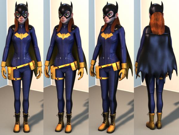
So I can't decide which type of rendering I like better the last one, or this new one. With the new one I did what I did with my Spider-man by rendering different layers and putting them together in Photoshop. This way I get more control over certain thing, but I lose things as well, such as SSS and the hair is a little sharper. I can kinda fake the SSS though. Let me know which one you like better because it will affect my final render. Thanks.
-
To be honest, I did animate the Scarecrow for two scenes. Yeah, um -- sorry about that, haha. I'm using my ipad to reply, so will have to watch to mov fil later. You would think a mov file would work on an ipad *sigh* Thanks for the advice, guys. I will definately keep the Wip going until final image.
-
That's why I love posting in the WIPs forum. I like showing that there is no "make dragon" button. It takes work to get good and to add detail to models. The same goes for every other portion of the animation process.
-
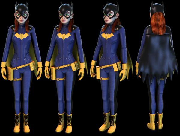
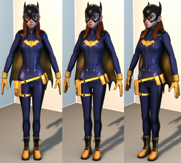
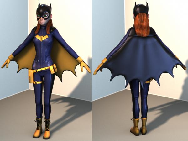
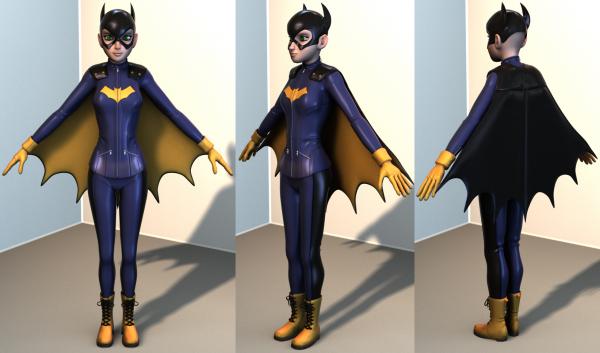
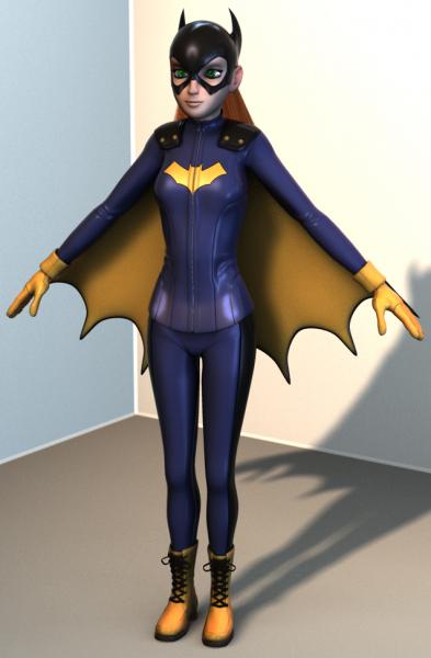
Well, here is the fully textured version of Batgirl. I have decided to keep the texture fairly simple to keep with her comic book beginnings. I am pretty much done with her until I get some advice on what rig I should try to use. Anyone think I should add some earrings? Thanks again for looking. I'll have to start think of a scene, or pose, or both for her.
-
I have no creases built into the cape. Maybe when I get it fully rigged it will hang better...? I don't really want to rebuild the entire cape to get them though .
-
That's looking pretty good so far to me.
-
How big would you have to have it made to get rid of the imperfections?
-
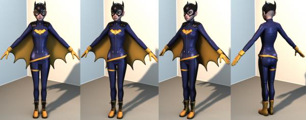
Ok, I know I post too much, but I thought I would really quickly put her arms down and relax the cape just to see what it would look like. It's not perfect, but it gives an idea of what she might look like when fully rigged.
-
Here is quote I just gave from the "Phillies Diner" WIP topic: "Sub Surface Scattering. It would be in "Group"/Surface/Subsurface Scattering. Turn it "On". I set my Levels to Red: 6, Green: 4, Blue: 2, Relative Density: 100%. In the chor when I render, I just make sure I have a strong reddish light set behind the model to really show off the SSS. I also like to add a 1 to 4% reflectivity on my skin group depending on the setup (that I got from Noah Brewer). Hope some of that helped . (Note: this is all done in v14)" There ya go.
-
Nancy, those renders are beautiful!
-
Thanks alot for the comments, guys. Hey Mark, I actually went the other way and enlarged the chin. I also thinned the entire skull. I think I am going to leave it here with her head . Matt, I'm glad you asked that. I have no idea what to do now. The last time I fully rigged a character was when TSM 2.0 came out -- so that'll tell you something, haha. Any suggestion would be appreciated. pic of final head below (although you never know, haha ...)
-
Thanks for the replies, guys. I seriously appreciate them. Well, with all the talk of her not looking old enough, I took a good look at her and realized it's not where I wanted it. I reshaped the face to make her look a little more like the artwork I was using as a base. So, although it isn't perfect, I think the face looks better.
-
Haha, Thanks for the comments, guys. Matt, the hair is actually three separate hair emitters. Two smaller ones on the side-back, which I comb towards the front. The larger one is all the back. I don't know how this world work for animation, but for stills I think I can get it to work. I got some responses from friends of mine that when looking at a close-up of her face she was looking way younger than I wanted (13 to 14), instead of 16 to 17. I'm horrible with telling peoples ages, so I took their word for it. I darkened both the lip color and the eye shadow. I sharpened the jaw and hollowed the cheeks enough to get rid of the "baby fat" look. I think it looks better now, and I think I will let it go at that. I also thought I would post this so you can see the hair from different angles. Thanks again.
-
I love this guy. He reminds me of those little pewter figures I would buy back in the day for D & D.
-
Here's the Hair and the Facial Texture so far. Should I add textures to everything else, or should I leave it clean?
-
I'm really liking this so far. I myself would like the wings a little larger to look more menacing.
-
Here's the finished Utility Belt. My lighting setup is making the lids of those smaller boxes shine some . Should I be leaving this "clean", or should I make texture maps for all of it? I'll be starting on the hair next and then onto a facial texture.
-
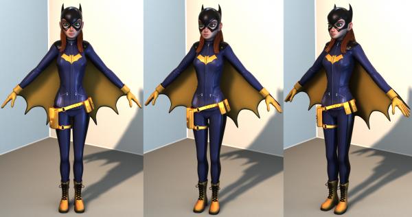
Thanks alot, Douglas. Once again, you are right, Rodney. I still want to keep some of the curve and pointiness of what I originally had, but I did want it to look a little more like the references. With the face; I tweaked her lip shape and added color to bring them out more until I add a face decal. I also brought the eye sockets forward. I had them positioned according to the side ref I had, but that doesn't transition well in three dimensions. I also made the eyelets on the boots a light metal color like the zippers to bring them out and add more dimension to the shoe laces. I also have the start of the utility belt in this version. Thanks again for the comments.
-
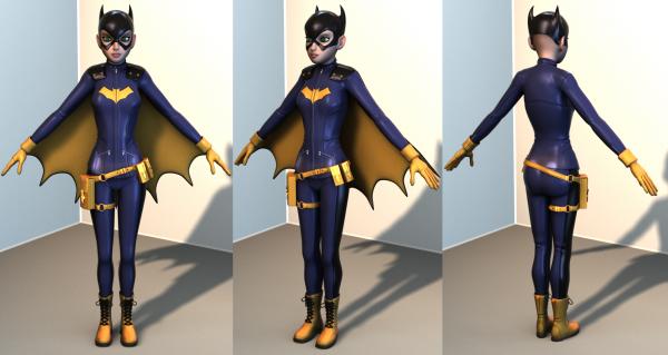
Thanks again for the help with the hands, Rodney. They still don't look perfect, but they're a whole lot better than they were. I will probably still be tweaking this, but I think the costume is all modeled. Now onto the utility belt .
-
That is pretty freaky, haha. I don't know a lot about animation, but the dancing looks pretty good to me. The arms seen a little stiff though.
-
Thanks for the comments. Rodney, you are right. Hands are hard, haha. I'll see what I can do. John, thanks for those reference shots. Besides hands, posing is the worst for me .
-
-
TAAAAAAAAAAAAAAAAAAAAAAR!!!! Congratulations on getting this out there, Will. When I fist saw the 3d model of Tar those many years ago it was a real inspiration to me. If it wasn't for guys like you, I wouldn't still be trying to make things myself. Hopefully, one day, I can come up with an original idea that I can make something of, and share with everyone. I love Tar. Congrats again.
-
Yeah, I'm definately liking these wings better.


