-
Posts
2,728 -
Joined
-
Last visited
-
Days Won
4
Content Type
Profiles
Forums
Events
Everything posted by Zaryin
-
I think it looks good. I agree, how are you going to fill the stands?
-
Thanks Ross, I posted a finished version in the Showcase Forum.
-
I think where you have the borw connected needs a little reworking. I would just connect them across from each other. I like what i can see of the spline layout otherwise. The face looks like it will be a little flat from the side.
-

Have attached arm and hand, let me know what you think...
Zaryin replied to Roger's topic in Work In Progress / Sweatbox
I think the modeling of the foot is pretty good. With the back of the foot I would remodel that. I would take the back cps of the ankle and extrude them down two times (maybe three) to the heel. Then attach the extruded part back to the rest of the foot. The rest is just some smoothing that needs to be done. Nice job so far. -
Thanks alot for the crits, Jim! I don't know if I said this before, but it was seeing images made by you that first got me to buy A:M -- along with the awesome features at the unbeatable price, haha.
-
Thanks alot, everyone. I don't know what it is about Spider-Man, but I can guarantee I'll be remaking him in another year or so, haha. Martin, I've been singing the praises of A:M Composite ever since I saw Patrick's Superman thread and decided to render out a finished image of my Spider-Man. I decided to try A:M Composite again even though I couldn't get it to work the first time. Little did I realize how easy it was to use. I just have to do some reading on all the different Post Effects and how all the differnet layers can work, but it makes the image jump from using it. Added Bloom to just the spec layer and a totally different Bloom to everything else. And I added a Tint to just my Costume Gradient layer. Come on, that's cool! Thanks again
-
Wow, the batmobile is really coming along. I think I might re-read this entire thread and learn a little more about mechanical modeling.
-
Thanks alot, Conner. In case you didn't see it, I finished this image and posted in the Showcase Forum, here: http://www.hash.com/forums/index.php?showtopic=23152 I ended up doing it all within A:M using A:M Composite. Thanks again.
-
Reminds me of the first centaur I made: http://www.hash.com/imagecontest/July04/20.jpg Great job so far. I would work on the front view a little though. The legs are sticking out way too far.
-
I remember when you posted the first one. I like that one, can't wait to see it "New and Improved". It's going to be great.
-
Thanks, Mike. I was having fun with A:M Composite on this one. I wish I had more RAM though, it eats like chocolate .
-
Good looking stuff so far. I agree with Ken's comments, but still great characters and I love that building so far.
-
I don't even like to comment on this thread anymore because all I say is stuff like "Wow!" and "Beautiful!". It's sickening . Great work.
-
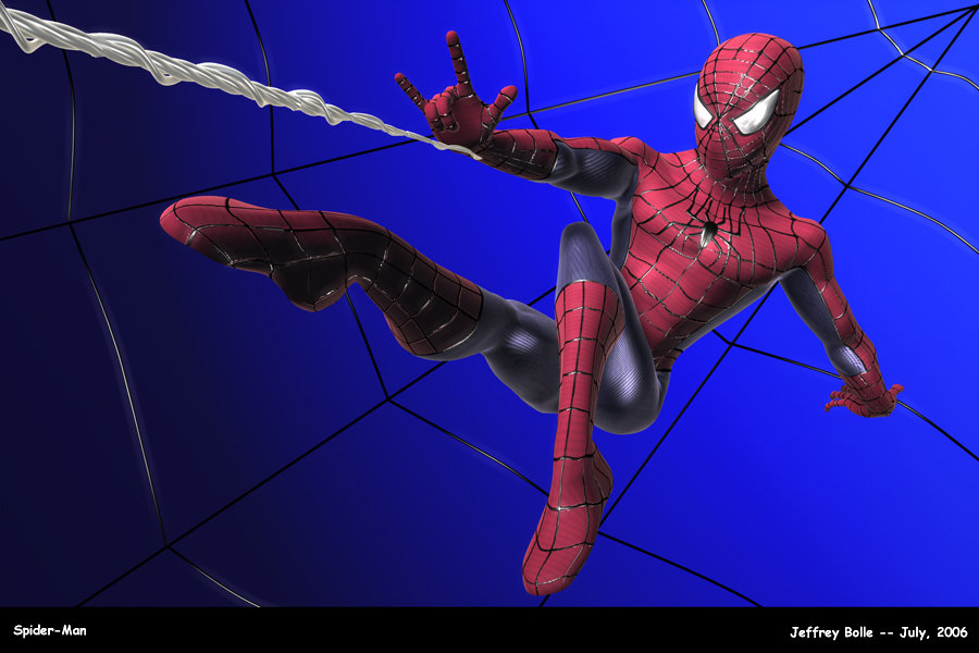
Ok, this is as far as I am going iwth this one, haha. You know what they say when a picture is never finished, so I am just going to leave it like this. I got it alot closer to the pose from the ref that Patrick supplied in my WIP thread. I think I could keep going with this, but I'm pretty happy with now. I also updated the first post with the new pic and a new link to A:M Stills for the new one. Thanks again everyone. I hope you like it. Jeff B.
-
Thanks alot guys. I already tweaked the pose and am working on re-rendering it. Should be posting an update sometime today. The hips look narrow because of the focal length of the camera. I do like that look though, so I guess it's just personal preference on that one. Thanks again.
-
Have you tried screing around with the skin shader yet. I use it on one of my guys and it looks pretty good (can't post a pic of it because I'm using it in the Image Contest). I love the back of the neck, haha! Seriously though, it's looking great to me.
-
Trajce: Thanks alot for the comments. Yeah, I'll just have to "force" the pose by cp tweaking. The background gradient is like that because of the direction of the light. I figure it would be lighter there. It doesn't really feel heavy to me, though I understand what you're saying. I do agree that he is probably a little too centered. I think I'll move him more to the right of the pic (his left). Thanks. Patrick: Thanks alot for the comments about my render. It's nice to know that I'm improving in at least one area, ha. Yes I did use AO. I also tweaked it all in A:M Composite. It is actually really nice. I haven't even sctratched the surface and it gave me good results. I also rendered at 1.1 gamma. I think next time I'll go with 2.2 and see how that looks. I did do some deforming of him in modeling mode of the chor. I and I am also using a camera lens at 25 focal. The web is all geometry with a high spec and a gradient for the edges. Made of tubes that I wrapped around by hand because my math sucks and I didn't know how to do it in duplicator or extrude wizard, haha. And thanks for posting that picture in my WIP thread. Thanks again
-
No problem, Jim. In fact, I'm glad for the crit. I will probably end up tweaking the pose now and posting a better image -- hopefully . And that's thanks to you and the others here. I was planning on making it final, but what the hey, hey. It always helps to here from others. I wouldn't have gotten as good at modeling as I am now without the great crits from others. Thanks again, everybody.
-
I think the underwater part should be a frameor two longer. It's too sharp right now. I also didn't see any water ripple in this one. That is simply fantastic work. Love this new one
-
I liked it, haha. That's about it. I didn't see anything wrong with the "almost POV" camera move.
-
I think the emblem is looking great. I agree that there's some weird stuff going on with the face here. It just doesn't look "smooth" enough. I love this WIP, Patrick.
-
Thanks everyone! Yeah, I knew the pose could use some work (always have trouble with posing). I still think it looks alright, but I could have exaggerated that twist alot more. I still kinda like the legs, but if I followed the silohuette rule -- it needs some work, haha. Maybe I'll rework the pose at some other time in the future. The pose is based off of an image that Patrick posted in my WIP Thread here: http://www.hash.com/forums/index.php?s=&am...st&p=170708 As you can see, his silohuette is alot better. I will see if I can get it closer to this in the future. It's just that my spidey isn't as flexible. I made the costume webbing with 4 point lathed tubes which I placed over a roto of my flattened model. I could then apply the Normal Mat to get the Normal output. In Photoshop I just flipped my color of the webbing to make the webbing white and the background black for my specular map. The movie version does not have webbing on the palms. Thanks again everyone.
-
Well, I finally decided to finish this image. I didn't have any time so I made a simple background. Everything was made, rendered, and composited (A:M Composite) in A:M. Except for the blue gradient background, text, and some very minor paint fixes on parts of the constume webbing. I don't really know how to use Composite very well, but I'm fairly happy with my results. Bloom to the spec layer. Another Bloom to the rest. Tinted my ambient gradient. And some other stuff. I probably could have spent a little more time on the pose, but I decided enough was enough and just wanted to get it finished. I also posted this in the Showcase forum, here: http://www.hash.com/stills/displayimage.ph...cat=0&pos=1 If anyone feels like looking there. So now in another year I should be making him again, haha. Thanks for looking! EDIT: I removed the older pic because it seems people were looknig at that one, but not the new one.
-
That looks just like the one my friend used to owm . Great job.
-
It's looking pretty cool so far Patrick. I can't wait to see it after all the tweaking. Martin. I might give my SPider-amn to the DVD, but I haven't decided on that yet. I might want to finish my image with the new one before I give him away. Thanks for remembering me though.


