-
Posts
1,410 -
Joined
-
Last visited
Content Type
Profiles
Forums
Events
Everything posted by MattWBradbury
-
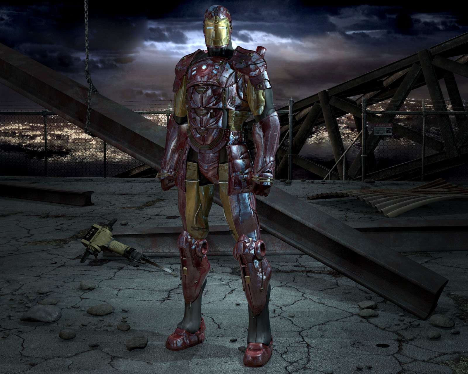
Now that's looking much nicer. You might want to also round the hands and feet a little though; they look somewhat mechanical at the moment.
-
As far as post, I would suggest darkening the areas around the character to create more of a contrast between the environment and the Iron Man. What I did was create basically an egg shaped gradient which which was applied under a multiply filter. I then lightened up some of the city lights using an overlay. The ending result puts much more emphasis on the character. The ground before was taking a lot of the attention away from the center. The background X shape works really well. I don't know if that was intentional or not, but it's a good feature in the composition. Here's the post I came up with: If you have tabbed browsing, you can easily open both images and switch between them quickly to see the changes. A lot of the changes totally depend on the mood you were going after, and since it is your piece of art, you should make the final decision.
-
I see I was trying too hard then; that or maybe the ghost model is preventing the kind of effect I was getting.
-
There are several problems I see with your rendering, like if you look at foot it's all... just kidding. Nice work.
-
Is the ghost transparent? I've tried using a gradient to get kind of an etherial look to transparent objects (to get ghost like effects), but every time, I could clearly see the splines behind the other surfaces. Can I ask how you got that effect?
-
You might want to try out the Keekat shader. It'll give you the feeling of hair without the intense rendering times.
-

Bioshock Big Daddy project
MattWBradbury replied to Teh_Demon's topic in Work In Progress / Sweatbox
It's a really freaky game. I suggest getting a nice video card, because it really adds to the immersion. The game itself is probably one of the most interatctive FPSs I have every played. -
I wouldn't suggest not texturing. It adds a lot of personality; you can't get the same feeling with attributes. The only other way would to use a material, but those can be very costly on rendering time to get the same effect.
-
Since the texturing on the suit is mostly materials, you could probably get away with using bitmap plus.
-
That looks great! Though shouldn't he have no expression at the moment? He looks like he's smiling.
-
For the sky color, find a picture of a sky you'd like your ship to be in, and use that color. The Hue 215 palette is a good choice for skys. You can try RGB(135, 180, 238). For the sun, try RGB(245, 238, 202). You'll have to adjust the Intensity on the sun light. The width of the light will also affect how realistic your ship looks. It's a big object, and might generate a softer shadow than a model of the same thing. The settings for this should be Ambient Intensity 100%, and Ambient Occlusion 80%. You can create multiple exposures like you would an HDR image, process them together, and then tone map it so you can make a brighter sun.
-
I agree with Dhar. We should join Stian's armada, lest we suffer his evil wrath. Looks like AO to me Eric. Stain, try using 80% Occlusion. It brings out more details in darker areas without over exposing light areas. Have you tried using the blue Global Color and yellow sun? It seems to make models more believable.
-

A Character without a name...
MattWBradbury replied to Kelley's topic in Work In Progress / Sweatbox
That guy's got some really wonky facial hair. Are you using maps, or did you apply it to patches? -
Try this:
-
-

A Character without a name...
MattWBradbury replied to Kelley's topic in Work In Progress / Sweatbox
Patti O'Brian? -

First time posting -- maybe
MattWBradbury replied to JadeEternity's topic in Work In Progress / Sweatbox
I don't think you'd violate the copywright, but it's a sticky subject. There's a lot of talk about it here on the forum. Several of our members are quite savy when it comes to those laws. You can check around the forum and see what issues other users have come up against. Nice work so far. -
Good luck modeling, and may the force be with you.
-
Very cool, he looks like he is positively pissed off. Must be the eye lids and no smile.
-

White renders and sun light
MattWBradbury replied to Eric2575's topic in Work In Progress / Sweatbox
-

did a quick test of radiosity with a flare
MattWBradbury replied to johnl3d's topic in Work In Progress / Sweatbox
What are the settings for your photon mapping variables? -

Bitmap plus and Normal Maps
MattWBradbury replied to Eric2575's topic in Work In Progress / Sweatbox
To put it simply, Bitmap Plus makes texturing a breeze. If you had to make an entire cave covered in the rock texture, it could take several days. With Bitmap Plus, you can drag and drop and you're done. -
Nancy's words bring cows to mind. Is it just my eyes, or is back right part of the hat pink?
-

Warp drive matter collector animation
MattWBradbury replied to Eric2575's topic in Work In Progress / Sweatbox
Create an animated decal of a moving material. Set that as your ambiance map for the bulb, and then turn on glow for the bulb surface. The Glow should appear where the surface is brightest, so it will give it a bit of dimension. You can adjust the glow settings in the Choreography so you get the best results. Look at many different materials. Just make sure to make your material repeating or you'll have visible transitions. -
Those lady bugs are HUGE! Or that's just a really small flower. Might want to rethink the scale.


