-
Posts
2,533 -
Joined
-
Last visited
-
Days Won
65
Content Type
Profiles
Forums
Events
Everything posted by Shelton
-
Paul Excellent study here. I would be interested in a tutorial as well Steve
-

Hiar for tree foilage, bushes, etc?
Shelton replied to Kelley's topic in Work In Progress / Sweatbox
Very nice!! Steve -
Did someone make a pdf file of this thread? Steve
-
360 of hero messing with colors Steve eleventh.mov
-
With this new character I wanted to have him in street clothes and then i the superhero outfit. Has any one done a pose slider to transform clothing from one state to another? Steve
-
Starting to put some color and looking at skin color One thing I have noticed v 14 beta 5, is that everywhere I have a hook the rendered patches are black at the corners. Has anyone else noticed this or have I modeled something wrong? The normals are facing correctly. Steve
-
Matt Here you go. Got the ears on and ready to start inner mouth and then to rig. I will work with cloth as well Steve
-
Rusty I thought the arm look a little off. So I pulled and rounded out the forearm that is all. Good catch. Steve
-
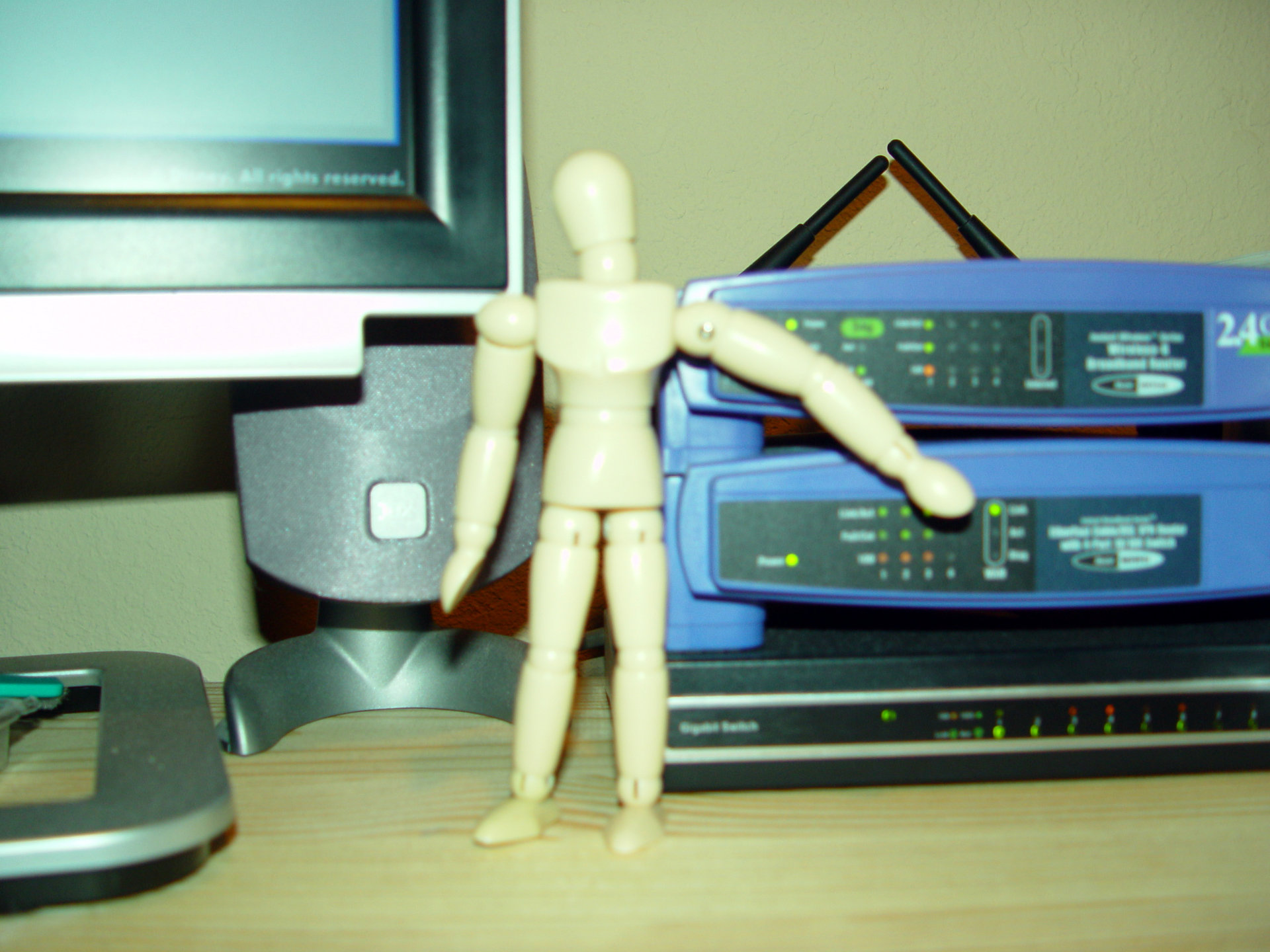
Rusty I will send you a picture when I get home. Yes the arms are shorter, but for you I have lengthen the arms. The reason they appeared shorter was the forearm was rounded closer to the elbow. So after pulling the thickness out the arms look more into porportions. I got him at the local art supply store. Micheals or Hobby Lobby or national chain should have one. Steve
-
Rusty I still have my art book that I dig out to see porportions and of course I have my ever faithful drawing man. Steve
-
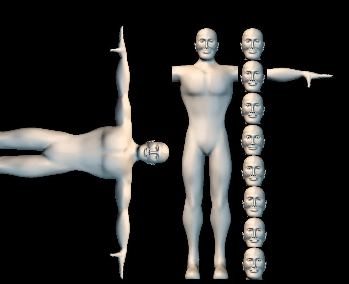
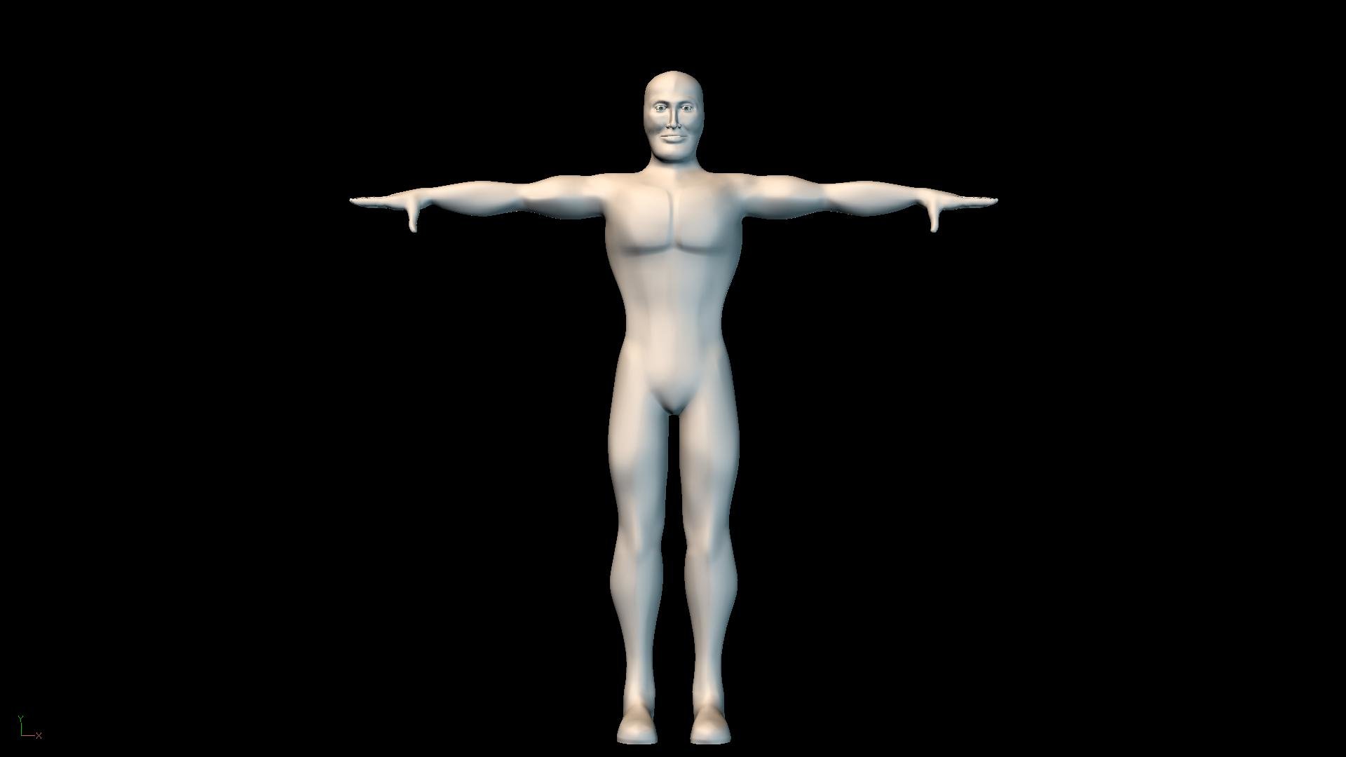
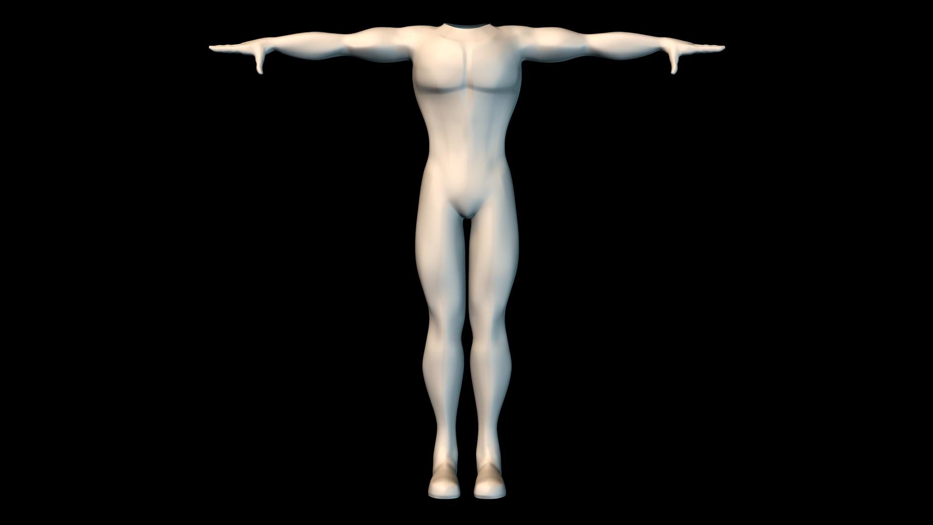
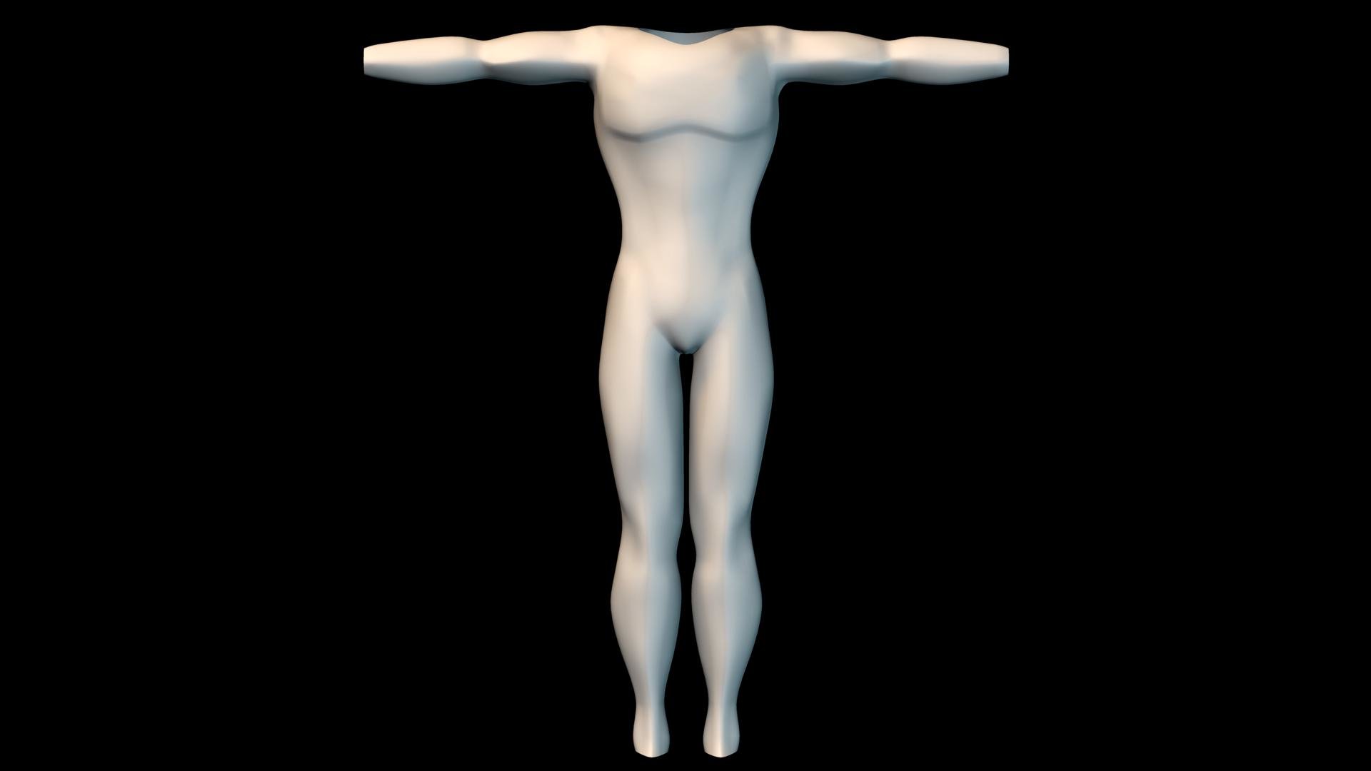
Ok here is a straight on shot of the character. The legs have been pulled back by 15% and the head I reworked the nose as it was too small. but I am on to the ears now. The hands are to be larger as the demo the hands will be a key part. Steve
-
Actually the camera is at a perspective so, (I used this to send the creases) I will upload the correct one. Also I was following Marvels Comic book guideline to porportions. So I will agree about the legs but they are usually about 1.25 their normal size in comic books and I actually increased the head .25 from the rotoscopes I had drawn. I will upload the correct one later Steve
-
-
I started on a learning project. I want to light a dance floor in a scene. Just starting to play with lights and the effects they have. I can see in my head the dance scene in Saturady Night Fever how the floor lit up. In a couple of test of placing a light under the flooring in the scene the light was not bright in the middle of the bulb. I can not the effect I want. Anyone have a suggestion? I have included a test shot. The trim rings are set for the colors of the lights and used as a guide. But as you can see the light is dark in the center of the light where it should be the brightest. What am I doing wrong? Steve
-
Not sure as of yet. I have three different characters I am working on. One is a comical super hero, the other is more of sci fi and the third is a comic book hero. I have the head built on the comical and comic book style. The sci fi will be more realistic face. I placed the head of the comical and fun loving character earlier tonight and found I have a great deal to add. Steve
-
-
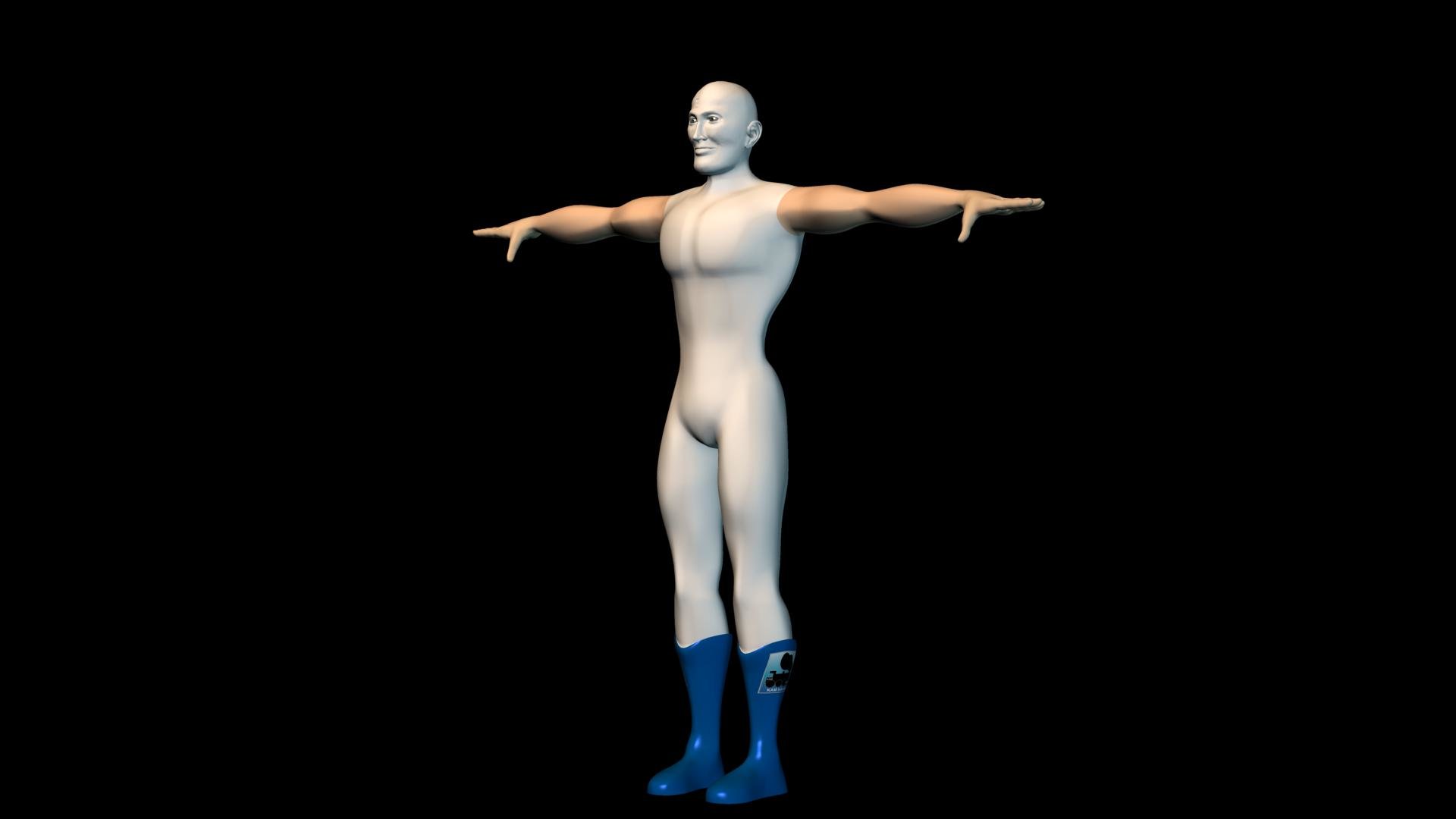
It has been a while and I thought it was time to get back into the game. I wanted to start with a fun loving super hero. Here is the start. Steve
-
I found your suggestion to be correct. I had the correct settings. Thanks Dhar, I look forward to meeting you at teh HASH Bash. Steve
-
I need some help. Polished metal has got me stumped. I have tried all the settings and I almost get it but the color is darker when I place it in a lighted scene. I am working on the nib portion of the pen Steve
-
Caroline, I agree. I thought it would be that easy as well. I am in the middle of decaling and learning photoshop at the same time Steve
-
Thanks everyone. I was decalling an easel with tga files that I created and when I looked down at the PWS I had 10 decals and still had a few more to add. I took each decal into Painter and imported a projection and I only used half as many. I have not had any problems on a 2.2 ghz AMD 64 4000 with 2 gig of ram but what I was thinking about was the render farm where each machine is only 512mb. Thanks again Steve
-
Is there a limit of the number of decals in a scene? On a model? Steve
-
Excellent that is the look I am going for. Here is the newest render I made before I read your post. Steve I will give a try in a few minutes Matt how many lights do you have set up?
-
What is the best practice? Light the model while or light the model in Chor window.... Thanks for the help. Glow feature was what I was thinking of but could not get my thoughts together last night.
-
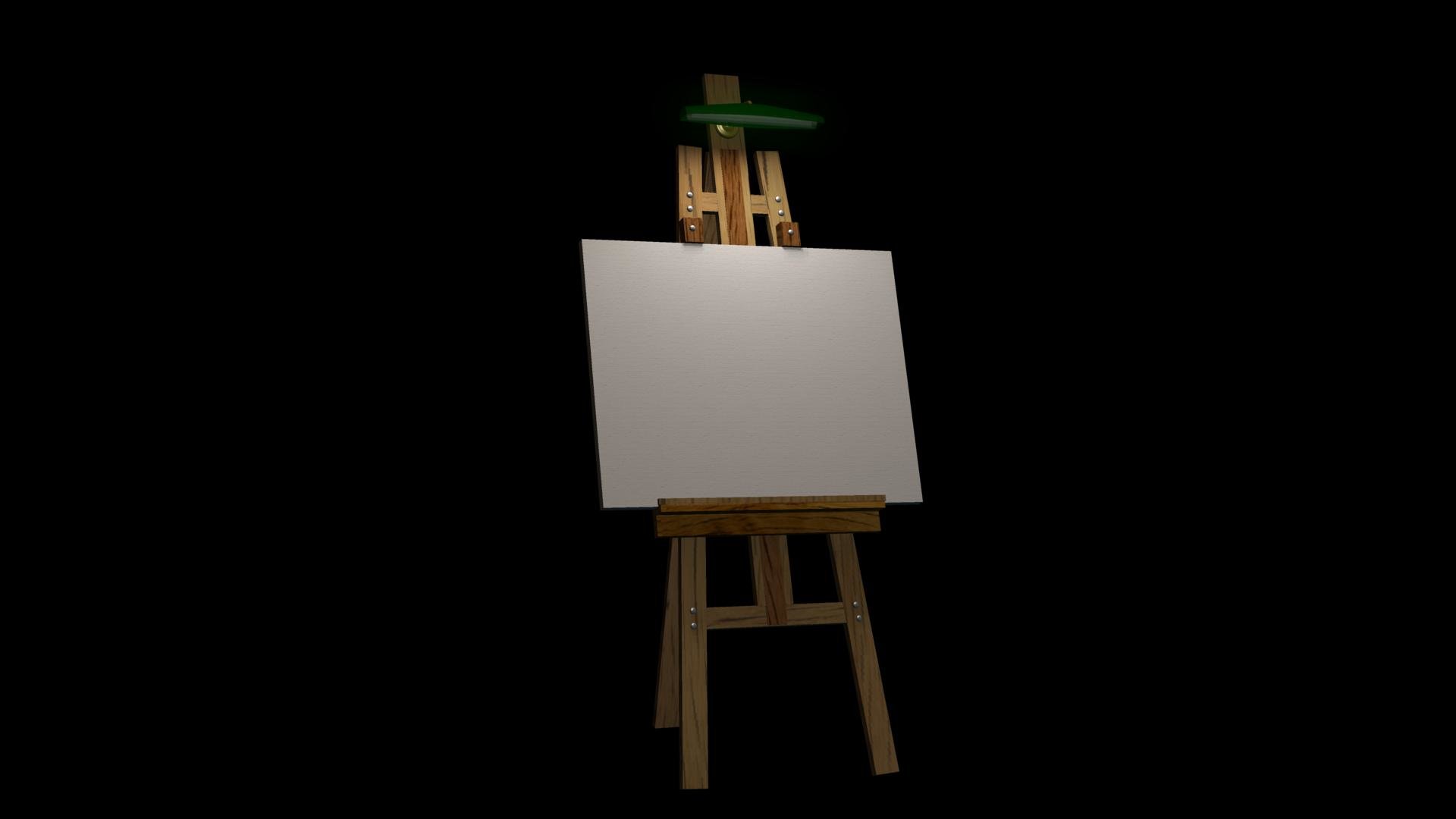
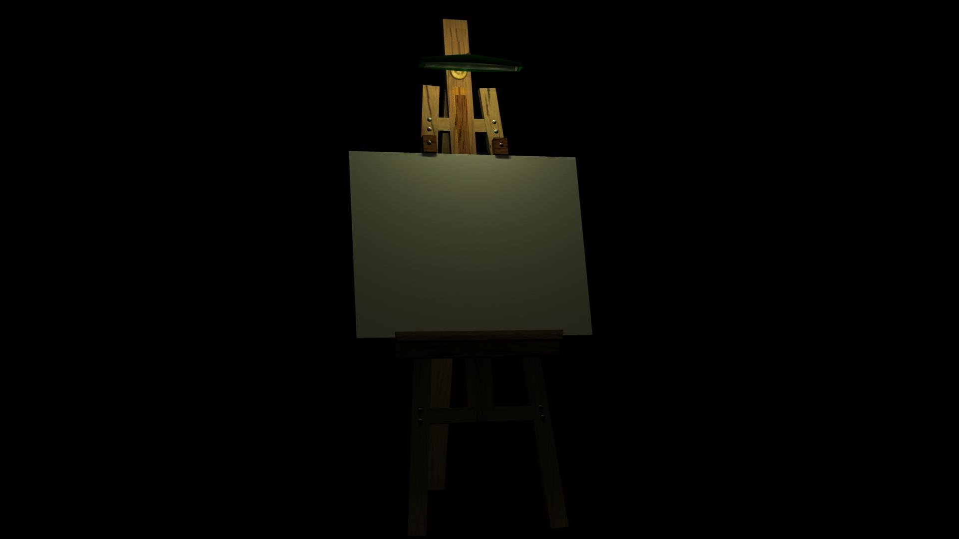
I am starting a new project. I have modeled an easel and wanted to place a light at the top. I have model a glass canopy on the light and have placed a light / bulb in the canopy. I have a couple of questions. I want the canopy to glow from the light / bulb. How do I do this? I want the bulb to mimic a real bulb and shine downward as a result of the canopy. Can you help me on this? Here is a render of the start of lighting the scene. thanks Steve


