arkaos
-
Posts
358 -
Joined
-
Last visited
Content Type
Profiles
Forums
Events
Everything posted by arkaos
-
Thanks, largento. Actually, I should have seen that to begin with after how many times I've read about that proportion in tuts (D'OH). Yeah, the front view really shows it...eyes WAY too big.
-
maybe a 5 o'clock shadow decal... EDIT: speaking of the goatee shouldn't there be hair on the bottom of the chin too, rather than just janging from the front? No way, dude....he uses Gilette - The Best a Man Can Get....lol Yeah, there should. There will be before he is done, I can assure you. (I hope) Last time I tried a 5 o'clock shadow, it looked like he had mud on his face, though. Gotta keep trying.
-
Wow. Those are really memorable mice characters and the poses you show them in make the scene totally believable. Great work. Can't wait for the anim.
-
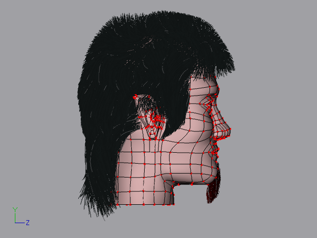
Thanks for the comments, everyone. They all gave me something to think about. This version incorporated some of your comments. The face is not quite as forward facing as it was. I eliminated a spline loop around the mouth and over the nose and reconnected some splines. I worked a bit more on shaping the facial features. I made the lips more full and emasculated the jaw line a bit (I think). And of course, I regroomed his hair. I haven't done any work on the eyes and eyebrows are coming soon to a W.I.P. near you. I am going for a fairly realistic face structure, but not so much that outrageous expressions look out of place. One huge thing I notice is that his eyes appear too wide from the frontal views. Maybe I should change that. What are your thoughts on what I need done there? Eyes have always been a weak point for me. Thanks for the comments so far, they have been very useful. Keep 'em coming.

-
Very good start. He shouldn't get cold in that outfit. I remember the AT-AT model. Way cool. The only real crit. I have is that the boots look a little out of proportion at the ankles. Seems too wide front/back and too narrow side/side. This is going to end up being a spectacular model. I've always found clothing modelling a challenge so I really commend your work. It is looking pretty darn authentic.
-
Well, well, well, well. It has been close to an eon now since my last W.I.P. Hopefully some of you might remember me, lol. I have not spent a lot of time with A:M lately because I've been concentrating most of my efforts in story development. I have finally reached the pre-production phase of modeling my characters. This character is a semi-human, mostly human looking, character from an unknown race (unknown as far as the story goes). I would like some feedback on my face model and any pointers/improvement I could make to my technigue. So far I have the base facial mesh going. I'm still trying to tweak the patches around to try to bring out the character. I've been spending a lot of time this year poly-modelling for work related stuff, so my splinemanship is a little rusty.
-
Great animation! I really like the motion blur in this.
-
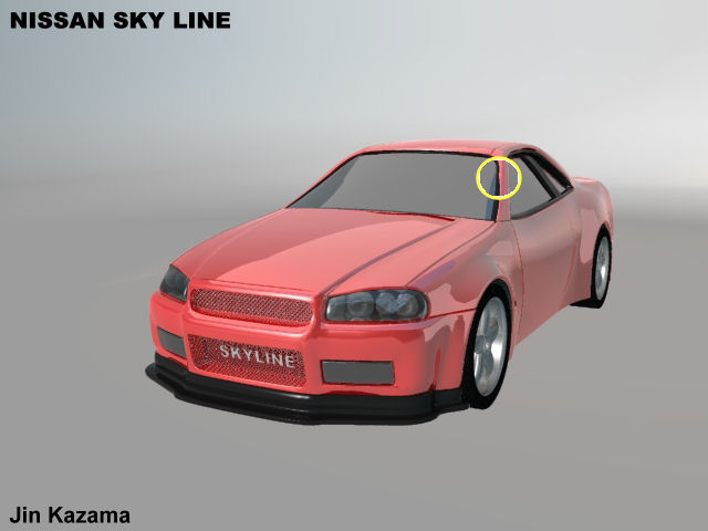
Very nice Skyline! I'm impressed. I noticed that there is something funky in the way the windshield meets the body on the driver's side. It almost looks like there is a little overlapping or maybe the way the specular is rendered. Here's a pic that shows what I'm talking about: Keep up the awesome modelling!
-
BOI-OI-OI-OING!!!
-
Pretty cool, Dog! What make you choose the red lighting scheme? Gives it a kind of eerie effect.
-
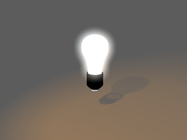
Matt, I'm not trying to replicate a lightbulb here. Just a quick demonstration of how he can use the different surface properties to tweak the look of the bulb. It's just a model with no frills for that purpose alone, put in a default chor with default lights. A quick example.
-
About your lights: From your last post, all you really need to do is set the "Glow" property for the glass surface along with the ambient intensity. You may need to set the ambient to a fairly low value, since the effect is additive with the glow. Also, in the chor, play with the glow radius attribute of the choreography object. These combined can give some pretty good effects. Also, you can refine the look further by tweaking the transparency attribute of the glass as well. When you get a look you want, you can create an On/Off Pose to set the necessary attribute to switch the light on and off. In this pic..... Bulb Ambient Intensity = 100% Transparency = 60% Glow = "ON" Chor Object Glow Radius = 30 Glow Intensity = 175%
-
That is one of the most photo-realistic renders I have ever seen. Great work agep! I really love the display on that thing. How did you pull that off?
-
He's kinda cute in that creepy sort of way. I like the clothes. A BUG! STEP ON IT!
-
Now it's time to have some FUN! Here is my latest version(s). I've created different artistic interpretations from the same render. First is the actual render output from A:M. And a couple of others:
-
Looking awesome! My only suggestion would be to add some flare to the nostrils. Usually, when a face is posed, the skin around the mouth and cheecks also pulls on the nostril area.
-
Hey Uzzbay. Nice model! I love the design, and may I say Phifer is lookin' hot! Great progress on the simcloth.
-
Those look totally CRAZY! Keep on Tinkering, Gnome!
-
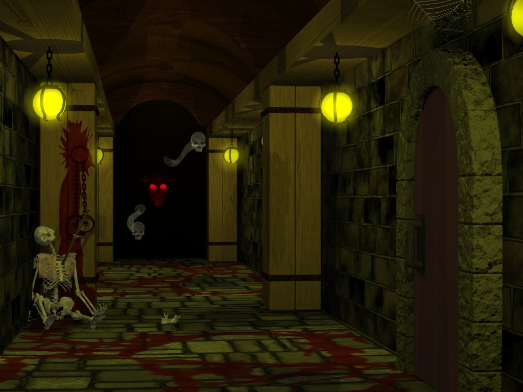
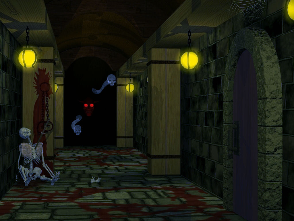
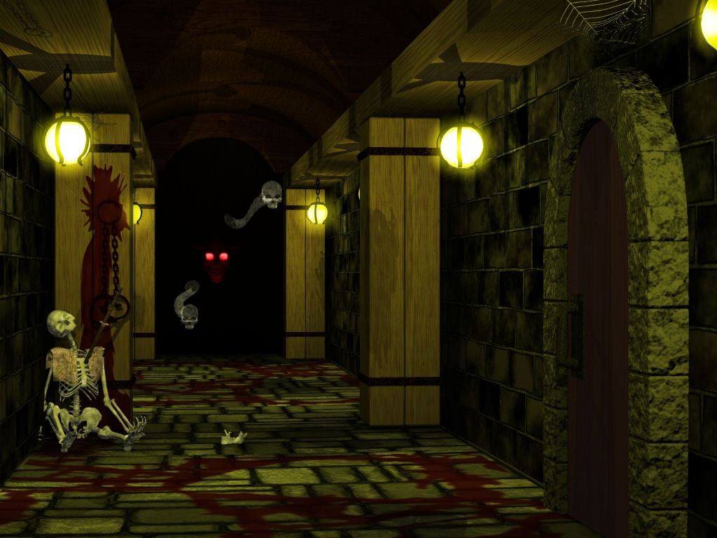
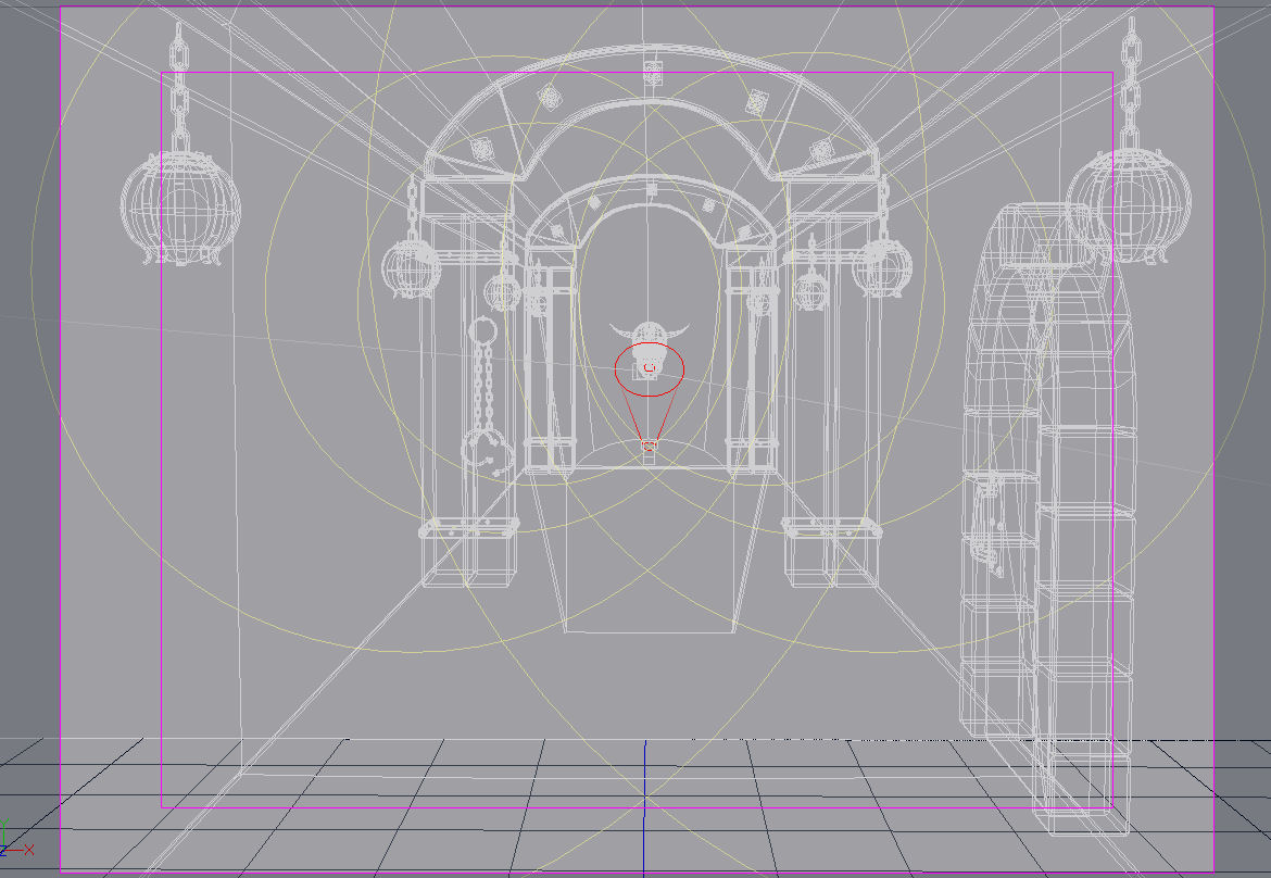
Hi Rodney! I've been reviewing your comments and I think you have made some really good suggestions. Your comment about the camera angle is one I will definitely explore. As far as the symmetry, I intend to keep that for now. In architecture, you see a LOT of symmetry--even (especially) in ancient architecture. By the way, the skull is NOT centered. The camera angle and distance from the camera make him appear so. You mentioned I've made some tough decisions, and you ain't lying. I'm still not sold on the flooring texture. It looks better before I render it (if THAT makes any sense). I used a darktree material to get the current wall texture. I rendered it out to a *.tga at high res and used that as a texture map. I really like the way it turned out. I basically did the same thing for the new floor, but it still doesn't look right. Any suggestions (or better yet, free textures) will gladly be accepted . I have actually revised the lighting a bit, I have it so I don't need any post-processing, here is a tidbit: The green you see on the floor, has been changed to a dark red. I decided to make it dried rivers of blood, so disregard the green. Remember, at this stage, I haven't added any age to the objects in the scene. As stated, that will be left for last. Achilles Desire wrote: " the blood on the column just doesn't look right. It's too Kool-aid red." Yea, I know....it's already been changed. "Hey Kool-Aid.....Oh, Yeah!" lol
-
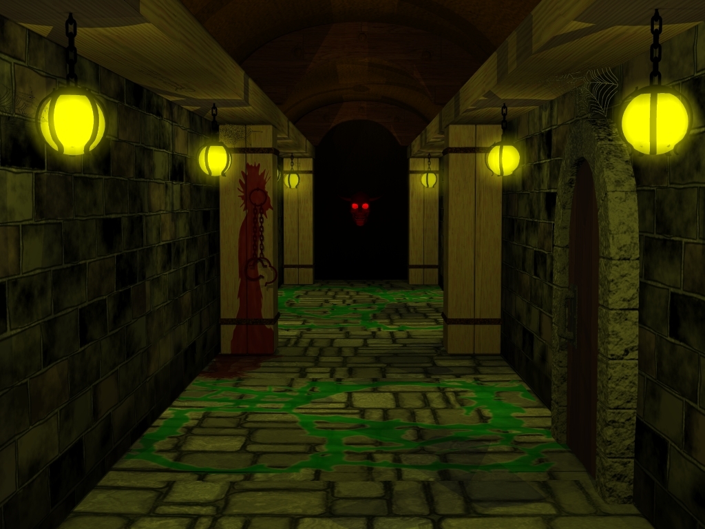
Well here is my latest update. I completely changed out the textures for the flooring and walls. I re-designed the column. The style of the first ones really didn't go with the scene. I still have to dirty it up a little, but as I said, that will be last on my list. Currently I am working on the webs (not included here) and some ghostly effects (not here either). My lighting still needs a bit of tweaking, so for now, I am post processing in Paintshop to get the feel and temperature. I know I should use compositing for that, but I am just now learning that, and I think this project is too complex for me to learn on. Later when I am more practiced at compositing, I will use it more. I don't seem to have the bump mapping very good on the floor. It still looks a bit flat. Right now I used a color map and a grayscale for texture with a displacement setting of 100%.
-
Hey Odog...Welcome back, buddy! I would suggest reading the information on this website Lighting tutorials that Luckbat gave to me. This is an invaluable source of lighting tips. It helped me a lot so far. Good luck Dawg.
-
Thanks for your input, Rodney. As stated this is still very preliminary. Just trying to get a feel of what's going on and what I need to do. So far I've gotten some excellent input from everybody and I'm sure the final product will kick-butt because of it. Yes, the texture on the left is messed up. I knew that when I stamped it, but I didn't change it because it took forever to get all the stamps done. That is one I shall fix. I'm also experimenting with different column designs, because I agree with you, the ones shown really don't work for me either. I have seen the corridor model from Mr. Bradbury. Very nice. Those guys are tops when I comes to modelling and lighting and adding the fine details. I have been studying it the past day or so. As for the texturing, I am thinking of trying to create my own image textures based from material renderings. The ones I used are images that ship with A:M and are not big enough to give a good render at this resolution. If anybody has any tips or ideas about this, please post. I am eager to hear from you people. And yes, the wood beams are a little too perfect and new looking for this scene. Some tweaking will have to be done. For now, I am going to concentrate on getting my modelling detail done, then worry about aging later. Aside from the walls and floor, everything else is textured with materials. I might want to re-think that if I want to use the set for animating.
-
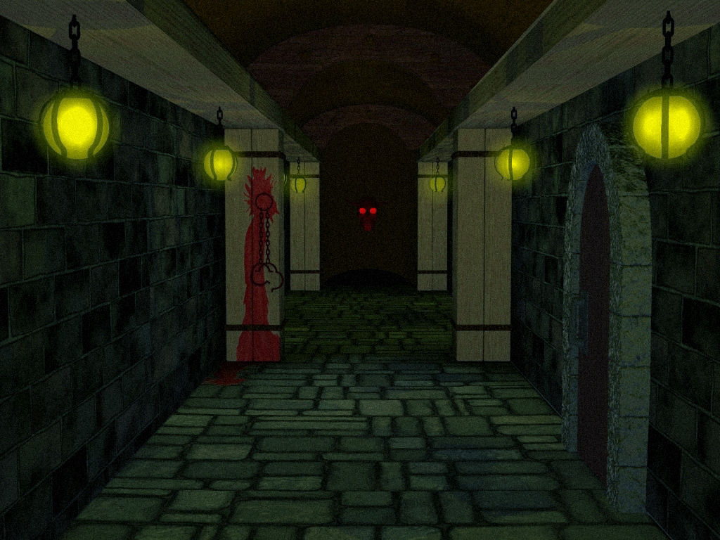
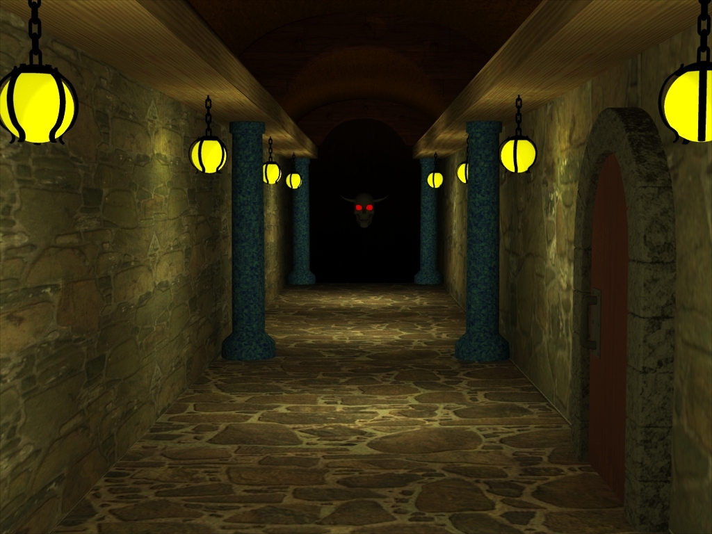
I actually stole Eugene's head and crammed a coupla horns on, added red ambience to the eye sockets and positioned him a little outside of the fall-off of the lights. Trial and error got just the shot I was going for. Spoken like a true D&D nerd! Bravo! Being an ex-Dungeon Master myself, I value your insight. Thanks.
-
Well, I have officially started designing my sets for the fantasy story I'm creating. This is a prelim of the first of many scenes. Here we have is a corridor leading....somewhere. Wherever is goes, it looks like a friendly face is sure to greet you. Preliminary. At this time I intend to add more to this set. - debris on floor and in corners - a few cute(?) little rats - maybe some carvings/runes/grafitti on the walls (?) - definately a carbon dioxide like fog rolling across the floor (some early attempts were pretty bad) - maybe a spectral form roaming the corridor. - more glowing effects from the lanterns Take a look, let me know what you think.
-
Well, my two year old loved you bear and butterfly, so I guess you did a good job. No really, I liked it too. Cool Pic. I like the fur on the bear.