arkaos
-
Posts
358 -
Joined
-
Last visited
Content Type
Profiles
Forums
Events
Everything posted by arkaos
-
Hi Mike! I really like the toon rendering you did on this one. It really fits the cartoon-ish character you got. I'm not going to be critical, seeing that you don't plan to make any changes. I think it is a cool animation with nice timing. I liked the landing most of all. Nice work.
-
Thanks for the comments, Yves! Some good ones, too. Couldn't have done it without ya! I sure will take a look at the wood tutorial, anything to improve my skills is good. Edit: I looked through your wood material tutorial. Wow! Thanks a lot for providing stuff like that for us. Most other people would charge a pretty hefty fee for training material like that. I definitely plan to put this info to use in my future work.
-
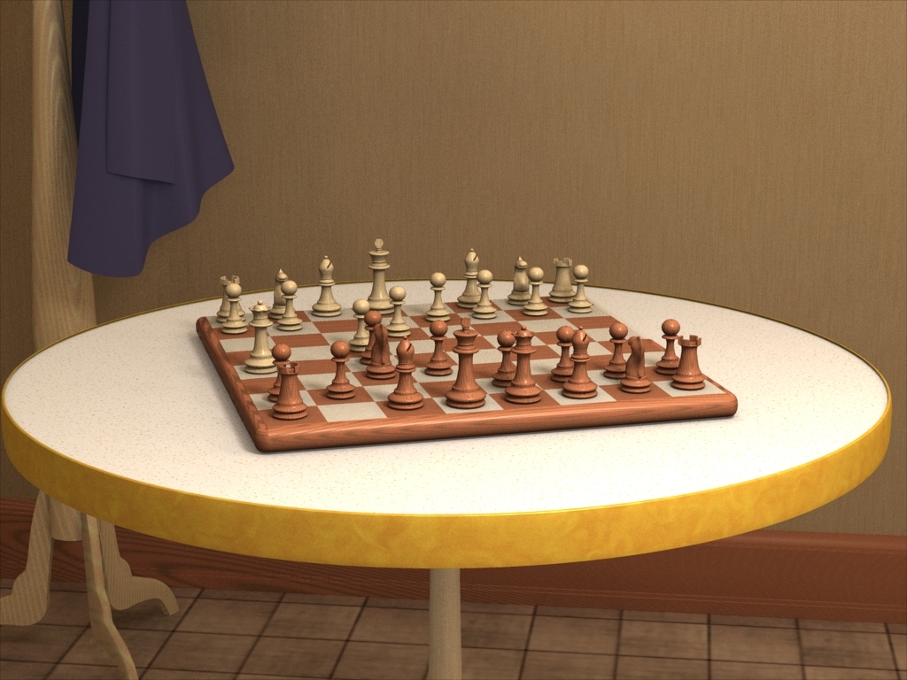
Thanks Dan, I'm glad you like it. I got that painting effect pretty much the same way you described, except that I used a low photon sample area and the default final gathering settings (100% and 0% Jittering). As for the striation problem in the second render, I'm not exactly sure what you mean. Could you point it out for me so I know what to be looking for? If you are referring to the vertical "striations" on the wall, that's just the material. This chess set has been my first go-around of messing with radiosity. Didn't really know what I was doing at first, but with everyone's input and Yves' tuts I learned a TON of stuff these past coupla days.
-
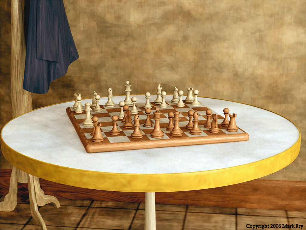
As requested, here it is. The non-painterly correctly rendered version. It took 3:18:xx to render using 9 lights and multipass = 16(4X4) and a resolution of 1024x768. Photons Cast: 15,000 Sample Area: 15,000 Photon Samples: 200 Final Gathering Samples: 100 Jittering: 10% Personally, I like the painterly version better. It has more character. I'll let you form your own opinions, though. That's part of the fun.

-
Great movie, awesome character design, and mighty fine animating! A true "Animation:Master". Bravo!
-
AAAAAAAAAHHHHHHHHH! OAKCHAS! YOU ARE AT POST # 666! AAAAAAAAAHHHHHHHH! For some reason I have an Iron Maiden tune playing in my head.
-
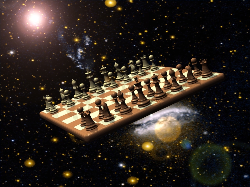
Coming up, sir! Just gimmee a coupla hours for a new render . I am thinking of adding more lights to the array to get a better result, too. For this render, I only used a 2x2 array. I knew it wasn't enough to give me a photo-real result, but I thought it would be interesting to see what I would get. Does anyone have any thoughts about how many lights I should use? The render time for this pic was about 2:28:00 at the current resolution, which the size I want. We'll see if there is enough time in a day for a new output.
-
I think I can out-nerd you here... It's years since I last played chess and I can't recall the correct shorthand, but this sequence is possible... White: King's pawn one step forward Black: King's pawn one step forward White: King's bishop's pawn one step forward Black: King's bishop's pawn two steps forward White: King's bishop's pawn one step forward Black: King's knight two steps to, erm, where it's shown White: Queen to where it's shown ...it's suicidal for the queen, but it is a legal sequence. Oh yes - before I get side-tracked - I do like the painterly look to the scene! Actually, I chose the word implausible rather than impossible because I realized that it was a legal, but bad position. Scott Let's face reality, people. We're ALL nerds!
-
Thanks for the tip pelonppp! I used final gathering, but with the default settings. But, I dunno, I kinda like the weird look I got. I am curious to see how it would look your parameters, so...well this is the way we learn! Awesome feedback everyone! Thanks for you input, I am learning a lot more all the time thanks to the Hash Comm.
-
Yes Scott, I do believe you are a nerd. Black went first. My pic, MY rules! So "NYAH"! I'm glad u liked it and could find something to giggle at. P.S. Yes...I did intend the queen to suicide intentionally. Why? I don't really know. Maybe because I suck at chess, lol. That's why nobody is sitting at the table. I moved and realized the only piece worth living for was gunna bite it, so I called a forfeit and left!
-
Hi guys/gals! Well, I've re-vamped my chess set a bit. Adjusted materials and rendered an indoor scene to showcase it. So many changes were made I thought I needed a new topic.
-
Yeah, I noticed that too...my excuse -> Laziness, lol. I applied the material to the entire model, instead of separating out the groups. I was going to, but I got REAL lazy and said, "Fudge It!" Well, I really ought to fix it. If I was doing it for a client, I would have to do it right, n'est pas?
-
I like it, Will. I especially dig the bunny mocking the typewriter Way cool!
-
Here is version 2 with the Queens in the correct positions and the shadows adjusted. Rendered Final, Multipass=25 (5x5), NO radiosity this time, Motion Blur 10% P.S. Radiosity render in closed room coming soon.
-
Thanks, Yves. I appreciate your help and guidance.
-
Actually, I used the Oak MR MR material provided on the cd and adjusted the material's colors and scale to fit my pieces.
-
Learn something new every day. Didn't fully understand that aspect of rendering. Thanks for the tip YP. Maybe I'll do a second version in a room, see what I git. If I use a room, should it be fully enclosed or can I remove a wall for camera positioning? "I am just an egg..." -Valentine Michael Smith
-
Hmmmm, no WONDER why I've been losing lately... Actually I set it up according to the picture on the website that sells this set, so...(I wonder if THEY know it's wrong, hee hee). Thanks for the comments! I only used 3 lights (besides the sun, but it's just for lens flare), so changing the setup will be easy.
-
This is my first attempt at radiosity rendering in A:M. It took me about 2 hrs to model, 1/2 hour to setup and 22:25 to render at 1024x768. Not bad seeing that I used materials for everything except the white tiles on the chessboard. Space backdrop courtesy of NASA. I hope ya like it. Let me know what you think.
-
YEAH! METOOLS! RIGHT ON!
-
Thanks for sharing the model, Dhar. I dig your fe-mail. She's HOT!
-
Now THAT prop spin looks TASTY! I'll have to keep this thread linked for future use! Good going.
-
I wouldn't worry about the "extra" splines for the head. Since your figure is anime style, there is no pressing need to mimick a real-life head. It looks good. Nicely modeled. Maybe do some facial animation at this stage. It would help to visualize/clarify whether or not modification is necessary to achieve the animated look you are going for. P.S. Akira is AWESOME!
-
Weird goings on with my particle emitter
arkaos replied to arkaos's topic in Work In Progress / Sweatbox
That's an excellent solution, David. I was hopefully trying to avoid that, because I wanted the flames to move with his flailing arms. The purpose of this project is to research effects for making a fireball spell and having the poor unfortunate victim catch fire. For now, I guess a separate model is do-able. Maybe I'll mock up a simple proxy from the troll and apply the same action to it so it mimicks the troll we see. Thanks again . -
Weird goings on with my particle emitter
arkaos replied to arkaos's topic in Work In Progress / Sweatbox
Is this a bug? Should I report it?