JoshB
-
Posts
381 -
Joined
-
Last visited
Content Type
Profiles
Forums
Events
Everything posted by JoshB
-
If you're really trying to get an old school vibe with it either bail on the shadows or make them as harsh as possible and almost completely black. <thinking old mickey mouse on the boat>. During the 30s animation was an infant it wasn't about even approaching realism--just getting it to move was hard enough. Beyond that the model is really coming along can't wait to see it move. J
-
Try this. Also, be careful with hooks in the neck area for the same reason you want to avoid them around the mouth. Keep them for now then do test animation to see how the bend/don't. I used to always run into 6 point patches (holes). The best method I have found to fix it is to just run a spline through the center and applying to 5 pointers one on either side. Try this first if it doesn't give desirable results let me know. J

-
As for the hair go to good ol' colins-loft.net. Good start I would like to see some adjusting to the cps do reduce those creases around the head. Keep up the good work. J
-
The way this effect was relayed to me is the following: Air has water within it--humidity. Therefore, the further away an object is from you the more water is in between you and the object--therefore, it will tend to look blue--at noon. Further, depending on the level of humidity the level of this effect changes. That why painters will add blue to their pain the further back something is. Therefore, the more humidity the more the effect--with true fog being the steam like result. As the sun rises and sets it is a prism effect. The atmosphere is the prism. As the sun is lower you get the reds and orange--as the sun goes up (well not really up but it's easier to explain this way)--the angle between the sun, the atmosphere, and our eye changes--which is why I said at noon. Because, depending on the time of day the blue may have purple, red, orange and for very short periods green and yellow. DOF is a combination of the apeture within a camera and of course the actual focus mechanism. With a regular camera you can turn the apeture setting to fully open and more things in the background will be in focus (Ansel Adams loved open apeture settings). If you decrease the apeture opening you will get more contrast with the background (if you go to my site and look at the lilys image or the floating leaf you will see the results of a closed apeture). As far as actual focus each lens has a range of focus where something is in or out of focus--which can be compensated for or adjusted with the apeture. But enough of that... The image is coming along nicely. You might want to add some turbulance to the fog though since it looks like you are going more for true fog than just a depth effect given the distance between the windmills. And right now there is no variation instead it looks like a gel between the windmills. J
-
http://www.hash.com/forums/index.php?showtopic=12070 Discussion about DOF. What I do is just set the camera to DOF. Set the back focus pane (anything behind this pane will be out of focus), the middle pane (anything in this pane is in focus), then the forward pane (anything in front of this pane will be out of focus). Select the camera, shitf click force keyframe, for all channels, and be sure to check the drivers to make sure it took. The other thing is if you turn multipass on you override the camera keys--therefore, have to set the distance by hand. If I'm not mistaken as you move the forward, middle, and back panes the numbers change for the camera DOF. Just, make sure that your render to file window has the same settings and you should be golden. J
-
I'm with Gene aka the model dude. However, if it is realism you're wanting a hair emitter is not the solution (at least not by itself). Create a cylinder. Create a tube slightly larger than the cylinder and with a little thickness--this will be the brush part. Give it a little translucency (as light will pass through the typically nylon material of the roller). Create a turbulance effect capture and apply it as either a bump or displacement map. Tangent: A bump map will give you the effect we want of minor hills and valleys without changing to geometry of the brush, however, it will not cast a dimpled shadow to the ground plane. A displacement map, however, will. But, displacement maps require two things--lots of geometry to alter the surface properly, and render time. Then if you REALLY want to take the realism to a whole new extreme. Add a hair emitter with the hair very very short, and bald in some areas and thick in others. Take the brush tool and swirl it all around. And that should make it pretty real. Hope that was a good explanation. If not let me know. J
-
I like it as well nice effect. I know this isn't the WIP but I would have liked to see the firing mechanisms a cooler color to step out from the background. But, such is the life. J
-
What Chris said will help. Render as targa, save as JPG, and scale down the quality just a touch and it should put you under the 1mb limit. BMP files are huge and very out of date. I think rendering a one frame Quicktime with a sorenson compressor would be smaller. Thanks for considering it though. Simple characters are good I was thinking more along the line of a bump map and a specularity map more than a color map. J
-
Nice. I like the blend of angles and smooth shapes. Are you going to take the texture further? Do me a favor. Post it again only instead of linking it to a file--right above the add reply button there is a browse button which will let you attach the file directly to the Hash server that way we don't have to download a zip file, only to unzip it, only to be a single image. You can attach up to a 1mb file if you do it will automatically thumbnail and the like. Thanks.
-
Now THAT'S what I was babbling about. It gives a lot more depth to the frame. Wonderful difference cloud like effect to keep it from being flat. Lovely, lovely, lovely. Se manufique (I don't speak, read, or write French--so if it's wrong feel free to correct me--but it matters not to the thread). J
-
Nice camera work. Did you actually plan the subtle speed changes or was the a happy accident. The chirping isn't too annoying. I wish there were some more subtle lights though to act as bounced light to give the form of the sack a little bit. I know it's a lonely seen but just adding a small sunlight underneath the back of the sac with a low intensity would help us see the bag. Especially when the camera goes around the sack and the shadow for the sack and the background blend into one. Also I would change the camera background color to a really dark blue (indgo) this will add a little depth to the scene and make the BG seem more endless. To sum up I love the camera work--something I REALLY need to work on. The animation is alright for how simple the movement is. I would just really like to see some different lighting. J
-
It's not free but here's my best shot. You can add audio layers in QT pro and then use the codec as it is inherent in QT. Basically render your animation timed to your music. Open the MOV. Put the marker at the beginning insert you sound. Save As with your options selected. It will re-render and poof you're good to go. I did this for an animation I did using Flash 5...long story why I had to go this route...but I won't hijack your thread. QT Pro = $30 No software to DL. All you do is pay the money they give you a key and you enter the key to QT and it opens all the options which are already installed just disabled. J
-
Alright I'll throw another log on the fire. Good style for the character simple yet very effective. I like the animation for the same reasons everyone else did WB, Disney (mostly WB though). The textures are great it's got almost a clay like aspect to it. Only concern I have. When I watched the first animation it didn't bother me that much, but in the second one it did. The contrast between the character and the background. To use a good reference to explain I pick the road runner. Road Runner light and dark blue against an orange background. Complimentary colors which make him stand out from the background. Wil E. Coyote (super genious) dark brown. Again, against and orange background dark against relatively light making him stand out from the background. If you could figure out a way to get him to become more seperate from the background I think it would take it over the top. Further, the background seems REALLY saturated (could just be my monitor) and draws my attention away from the animation and character a little bit. Keep up the good work. J
-
I'm with David on this. Be sure to bevel your edges. It's tedious but it is worth it. Given the simplicity of the design you should be able to use of the beveled primitives from the cd--then rescale the bottom (it's similar to how I did the keys on the keyboard of my computer artist piece). Same could be done with the foot. Unless of course modeling is what you want to do. Not sure if I like the glow effect on the eye. The reason I say the is because the eye appears to be setting behind the slit--however, the glow is also in front of the slit. An object "glows" because it emits light--light cannot pass through a solid object--therefore, there should not be light on the top and bottom part of the slit. Beyond that great job considering you haven't been using the software very long. And, mighty brave of you. I've been using AM for years and posted my first image a couple of days ago. As for textures it depends on what you want. Clean new shiny robot--or rusted out s***box. Whether you want to place images--or create a material from scratch. What kind of metal is made out of. So many options. J
-
Couldn't watch it Tony--glad to know you're not dead by the way. If you could be so kind as to re-render it as a quicktime using the Sorenson3 codec on high--that'd be swell (and should be smaller by the way). J
-
Those are called surface normals. Tools--options--modeling--display normals. Every 3D software I have worked with has these. Basically they effect materials and various dynamic effects. For instance, if you use the cloth sim try this test. Create a hanging fabric/drape then make the normals face a certain direction. Have the cloth glide across the objects and note the difference between when the side with the normals pointing toward the objects compared to the other. The way it effects materials (to the best of my understanding) can be seen in the porcelain material. What the shader does is looks to the surface normals to help the render engine to determine how light and shadow should pass across the model. In most cases you want all of your normals facing out of the model as opposed to in. As it pertains directly to AM be careful with your 5 pointers in a lot of cases (actually most of mine for some reason) the normal wants to point into the model as opposed to out of the model. Be sure to flip these by selecting the patch, right/command clicking and selecting flip normal. If you want I can create the simulation I'm talking about--just PM or something and I will--I'm just taking a break from one of my projects right now so I figured I'd run around here for a minute. J
-
I love that sweater. How did you manage it? Excellent model by the way. And a good makeup job considering most people who make females end up making Tammy Fay. J
-
I would like to see the gills smaller because right now they almost wrap completely around the neck. (A minor thing which I wouldn't have noticed if it wasn't midnight. Fish have gills and vertical tail fins. Mammals have blow-holes, breathe oxygen, and have horizontal tales. Thus, you have combined two species, and for some reason with this lack of sleep I just can't seem to suspend my disbelief far enough). Are you going to add the webbing to the space between the thumb and the forefinger as well? The reason I ask is because I would suggest against it (if you're curious as to why just let me know). Something about the fin where the lat muscle would be doesn't sit right. I think where it connects to the hips it is too far forwar. I just keep thinking about manta rays, and winged animals (bats). The wings connect more toward the spine than the torso. Also, depending on how much you want to emote with the eyes you may want to beef the browline. Love the frontal muscle detail. The dorsal fin is beautiful. Very elegant model, and looks like it should be in the ocean. I am a minimalist by nature so I really don't want to suggest adding; rather, I'm thinking just altar some stuff and it will bring it over the top (at least to me). J edit: I disagree scales will destroy the shark, ray, whale, dolphin, etc. vibe that it has which will make it less like a smooth, slick, stealthy creature--and into the typical depiction of a merman. I do however think the specular intensity/falloff should be increased/decreased to give it more of a "wet" look.
-
Yeah attaching the ear was harder than modeling the head. I remember on my first head it was all bumpy and creasing but this time it worked out (and as long as you put them in places that are going to get animated too much you're cool). Well good luck, looking good, and like to see where it goes. J
-
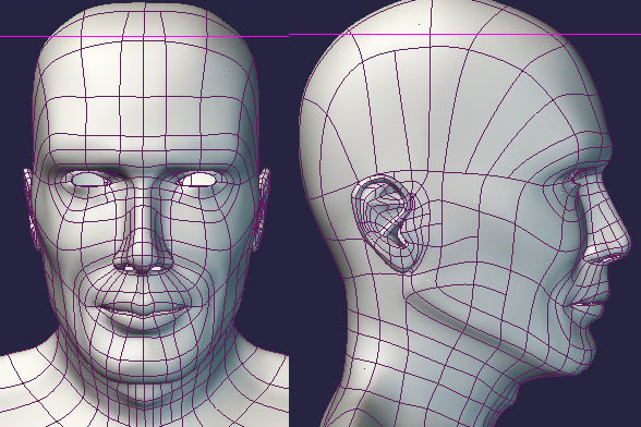
KenH--your wires have arrived. I did a couple of test poses and the head seems to be pretty animatable so anyone who wants to get a magnifying glass and mimic the splinage feel free. David--I noticed the ear thing as well. It is a little difficult to get to be right as the rotoscope for the profile has been chopped on the back (behind the ear) and the top. Therefore, I think it's more that the cranium just isn't big enough. Still working on that part. People are starting to look at me really funny though. I keep staring to see what their ear are compare to their nose, and the back of their cranium's. Jeff--I'm not quite sure what you mean by short. The chin doesn't go out far enough. Or, the distance from the chin to the neck/adam's apple isn't long enough. Take a look at the rotos as I think it will aid in this whole ordeal. The profile is slightly turned and VERY small so I have to try and compensate. His torso is also turned slightly to the left which is distorting the depth of his neck that I think you're talking about. The rotos are from an actor Mads (something). They aren't the best. Right now I'm trying to make a 'general' head which is one reason it is so light. The other is because I just felt like taking advantage of the beauty of splines.
-
Did a couple of tests realy quick and it does appear that this head will animate so here the wire as promised. Now I'm off to post this on my thread. Hope that gives you ideas on making your model lighter. Of course depending on how much you want/need the face to do you may need to make it a bit heavier. J
-
Well now I know what you look like. You're doing wonderful so far. The skin tone is a little dark and your upper lip is fuller than that of the model. Or, it's just the lighting I'm not sure, I think it's the lighting. Going to do some tests using my recent head project and if the poses work then I'll post a wireframe here and in my original post so you can see what I did, because there are VERY few splines in my model. J
-
Actually if I remember the most relaxed state for the eyelids is open given the shape of the muscles and the like. But, it does make since to model them whyile closed. I like the texture of the face a lot good specularity in the right places. However, since I have no idea what you look like I can't tell you how close you are. But, if I am look at this right you have done what most people do when modeling a head. You shape the lips with one spline. And, then use another spline for where the lips meet, however, you connect that spline to the lip outline spline. Then feed a spline through that same cp. Therefore, the one cp has three spline running through it. I would recommend using a different solution because with that many splines running through the same cp you will have a tendency toward creasing. If that's not what you did--nevermind. Good job so far. Nice eyeliner line. J
-
Some computers especially unix based machines don't like windows media player. The most common compression method I know of (and use quite often and successfully) is the sorenson 3 codec for QT it gives the highest level of compression without sacrificing too much in detail. It is the codec that most of the brodcast design students at my former college use. J
-
I know it's possible I was just saying it's difficult/annoying. You could also place to lights on either side at a 45 degree angle which will balance lighting on either side. But, why wait for an overcast day (the scanner is a handy tool to keep around). I was just thinking you slap a fractal sum or some other combiner render and poof--you got your bump layer for PS. But, as vern said good luck with it. J