JoshB
-
Posts
381 -
Joined
-
Last visited
Content Type
Profiles
Forums
Events
Everything posted by JoshB
-
What size is your decal now? And, honestly I don't really see the aliasing you are talking about. I mean there is a little here and there but not due to the map. The blob has a little and the bubble he seems to be flying into has a little--but again not really the maps fault here. One way, to get rid of the aliasing leftover from the 2 antialiasing passes from the final render option is to over sample. Let me digress: You are using the FINAL render option and not the shaded render option for these examples right? If you render your image 50-100% larger than what you intend to view it at when you shrink it down a lot of the aliasing will be subsampled away--that's oversampling in a nutshell. J
-
I like the layout and colors. I wish there was more content though. J
-
Yves or somebody, could probably tell you the exact difference. But, from my understanding they're different compression algorithms. From what I've noticed it's not so much a size difference it's a quality difference. And, Sorenson3 is the compression method the broadcast design students at my old school used--so, that's what I use. Sorenson3 doesn't compress as much as Sorenson--however, the quality it better--from the test I just ran. I like the eye rolls after his head stops spinning around. The walk off of the white robot is a lot better now. I still think the light is too yellow though. Can hardly wait for the final render. J
-
Yeah I should've been more detailed on that little tidbit as well. In my second post. Right-click the images link UNDER the decal on your model--Add Image. Sorry. Could've saved you the dope. J
-
Yep sounds like me and painting. Looking forward to an update. J
-
Sorry I missed your f-curve question. When you animate AM create a spline (basically) in between keyframe (cps) this spline initially acts just like a spline when you model. And, just like a spline you model you can adjust the gamma and intensity. Therefore, if you open the timeline at the bottom you should see something that looks like an EKG. Click that and you will see all of your curves. Select the specific bones--and properties if you want--that need changed then adjust them. Hopefully that was a good enough explanation--if not let me know (or hopefully someone can point you to the link that teaches that--I can't remember). J
-
From frame 800 to about 850 when the white robot first starts walking off it seems like he is having issues getting going. Kind of a matrix effect where he is in slow-mo to begin with and then he goes to regular speed. While it does take a person a little time to ease in to full speed it is too drastic right now. Key up the intensity on your shadow throwing light--maybe 5%. As for the glow I have NEVER done glow before so you're on your own--sorry. J
-
And here is the results of the above files put together. J

-
Sorry gentle people fell asleep on the job. Doug I am most apologetic. Gerry as well. I hope to PM you both to let you know I have finally posted as promised. Attached should be a zip file containing the necessary files. One is a PSD file. Two layers. One for color, one for transparency. The project file with my default cone model. Create the color map--complete--no alpha channels--be sure not to use pure black as AM trys to set that as clear (at least for me). Apply it (in this case I did cylindrical)--then edited in the UV editor. For the transparency map just duplicate your color layer--desaturate--tweak through levels. White is opaque--and black is clear. Therefore, we need the face to be white, and the body to be a shade of gray. In AM right click the images link--add image--transparency.tga--be sure your repeat is the same so it will position properly (you may have to play with this to get just right). Poof you're done, and it's animatable. J And I will apologize ahead of time for the second post as it is to include a sample render. transparency.zip
-
Sorry should've specified further. I want to be a creative director or technical director when I finally bust onto the scene--so, it is very enjoyable to help people out it just doesn't take a lot of effort for me. It's a Freudian way of avoiding my own work. Which I am going to take a break from the forum for a little while here soon to get cracking. But, first I have to finish what I started. It really is looking good. The shield is a good size. I'm mostly wanting to look at the lighting setup your are using to see what can be done about a couple of areas that I think could be improved. I am looking forward to seeing this animated though. J
-
I don't think it's the length of the fall so much as the time it takes him to accelerate. Change the slope of the f-curve so he quickly goes from slow to quick to stop. J
-
Do me a favor. Do a screen capture from top view filling as much of the screen with the layout as you can. I want to see something. Or, post the project file. Looks good though. You may want to take the decal you have (if it is seamless) set the repeat value to 6 or something and turn seamless on. This will reduce the size of the bumps which are definitely too large. HA! I'm spending more time solving other people's problems than I am working on my own stuff. How lazy is that? Actually I just don't want to get too involved in my stuff because I lose all track of time--and got too much other stuff to do. J
-
They look like different compression methods of the same image--just my thoughts. The one on the left has a slightly higher range to it from dark to light. Pay attention to the highlights specifically. The one on the left has brighter highlights (specifically with the seal of the shield) while the one on the right has more muted colors. Just my observations. Which do I like better? Either one is fine--they are so similar it isn't worth discussing. J
-
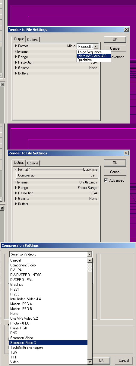
If you have a version of quicktime later than 4, I think (can't remember when sorenson3 was added to it) it comes with a version of the compressor. What you need to do is in AM you have to select quicktime as your output. The click the little triangle to open the options for it. Click on set (sometimes you have to click multiple times). It will open a new window. From the drop down select sorenson video 3. Then the quality slider is similar to that of the JPEG saving option in PS. Be sure your frames per second match the frame rate of your chor. Keyframe intervals aren't important here (at least I've never noticed a major difference when playing with this). Hit okay. Set your other options and you're done. We are using one of the most underplayed CG applications available. The documentation is more limited than others. Therefore, if we don't help each other--who will? J
-
Compressors are like various image file types. Each has a mathematical algorithm and a method to read it so that it uncompresses. Think of it like this. Make an image in PS or some oher paint program. Save it as a PSD, a TIF, a JPEG, and a BMP. Each one will be different in size because each uses a different algorithm to save it--which various software can then read later. Similar to zip files. When you render a quicktime at full blast there is no compression which means each frame is left mathematically the same as it was when it was created. Most of the time this is unnecessary because the differences are only noticeable to the computer. For instance, the R value in the third pixel from the right uncompressed is set to 244, compressed it's 246. VGA=640x480 you made your 740x580. Now I'm going to try to get technical--I wish I wasn't because this is not my area of experitise--but in general this is my understanding of images in CG. Say you have a square of red. This red sqare is the same color all the way through. Therefore, when it is saved the computer says from point A to B this is the color I need to be and from points C and D this is the color I need to be. If you're a programmer type it would look something like this: A location = 0, 0 B location = 0, 4 C location = 4, 0 D location = 4, 4 Set color (0, 0; 0,4; 4,0; 4,4) = red Now, the more complex the image the more time the computer has to do this. Therefore, if you render something that is pretty flat in color--not a lot of bump maps, no real variations in color, and a solid color for the background the computer doesn't have to do all that. From what I understand of uncompressed images the computer calculates a per pixel color NOT an area of color. For instance the image at the bottom goes like this. Solid red on the left saved as a jpeg at 12 quality. The one of the right has a noise filter placed to give it some variation save in the same manner. Notice the difference? J
-
This has nothing to do with splines. When you render you are creating an image. Therefore, depending on your settings it will increase or decrease your file size. Use quicktime. Go into the setting set them to high. And, use the sorenson3 video compressor and it will be much smaller. From the sounds it's either an avi file or your quicktime file is uncompressed. For me to give you the real answer you will have to tell me more. What size were rendering--obviously an image the is 1024x768 will be a much larger movie file than say 512x384? AVI, MOV, or TGA--different images/sequences take up different amounts of space? What compressor if any? How long was the sequence? Stuff like that. J
-
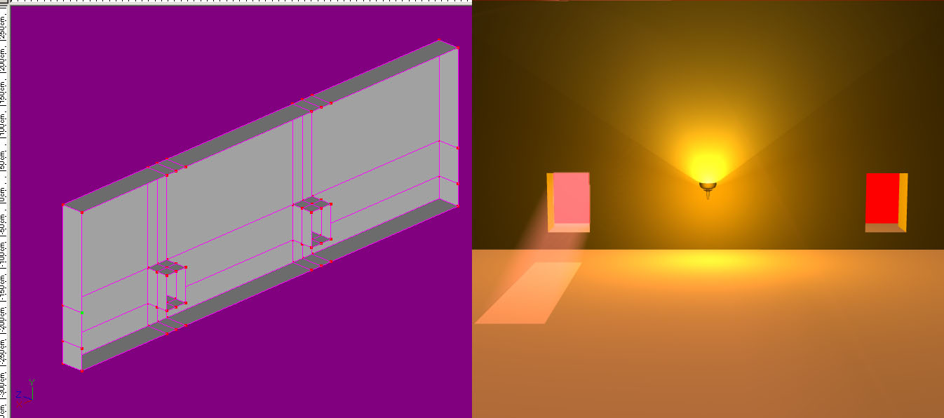
Looks good so far. Something about the proportions of this room are bothering me now with shield added. I'm noticing a lot more. The windows seem too large for the walls, the shield seems too large compared to the torch and the wall--usually it is not a real shield placed on the wall it is a coat of arms and smaller than a real shield. Maybe it's just early and I'm being nitpicky. J
-
ha! It's Neo's jump. Be sure to turn raytraced shadows on when you render him for real because the light's passing right through him. J
-
For volumetrics to work on this model. You need to use a klieg light. If you don't turn on shadows it will punch right through the wall because it isn't paying attention to the surfaces it hits. Then just stick it behind the window. The problem I find with most people and splines, especially with inorganic models is they freak out when the splines connect and curve. So, they delete the end spline then create a spline that doesn't go around the bend with hanging cps--then deleting the hanging cps. What you should do is run the spline as far as you can--let it curve--you can fix that later. Get the complete spline done--then hit peak. And, you'll get the look you wanted. J
-
I have nothing more to say--except: That stinks. J
-
You will need to delete the spline that create patches on the back of the wall to get rid of the internal patches. That should do it. And, the volumetrics should work. J
-
That doesn't make sense. But I don't know a lot about the TSM2 rig. I thought it just made a control rig for you. So, in my mind all you should need to do is go under the head bone you had to put in anyway--add the eye bones and nulls--and you're set. But, like I said don't know a lot about TSM2 rig.
-
Sorry for the second post just want to make sure I got your attention. I was wrong. You will need to make two klieg lights that shine through the windows. Turn on volumetrics. Turn on shadows. Try to match the light as closely as possible to the one that your sun light makes. Then turn off shadows for the sun light. J
-
Don't need a pose slider. All you do is place a bone in the eye with the base in the middle--the tip at the pupil. Assign the eye (without the eyelid) to the bone. Add a null that floats in front of the eye. Place an aim at constraint from the eye bone to the null and poof--eye control (a little sloppy but hey it's a short animation), and just make sure they are all children of the head. Then you could go even more cartoony by having the eyes spin inside the socket after his head spins around (Popeye comes to mind). I usually don't use AM materials I use decals--so, I have no answer for this. You might be able to apply an ambience map on the robot. Just make it white and apply it all over the little guy. Then set it to 0% at the beginning of the animation--then around 100% when he gets hit then -100% to make him look charred. I don't know if that works--but, hey can't rain all the time. Alright, floating was a bad way of trying to explain it. You've made it so the feet don't penetrate the hill--however, he is walking in slow motion. It's like he is trying NOT to step through the hill instead of just stepping onto the hill. I hope that was a better explanation. As for the bolt the only reason I want to see it on a black background is because it is more obvious. Then what you can do later once you get the motion as solid as it is going to be. start playing with the elements that aren't to the same level the bolt glow, the background, the ground plane beyond the hill, etc. J
-
To make volumetrics work you need to rethink the way you model. Here are some tutes to help you. http://www.alienlogo.com/tincan/Spline1.htm http://www.alienlogo.com/tincan/Spline2.htm http://www.am-guide.com/TinCan/Room-tut.htm The model you have is not a solid mesh--therefore, the volumetric effect is bleeding through your model. Try those. Absorb the info. Particularly the information about continuous splines. This is the only way to make a complete model--right now your wall model is a series of floating patches. Now the down side is when I said this is not the best way to model something I wasn't kidding. You won't be able to use volumetrics with this model the way it is. Even if you fix the non-continuous spline issues in this model will still not be a solid mesh. Have you done the Art of AM yet? You may want to. Or, just forget about volumetrics for now. But, definitely look at those tutorials linked above because you need to work on your modeling thought process. Don't be offended a lot of new users start modeling the way you are (a car grill pops to mind immediately ). Unfortunately it is not a good way to model. It increases your render times dramatically, your normals end up going in all sorts of directions, and you will get internal patches. Which brings me to the image--you have to put this pline ring on the inside of the window otherwise you get internal patches and AM doesn't know what to do with your surface normals which plays havock with your render times. Or, if you really want to use volumetrics you will want to use a different solution. J