JoshB
-
Posts
381 -
Joined
-
Last visited
Content Type
Profiles
Forums
Events
Everything posted by JoshB
-
Still no dice. J
-
Need to embed the models on your project file otherwise they won't/aren't there. Just the choreography. J **EDIT** emitters don't create light in CG only lights do. Therefore, you need to add a light to the torch for it to cast light.
-
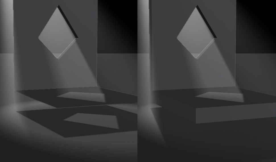
Your normals are facing into the room. Therefore, when you put a light behind the wall it doesn't read as a solid object--thicken the wall--like a real wall. By putting another plane behind it with the normals facing backward. Also, the klieg is a type of light (it's the rim light in the default chor). It is supposed to replicate stage lights. There is also directional (sun) lights which are lights that go in one direction and do so from the light origin to infinity in all directions. There are also bulb lights which radiate from the center out in all directions and there falloff can be adjusted. J

-
Sorry didn't see this until just now. If you plan to animate this head I think you might have a couple of problem areas. Green--the eyebrow movement that most humans do with cause the hook you have there to become more noticeable. I would actually continue the spline around. I will only add a few more patches to your model and will give you more control of textures in the UV mapper (if you go that route). Also, it will reduce the size of the 5 pointers you have in the middle of the brow (red). Red--when people furrow their brow it will have a tendency to fold over itself in a sort of sweeping motion. I would add a spline from the eye into the brow so it is easier to achieve this effect. Also, the hook you have at the top of the nose will, again, become more noticeable when/if your character does this. Blue--I usually recommend 3 splines where the laugh lines are because when your character smile only having two may not give you the control of the shape you will need to keep the fold smooth. Also, I know people with long necks so I know it is possible (Uma Thurman when she stands with her head straight up). However, it is the shoulder muscle which makes people seem to have shorter necks. Anatomically the chin hits this muscle at its connection to the neck--usually. But, noone is "anatomically" correct. I would like to see the rotoscope you are working from, because, it doesn't read as natural for this model. J
-
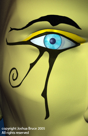
It would be a little bit more peaceful if the eye wasn't still the yellow color (if this is something you plan on doing disregard). Given your description there is a scene from Princess Mononoke where the main character gets upset and the background starts to change color--and so does his skin color. Just a thought. Good word. That's what I was looking for. Thanks for that Colin. J
-
If the character knows the object is heavy there should be some anticipation before he begins to pick it up. Think about the olympics when they lift heavyweights--they bend down and keep readjusting their hands and bending their arms and legs. With the way he is picking it up he is just grabbing it and leaning back. OSHA will be calling you--he's lifting with his back--not his legs--and without a back brace As he begins to fall back his right leg should straighten a little bit as he tries to regain his balance. His left leg should hit the ground then he should fall lower slightly as the character tries to steady himself. A bounce if you will. Think about when you jump and land. Your feet land and then your legs bend and your muscles try to slow you down--then you straighten back up. He looks as though he is trying to throw the object as he comes forward. If this is the case I think he should bend back slightly before he comes forward. And, his right leg should straighten more--otherwise he might drop the hefty object on his toe (at least that's what he might think). Right now his right leg on the forward motion is just swiveling on the ankle. The timing seems too constant. He bends--he grabs--he leans back--he leans forward--no pause no break no acceleration/deceleration. Depending on how motivated he is to pick this thing up the beginning should be faster (psyching himself up) or slower (dreading the back pain). The initial motion of the pickup should be slow and steady then as the object reaches the apex of its arc it should starting speeding up (which is why he needs to catch himself). Then once his left foot is down it should slow again (as he starts to steady himself). Then he uses the coil and tension of his muscles to start the forward motion to toss the thing back down. Hope that helped and wasn't too vague. J
-
http://nathanimator.tripod.com/3d/jowhuge.jpg FOUND IT!! Everybody--try that. I saw the tripod thing too--but I wasn't going to give up. It's got great textures. My only issue is the lazerbeam. There is no variation in color where in reality (which is the level of your textures) lasers differentiate in value as they pass through dust particles and such. Also, they are constantly pulsing at various rates which adds to the variation. Good use of DOF. J
-
Then try this phrasing--he has no toe bone. Therefore, when you animate the foot--he will have no toe. Only a big lump of concrete at the end of his leg. And, in the words of my favorite little robot "one is glad to be of service" J
-
I'm thinking you don't have enough spine bones for good deformation of the trunk. I always work in layers myself--with anything. Start by getting your mesh control bones in all the right places with enough to get the deformation you need. Then add your fan bones. Then slap on your control rig and you're good to go. He doesn't have any toes. Or, is this an image of your control rig--because it seems way too simplistic for your model? As for the rigging links--there's a whole rigging forum with your name on it. http://www.hash.com/forums/index.php?showforum=43
-
I'm liking how close together the characters are. It's making the silhouette read poorly when he points. Imagine your character with no frontal lighting--can you still tell what going on? If not--you may want to try something different. But, if you haven't really worked on camera angle don't worry too much about that. However, I would recommend working on it a little before you spend all that time animating. J
-
I like the image. Like the character. Textures are terrific. But, it doesn't come across with the presence of a god-figure. He seems more like an imp--Scrappy Doo vs. Scooby Doo. That's my only criticism though. For me, it just doesn't read as Oden. J
-
This is why I think it looks like a toy--it's too clean. The floor is all polished and reflective with no dust. The car is crystal clear. And, the image itself doesn't have the tell-tale signs of a photo of a real object (grain, dust, etc.). Therefore, if you're really looking to try to make this thing look real I would work as follows. First, try to tweak the render either with post effects from AM or in PS (or wherever) so that it really looks like a photo--even if it look like a photo of toy. Second, muck up the environment. The dead giveaway to something being digital is that it is too clean--specifically the environment. Life has too many variables to have settings for. Plus, you are working in the only true clean room in the world. Third, you can do the same to the materials on the car but, I don't know much about the materials you are dealing with so, I don't know how easy it will be. Hope that works out for you. Looks wonderful. The model itself doesn't look like a toy. The materials don't look too toy like. Like I said--you just have to muck it up to make it look real. J
-
Thanks It's actually for an independent author. She is sending out query letters and needed the letter head for them. She is also thinking about using this for her book cover. But, of course, as with most clients she has changed her mind and wants me to redesign the eye makeup. edit: Here is the redesign. J
-
Thanks Tom. The best part of working on it was the eyeball. I think that's where I'm most satisfied. It's too bad it doesn't print out nearly as clean on the regular bond paper that they will be sending these letters on. Plus the printed version is only 2" wide. But, I'm definitely satisfied with the image. J
-
That was just wrong. Good work. Nice depth. And it have a wonderful clay like quality. I'm enjoying it. J
-
I just recently completed this image for a letter head. I was asked to recreate the Eye of Horus. Met final approval today. Enjoy. J p.s. Forgot to mention this. No post effects. This is the render straight from AM.
-
Yeah, you know what this car is..or you better
JoshB replied to pixelmech's topic in Work In Progress / Sweatbox
I've never found one specific to 3d. The problem is that 3d simulates actual camera lenses--however you cannot capture every subtlety there is. Also, there are two measurements you typically get when dealing with photography. Lens size, and film size. 35mm?? So, the question becomes are you saying you used the super 35 render option--which mainly has to do with image size ratios (length to width). Or, are you saying that you changed the focal length to 35. Given your image I'm thinking you meant that you used the super 35 resolution option? I've said this on a different post. To the best of my knowledge these output options only deal with aspect ratios. For instance, super35 is an aspect ration 4:3. Which means for every 4 pixels you have in width--you only get 3 in height (same as low, mini, and VGA). Where as say DV has an aspect ratio of 3:2 getting only 2 pixels in height for every 3 in width. Now if that wasn't confusing enough--pixels aren't square. Now the simple version: Basically using the super 35 to render is fine--depending on what you want to show--and how you want it framed. However, you could just as well use the mini, low, or VGA render output options, because the aspect ratios are the same. Now, changing the focal length of the lens of the camera gets mighty tricky. Because, you change the focal length (zoom in and out) you are also changing the angle of the lens. This can create/destroy depth where there wasn't any. Have you ever heard of a vertigo shot (so named because it was used extensively, and I believe for the first time in a major film by Alfred Hitchcock in his film Vertigo) where the actors seem to stay the same size--but for some reason the background seems to get closer or farther away (Goodfellas, Lord of the Rings, Don't Tell Mom the Babysitter's Dead, Vertigo, and many more) that's done by changing the focal length/zooming, and dollying (< edit: almost put a hex on the whole thing) in or out depending on the desired effect. For example, I have attached a little animation for demonstration purposes. Focal length in the beginning is set to 10 with the camera really close to the models. Notice the distortion in the petal at the top of the screen. Now, no animation except on the camera--none. The focal length goes from 10 to about 80 by the end of the animation and the camera is shifted backward. Notice that the forward flower doesn't move much (well actually it doesn't move at all but you know what I mean) while the others do. That's focal length. Hope that didn't confuse you I know I have a tendency to get a little out there. J edit: consequently this is why movies are formatted to fit your screen. Basically what they are saying is "We shot this with an aspect ratio for 16:9 but your TV only handles 4:3 so we had to chop a couple inches off either side to make it fit" (buy letterbox/widescreen then you get to see the whole movie). Also, you may have noticed sometimes you watch a movie and the screen slides in a way that makes you uncomfortable--this is scanning. The scene was probably shot initially with a still camera with one character on one side of the screen and the other character on the other side. But, to make it fit and "flow" on TV they had to shift back and forth between the characters. And, to even add some more babble. You know when you are looking through the default camera you see these two little rectangles. The outer one is the camera view (what the camera sees), and the inner is the TV safe marker (meaning TVs shouldn't chop anything). Basically different TVs handle broadcast slightly different from one another--but not enough to notice a huge difference. So even TVs may chop something. But, the only place you may really notice is in the titles/text sequences--because let's face it if you were watching Mad Max starring Mel Gibso you might know there's a problem. If you get the chance--watch a brand spanking new movie on REALLY old TV--even some "cheaper" commercials have this problem. Or watch a REALLY old (before tv because they didn't care) film--that has been converted and you'll notice one of two things the fonts seem squished (because they are) or in some cases letters are missing (because they are). There's even this one old moive--a western--that has this handdrawn map. In the theaters you could see what this guy was talking about because you could see both sides of the "army" on the TV they could only show one side of the map. That's what those rectangles are--in case you didn't know. Keep your credits within the inner one, your main image within the outer one and you should be set to go. edit: how many times am I going to have to edit this--brain not connecting to hands too well on this. Many slubs and zools knew what it was like to be roasted...nevermind. flowerFL.mov -
Yeah, you know what this car is..or you better
JoshB replied to pixelmech's topic in Work In Progress / Sweatbox
The main reason for the soft look--that I can see--is that the models are not directly under the spotlight. They are in the falloff of the light. Reposition the spot so it is more over the two models and then tone down the intensity a little. And you should get a really nice look. Also, for the headlight shields you may want to add another layer to give it thickness. Other than that great model. Nice rework of lighting--no more basic chor. And, a nice render. J -
They don't need to be real lights--with a source. All you really have to do is falsify bounced light for the interior. I recently modeled a maquette of a sculpture I did--the angles made no light inside th model. So I just stuck a sunlight there and it falsified bounce radiant light--without photon mapping--thus no real increase to render times when I did my 360. You could of course add the real lights--but don't hesitate to use fake lights--that's the beauty of CG we can add lights anywhere and noone even knows they're there. We can even make lights that don't cast shadows. Heck we can even make blackholes--how many lighting directors would love to have that capability? edit: sorry forgot the reason for my post in the fist place. It looks wonderful. I wish the render wasn't so dark. I don't but for me whenever I see a dark render I wonder what the person is trying to hide. I'm sure you're not hinding anything--just a natural response. The doors look fabulous. I would like to see a little camera movement to see inside the trunk though. J
-
First let me apologize is this post isn't my best work to date--been a real long day. But, I wanted to comment on a few things--unfortunately due to my tired state I didn't read all the previous posts so I'm sorry if I repeat what someone else has said. Now having completely dismissed this post before even starting let me continue: It looks like a fast walk--because it is. Definitely not enough time spent in the air. When you run you are actually jumping. However, this is more effect with this model than you might think...look at all that stuff he's carrying and try to think about in terms of weight. I mean a gun--which looks to be a few pounds. Full body armor probably weighs about 60-80 pounds. And, he's got a pack on his back. Now I know some burley individuals but they're not leaving the ground with that stuff on--unless they are weightless--at which point I would study moonwalk footage. The problem with trying to run in a weightless environment is that you don't know as much about the timing--here it's pretty simple you go up and you come down. Weightless it gets tricky--but I digress. What I would do is actually leave the timing and overall motion the same--however, I would add some secondary motion to demonstrate the weight. Right now he's just point one foot in front of the other. But what feels "wrong" to me is the fact that he isn't bouncing. Final Fantasy had the same problem. But, the reason was they were using motion capture but the guys weren't wearing all the gear--at least if memory serves. Therefore, they had "regular man" running--then they pasted the motion over a model that was weighed down by about 80 pounds. When his front foot comes down his back should shift forward, his pelvis down, and his arms should drop a little from the gun. Videotape yourself with your standard issue camping equipment and a broom in your hand. Also, humans have a habit of using their arms to build and maintain moment, you see it in army movies all the time. Guys running with their gun cross chest swinging it up and down. I hope that didn't come out too babble-like. J
-
Don't know why you made the handle bone have falloff it doesn't need it--because there is no CP weighting. The bullet actually being part of the gun bothers me. Because what if you want to shoot multiple bullets at the same time? This set up your character only gets to fire one shot at a time. Granted a remember another post on a different thread about this gun which made a lot of sense. You generally don't see a bullet flying from a gun in realtime--I mean slo-mo okay--beyond that just a flash from the gun and you're done with it (look at killer bean 2). But, again, this gun can't fire multiple shots--I remember an atari game that was like that boy that irritate me. If you missed you had to wait for the shot to exit the screen before you could fire again and it took the bullet a good second or two (which is a decade in game time I'm sure you know). Typically a laser pointer is mounted somewhere on the gun--not in the barrel (I could write a novel about that but I won't ). However, if you prefer this setup if you have the sight on and the bullet fires the laser would no longer pass through the bullet as gun laser sights don't penetrate solid material. The aiming system is an interesting solution. Considering you can be dead on accurate since you can place the null wherever you want to. A lot more elegant, I think, than just using an aim at constraint on the object you want to hit. A trigger only moves back and forth. I would make a percentage pose and be done with it. Or, add a eular constraint so you don't accidentally rotate the trigger left and right--or roll it for that matter. Also, due to the hierarchy of the bones when you rotate the handle bone--the whole aiming structure is destroyed. Hope that helps. J
-
Could've been worse I could've posted eight times in a row to say the same thing J
-
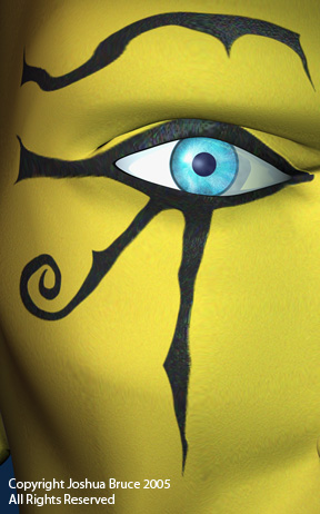
Your ear is missing the Y branch--it only has half. As for the toe--I'll get right on it--maybe ::starts trying to beat other projects back into submission:: J
-
Yeah, you know what this car is..or you better
JoshB replied to pixelmech's topic in Work In Progress / Sweatbox
Woohoo I actually can contribute to the mach 5--right one. Add a slight bump (if you could paint a bump map with "brushed" strokes that would be perfect) to your chrome this will change the reflection slightly. Change the color of the ground plain--with some variance in color--like a blacktop road, surrounded by grass, with a cloudy blue sky. Also, add some (very little) reflection to the body itself to give you that radiated light feel--without having to wait around for photon mapping. This will give a more consistant lighting/coloring across the model. Hope that made sense and helps. J -
I like the far background layer good trapping lines as the head is a sphere and will lead the eye around the card. I would like to see that full head looking toward the text from the bottom right of the card--mostly just to see if it works. The reason my mind is going this way is because humans have a tendency to look where others are looking--therefore, if the rabbit is looking at us the tendency is to think he is staring at something behind us. Further, English speaking people tend to read left to right top to bottom. Thus, putting the rabbit on the bottom right it will, theoretically, be the last thing anyone sees--but, he will be staring back into the card--getting the viewer to be trapped. Now the text boxes I am having issues with. Mostly because they seem to clash with the background. I agree that the bevels seem unnecessary (also, bevels, drop shadows, and outer glow are layer effects in photoshop they don't have the same--ooooh ahhh appeal they once did. If you did it the hard way--I'm sorry--just know there's an easier way). I would recommend a flat square--similar to what you had before--no outline. Also, if you could make the blocks a warm color--almost red this will help make them stand from the background (which seems to be the only logic behind the bevel). Red/orange is the complimentary color to green/yellow. Therefore, when you put them together there tends to be a push but aesthetically they don't clash. Try to stay away from full on red and full on green--or be prepared for a lot of christmas comments. Similar orange is the compliment to blue--but then you have a lot of broncos comments to contend with. Given my affinity for page layout I would recommend putting the name block in the top left, leaving a small gap between it and the edge of the card. Follow it by the info box in the center of the card--making the box itself slightly smaller than it's current incarnation. Then a render of the bunny head in the bottom right staring back into the card to trap your viewers. With the ears going up the right edge of the card. Now top to bottom left to right it's as simple as an introductory conversation--my name is, i do this, my work is here, contact me here, simple sample image which directs you back into the card. We now know what you do. However, art is too general. Think of it like this. If you are handing this thing to a business type person they are the most impatient, inconsiderate, and non-time having schmoes you will ever meet. They don't have time to screw around. Saying you're an artist in today's market isn't like it was back in the day--when you either painted or sculpted. Digital artists, graphic artist, painter, sculptor, sign art, so on and so forth--all art, but different. If you want to animate and do vfx just leave it at that. I am saying this not to try to take over your design (which is how I react sometimes to crits like this). What I am saying is basically what I would have done given the elements you are working with and why--without trying to bring my own personal aesthetic and style into the mix. I never would have chose those elements--because they're not me. However, they're working a lot better for what I've seen from you. The green coincides with the coloring of your site. The character matches more of the work on your site. It's in CG and most of your site has 2d stuff--but nonetheless the concept is the same. You are definitely heading in a more consistent direction and that is wonderful. J p.s. if cost wasn't a major concern I would also suggest putting your character head on the back of the card, maybe looking as though he is trying to peer around the edge of the card. p.s.s and just to show you that I don't think myself above this. I once had an objective statement on a resume that went something like this--I want to animate interesting characters using various rigs. In an environment that fosters personal and artistic growth. Okay--that's not saying much. First, off what makes a character interesting? Second, rigs in general are, by necessity, interesting? Third, isn't that the objective of an animator in general? Fourth, isn't the point of a job to foster personal growth? Fifth, what direction do you want to grow artistically? Again, they say so much but not really. I got so fried by my prof (if that's your objective statement--again--sorry). But, he LOVED my business card if you want I'll post it so you can see, and I'll explain why I made the decisions I did.