JoshB
-
Posts
381 -
Joined
-
Last visited
Content Type
Profiles
Forums
Events
Everything posted by JoshB
-
The lines are making it a really busy design--distracting the eye from the letters which should be the focal point. Don't know what you do--still. Are you an animation studio. Visual effects studio. Rental studio. Painting studio. Are you even a studio--or just an independent. Also, considering the title it could literally be anything. However, you are advertising yourself--not a company. Given your online portfolio you seem more like a 2d person not a CG person. If you can do all these things which one do you really LIKE to do--and stick it on your website. Yes I know--I really like to do all of them--pick your favorites. For instance--I can light, I can texture, I can composite images, I can take a mean photo, draw a nice picture--life or fanatasy, just found out I'm good at sculpture, animate, web design, web animation, graphic design, logo design, design layout, page layout, workflow, story board, write, act, blah, blah, blah. Multimedia artist and proud of it. But I REALLY like computer art--computer artist. But, I REALLY like to bring stuff to life--visually (texture, light, animate). But, I want to get PAID to animate--therefore, business card says: Josh Bruce Animator Further, the assumption in most houses is that you are semi-versed in a LOT of areas. Think of it like this--you're selling yourself. The business card gets people interested--so it better reflect in some small way your personality and your style. Most of the stuff on your website are cartoon animals. So, if your business card doesn't reflect that nature in some way--it's a mixed signal. The business card should lead into a resume with a similar "feel." These two items lead to the website. Which, again should demonstrate your style--your best work. And your range, if there is one, some guys only do frogs--but hey they are some nice flippin frogs. Others do mechanical models--but they are some nice mechanical models. If you're range includes all those things--prove it in your portfolio. I could tell you I was the best Mechwarrior modeler you've ever seen--but show me a mechwarrior on my site to back it up. Anyway, it doesn't match you. You don't seem like a dark person--as the color suggests. You don't seem like a rigid person--as the lines and boxes suggest. And, it definitely doesn't match the work on your site. I was expecting some gothic style artwork--imagine my surprise when I saw your warner brothers style. Therefore, I'm not digging any of the designs--as they pertain to you. The design is alright--just not for you. J
-
The rounded corners. Look in your cd and pull out the beveled cube and compare that to a regular six sided patch. J
-
Best way to set up a gun shooting?
JoshB replied to Newbert_Zero's topic in Work In Progress / Sweatbox
Well you can make the bullet part of the gun but then when he shoots the gun you want it to translate to a path outside of the model so that the gun bone is no longer making the bullet move upward. Personally I would make the bullet seperate from the gun then when he fires just import an instance of the bullet and go from there. Also, you should try editing your initial post to include all those other posts that aren't necessary. J -
Love the vogue sequence myself. However, something about the lack of motion in the collar bone steps down the motion for me. I mean the collar bone itself doesn't rotate much--however, it does rotate especially when the arm crosses in front the body. Love the model and texture. I think the eyes are fine with the full mask--I do have issues when they are with the open eyed mask. What I would do for the eyes is to make them a blind mans eyes. You know the old sage senseis from all those great ::cough:: cheesy ::cough:: kung fu movies. Retina almost the same color as the cornea and the pupil almost real light as well. And, thanks for all the contributions to the wonderful world of hash...I figured this was as good a place as any to say that. J
-
Yeah, you know what this car is..or you better
JoshB replied to pixelmech's topic in Work In Progress / Sweatbox
I think it's your nicest work yet. Sorry I didn't comment on the trunk issue--I had no idea what to do there. Definitely coming along nicely. J -
Vernon you are the man. For the longest time I did not post to this thread simply from the nature that I thought it was going nowhere and off topic to the purpose of the forum (WIP). Thus, a concrete concept from start to almost finish. Pixelmech's Mach 5. The McLaren. The Dragon. Seraphum. So on and so forth. Then I couldn't stand it anymore simply because I couldn't believe the topic was still going. Not only because of MM but because of people talking about how upset they were that this thread had absolutely nothing to do with anything focused. The concept here is that everything is everything. The largest the same the smallest the same--everything of equal importance. Is it off topic--yep. Can some of the images be considered risque--yep. But, just to rock the boat a little (I'm not in a good mood right now so pardon me if I seem brash) by mentioning a phenomona I have been questioning for a very long time. When art is interpreted who is it that makes it perverse--the artist or the viewer? Was Michaelangelo perverted for making David in the nude? Some people think so--because they can't get passed the sexual nature of a nude figure--however, some people can, simply by looking at the body as a series of forms. Does that make one person right and another wrong? Who knows? Furthermore, who cares? We each bring to the table that which we already have. I'm pretty sure we all think MM is a little strange and out there--thus, his latest image has to be a phallus. But, I thought the same as Vern--flipping us off not flashing us. Now I'm not saying you have to meditate on it. Or whatever. What I'm saying is stop perpetuating that which is complained about most in our society. Parents don't like what their children are seeing--yet they don't change the channel. Just change the channel. Or read but don't respond. If enough people do it then the only way this topic could possibly resurface is by MM himself. However, I don't find it enjoyable to resurface a topic that no one is responding to. Remember the bully at school--ignore him and he will go away. I will say this from an artistic vantage I appreciate the latest image a lot more than the others. The reason I do is because the first image was not an MM original--it was an image by Da Vinci modeled by using someone elses head model tweaked out. The second image again wasn't an MM original it was the droids on what appeared to be a stock image of a beach. However, this last one actually seems to be an original model textured, lit, rendered, and arranged by MM. From an aesthetic standpoint I don't like the image. It is not appealing to me. It shows not elegance. The colors are not complementary to each other. The model does not mesh with the photo. The high dense black surrounding the green carrys too much weight. And, a few other things which I find annoying. But, I'll tack this little quote on here: "So, even though it may appear to you that nearly everyone hates Jeff Koon's work, the critical point is that people take the time and effort to hate it, publicly and at length, and this investment of attention effectively endows Koons's work with more importance than the work of those artists whose work we like, but not enough to get excited about." J
-
http://www.zandoria.com/uv.htm When you create an object in 3d the vertices/cps are given a 3 point location XYZ. There is also a corresponding set of coordinates given specifically to how materials will be effected on the object UVW. Therefore, if your UVW coordinates are drastically out of sync with your XYZ coordinates, and the size/shape of your material you will get undesirable distortion. However, if you project the image directly onto the shape you have created then I don't see how this could be the problem--I just thought it was worth mentioning--and checking nonetheless. J
-
If your mission on this forum is to gain a reputation as being an aloof, mysterious, dodging person--you're well on your way. However, if you continue along this path the way you have been chances are people will begin to ignore your posts all together. This seems more like a topic for the Off Topic section. As it seems to have nothing to do with a grander project that you are working on--thus Work In Progress. The topic is not Animation Master. The only reference to anything AM like is that of another post in which you were deleted. It seems more like you want to have a conversation about EVERYTHING with no focus--if this is your intent--good job. However, if it isn't your intent--slow down--get some sleep (not meditation SLEEP)--get some focus, and stop reading every internet article in the known universe. However, we will most likely never know whether you're "playing" or not. Because, to put it simply--if you are, what's the fun in giving it away (Andy Kauffman table for two)--if you aren't, then this is perfectly normal and you don't understand why some of us are having "issues." And, no matter how many times we explain that it has nothing to do with a fear of the subject--or not meditating long enough--or not thinking about it that way--if we are not thinking the same way you are we are doing one of the afore mentioned coping mechanisms. As for the model itself. What Marcel said. I don't think he looks like Zeus I think he looks like the Sistine Chapel creation of Adam tile. The lip sync is not right on the animation the timing is off giving it a very overdubbed vibe. J
-
Also try checking your UV coordinates for that particular area. It's pinching as the though the projection was done with the selected cp/spline parallel to the upper cp/spline then the cp was dragged to its position. If your UV coordinates are distorted in this same manner you will get pinching like this as well. Of course that is if the flipping of the normal doesn't fix it. J
-
The falloff to complete black at the top of the image bothers me. You might try some bounce lights from the ground to the roof just to give it that radiant effect. Other than that looking pretty good. J
-
Yeah, you know what this car is..or you better
JoshB replied to pixelmech's topic in Work In Progress / Sweatbox
Well that's one way to get out of modeling a grill. Seriously thought it's coming along nicely. J -
What idolitry? What I was saying is that iconoclasm is the act of destroying religious imagery? Therefore, iconoclasm does not apply if the image has nothing to do with relgion. Thus, until people start worshipping Michael J as the founder of some unknown religion to praise some unknown god, and then we destroy images of him because they take away from his glory--there is no comparison to iconoclasm. Now, if you made a "photo-realistic" model of the pope. Then someone destroyed it because it takes away from the glory of god. Then iconoclasm will apply. When people accept non-reality as their reality it will be a hell. However, people do that now. Why are people always afraid of the future? Since, time in memorial people have been trying to frighten people into stagnation. Don't move forward because the world will explode if we do. Throughout the ages people have been doing this--why perpetuate it? We have moved forward. We cure diseeases, we can communicate around the world in miliseconds, we have explored every inch of land on this planet, we have gone to space and back--and the world's still spinning. A person cannot take advantage of you without your permission (Franklin D. Roosevelt--I think). An individual is an individual. If everyone in the world were to disappear I could still survive. We can stand on our own legs. There are just a lot of people trying to convince us that we can't. J
-
When Michael Jackson becomes a religion...then we systematically destroy the images of him because we should be worshipping him directly...then it will be iconoclasm. J
-
Most artists I know that create dragons use bats as their reference. Since bats have the same fingers joint set up as the archetypal dragon--and the same webbing. Since it is a web the size of the skin would decrease slightly and then fold in on itself. The fold does bother me because it looks too stiff to be flesh. Look at some bats. J
-
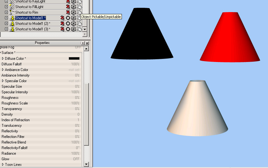
Don't know if this is what Rodney was saying so I'll just say this. Why not just change the color. In the chor you have a shortcut to your model. The shortcut has pretty much all the capabilities as your original. Therefore, the same options. Thus, just change the color on the shortcut. The white one is the original. J

-
I'm concerned about the legs and neck. They seem like they will crease undesirably. Also why is the jaw so harsh? J
-
You the man stan...uh...Gene. Are the shoulders univrsal joints I can't tell from the image. Do you rig these creations of your or do you just like modeling them? J
-
The corner of the door is entering the car at the top...but beyond that...as Robin Williams once said...one is glad to be of service. J
-
They look like regular hinges to me so...if you have your angle right you should only need one bone for the entire door. Start the bone at the body where hinge actually rotates and put it in the angle that the actually hinge would be. Assign the entire door to the hinge and it should give the illusion of there being two hinges. Or--the hard way--but a man with your time this shouldn't be difficult. Start the bone at the mirror on the top part of the hinge. End the bone at the top hinge (the side near the windshield). Point the roll handle away from the car, assign all cps to the bone. Then just rotate on Z to open and close the door. J hope that made sense edit: added image just in case.
-
It's not the best render I've done...and I'm sure you've already discovered it...but nonetheless. You could also add some very subtle bump mapping or the like to the body to give it more of a foam look. The secret to plastic is that it has a sharp specular highlight (depending on the type of plastic). Also, is the fact that it is somewhat reflective, however, not usually necessary to add to cheat the material. I like the grill. It really looks like you are getting the hang of modeling. J
-
Still having a problem build grills are we? Good job on the body though. Try a toon render because you might just find you don't need that rubber texture. Because the more texture you add to it the more it will look like one of those old school wooden toy cars, and away from the book--but maybe that's what you want. J
-
You just took Colin's advice of modeling any and every last thing and ran with it. You have definitely come a long way--in an extremely short period of time. I'm unfamiliar with the book so I can't give too much as far as critique on this one. If I knew the look or had a sample image to go by I could offer something more--beyond that--keep on keepin' on. J
-
Stian you are a man with WAY too much time on your hands. Very nice. I have not tried my hand at mechanical modeling yet--as I find it supremely more difficult than organics. So I know this is a tasking progression. Love the build movie--that was really having too much time on your hands. However, incorporate that then fade to the finished model, then spin it, and zoom off and that would be a fun little thing. Again, good job and much respect. J
-
Interesting gun. Try some grundge maps and bump maps for textures. Another piece of advice. Instead of posting three times for three different views. Render the files. Stitch them together, and post one picture. Like this That way we can get it all in one shot, instead of having to click back and forth. Thanks. J
-
My "Cooper " Head doesn't look right!
JoshB replied to brainmuffin's topic in Work In Progress / Sweatbox
Nice model. I'm not really liking the dent in the forehead. Men usually have broader browlines than women, therefore, more muscle, thus, more creasing in the general area. However, women usually have much less muscle in the area, therefore, their browlines are not dominant, thus, not a lot of creasing. Plus it really does look like an accidental dent. But, very nice nonetheless (is that a word). J