JoshB
-
Posts
381 -
Joined
-
Last visited
Content Type
Profiles
Forums
Events
Everything posted by JoshB
-
If you want it as your avatar render as tga then use flash (if you have it) or you can compose an animated GIF (but those aren't as nice, and they bog down my computer at work ) Looking good. J
-
Looks nice. Interesting concept. However, it looks as though it is floating (I know it's floating--but, sliding) as the camera rotates I think this is a combination of the untextured floor and the motion of the camera in relation to the coat. And, I'm sure you saw the shadow flicker. J
-
The now RED robot as he walks up the hill his feet are floating down--it would seem they should have a little snap. All you should really need to play with are the curves of the f curves for this motion to give them a little more ease in and out and snap. The secondary animation on the antanae of the toys robot is nice. What would be nice to see is around frame 753 have toys open his eys slowly with his pupils looking up (like rolling his eyes) and then come back down to looking straight. Because, right now it's a little disturbing that he starts walking without looking where he's going. I know he's a robot and doesn't really need to watch where is going--but, still disturbing. When he gets zapped (1045). Have him go straight to spread eagle position. No lift and jump or anything--just snap. And, if you can change his ambience intensity from 0 to somewhere closer to 100% and the color a red-white (otherwise known as pink). Also, if not too much work. Change the background color of your camera to black (just temporary). Add glow to the bolt, and to the red robot when he gets zapped. Mainly I'm just curious what this could give you. J
-
Yes J
-
The light is much better. I'm really liking this render. Do me a favor. Add a directional/sun light that is above the room aiming down to the floor. Be sure to turn cast shadows off. Make it slightly green. And, make the intensity low, you only want to lighten the darkness of the floor in the foreground a little. What this should do is add more light to the room--specifically the floor--while maintaining the same low level light feel you have right now. Also, do a wireframe render/screen capture of your scen from the side view so I can see your lighting setup. J
-
It's your room. Looks more like a castle so, think castle. Or you could go with a roman style room by adding some columns at the four posts. Personally, I would animate the scene first. Plan it out if the characters aren't interacting with the scenery then anything you add right now to the scene will be arduous and only act to increase your render time. So get animating. J
-
Turn off has falloff--then you don't have to worry about how much influence it has--and if you're not weighting this thing then you don't need it anyway. Double-check the left leg and make sure the cps are not assigned to the other leg's bones. That happened to me before. J
-
If you make your model transparent it will make everything on the model the same transparency. What I would suggest doing it create a color map which includes the color of the blobby--with the face on it. Get it where you want it. Then create a transparency decal which will be some shade of gray where you want it to be transparent--and black (well one shade lighter than true black) where the face is. You can do this real easily by duplicating the layer of the color map and playing with the levels. Then right click the images link under the decal and hit add image. Select your transparency image. Set type to transparency. The decal will be placed in the exact same spot as the color map and you should get what you're looking for. J edit: if you want I can demonstrate something for you.
-
Or, you could guesstimate. Or, you could even go into muscle mode in the choreography and scale the window that way. But, all of these will tecyhnically stretch/distort your decal--because you're not changing where it is you're change the surface it's on. Think about a balloon with a stamp on it. If you stretch the balloon the stamp changes--same concept. Therefore, the best method to do this, in my opinion and experience is to use the UV texture editor. Resize the window to the size you want. Then do a split screen of the model and the UV texture window. Adjust the points until you get a "clean" decal and you're done. No fuss--no muss. I think that's all the ways I know of to scale that window. J
-
For the grass you can use the hair particle emitter. It is capable of using images so you can go that route. Just make a blad of grass with and alpha channel in PS or some similar program. Or, you just tweak the hair properties until you get a look you like. Turn object collision on--that way when they walk the grass will react. The benefit to using hair for grass is the you can comb it and muck it up a little--since real grass grows semi-randomly. Do me a favor--next test render--use the frame burn post effect. That way I can tell you from frame such and such to frame such and such--do this. It's what the pros do. Anyway, the green robot points. The white robot freaks, and then looks forward. He leans back (inhaling) then sighs. The way it is now he reaches halfway through this sighing motion then starts to blink. I think that is backward. As he begins to lean forward (sighing/exhaling) his eyes should close, and be completely closed at about the midpoint of this motion. Also, when he reaches the end of the motion I would like to see a little head shake back and forth. Maybe to or three times. Think about when someone tells you something you don't want to deal with. You sigh the exaserbated (can't spell but I can use big words) sigh, and at the end of your sigh you shake your head slowly almost in disgust. I'll wait until you zap 'em to go into the ending bits. Great job so far. J
-
The white robot's eyes should be slowly closing as he exhales--in my opinion. The change in the direction of the point is very effective. One thing about the eyes. When humans turn their head--unless consciously trying not to--they blink. It's an instinct thing. If you're turning your head you don't if something is there to poke your eye out--so you cover it. Anyway, these guys aren't human--but it's something that makes it seem unnatural. If these weren't robots I would be getting overtly picky on the green robots walk up the hill. When you walk up hill you tend to lean forward--trying to fall up. Also, this is a slight bounce as you prepare to give yourself enough momentum to lift your foot--give it enough time to swing, move ahead of the previous foot, and land. However, robots don't have the issues humans do--bein driven on gears and servos. So, the question is how human is too much, and how much is not enough? Find the middle answer you're set--and you're pretty much there. J
-
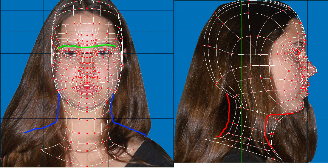
Apologize to Jane for me--I drew on her face. And, just because she can beat you up--doesn't mean she will--just play nice. Anyway: The green line is where your first complete Eye Spline ring should be. Image she is wearing goggles and the outermost ring should be where her eyebrows are. I think that's what Jage was saying. The blue line is where I'm estimating her neck and shoulders should be. Given where her left shoulder is. How it is angled. The color shift in the hair. And, the fact she's a girl. Also, given the curvy natuve of her face it would seem that her neck might be slightly thicker than what you have. Red: The chin is not recessed far enough. Which leads me to believe that the nape of the neck is not far enough back. This means you will need to increase the mesh density in the front part of the neck. Which could also prove beneficial as it will decrease the size of the five point patches connecting the skull to the neck. Good job lining them up though. And, the shots themselves are wonderful. Good posture. Straght. Just wish that hair wasn't there. As for the hair question--I have no idea. Still playing around with that concept. J edit: helps to put the right picture in don't it?

-
Yes it would stretch the decal. However, you can right-click the decal and hit edit which will open the UV texture editor and you can change the position of the UVs. Which can fix the stretching problem. Or, you save your old model as a prop (as long is it was within the model itself that you sized the windows), then import the prop under your model. And, use it as a reference. Or, you could do a straight on render of your window wall, save as tga, import as rotoscope, and use that for scale comparision. J
-
Yeah I thought of that too. But, got this. J
-
I liked the headlights from the previous version. Actually, I thought that was the best part. J
-
No good. Sorry Heath. J
-
I don't understand the question. If you copied the model I made you should be able to look at from front view. Select all the cps for the window. Switch to scale mode. There will be little grab handles that will allow you to scale along a the Y or X axis. J
-
WAAAAAAIIIIITTTTT!!!!! Almost forgot--and, I'm rebuilding my website to include some more of my digitally altered photography. There I think that's it... Maybe... Possibly... ... J
-
I'm just going to throw myself into this a little bit further. I've been doing the college trip for about 3 years now. Deans list every quarter yadda yadda. Being an art major in college sucks. It's a time sucking vortex of doom. For instance, last quarter I was taking sculpture, woodcarving, and Western Civilization. So, I had to make 3 sculptures in plaster. Three sculptures in wood (one of which had a minimum scale of 3X4X5--and I drive an Elantra--the logistics on that sucked)--in a little over 8 weeks. And, I had to be able to keep in tact the last 4000 years of western civilization. Now, add to that I'm currently working on my Zero project in AM--when I get a nice splash render done I'll post it. I've decided to practice my human modeling skills by doing some stills. Which in turn is going to aid me in making my Hades and Persephone project. Now I'm in painting (which I hate to paint to begin with) we have in class assignments and a homework painting due every week. And, photo II in which each assignment must have four prints to be critiqued of which there are three assignments. And, I'm taking Greek and Roman Culture--so again last 4000 years of man shoved into my memory banks. Oh did I mention I work as well--a little over 23 hours a week. The two studios classes are 3.5 hours each twice a week and the culture class is another 2 twice a week. Now throw into the fire--I love to help/teach people--so me and this forum are REAL good friends. So, my most hated question of all time from the people I meet. So, what do you do in your spare time? J
-
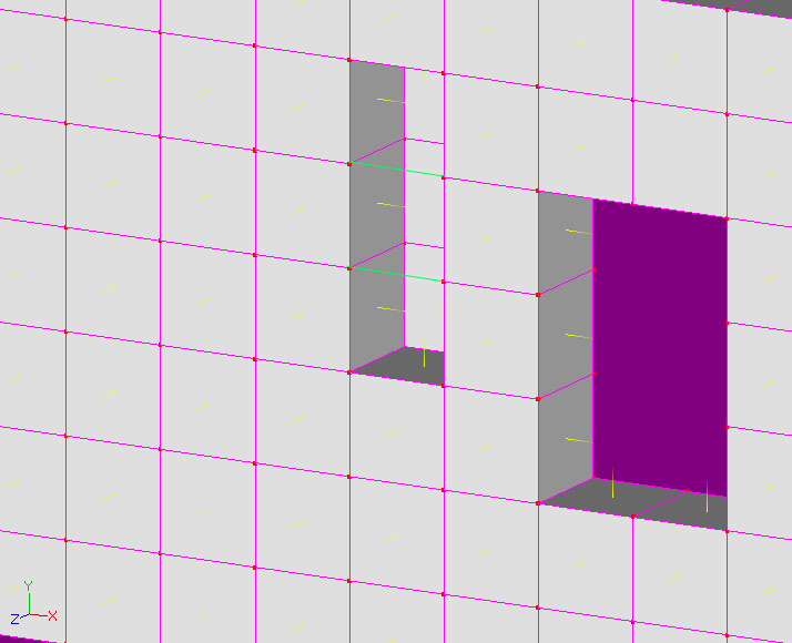
Now this isn't the best modeling job so keep that in mind. Also, because the splines are peaked it's going to be impossible to tell what are complete splines and what arent. But, I will try to explain. The frame (rectangle) that makes up the back wall is a complete spline. Which means the splines that connect the front and back of the wall are "floating" splines. The windows are made by the horizontal and verticale splines that wrap around the wall--which are complete. This causes a problem though because the window will become solid. Easily remedied by adding a cp to each spline in the center of the window top and bottom. Now comes the second problem. When you try to connect the front window rectangle to the back you will get internal patches again. To remedy this cut the spline in half again (pressin Y with the spline selected). Then run a complete spline around the inside of the window. I did a copy flip attach method so the windows would be equidistant. The floor itself was easy enough. Snap to grid. From top view go to the right pretty much wherever you want to. Draw a 2 point spline--as long as you want. Select the spline--extrude to the left--as far as you want to. This will give you a patch. Now switch to side view--select the patch--extrude down/up as far as you want to. Use the scale tool until you get it to the right size and poof you're done. J
-
Yeah whenever I ask a girl to model for me it takes about three hours to explain. When I'm out model hunting I find myself taking my sketchbook and mini-portfolio with me--just so I can say NO REALLY! You should see what happens when I ask guys . When I take roto shots I usually get a bunch just for reference. I'll take the basics (the ones I use for the actual rotos in my 3D app)--hair slicked back (firmly attached to the head) or in a ponytail. Then I'll get a close-up of the ear. Then if I'm feeling particular sadistic various facial expressions. And, if I want to go semi-photoreal I'll take a front on, three-quarter, and side shot (again). Then in PS smooth them all together to make a texture map. Eventually I will get around to making a lot more stuff in AM, and stuff that I can post (my models are really shy) to show you what I mean. Maybe I'll make myself. Hmmmmm....great....yet ANOTHER project. J
-
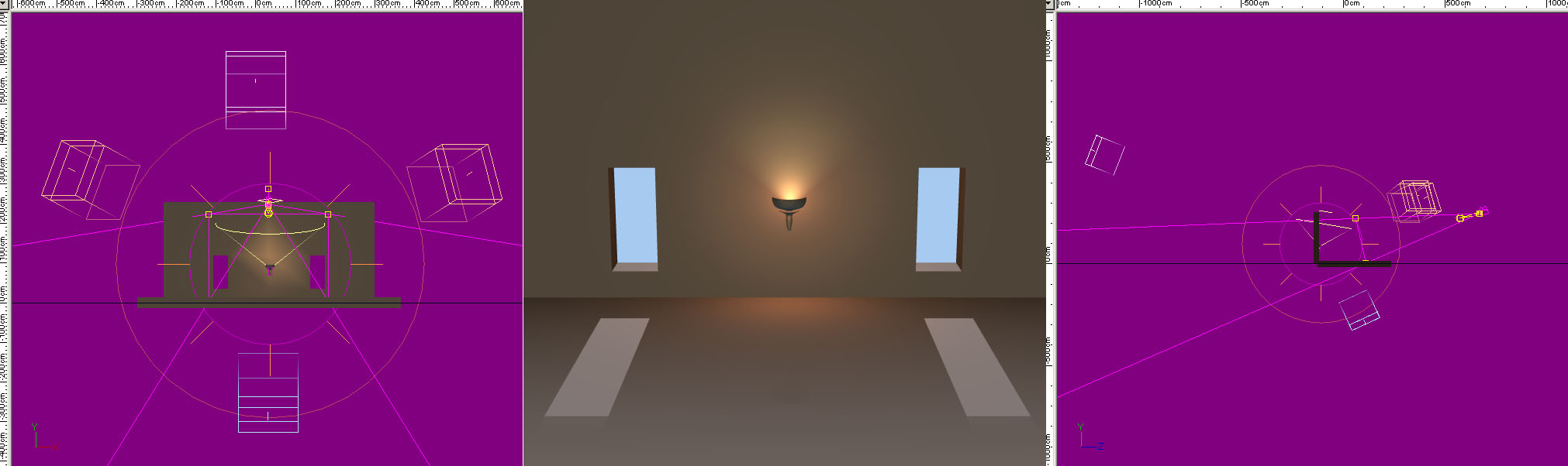
If you rebuild your room model you won't have to reposition any slabs because they won't exist--here is an image using a real quick model I made using the instructions I placed above. It isn't just a matter of convenience of having one model it's a matter of render time--material effectiveness, and if you plan on animating your camera you may get back artifacts from the internal patches. Here's what I did: I rebuilt the floor and wall with windows using your originals as a guide. I took your torch model and added two new lights. One bulb and one klieg. I played with them a bit to get the position proper. The bulb light is lit a reddish orange color (as depending on the temperature of the flame the bottom will tend to be red). And, I made the klieg a yellow (as the tip will tend to be yellow). I took the backlight and made it white--I just copied the "key" light from the default chor. There are three fill lights in the scene. One blue--and two orange. The blue is placed under the models and meant to add just a little bounce light from the sun light. The two orange fill lights are there to add bounce light from an assumed wall and/or torches on the other side of the room. Also, they pick up the slack from where the torch light falls short--and finish filling out the light in the room. The texture files did not come across so I did not play with those. I hope my advice helps. J
-
Your concrete slabs have a bunch of internal patches which are GREATLY effecting your render times. Also, it is just not a good idea. Your splines are not running around the model the way they should. It appears as though you used the grid wizard--then extruded the grid. Which is causing weird things to heppen to your surface normals and causing the internal patch problem. Basically a good rule of thumb is that if someone cannot see the patch you just built--don't build it. To build your base slab: From top view put a spline running down your monitor from half the depth you want your model to be--then run it across the X axis half as well. Select the spline and extrude it to the width you want. Then from the side view select the newly formed patch and extrude down to the height you want. Now this will give you weird curves--DON'T freak out. This is the nature of splines. Once you have the "box" made select the whole thing and hit the peak button. This will give you a model exactly like the one you are currently using. Still not the best splinemanship--but it will give you what you have now. It will render A LOT faster. Your surface normals will be correct. And, you won't have internal patches. **EDIT** also your backlight has been increased in size along one axis to a length that is unnecessary. As I said before directional/sun lights are infinite in all directions--and have no falloff. Imagine it like this. Take a plane that emits light in one direction--the light will never fade the further away your are--and the plane goes on forever in both directions. J
-
Simple--put a light there. Complex--you could do it multiple ways. One would be to actually build the lights into the model itself. Right click in your model window--new light. Or, you can just start adding light in the choreography. Let me play for a minute. J
-
I would also recommend retaking your rotos if it isn't too difficult. When you take a rotoscope shot you want to get any non-essential information out of the way. Ask "Jane" (if that is her real name) to put her hair in a ponytail held in the middle of the back of her cranium. This will give you the curve of the skull and the nape of the neck without the hair being in the way. Also, when taking the rotos try to end them just below the collarbone. J