-
Posts
7,863 -
Joined
-
Last visited
-
Days Won
15
Content Type
Profiles
Forums
Events
Everything posted by NancyGormezano
-
Ummm...I'm not necessarily recommending that ...I was only trying to say that it could be used for that...and that's what was done for TWO and SO projects. Some people like to do it that way. I don't. I find that I prefer doing dialog as a separate chor action (separate from any body chor action), as in some cases, if the dialog was done in a separate action (not chor action) - there would be difficulty in getting the changes to show up in the real-time if one modified the dialog action. One had to go thru lots of banging on enter, space key, closing and opening of chor, saying prayers, before change would show in chor. I'm not sure what causes this - it may be that the characters for TWO and SO had such complicated rigs (1000's bones, lots of expressions) that it took forever for change to show (pure speculation on my part). Another "problem" is that when the wav file is in the separate action - it usually doesn't show visually in the right place in the timeline when in channel display mode, so makes it hard to sync body parts to the dialog wav form. So best to try it first with a test with your characters, simple chor. The advantage to doing dialog in action is that you can have the wav file in the action, so that you can move them around in chor as a unit, and you can easily have multiple/different characters saying the same dialog, using the same action.
-
Actions can be used for dialog, as well as for building sets (with action objects), and for bvh motion capture type things. I use to use actions for complicated dance steps, and then would string a bunch together in the chor. However, I found that I needed to modify the actions, so that they would work for different characters of different proportions - even if they used the same rig. I've used actions for repetitive breathing motions, as well as water wave motion, both to be mixed, overlayed with additional chor actions to get more variation. The neat thing about actions is that you can change the timing in the chor (to speed up, slow down), crop to only subset of action, as well as repeat backwards, forwards, change holds, jump around frames, repeat only portions of action, mainly by use of the ease property
-
Very excellent - YOU are a gem! I like both, but I think I prefer the first - probably because the column expands with time, and resembles dispersion effects more closely (IMO)
-
me too, didn't like THAT new one. I like THIS new one better than old one.
-
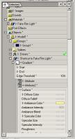
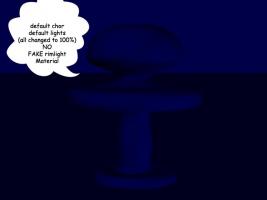
I'm ok....sorta...with what you've got there for night time lighting, when I think about this panel in context with the rest of the strip. As a stand-alone panel - no. So in case you might want to experiment for future: Here's a simple trick, to "silouhette" your models, that I stole from Holmes the Hustler, who stole it from the Bigboote Boy: A FAKE rimlight MATERIAL (no electricity, foreign oil needed) 1) create a gradient material 2) add an ambiant color of your choice in the 2nd attribute only - Normal people might choose light blue/off-white. 3) change the percent ambiance to something 50-100 4) set the edge threshold property to something other than 0. (the higher the percent - the more/wider the rim light edge effect). Tasteful, subtle people choose 10-20 5) drag material to model 6) play with edge threshold, color, ambiance % (in the model instance) to taste while doing progressive screen renders. You must render "progressive render" to see effect in real-time. It's an interesting look...but may not suit your taste.
-
Oooo..eeeee-uuuuuu eek eeeek eeekk (translation: Pretty! in whale speak)
-
They both look great - well done, youse guys
-
Very nice stuff! with a very nice mood...I love the overcast look & I can hear the silence, except for the water, and faint whale moans and groans... Ummmm....dare I say: Photoshop? That is, if you're not looking for an animatable/dynamic solution, nor a static image purist's solution? It's the resultant image that counts - not how you got there, from the viewer's perspective. If you are going for static image, A:M solution only - have you tried decaling photo of foam/spray (or some noise pattern) onto a shape/grid, messing with surface & decal properties (color, transparency, spec, reflection, roughness), positioning & deforming the spray "object/grid" in the chor, based on camera ?
-
And seems to render much, MUCH faster in those scenes with hair - especially with lots of hair. 'Tis a dilemma. If you want to use NON Multi-pass, then perhaps you can remove the fake rimlight? (add lighting instead)
-
Are you using Multi-pass rendering? I ran into this problem (15e) & using bump maps & fake rim light material, only when I rendered with the default (NO Multi-pass). When I rendered WITH Multipass - the bump maps showed up. Where did da bump-bumps go?
-
Yup, he looks like quite a cupcake - intellectually-wise of course, with a nice set of wings. I find it interesting that you chose not to make him cherub size. Nice model!
-
Barney? He'sa look like a Pasquale or a Jean-Pierre - but Barney ??? Nice character!
-
Oooooo - I like that! For some reason I can imagine Calliope music being played with this ...yes...I know...not very war-like sounding. Maybe it's the amusement park carousel like action that conjurs this association for me. Coincidently, according to wikipedia, Calliope was the daughter of Zeus and Mnemosyne, and in one account was reported to be the lover of the war god Ares. Sorta fits. Maybe?...ok...Not really. Nice!
-
Holmes suggested a good quick fix - should work - However, if you are still using ver 15e - there should be a problem with both walls as the decal does not cover the entire patch (even tho image does not have alpha channel). I always get a problem when I've done this in ver15e. The problem will only show up when final rendered - It will not show in the real-time view. Ver 15f should fix it. I will not be able to test it as I have the CD and do not have access to 15f. For the sake of curiosity, and to help solve this mystery - perhaps you can upload a zip file that contains a model that just has the 2 vertical walls (good and bad) along with the image you are using for the decal. -hmmm... not quite understanding this statement - but perhaps this is a clue to problem?
-
My first GUESS without seeing anything, is that you are using ver 15e and that the decal you are applying does not cover the whole patch and that the image you are using perhaps has an alpha channel If that is the case - download ver 15f (unfortunately not available for CD version) - However - if you prefer or must stick with 15e - first apply a decal to the surface that covers the entire patch (using an image that is the same as the patch surface color or desired background color) - then apply the offending image that doesn't cover the entire surface (and has alpha channel) And without a picture - I hope that made sense...
-
Very terrifically marvelous, of course!
-

My new creation,NUDITY,NUDITY
NancyGormezano replied to steve392's topic in Work In Progress / Sweatbox
I agree with Matt - the skin texturing is terrific - tell us what you did, please...please...please. -
Very interesting scene, well done. I like the more lit version better - but it all depends on the animation and what you're going to do with it A cockroach would scurry when the lights go on - unless he/she's watching tv alongside your main character.
-
I like the "Fake rim light" look best, then toon, because of the lighting Cute, effective characters
-
Ullis - are you using vers 15e or 15f? If 15e - the streaks might be occurring because of the known problem that occurs when a patch is not covered entirely by a decal. A workaround would be to decal the patch(es) with FIRST a background color image (blue), and then apply the "C" decal (or add image to the decal container) with the alpha channel - the streaks will probably go away. If you don't decal the background color first then streaks can sometimes appear. I believe this has been fixed in 15f - but I can't check because there is no 15f for the CD. I am also assuming the transparent area of your image with the alpha channel is 100% transparent and doesn't have residual "flecks". The halo area is a different problem. In this case - it can probably be taken care of if you create your "C" alpha image in photoshop with a background layer that is the same color as the "C" (black?)
-
Very very terrific - congrats! If you're going for realism - then we need to see translucent nylon strings and the individual coils on the metal strings, and of course some smudging and fingerprints on the tuning pins.. "A realist's work is never done", said the bait to the hook. Truly lovely model. No joke.
-
It definitely looks like stainless steel - no doubt about it. Some dents & pings, stains, etc, would help and perhaps the umbrella fabric can be a bit weathered, ie more sunfaded in spots, with spots of bird poop? - ok - forget the poop. Great cart !
-
very impressive - that's a mighty fine looking piano! (heh heh)
-
I will assume that you have 2 different image files, 1 for the front and 1 for the back. When you are in 3dpainter - you need to right click on the image file, eg. the one for the front and choose "Make only this image editable"
-
Oooooo....Very very neat hotdog stand! But perhaps a bit toooooo neat? Will you be grunging it up?


