-
Posts
7,863 -
Joined
-
Last visited
-
Days Won
15
Content Type
Profiles
Forums
Events
Everything posted by NancyGormezano
-
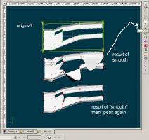
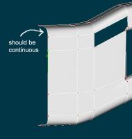
I think the TAOAM is a good start, but they are not the endall. They introduce new user to one of many ways to do something, but not necessarily the only way, nor are they very deep. Just don't take them as gospel, never to be questioned. Some of the interface(s) has/have changed. Some of the models are faulty. New users run into the quirks, get frustrated. But the exercises are worth looking at, trying, and then asking questions, and moving on to other tutorials, examples. And yes it's hard to find the info here on forum doing a search. That's why questions are always good, at whatever level you're at. Hmmm...I don't have a real answer other than I too have noticed quirky behavior when switching between peaked and not peaked cps, and with extrusion. As I said before, I'm not a mechanical modeler. I do squishy characters, and am not that picky about exactness. I traditionally work only with continuous curves (not peaked). If I need something to look sharper or rounder, smoother, I will add splines, or work with bias handles (less usual). When I took your model and then hit the "curve switch" I get a very funny looking splines. When I hit the peaked switch again, I get another funny model, different from your original. Me no likee. More importantly, I also notice that if I take your left most spline that you used for extrusion, that it is NOT a continuous spline - so I will guess you peaked that original spline from which you extruded - not a good idea, I don't think. As an alternative, or something to add to toolbox, I find I have more luck with getting "protrusions" or "indents" on/in a surface when I think of the surface as a grid (after extruding with continuous spline). Outline the cross section or shape to be protruded on the grid/surface with a continuous spline ring, thus creating 3 and 5 point areas. Then select all of the inner area and move it in 3D space out or in from the surface. To refine the indented shape, or protrusion, stitch in more spline rings. Then select all those 5 point areas (when everything is happy), and green donut your way to nirvana. malomethod.mdl
-
Glad to see that the phantom CP has been identified, but I am really curious as to how you are getting these. There seems to be some sequence of steps you are doing (not your fault...it's probably a bug). It would be good to identify what causes this - as I remember, you had some other weird model thing going on that could only be solved by copy/paste into a new model (or at least I think it was you, maybe I'm thinking of someone else). So I'm suspecting it's something in your process. (EDIT: yes, it was you. See this post about the funny coffee cup.) I looked at your project. I wonder why you have splines that are not continuous when you are "extruding"? Are you peaking everything? (why?). Are you connecting splines using the shift key? Are you messing with biases (maybe too early in the process)? I am not a mechanical modeler, but these are very odd problems, and perhaps you are using some keying/modeling sequence that might fit for blender, but perhaps is something that showcases a bug in A:M? And don't beat yourself up about asking questions here...WE LOVE IT! It helps everyone to learn something. Even those who have been here since the last Ice Age. It helps us all to shake out bugs, learn new methods. And please try to remember - those TAOAM exercises were constructed pre-Ice Age, and the software has evolved, changed, and what worked then (for the most part, sorta), might not still be true now (less sorta).
-

Anyone see Rodney the artist
NancyGormezano replied to johnl3d's topic in Tinkering Gnome's Workshop
Oh yes! The world is longing for another animation with John in it. A dress is way better than a vintage cow suit circa 2006. http://amfilms.hash.com/video/101/Im-a-Cow Great banner Rodney! I really like your artwork, characters. -

Anyone see Rodney the artist
NancyGormezano replied to johnl3d's topic in Tinkering Gnome's Workshop
It's under User Groups Nope. can't see it. I use to be able to see it, even tho I'm in Film group. -

Anyone see Rodney the artist
NancyGormezano replied to johnl3d's topic in Tinkering Gnome's Workshop
huh? What area? Coincidently I just noticed that there isn't a fellows forum anymore, or else I've been defellowed. -
looks like rain on the window pane. Ah..yes..now I remember. Dst files are related to DarkTree materials (procedurally generated patterns). I'm not sure how you get ahold of them. I have them because they were used on TWO. But I don't think they are standard issue with A:M anymore. There might be free ones? or you might have to purchase, not sure. right click on material/ new material/change attribute type to plugin/darktree/simbiont/load darktree (usually a dstc or dsts file - have no idea what the difference is) In general I stay away from complicated procedural materials because usually they are render intensive, and I find images/decals easier to control, and faster to render, and can get the same look. Bitmapplus material comes standard with A:M and you can easily use that with any image if you don't want to mess with decals. It has its funnies as well. right click/new material/change attribute type to plugin/kci:dnd/bitmapplus/add an image. Renders fast, but you only get to use it for color, bump, displacement type.
-
I/we know somebody in Scotia. Not an A:M user. Does that count? Probably not.
-
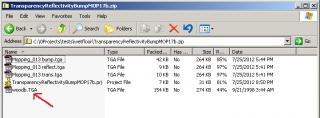
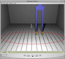
Ok...NOW I see the grid you are talking about in the 2nd movie. (I had to enlarge the movie so I could see it). I don't know where that is coming from, other than possibly it's a reflection of some decal/material on your ceiling? I was originally referring to the variations of gray inbetween the floorboards. It just seemed odd, that it was only in one area. A hand drawn look is always preferrable in my book! The image I am using for the wood pattern is a tga file...I don't know what a dsts file is. The wood pattern was included in the zip file I posted above. When I looked at the contents of the zip file, I see it is listed as woodb.TGA (caps), whereas the other .tga files have lower case for the extension. Perhaps macs don't understand caps in extensions? Just rename it with lower case? I believe I originally got this image off an A:M CD/data/materials/wood-b.TGA. I believe it is a very old image, so any CD/year will do.
-
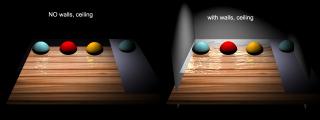
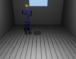
Yes, this endless tweaking drives me crazy as well, but it's worth it in the end. I'm learning something. I would expect to see a difference between your first movie and 2nd in previous post. You changed the camera angle, and you added the room: something more for the water to reflect. I saw a difference when I added a room as well (did not change camera angle) And yes, I have no doubt that if I switched to 15j+, PC I would start to see even more different results from mine (16, 17) and yours. Other things that will make qualitative differences in resultant image: I am using klieg light (not bulb), no shadows, No soft reflections. Not sure about your grid pattern. I see evidence of it in both of your movies (in the floor boards), before the floor gets wet, and more pronounced in the 2nd movie, because of camera angle. Are your floor board patterns a decal? My first suspicion would be the image that you're using.
-
I too have noticed discrepancies between renders done via the quick "render lock" and final render settings. Especially when transparency is involved. See this post . In some cases (especially with transparency) I prefer the screen render results. So yes, it makes it difficult to tweak. The reason the render lock image is different is that some computations apparently aren't done, or are done differently than the final render. Additionally there will be differences in final renders if you go with Multipass OFF, versus Multipass ON. I would need to see your settings (in your decal container, group surface, render settings) before commenting as to how to tweak. Can you post a screen grab, and describe what you are doing? Btw, it is much much better (easier for viewers) if you post jpgs or pngs to the forum, not tiffs. In order to see tiffs I have to download and save the file, and then open it up in photoshop. I converted your last screen grab tiff to jpg.
-
Try these settings to start then tweak to taste. The black is 26,26,26 (never use 0,0,0), and the white spec is 238,238,238 (never use 255,255,255). Additionally, make sure that your lights in the chor have specularity =ON, or else you won't see any specularity. The settings for the surface will vary according to the size of your model: how much & how deep you want the material to reflect, how big the spec size, intensity, how rough or smooth you want the surface material to look, and most importantly do you have something to reflect in the model. One size does not fit all.
-
There is no refractive index type setting for the decal. It's the bump map that makes the lines ripple. So if there isn't any gradation in the bump map, then there will be no rippling. Refraction will bend the image uniformly. However upping the refraction in the group surface properties will increase your render times, sometimes quite drastically.
-

An interesting test project...
NancyGormezano replied to MikeV's topic in Work In Progress / Sweatbox
yeah - seems like it would have been better for the plugin to have used splines as input, rather than ai files. Must have been a reason why it didn't. Perhaps because it probably made use of same code as the font plugin. It's a very old plugin. I still use XP Pro, and Photoshop 6.0.1 (pre CS) which can export paths to ai, that work with the plugin in A:M. My version of PS does not give me any options as to which version of ai to use when exporting, but since it works with A:M, I assume it must be 8 or lower. I hate upgrading. Invariably, things stop working. OS's, drivers, graphic cards, computers, software. Bah humbug. (uh...GULP...That must have been my evil really OLD cranky twin who wrote that last statement...) -
Not sure what you are going for. Are you trying to demonstrate waves? Without seeing your settings it's hard to know. But it looks like you are using a grayscale image sequence for the reflectivity and transparency (same as the bump?) instead of using only a black/white image sequence that defines the areas, and the amount of transparency, reflectivity is varied by setting the % in the decal container? Your still image in your previous post (mopped0.tga) looks right.
-
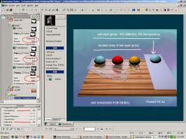
The wet look works sorta - but you seem to be covering up the color of the floor, so it looks more like painting. If you are happy with it, then go with it. However if you want to keep the color of the floor then: What I found best when using your mopping still, was to use a different black & white image for the transparency and reflections (with no key color) and your gray scale one for the bump. I changed the bump image to have a black background (no key color needed), but would probably still work with your white background (no key color). The important part is having black backgrounds for the reflection, transparency images. The image in the decal says that for reflections: black = 0 reflective, white = 100% reflective transparency: black = 100% transparent, white = 0% transparent The group settings: transparency =0 and reflectivity =0, will only apply to those areas that have not been stamped with the decal. I found that there are differences as to how things look when rendered in 16b versus 17b5, so be warned. They also look different as to how they appear on screen (with render lock) versus final rendered. Hope I'm not intruding, and hope this helps. TransparencyReflectivityBumpMOP17b.zip
-
I like that you're going for a stylized look - but I have to agree, it's looking like some very thick, stiff water as it gets applied - but I like how it looks at the end. Perhaps try lowering your bump percent in the decal to make it less stiff looking? I tried a test at doing something similar here, but not using an animated image sequence for the "painting" part, mainly because I didn't have one, and also wanted to try "drying".
-
uh...I can barely see your image. I had to play with the brightness/contrast in photoshop to see it. I don't normally have a hard time seeing images on the forum. I'm wondering if your monitor has the brightness cranked? Or are my eyes failing me? EDIT - I just looked at the histagram for original and yes, values are skewed towards left. (just uploaded a wider dynamic range version)
-
looking good! Really like that mopping effect.
-
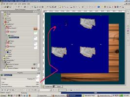
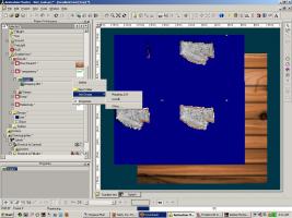
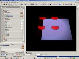
First: I LOVE your mapping mop...er...mopping map...It will be terrific once you get the kinks out. 1) The first thing I notice, after making your wet group blue, changing transparency to 0, and changing the image type in transparency to COLOR is that the stamp is not positioned correctly in the upper left quadrant. The other thing I notice is that after using white as the key color there is noise in the image or the other stamps weren't positioned correctly. I only changed the settings so that I could see the UV mapping. 2) FYI, you do not need to have 3 different decal containers. You can add images to the first decal container, and then specify what type (color, bump, transparency, reflectivity, etc). That is easier to manage and all will have the same UV mapping. right click on images/add image/pick image. Change type to whatever you want. EDIT: I am not sure how you are using the animation (mopping) image sequence - IF you are applying it as a .mov or .avi then you might be experiencing compressing artifacts. Your best bet is to use an uncompressed image sequence of individual files (img001.jpg, img002. jpg, etc). Otherwise, I'm not sure why you have the speckly effect. AND if you want to cut down render time - use a klieg light with zbuffered shadows instead of a light bulb with raytrace shadows. EDIT2: New screen capture shows where I restamped the top left, changed the 1st decal container to have multiple image types (transp, bump, reflect), made wet group red, added klieg light. This is to show how the surface colors of the wet group and base will influence the look as well. This is a screen render. I have seen unfortunately that final renders will look different than screen renders. ugh. Makes it difficult to tweak.
-
Nice!
-
I like your Mopping Map! Definitely looks promising. You should probably be able to use it as an animated gray scale (or just black & white) reflectivity map to define the wet areas (puddles) along with animating the transparency and reflectivity fall off values. Your reflectivity map can be shades of gray (white is 100% reflective, black - 0), no need to set a key color, but you could use an alpha channel instead (probably not necessary). I needed to do something similar, so I did a test for myself, see here
-
5 point patches are a coin toss for everyone, in terms of getting the green donut. And the normals have to be manually fixed sometimes. BUT what works almost 100% of time, assuming the patches are legit 5 pointers, is to select the 5 cps, and if the green donut doesn't show, then hit "." (ie the period key, which selects all other cps), then "." again to get back to the original 5 cps. Essentially ".." or double period. Green donut should light up. If that doesn't work, then hide all but the 5 cps, and lasso the 5 cps - donut should show up. If it still doesn't, there is something funny about the splines not being legit, and you might have to break some splines and redo them. To fix your Coffee cup model permanently: try selecting all the cp's, then copy them. Start new model, and paste into new model - ignore warning messages. Save model, close it, start new project, open this new model. Do not know why you have funny duplicate cps to begin with.
-
And I have noticed that if I select all CPs and copy - then paste all cps into a new blank model that Hash comes back with a message saying there are duplicate cp #'s and it is repairing them. (and to send a report in to A:M reports if you can say how it might have happened) This new copy/pasted model seems to be fixed when I bring it back in.


