-
Posts
635 -
Joined
-
Last visited
-
Days Won
3
Content Type
Profiles
Forums
Events
Everything posted by markw
-
Wow Jason! Though I too find that time hard to believe I think something must be off somewhere. (But oh what joy if true!) Probably best to run the test more than once to be sure no matter what results we get any way. Robert stated that the render output in A:M's preferences; Tools > Options > Render tab, should be set to "use settings from: The Camera" Those settings are;
-
Hi Sebastian, I'm not sure from your description but I may have seen the same problem as you when using the LiteRig a year or so back and I'm not sure it is the LiteRig causing it per say. For me it wasn't that the CP wights were wrong but that the bias settings for the splines passing through them were altering just a little each time a joint was moved and so the distortion effect got worse and worse. CPs that were not parts of joints never showed any distortions. Closing down A:M and then reloading the project fixed the distortions but they would creep back in again every time I played through what I was working on. However these bias distortions were not evident when it came to rendering so long as I had not played/stepped through the Chor before rendering to file. I never saw this affect in an action window but that maybe just because any given joint never got rotated enough times for the effect to show. I would suggest rendering out a few frames and see what you get. I reported all this to Steffen and in the next A:M that he released it seemed fixed but I had also stopped using the LiteRig by then. Maybe this issue has crept back in again in 17g? As for the LiteRig itself I'm not a big fan. When it works its a nice rig to animate with but I'v always had problems getting it to work properly. The 2008 rig would be my first choice now.
-
Happy Birthday!
-
I have to agree with Sebastian and also say it needs a more definitive end. Something to tie it all up. The hospital idea would have a certain irony to it… With the cliff top shot of him, maybe you could have him throwing the flowers away there and we see them falling as he walks away. Just to clarify about the clouds, here's a snapshot of the lines. Is that caused by the texture maps? or something else?. I don't recall seeing them in earlier posts…
-
Yay another one Happy Birthday Paul !
-
Here's to the man who made all this possible. Happy Birthday!
-
That's a pretty good rough draft Simon. Nothing like jumping in at the deep end and doing a dance routine your first time out!
-
As noted by Robert above, time and suitable assets also made it not possible for me as well this time round. But if I may here, I do have some other thoughts on the subject. If its to be more about the animation then, as I see it, all an entrant should have to do is open a Chor, drop assets into it and start animating. To make it that simple, in general I would keep the subject choice to just verbs and/or adjectives. That way it would be completely non dependent on needing to have or make any specifically themed assets or characters. If entrants felt they did not have the time or perhaps the skills necessary to make and rig their own assets they could just use the default ones that come with A:M without felling they would be at any disadvantage and so could get animating straightaway. If however something more specifically themed was required for a given competition then there could also be a "box" as it were of assets on the competition page that folks could rummage through. Which again would mean the entrant could concentrate solely on the animating.
-
As noted by Rob and Gerald above, virtual cores are not going to be as fast as real ones and that A:M itself doesn't really make use of them. However Netrender can make use of virtual cores, treating them just like real ones. As rendering can be such a large part of the time component in making an animation, gaining even a 25% increase in throughput is desirable. Here's a link to Robs Three Tea Pots test where I tried doing 4 frames in A:M and then 4 frames with Netrender and then again at Rob's suggestion of turning the Hyper-threading off and using Netrender. http://www.hash.com/forums/index.php?s=&am...st&p=383079 Although the hyper-threading slowed things down a bit it was still quicker over all when using Netrender. So I would say if you can afford it then get an i7, then you would be covered for pretty much anything you wanted to use your system for.
-
Some ancient Greek philosophers thought that matter was infinitely divisible and that you could keep halving things forever. I sometimes think revising and polishing animation is a bit like that at times. There's always one more little thing that could be improved
-
That was a quick turn around Simon and looking better yet! This screenshot is of the chest contact and his face is pretty much touching the ground too at this point. I would still have the head lagging behind his body some at this point (just by a couple of frames or so), as indicated by the red line, so that his face clearly hits the ground last.
-
Oh that's starting to look better! More screenshots here. The first is the contact frame for the pelvis and the second the contact frame for the chest. Note that the pelvis has risen up, it really needs to be touching the ground still at this point. After the chest has made contact is when you want to start raising the pelvis again to get that little bit of body "bounce" in that you've got going there. The next shot is from after he has come to rest and it looks like his pelvis might still be a bit high and not actually touching the ground. Also I think I would try and give his head a bit more "weight" and have it droop more. At the point where he has pushed up going into the kneeling pose the shoulders want to be leading with the head following all the way up. See the last two screenshots.
-
Yes I think that last one following Sebastian's suggested body motion looks better. I think though you need to keep a more backward curve to the body as he goes down. At the moment his chest hits the ground before his pelves gets there. Here's a rather rough visual at what I mean;
-
Well consider, most production houses would in fact have three if not more projects running; one in production, one in pre and one in post. So yes why not start another smaller project as well. I would only add that even if nearly all your time is going into the new project keep the primary one going as well don't stop completely! There are benefits; 1: When stuck on one, switching to the other project clears the "registry" as it were! 2: When you come back to the first you will have a fresh set of eyes on it! 3: Use the secondary project as a test bed for things that can be directly applied to the primary project. 4: Any experience gained on the secondary project can be folded back into the mix on the primary project thus making it better still.
-
I always have the little Show/Hide Decals button up in the tool bar as a visual reference that I can check. It maybe doesn't need saying but for the benefit of any Mac users the keyboard short cut is; cmd+d
-
Yes have a Happy Birthday indeed!
-
They would probably say they were using "Yiddish" although that seems to be pretty much slightly misspelled German. It's hard to think of many German words that have made it straight, unaltered into standard non-comedy English even though most of English originates as German. dachshund Kindergarten gesundheit I'm sure there are a few more. There's also Doppelganger and more importantly for us story tellers; Schadenfreude
-
-
Talking of the classics, I found this program this afternoon about the master himself Chuck Jones on youtube; http://www.youtube.com/watch?v=vrD0aog7Kts...ayer_detailpage
-
Hi Simone, Of those two I think I prefer the second shot, zooming in to him. I was also wondering if you could maybe get a bit more leg movement in as he crawls out of the water? At the moment he just seems to be pushing with his toes. You would need to rotate his thighs a bit to get his knees pointing slightly out to the sides. There's also a bit of 'pop' going on with the legs as they over straiten. Is he safe now or do you have more misfortune lined up for him?
-
Hi Paul, good to see you around here again. That's a fine looking Humphrey lookalike you've got going there! Looking at your wireframe I was wondering if he wouldn't benefit from having one or two more spline rings around the top of the arm/shoulder area? Having three spline rings on a joint is usually a good rule of thumb to start out with.
-
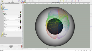
Another possible method, strait off the top of my head, would be to model the brain as a solid and then decal it with some good images three times; 1st for transparency, 2nd for color and 3rd for displacement. The screen shot here took all of 5min to set up so its not great but maybe works as a proof of concept though. Project1.prj
-
I see it's both Ilidrake's and thejobe's birthday's today! Happy Birthday the pair of you!
-
Well I like the end of that last one better but prefer the start of the one before I think! Still seems to be too much water in the air and rather "cubist" in look when its rising up in this new post! I've taken the liberty of splicing the two posts together here. Admittedly the timing is way off in this (it all happens a bit quick now) but I think something like this looks to be a better volume of splash and shape. Why_S15_x.mov
-
Hello again Simon, still giving our hero a hard time I see! I feel the same as you about the splash I think. So as always this is just my 2c worth of rambling, but... Seems to me the splash starts OK but then it keeps getting wider and sending up more water when it should be fall back down again. The area of water that splashes up, that was displaced by his body, should remain more or less constant at its base and not expand out as a ring throwing up more water as it goes. In very general terms, and depending on how an object hits the water, you will most often get two splashes. The first and more dramatic as the object first impacts the surface and displaces the water and then a secondary smaller "spout" at the centre of the impact as the displaced water returns to fill the "gap" (left by the now sinking object) and collides with itself. (Given the look and feel of this adventure though I would probably forgo that secondary splash)


