-
Posts
21,632 -
Joined
-
Last visited
-
Days Won
114
Content Type
Profiles
Forums
Events
Everything posted by Rodney
-
You may want to experiment with hiding parts of your model that might effect the cloth adversly. An example posted here in the forum some time ago had a shirt that worked with with the characters arms and belly (those areas needing to effect the cloth) but had no other geometry underneath. An example where the entire body underneath the shirt had the cloth flapping uncontrollably. So... my suggestion: Remove unnecessary geometry.
-
Looking good thus far Steve. I look forward to seeing/hearing more from your project.
-
Cute (errr... disssspicably evILL!) I like.
-

Problem with hair - Five point patches are bald
Rodney replied to thefreshestever's topic in New Users
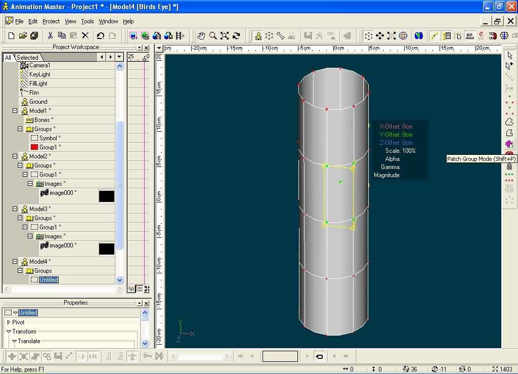
Something I overlooked for years was the 'Patch Group Mode' tool (shortcut key: Shift P). When flipping Normals on individual patches that Icon is quite valuable. -
There is 'Orthogonal' and 'Perspective' available. You have to access them from the Camera under Objects though. Don't use the Camera in the Choreography as the option won't appear there. The closest thing otherwise is 'Birds Eye' view which is enabled via Right Click/View. Welcome Back!
-

I don't think I ever showed this...
Rodney replied to Paul Forwood's topic in Work In Progress / Sweatbox
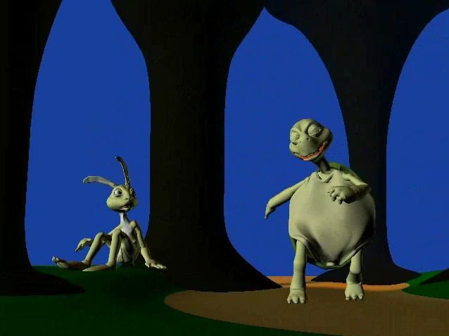
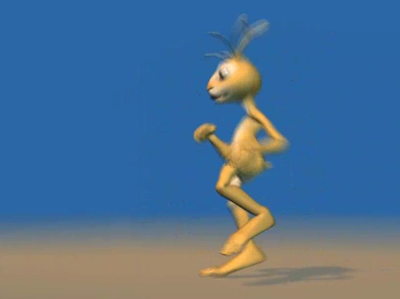
Those are a real treat Paul! You are really strutting your stuff there. Great use of A:M's motion blur on Rabbit! That feature seems designed for him. Wonderful work. Thanks very much for sharing them with us. Here are a few frames from each of the videos for those interested. It was hard to find a clear shot of Rabbit as he was moving so fast! -
Mike, Generally each finished exercise is posted into each exercise topic as you work your way through the manual. Then as you post the last one let everyone know you've completed them all. If you've got them collected you are welcome to post them all right in a topic of your own too of course. 'The Art of Mike!' as it were. Steve Sappington has a pinned topic on Certification in the TaoA:M forum. Definitely check that out. TaoA:M Certification!
-
Stian, By all means keep refining the smoke but with sound added that would be entirely convincing. If there was a little wind... with someone saying something like 'Oh no!' or an off screen clue to let us know a 'real audience' is behind the camera that would add considerably to the effect. If you could add frames to the beginning or preroll the smoke perhaps you could have the smoke trail already going by the time the 'camera' starts to video the scene. As it is there seems to be a 'crop duster' feel to it. (That may be okay though as the audience finds out soon enough what is happening!)
-
Locating Useful Links via the forum's 'Search' function The best source of support may be the A:M Forum itself. It is like having a giant searchable FAQ available 24 hours a day / 7 days a week. Familiarize yourself with the Forum's Search function and you may find your questions have already been answered. Look up to the right of the forum menu to launch a Search or Click Here. Searches can be linked as well. Search topic titles: Modeling a Perfect Sphere. (For more specifically targeted searches) Search every post and every word in the forum: Posts where 'perfect sphere' was mentioned. (To retrieve maximum information) The word(s) you use in your search will be highlighted in the text returned.
-
Useful Links for New Users Forum areas designed specifically to assist you: Newbies Forum - The place to introduce yourself, meet other users and explore A:M. The Art of Animation Master (TaoA:M) Forum - 20 guided lessons designed to get you up to speed animating, modeling and directing short films in the minimum time necessary. The TaoA:M forum provides links to video tutorials, expert advise and a clear path to success with Animation:Master. You aren't a newbie for long so take advantage of these useful resources!
-
I'm ready to update our 'Useful Links' listing for 2008 how about you? For those unfamiliar with the topic please check out the previous Useful Links listings. Not all the links there will be current so if you have corrections or updates please feel free to post them here. If you have a link of interest please post it here where others can benefit from the information. If you found something useful its quite likely others will find it useful too. Please read this fine print before posting! Your posts may be edited for clarity and to ensure links remain current. Only post here if you are willing to have this done.
-
Which fits your story better? I could easily see your scene in either environment or even both! Ultimately though whatever you have as a backdrop must serve the story. How's that for being non-commital? Seriously though... think about it. If you are trying to portray the Troll as being beset by a bunch of knights you might have him in his own territory (the forest or cave area). You might also have the Troll trying to free himself from the castle. On the other hand... perhaps its the Troll that is the big bad guy and the noble knights are doing their best to protect their village. Perhaps they set out on a quest to kill the beast in his lair? Perhaps he's eaten too many children? Ask some questions and let your story provide the answers.
-
Eric and Braydon, If you are willing I'd like to suggest you share this project here or start a project in the WIP forum. The education everyone gets from seeing the process as it unfolds will provide a learning experience for all. Projects kept in the dark often seem to never see the light of day.
-
Eric, Not only do you have some fine work on display... your site menu/layout/operation is pretty cool! A lot of animated sites are too busy or two slow but yours seems pleasantly optimized. Nice gorilla too!
-
I don't blame you one bit! Take your time though. There is a lot to learn and discover. Often the journey is just as great (maybe greater) than the destination.
-
Gabe, I've lost track of whether you are connected to your Library or not. Its generally better to stay in one topic for related problems rather than post in separate topics. If the subjects are unrelated by all means start a new one. Libraries and Data seem to be your theme thus far. Remember what you discover as you'll soon be able to assist others with similar questions. For anyone having difficulty connecting to their Libraries the following Tutorial/video will be of use: http://www.hash.com/lib/win.html
-
A:M v15 will install into a directory like this (on a PC): C:\Program Files\Hash Inc\v15 Inside the v15 folder will be a folder named 'Data'. Copy the new 'Data' over the old 'Data'. The next time you open A:M the files should appear in your Libary.
-
For Gabe mostly but for everyone else too! Because I know you'll want to use them with your manual! http://www.hash.com/2007web/vm.htm
-
Read either of your other two posts for a link to the A:M Data download
-
You type too fast! Check out your other post for a link to the data that comes with your websubscription: http://www.hash.com/forums/index.php?showtopic=30875
-
Don't forget to download the rest of the A:M data to go along with the websubscription. It has a lot of textures and materials (158MB of data!). http://www.hash.com/ftp/pub/misc/Data.zip To view the folder first before downloading try: http://www.hash.com/ftp/pub/misc/
-
Have you ever heard that saying "If you have to ask..." If you are wanting to tackle this before working your way through the manual (TaoA:M) I would suggest you don't model but rather modify some models that are already there. By modifying a character model you will better understand where you are heading and you will know what to look out for as you model. Once you have your character modeled you'll still want to animate him right? For that you'll want to understand a little about rigging. Work your way through TaoA:M as it will teach you all the basics you need to set yourself up for success. If you really must model a character before getting the foundation laid first I would suggest creating a very simple model using Lathing and Extrusion to get a good feel for the tools. Lathing, Extrusion and Stitching *are* the basics. Consider starting a topic in the Work in Progress forum. That way you can post your progress and get feedback too.
-
Mike, Open your CD Select the 'Data' folder Right Click and select Copy Locate the Data directory on your harddrive (this should be C:\Program Files\Hash Inc\v15) Right Click and select Paste (inside the v15 folder) This will overwrite the Data folder so when it prompts to overwrite say 'Yes'. Roughly the same information (but with some images) can be found here: http://www.hash.com/lib/win.html
-
If you are talking about he Dalmation from the Extra CD/DVD then I don't think it has been rigged for animation. You'll want to put at least a simple rig in it in order to animate it properly. As Paul suggests there are exercises in TaoA:M that are designed to help you master this. Working through the manual may be a diversion for a time but the foundation it builds will be a solid one.
-
Thanks Holmes! I do like to have fun this is true. It is also true that I cannot afford too many raffles like this! Encouraging others to pursue their goals is something I can more easily afford and I plan to do that a lot more frequently. Its certainly a lot cheaper than raffles. The prizes given out in 2007 are representative of the truly outstanding resources and providers we have in our community. I hope this raffle put a little spotlight on a few resources available to us. Who wouldn't love to have more resources like Hash Inc's SIGGRAPH DVDs, 3D/A:M Painter and Barry Zundel's A:M Training DVDs. I know I would. Ultimately of course this is just a raffle and not meant to be anything more. But it has indeed been a whole lot of fun. Perhaps we'll do it again someday.


