Rodney
-
Posts
21,633 -
Joined
-
Last visited
-
Days Won
114
Content Type
Profiles
Forums
Events
Everything posted by Rodney
-
After reading your description I had something pop into my mind that I thought I'd test. It's probably more than a bit of overkill for what you want but the test... tested out. The idea was to create a Path consisting of three splines. - Constrain a card to each of these splines in three instances (IAW its the same card model) - The model has 1 bone and 1 null built into it - The bone is constrained to the Null in an Action - Drop the action on to each of the instances of the Card - Then use the Nulls to direct each Card's orientation (One additional Null/Bone could be used to control them all) - Animating the Ease of each Card on the Paths allows them to decend in whatever order is preferred See animation for a look into the process. It may be fairly useless to you but I felt a little like JohnL3D experimenting. cards.mov
-
Seeing them just in the T poses and not in context of a scene has me at a disadvantage. The feeling I got was similar to your explanation though... that this guy is larger than life. Much much larger than life... so consider that a success. The word grotesque is used here often to describe such characters but is often misunderstood to mean ugly... Cutthroat is definitely not ugly.. he's got great appeal! Jaws from the bond movies was both ugly and appealing of course. He was great fun to look at and as I understand it has a great many fans. I percieve that Cutthroat is going to have a whole lot of fans too. He's my favorite character thus far... I always love to hate those badguys. I assume McCrary is drawing him at similar scale (I love his strip BTW!). You've got the right idea just wanted a little more info on the scale. I'm happy to see you've got that angle covered. Once we see him in actual poses and in his environment it'll all make perfect sense. As always I look forward to your next update.
-
You've worked this one pretty good. Its definitely reading more of a 'victory' than your first image. You can call that pose a success.
-
Mike, I did a fresh copy of the Extra DVD content over to my v15 directory and connected to it via the standard method. I can't help but think its the capital letters that are messing up your connection. If you typed in the address manually thats got to be it. (I don't recommend doing that)

-
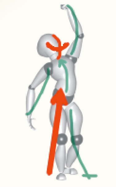
He does look a lot more relaxed. I'll stare at this one a bit more and see what there is to see. I'll try to thumbnail a few poses too as thats a great way to test out things. If you are still willing to work this pose a little more I'd like to see what you might do with that other arm. I'm not sure if it'll go well with your current pose but see how it arcs the other way in my overlay? The legs... they seem to be standing straight on. I think the staggering you had before was better. If you can pull one back he'll look like he has more balance/assymetry.
-
Very nice. I love Cutthroat Jacques. The scale looks a bit odd though. Not the height but the size of his head and hands etc in relationship to Flemm. I suppose its not unreasonable that he would be larger than life but something looks a bit off to me. Perhaps if you scaled his feet and hands down a bit(tapering in a little as you go of course) that would tell the tale. Hope I'm making sense.
-
I still suggest a pose more like this: Squint your eyes a bit as I didn't make your underlying figure transparent enough. Shoot that hip way up... like he's trying to take off flying. Scott has great point concerning the fist.
-
Mike, Thanks much for the annotated images. That clarifies things a lot. I'll look into it and get back to you (assuming someone doesn't beat me to it first) I'm taking my family to see The Spiderwick Chronicles and will investigate upon return. Added: Those two directories don't look like they are the same. Syntax matters and the one in A:M is all caps. The one in windows is not. Perhaps you can delete it and add it in again. (Note: I suggest restart A:M without the libary link present before you add it in again. This will ensure its not there and there are no conflicts when you open A:M again.)
-
I love it. Thats why people need face tracking... to get that story/song out there. I fear the size of Earnie's mouth and its limited articulation seems to restrict him a bit. You've played well to that constraint here with this animation. Perhaps where the character has such limitations the camera could move/zoom in on occasion? I haven't purchased Zign Track yet as I know I don't have time to use it now but rest assured it'll be finding its way into the budget.
-
Wow. You've been busy! Very nice texturing work. It looks like a really fun adventure. Is there a working title yet or is that the actual name '3D Mexican Movie'?
-
Ah... that makes a lot more sense then. I'll have to investigate 'warrior pose'. Those guys are always screaming at their gods. Edit: A few images (not particularly inspiring) on 'warrior pose': http://picasaweb.google.com/lh/searchbrows...rior%20pose#0+1
-
There is still a lot of tension in the pose that (as others have noted) reads as something other than victory. Perhaps if he's standing on a defeated foe your pose would be golden. Is that something that could be motivating the pose? For what its worth I think the tension may work against the average 'victory' pose. I'd try to soften up the angles a little shift the weight a little more... Relax and stretch the pose. Lowever the head to at least eye level (who is he looking at?) might be worth experimenting with too. As I say though... if you are trying to strike a Frazetta/barbarian/hero victory pose you might just have it. If he had a sword in the other arm it might even be a little further weighted down. I know it may sound a little ridiculous but what the character is doing really drives the pose. As we don't have that piece of the puzzle its a little hard to know.
-

Why does my light shine through walls?
Rodney replied to edlundart's topic in Work In Progress / Sweatbox
The short answer (I think) is to add a second layer to the wall. The light will pass through the first and be stopped by the second. I use to have a pretty decent description of why this happens laying around here somewhere. Its a necessary thing though to have the light penetrate the first level of geometry or else most models would hardly be lit at all. Creating objects with actual thickness is generally the answer to the problem. Again... I think this will be true in your case. Apologies if it is not. -
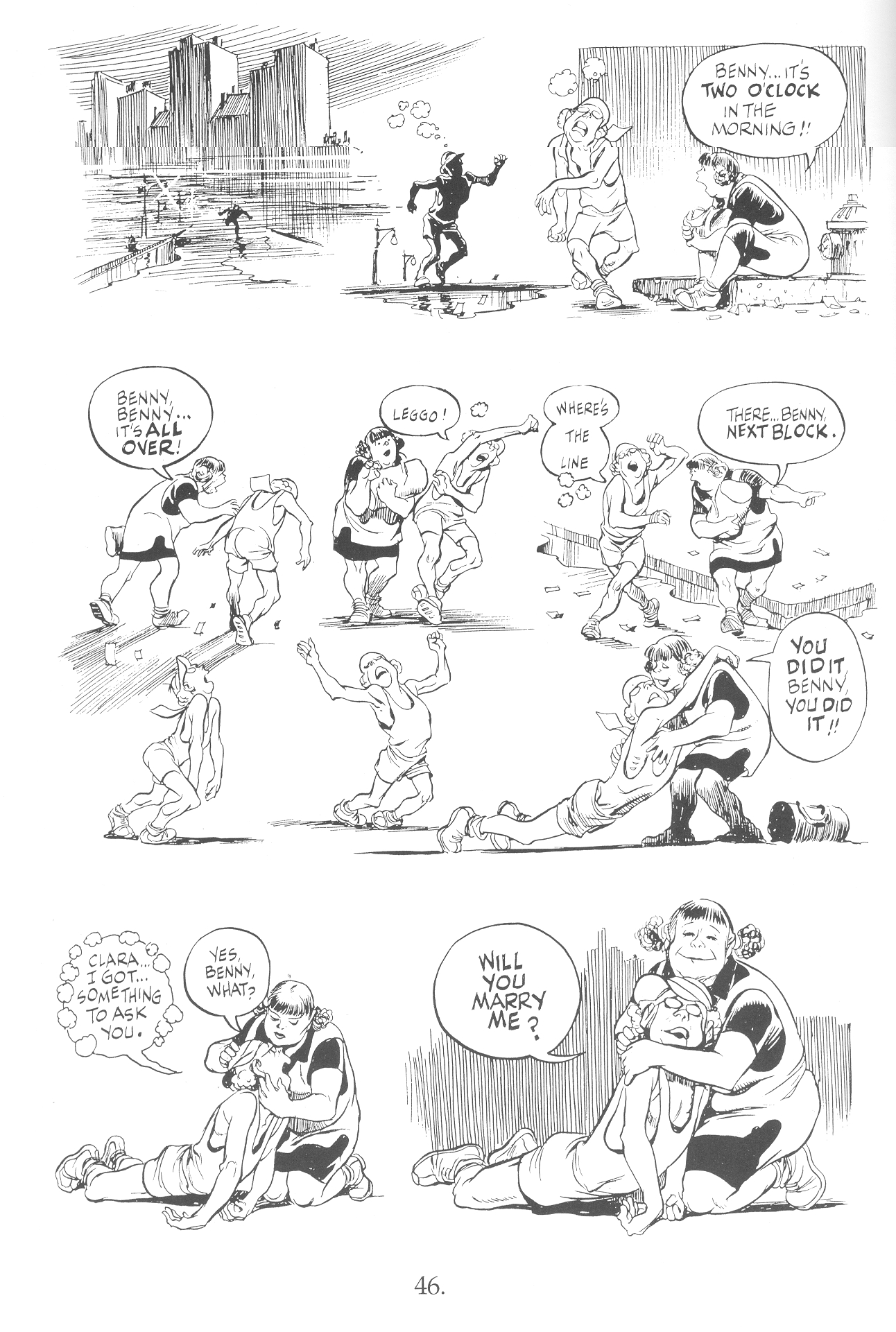
Your descripton immediately made me think of the late great Will Eisner and one of his graphic novels. The main character runs a marathon and is the last to cross the finish line. The story is a wonderful one created by the master of sequential art. (See attached) The poses there are complex though and certainly not meant to stand on their own as static images. They are designed as elements of a graphic 'moving' narrative. Something of use to everyone in refining poses might be a search on key words at Google Photos. Here for instance is a variety of 'victory poses': http://picasaweb.google.com/lh/searchbrows...ictory+pose#0+1 I don't see too many exhausted ones there though. Will Eisner's character though... he's enhausted! The page is from the excellent book 'Graphic Storytelling and Visual Narrative'. Highly recommended.
-
First, let me say... I like the premise of this WIP. Please stay with it as long as you possibly can. I have to agree here with phatso when he says: It looks very much to me like he is having an angry discussion with God. For the pose to say 'victory' I think you need to layer in another action. What kind of victory is he celebrating? Has he just finished running/winning a race? Maybe he's expecting good news and found out he just got a job? What about that other arm? Could it be put to better use? If he was saying something what words would be in his dialogue? This is pretty cool stuff if'n you ask me. Glad you are willing to post it.
-
Nice updates. I'm loving how you keep us interested by showing a little more of your work each time. Its addictive! You are living proof that the journey is just as important as the destination. Thanks for posting your WIPs here online. BTW - Mr. Sneeze has a hook? (I haven't been keeping up and missed that) You are just full of surprises. Edit: Your website is looking great too! Interestingly enough... your webcomic on the site right now answers my question about Mr. Sneeze's hook. Great timing.
-
Any update Mike?
-
The importance of Named Groups cannot be overstated. By naming your Groups it will save important information (colors, pivot settings etc.) that otherwise WILL NOT be saved. Its generally a good idea to name them something related to what the Groups purpose serves. The order of your Groups in the hierarchy of the list is important too. Newbies... Oldsters... Create and Name your Groups!
-
I can feel the weight of it just by looking at it. Heavy!
-
It looks like you are off to a great start! (Get some sleep though to conquer that cold!)
-
The answer will depend on your experience and knowledge of the formats and the conversion process in question. I have to assume from your post that you aren't very experienced or knowledgeable in either one. Hey... join the crowd! If your experience is little and your knowledge lacking then it will be near impossible to get animatible characters from other programs into A:M. The differences in methods used are a considerable challenge. Several professionals have bridged that gap but to the tune of at least $1000. Previously a studio that supposedly perfected the process (or as near to it as is possible) said they'd license the technology for around $150,000. But... this mostly to get A:M models wholely converted into other programs. Everything from everywhere else into A:M? Not likely for any amount of money. Clearly its not an easy process. I have yet to see the work produced from those methodologies so I can only assume they are worth the investment to these guys. A:M models usually work and animate best when the splines are continuous. With other programs this is rarely the case and many methods are used to manipulate the models. When a model is imported from another program into A:M from these other programs the importer has to make decisions of where to continue the splines. If many splines meet at a single intersection some decisions are going to be wrong. *If* you can design your model in these programs with A:M in mind. *If* you understand the process of conversion *If* you model in such a way that the particular importer/converter can translate the model well *If* you can keep the mesh simple enough *If* you have the money or programming prowess to successfully convert the models Then you should find great success in using other programs models in A:M. Most people don't have the patience or resources to put toward it so they model in A:M instead. Its not impossible and I don't want to be all doom and gloom but I want to tell it to you as straight as I can. Outside of Props its not going to be easy to animate models from other programs in A:M. To answer your question though! There are plugin Importers available for the following formats (there may be others but this is all that I have): - .3DS - .OBJ - .DXF
-
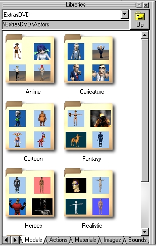
From the images you've posted I can't tell quite what you have there with regard to the Extra DVD. Where did you copy that data? I'm not sure about your usage of the word PWS here either as the Project Workspace isn't related to the content. If you mean to say you can't drill down in Windows Explorer... now that is another thing. There is a limited Library built for the Extra DVD and the easiest way to point A:M to it is to point it to the DVD folder containing the library. Once you've achieved success with that you'll be able to do the same should you move the data to your harddrive. Thats one problem. The other is that not all content on the DVD is in the Library. As I recall the Library is limited. Perhaps given a little time we can fix that and create a full Library of all the content but I suspect a lot of the preview images aren't embedded in the files. (The preview images are required for the images to show up in your Library and if they aren't there they get replaced by a default icon.) There should be a readme.txt file or two on the DVD that explains this a little more. If you can find the Library file you can drag and drop it into your Library folder.
-
In addition to what Caroline says about images versus materials it should be noted that some Materials can -use- images and as such when the material is applied to geometry the image is transferred. As Materials take a lot longer to render I'd say stick with decals/images as much as you can. The manual covers some very important information on these topics and is recommended reading. Hopefully you've downloaded it.
-
Oooo... I like! Interestingly that image (the lines at least) looks a lot better at low resolution than it does larger. The toon lines in the larger full images don't appear as crisp which might be preferred in a mechanical model. My thoughts usually run the opposite as I'm always looking for more variation in toon lines. In this case though the crisp lines would be ideal. Something I've never had confirmed by others but seems to work well for me is to increase the line width a little and render to a larger format (VistaVision or whatever that one is called). Then resample to a lower resolution. For some reason that keeps nice crisp lines where the smaller render doesn't. Only a few years ago producers of the animated Star Trek series would have been giving you a call on the phone to borrow your model. Very nice economy of splines too!
-
Nice John. The judicious usage of both approaches would really make a scene look great. With all your various projects and tests I assume you have amassed a pretty large collection of foliage by now.