Rodney
-
Posts
21,630 -
Joined
-
Last visited
-
Days Won
114
Content Type
Profiles
Forums
Events
Everything posted by Rodney
-
Wow guys. My thoughts and prayers go out to you too! Jody... what can I say except, "Keep up that positive attitude!"
-

control glow with surface diffuse fallout
Rodney replied to johnl3d's topic in Tinkering Gnome's Workshop
Very nicely done John! I think I need to stop experimenting with glow for awhile... I'm starting to get a headache. -
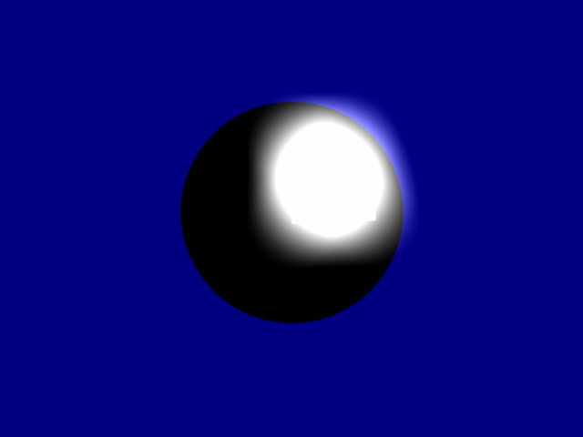
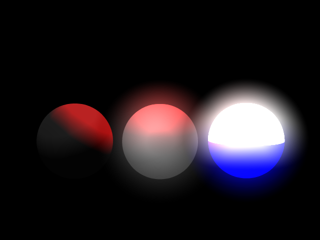
Tom, One important thing I forgot to say with regard to lighting with Ambiance is that the Ambiance is cancelled on surfaces that are set to Black (i.e. the Diffuse color is set to Black). In other words the ambiance of a purely black surface is... relatively... 100% black. This often confuses folks because they might set up a surface that is black and wonder why they are seeing no effect. So a general rule to follow when needing Ambiance is to avoid the color Black (at least 100% Black). The really cool thing about this is that we can use that black color to control the placement and effect of Ambiance. This comes in particularly handy when we are using images to control surface ambiance. This is one of those useful things to know kind of like using Negative Lights to darken areas of a scene that captures our basic intent but is too evenly lit throughout. A too simple example is this sphere that is entirely black with the exception of one patch:

-
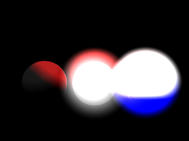
Something I haven't experimented with a lot but know should be explored when considering Glow is how an object (or scene) is actually lit. Here is the previous rendering but this time with a really intense white light backlighting the spheres: I suppose the point I'm trying to make here is that we don't want to adjust the Glow in a scene as much as we do the surface properties of the objects and the lighting in the scene. This is one of the reasons we see a lot of pros spend their time setting up a scene with only greyscale colors before going on to color, texture and light a scene. Glow itself tends to be a Global property within any given scene; it is the effect of all the accumulated light available on a specific surface. The surfaces of the objects and the lighting then dictate how we perceive anything in that scene that is glowing. Depending on your specific goals, once you've got everything set up, animate the lighting and surfaces to effect the glow. Hope that makes sense! Edit: It should be noted that we haven't explored Radiosity and Image Based Lighting, HDRI etc. Surfaces that emit light (and glow) are generally a function of Radiosity.
-
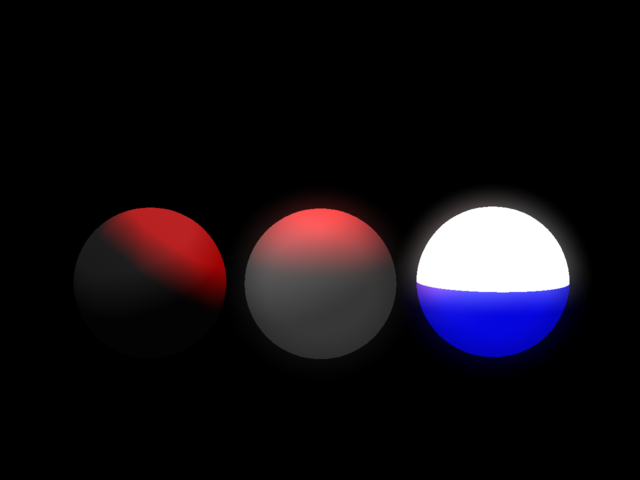
I don't recall ever playing with Glow and Ambiance Occlusion before but it produced this: Once again keep in mind that these are all the same basic sphere tossed into a common Choreography. Note the variable color to the glow of the center sphere that has produced red on top (due to the red light above) and a greyish glow beneath. Edit: Also added a second rendering of same setup with a few minor tweaks such as Ambiance Occlusion dropped to 1%.
-
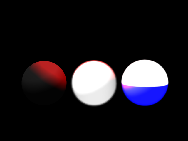
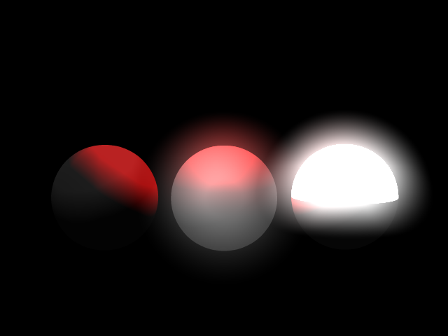
Added a new named Group to the lower half of the sphere with Blue Ambiance set to 50%:
-
I made only one change here. The Group that has the Ambiance settings that controls the surface of the right-most sphere now only contains the Control Points for the top half of the sphere:
-
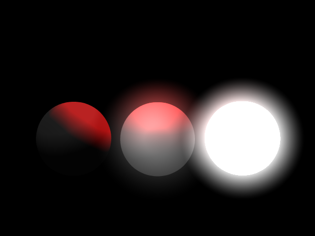
Here I've added one red light into the Chor and set the Ambiance Intensity of the left-most sphere to 0%:
-
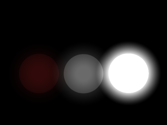
If I'm not mistaken the classic solution to controlling glow is to manipulate/animate the Ambiance settings (Color and/or Intensity) on the specific object you want to effect. Something that is also often overlooked is adjusting the Diffuse setting to a lighter or darker color as that also will alter the effect of Ambiance settings that otherwise remain the same. For those who have never played with the Ambiance settings under Surface properties I highly recommend experimenting there as adjusting these settings can be useful in many ways. For instance, composing a scene without any lights etc. Here is a quickly thrown together render of three copies of the same sphere placed in a Chor with only a few Surface settings changed on each: (Note: There are no lights in this particular Choreography but I did crank up the Chor's Glow intensity setting to 50% and that is effecting all three spheres accordingly.)
-
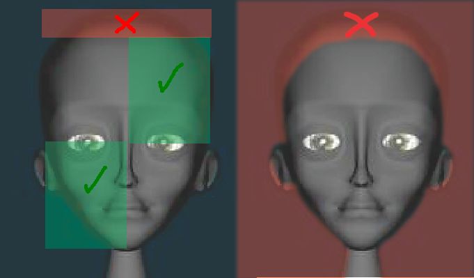
Hmmm.... I'm not seeing much of a difference here. The proportions still seem to be off in the height of the head. So at the risk of being a pain I'll give it another try. Note that in the attached image the green boxes are the same size. The red box indicates everything that is 'extra' and IMO of an excess size. At the right side of the image I've outlined what the the shape of her face would be given equal distance from both the top head to the bottom of her jaw to the center of her eyes. I'd be tempted to raise the ears slightly also but that's not as important as the overall proportions. IMO the green indicates the maximum rather than the minimum and will be covered in hair so IMO you could cut the top of her head even further down to size than what I am indicating in the image. Cheers!
-
Go Spleengene!
-
Sum Squared, I get that Fuchur is trying to imply 'tied' or 'tethered' but I can see where the use of the term dongle will be confusing. Accuracy is important. Rather than just say it's wrong though and especially to help Fuchur in the effort to use more correct wording, it'd be nice to know what you'd prefer to have it say rather than 'software-dongled'. Any suggestions? (I have a few suggestions but I'm not bothered by the terminology currently used).
-
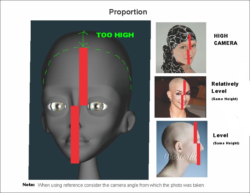
Glad to see you are still plugging away at this! I know we may be seeing Nora from an angle here but to my eye the top of her head appears to be too high. As a general rule the eyes are half way between the top and the bottom. For a cuter look we might even exaggerate by lessening the height of the top of the head more. Nora's hair may rise to that height but unless going for a specific look I'd say to lower the top more. It looks to me as if your style with Latimer has his eyes almost 3/4 of the way up his head. Therefore it might be worth experimenting with that same proportion with Nora. Attached are some random references. I'm not sure where the drawn one came from and if anyone knows please let me know and I'll attribute the artist. I add it here mostly because it gives a lot of views that follow the 1/2 to eyes rule as well as shows how hair rests on top of the skull. Note that in my feedback/image I am assuming that the rendering of Nora is from a more-or-less front-on and level view. It's been a long time since I've had the pleasure of thinking about your characters and you know what? As I think back to when I was first reading your script, I begin to realize that I miss hanging out with them and following their adventures. Post more WIPs! Edit: Posting a wireframe may help in the assessment too.
-
A little drilling and milling for fun...
Rodney replied to MMZ_TimeLord's topic in Work In Progress / Sweatbox
Very impressive rendering in that sequence. The HDRI really makes a difference. I have no idea what the object is that is being put together but it's very cool seeing it piece itself together. -
Very impressive Marcos. You've got a winner there!
-
Here's a sketching update of sorts... This isn't quite a Tuckertown update but rather than start a new WIP I figure I'll just post this here. I have been making progress with Tuckertown but mostly in the refinement of look of the characters. Translating from drawings to 3D is always a challenge because in drawing there are so many cheats you can perform that don't directly transfer into three dimensions. This 'cat' was created when I started to throw down some random splines and it looked a little like an animal's head. I kept pushing it in that direction and came up with something that vaguely reminds me of a hyena from Disney's Lion King (the face... not the body). The rough body was added because I thought I would donate the model to the community and the water was added mostly because I figured he should be doing something. Figured he might be suddenly distracted by his reflection in the water while looking for his next meal. He's not too bright but that sometimes works to his advantage. For instance, he's not afraid of the water. He does have some basic paws underneath there. If I was to pursue this character he might be considerably more skinny, perhaps having his ribs showing prominently. This to suggest he is not particularly good at capturing his own meals but is still highly motivated by his hunger. I really need to start rigging characters because I know that seeing them fully rigged and articulated would further motivate me to refine and finish these. I suppose this guy could be further modified and hang around Tuckertown with the forest critters as there is to be an occasional Aesop's Fables element to it. So that is a consideration. Edit: This is the first Chor I've rendered with A:M's new default Ground Plane. Thus far I much prefer it to the old default. I may not have to delete/replace it as often.
-
Congrats on recreating the Chor! Two things jump out at me that make it a bit harder to enjoy this sequence. The first is the jumping/moving shadows on the house seen primarily at the beginning. I assume this may be a shadow from the dragon just off screen to the left? If it is perhaps you could key the dragon to be Off until later in the timeline where the issue of shadows would no longer be of concern the key the dragon back Active so that the shadow will appear just before it enters the scene. The second is that the camera pan and zoom seems to cut from its smooth movement right before the dragon enters the scene as the camera as the camera then moves to the front of the dragon and then zooms in on the characters. If this is two Chors then I can see why the cut might be there but otherwise perhaps it's just a matter of smoothing out the spline/path of the camera's movement. It almost seems as if the camera path is peaked at that time/location. I really like the zoom in to the characters there at the end. That should make for a nice transition in the next shot/sequence.
-
Impressive work Will!
-
Happy Birthday Mike! May all your splines be continuous.
-
Mike, You must have read my mind because I was about to suggest starting a WIP. Its not only one of the best ways to flesh out ideas but its a great way to get feedback. Your persistence and determination are great assets. Keep it up! Added: I should mention here that often when developing sets/settings that aren't fully planned out, a useful methodology is to use proxy models and then later replace them with the real models. In that way models (which can be as simple a rectangles and squares) can be placed in a choreography quickly and refined or replaced later. Its not unlike what you are doing here with the curtains.
-
Perhaps the word you are looking for is 'mirage'? http://en.wikipedia.org/wiki/Mirage" According to this article the effect seen on hot asphalt or via jet engines is called a Heat Haze. Added: I can think of one way to attempt the effect in A:M that would involve creating a mask (or garbage matte). The mask would then drive displacement of the area where the effect is desired on the image orr sequence. I suppose a separate matte might add a little mirroring or reflection. Here's a video tutorial that might be adapted to the cause. I think the hardest part would be to isolate the area you want effected. In thinking of some of the old Bill Young material tutorials I think we'd be able to create a material that masks the top and bottom of an area (with black via gradient) and then some fractal type noise in the middle. I supose a spherical material could be created to an circular zone in which everything was effected. http://www.projuice.org/tutorials/visuals/heat-haze/
-
VERY NICE! I love the style. Kudos to you and Mark! (My only nitpick might be to make the knees slightly less spherical (?). They are so different to what we are use to seeing in CG characters (a good thing!) that my thought is to further downplay in some way. I admit that I'm not sure how to get that accomplished. I perceive that the audiences attention that will be on the stylistic knees (at least until the audience gets use to these characters) and an effort in almost every scene will need to be made to intentially redirect/point/focus the audience's attention to the face. This really isn't a crit but more of an general observation.)
-
As the folks at PIXAR would say (Peter Doctor in particular), "Make mistakes faster!" You are doing just fine. It should be noted that you can get away with a lot of splineage that isn't optimal. What you are doing now however is learning 'optimal'. This will pay off big dividends in the end.
-
I'm late to the party but... speaking of spline layout, your modeling of this object reminded me of an old tutorial by Rodger Reynolds: http://www.hash.com/r_reynolds/surf_tute/surf_tute.htm
-
Awesome setup. Awesome job. Hopefully that'll get your work further out into the public eye (like your Belltire commericials!).