-
Posts
21,649 -
Joined
-
Last visited
-
Days Won
119
Content Type
Profiles
Forums
Events
Everything posted by Rodney
-

32 patch sphere become Primitive guy
Rodney replied to johnl3d's topic in Tinkering Gnome's Workshop
Funny looking guy! There are two things I have found that really transforms the art of combining spheres into props and characters: - Simple spheres are easier to manipulate (use low patch/low CP spheres wherever possible) - Tweaking of Bias handles enhances and melds the spherical shapes - Much can be hidden in toon rendering (using high ambiance settings can meld shapes as well) My point here would be to break up and hide the original spherical shapes where you can. The specific areas of interest would be where the shapes connect with other shapes or where you want to draw the viewers attention. Of course if your goal is to have a spherical man then... disregard all previous! -
Oooo... I like where you are headed* with that! Looking good! *Pun intended.
-
Thanks Tore! I'll guess that few people do. Due to low usage and interest in dopesheets over the years I've lived in fear that some functionality might disappear for general lack of maintenance (and in some ways it has). It's that old principle of 'Use it or lose it.' It might be nice to use A:M's Dopesheet to assist with our modern day storytelling in similar fashion to the classic dopesheets/exposure sheets of old. As we are in the modern age of computers we might even extend those classic xsheets to take out unnecessary middlemen and directly drive the storytelling. Folks, that (automation and computation) is what computers were created for in the first place. But computers can only do what they are pro-gramm-ed to do. And for that we need to input instruction... words... sentences... phrases that expose the computer to our thoughts in a way they can be understood. A dopesheet is one or several ways to get that done while keeping the artist/writer/creator in control. I am not a fan of automating everything. What's the fun in that? But levering what we have available to us... now that is something else. Often a simple sketch, outline or plan to follow will be enough.
-
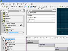
Here's where things get really interesting... Note that A:M's dopesheet is a text driven workflow. This allows us to create dopesheets that outline and even automate our animation before we even open A:M. The key is to understand how this information is stored: <ACTIONDOPESHEET> Name=My Great Adventure <TEXT> Name=1 The Beginning StartFrame=0 EndFrame=18 HasTranslated=FALSE ChorFrames=18 Length=18 <PHONEME> Name=Enter the Hero DisplayName=Enter the Hero StartFrame=0 EndFrame=18 ChorFrames=18 Length=18 </PHONEME> </TEXT> <TEXT> Name=2 Deep Trouble StartFrame=18 EndFrame=1:12 HasTranslated=TRUE ChorStartFrame=18 ChorFrames=1:12 Length=24 <PHONEME> Name=Exhausted DisplayName=Exhausted StartFrame=18 EndFrame=1:12 ChorStartFrame=18 ChorFrames=1:12 Length=24 </PHONEME> </TEXT> <TEXT> Name=3 The End StartFrame=1:12 EndFrame=2:2 HasTranslated=TRUE ChorStartFrame=1:12 ChorFrames=2:2 Length=20 <PHONEME> Name=Hero Pose DisplayName=Hero Pose StartFrame=1:12 EndFrame=2:2 ChorStartFrame=1:12 ChorFrames=2:2 Length=20 </PHONEME> </TEXT> </ACTIONDOPESHEET> The following screenshot displays what the above text creates inside A:M: Note1: A:M will display various colors for missing Poses or other elements. This let's us know we still need to create that Pose or correct a particular error. Note2: Unless very familiar with how timecode works it is generally better to set timeframes inside A:M. Let A:M do the math for you!
-
Here's another short video that demonstrates the means of adding words to our dopesheet phrases without having A:M invoke the phoneme/lipsync dictionary. Key point: Outline your 'sentences' first with numbers and then go back and rename them. Future Topics(?): A look at outlining and automating A:M storytelling/animation via externally created Dopesheets. This allows us to bypass the renaming stage. DopesheetsBasic_Naming_Phrases.mp4
-
With the recent talk of Copy/Pasting poses I thought I'd revisit Dopesheets... For years I've wanted to put together a tutorial on the extended use of A:M's Dopesheet and have consistently failed to do it. The attached isn't much improved from that but rather than throw it away it might be of use to someone. Key points/takeaways: - Dopesheets are a powerful tool - Dopesheets are useful for more than just lipsync/phonemes - There are lots of things we don't know about A:M (lots of features we don't effectively utilize too) - It's vitally important to use numbers instead of letters when accessing some aspects of the Dopesheet workflow Standard disclaimers apply: Poor video quality, no audio, etc. etc. etc. Note that in current releases of A:M dopesheets cannot be saved separately. They must therefore be saved/embedded in an Action, Chor or Project. As Dopesheets are one of the fringe features not generally used by folks beyond the core lipsync/phoneme usage as outlined in TaoA:M tutorial some glitches and gotchas can be expected when exploring more deeply... so when in doubt... save often. DopesheetsBasic.mp4
-
Thanks Mark (and everyone else!) for the words of encouragement. We have some fine talent here in the forum and I consider it a blessing just to be associated with you all. Gerry, Thanks for checking out the link. My verdict thus far shouldn't surprise anyone: The Sony site isn't going to be of much use to any single person as it is a site for collaborative review. As such it may be worth looking into for those involved in a collaboration with two or more other people. I wasn't able to get very far into my exploration because... alone I'm very much one less than two. There reportedly are some annotation features which, if operational in the Beta, would be useful. There are quite a few other folks pushing into cloud services for creative content. Time will tell which provide the optimal services.
-
Please pardon the test... This is a test of a workspace on Sony's new media cloud service. 5 Gigabytes free while in Beta but there should be some $ required once released*. The cloud is sure to be a multiplier where it comes to collaborative projects and Sony is a major player so I figure it is worth the test. Added: Here's a test of Sony's new media cloud sharing service (currently in Beta): Tinkering Gnome in the spotlight (This is a simple JPG rendering) Access to file is set to expire in 7 days. (page says 6) And here is Thom: Thom (available for 1 month) (I see no way to assign a preview image to unknown file types... Beta feedback!) For those curious here's the link to Sony's site: https://www.sonymcs.com/ The apps within the workspace (I see three entry points at present) are designed to review Audio, Video and Rought Cut. The service is obviously designed for video so will be testing that out as well. *Prices appear to be: Standard: 5GB / $0 mo Pro: 100GB / $25 mo Unlimited File Sharing Pro+: 200GB / $50 mo Unlimited File Sharing Teams: Contact for customization
-
Whoa. Off the charts there David! Looking very good.
-
That's coming together nicely! I love how you've differentiated each of the characters. The following is food for thought... not so much a suggestion for your current project: You can adjust the ease of a few of the Actions to get slight delays such as seen in Matt Campbell's dance here: GczxW4WXz6o Unless my eyes are deceiving me, even there however we can see a cyclic pattern trying to sneak through. The general pattern is that PurpleGirl is in the lead and RedGirl is always coming up short. Ideally a character will lag in some places and rush ahead in another. The goal is to get the characters themselves to run the show through personality. Matt would be better able to outline his approach. A better way than ease (or something to use in combination with it) would be to layer in another Chor Action over the top (actually under in the PWS hierarchy) of the other Actions that subtley shifts a few characters out of mirror sync (maybe you've got some of that going already and I'm just not seeing it). I hesitate to suggest this because making sure the proper settings to blend the Actions (Replace, Add, Blend, is import if using that methodology. It looks like you are up to it though. Another approach would be to save different copies of your Action and then tweak a few of those. Then import all of them into A:M and point the shortcut to a different Action. Again, the goal being to give each character their own personality. i.e. This guy has been doing this for years... this guy is just learning... this guy is overconfident... this guy always tends to miss a particular cue...
-
Perhaps someone can get you (or other Maverick user) onto the v18 Alpha list so you can install that and see if the latest works in Maverick. It's a long shot but -might- resolve the problem. Whether the fix is incorporated yet or not... v18 will likely be the fix.
-
Yes, I'm seeing the same general oddness. It's like A:M is ignoring the thickness of the line that is set until the model is deleted and placed back into the Chor. Aside: You might want to change the background color of the camera (and make sure Alpha is turned off) in order to better see what is rendering.
-
Agreed! An obstacle... most of my 3D doodles aren't even worth rendering still frames much less full blown animation. Still, if I ever run across a story worth being told I might be tempted to go for it. In the meantime I'm pretty happy with minor fits of exploration. Animating short takes of the Tinkering Gnome hard at work for forum banners and such... hmmm... that might be worth a go. Edit: To provide a bit of insight into my general/present approach, I tend to explore an idea only as far as I need to see that I know that given approach will work. At that point I quickly lose interest in the experiment because I then know how much time and effort that approach will take to duplicate. This works for me because I have a lot of recipes that aren't likely to be fully cooked or served.
-
Here's a clue. The fact that v15 was working before and still is working on Mavericks is a great omen. Steffen now just needs quality feedback to determine what got broke in Maverick that was working in previous releases of OSX. As has been noted... it takes time to account for breaking changes in Apple and Microsoft code. The good news is that because A:M was working before we are likely looking at a nasty bug rather than the end of the world.
-
Happy Birthday to the wedgiest guy I know. If you haven't downloaded and played a few of his games... you should! - Drop it Pocket - Izzy the Busy Squirrel The above are links to forum topics. To go directly to his download page GO HERE. Website: http://www.pencilwedgees.com/
-
Off the charts! You've captured a great hand drawn feel. You've got an awesome cartoon style in this short that isn't easily pegged as being created in any 3D software... which is a very good thing! While we as creators should care... who else in the audience cares. ----------------------------------------------------------------------------------------------------------------------------------------- Obligatory Feedback: Regarding the credits... I follow what Nancy is saying here. There is something of a problem with focus at the credits in that the words don't get read at all primarily because folks will be wanting to see what is happening with the character while driving. As I believe the actual focus should be on the character what then to do with the credits? Answer: Pop the text up on the screen in static chunks where the scrolling doesn't compete? I'm guessing three or four chunks of text would be sufficient. So how to tell the viewer to move their attention back and forth between text and character? I would add some small things (rocks, trash... a can or piece of paper, road scratches, paint, pot hole, sewer cover, etc.) running not-so-psuedo-randomly under the car in the credits to cue the viewers attention so they are fully focused on the car when it encounters a new activity (running over Kid1, taking a sip of his drink, running over Kid2) and then pop in the next static screen of text immediately after. I do think making the font/text more readable would shorten the time needed to read the text but the primary obstacles to reading that text are 1) scrolling text 2) activity occurring elsewhere on the screen (moving targets for the human eye to track in both cases). Combined with the small text and non-block font, the words on the right aren't likely to be read except by treasure hunters who love to freeze frames. I suppose what I'm trying to say is that there is a beat to the activity on the left and a beat to reading the text on the right and the challenge is to get them into sync (as you already have in the main short). Regardless... as it is... you have extended your all too short short via the credits and I find that to be a wonderful thing! Folks want to see more of this character and figure out what the deal is with him. The credits really do work 'as is'. ----------------------------------------------------------------------------------------------------------------------------------------- In other words: Bravo! Encore!
-
Off splining some more cool characters no doubt! Happy Birthday Jirard!
-
I'm not quite sure I should comment on my general ideas of 'developing' A:M in China or anywhere else and I suspect perhaps you might mean 'promoting' more than 'developing'? I suppose I could summarized my approach to development as a grass roots effort bubbling up from the bottom... thusly: 1. Get A:M into the hands of those that instinctively know it is a good fit for them (this in my opinion is often artists who know very little about programming and don't particularly want to learn to program). 2. At the same time introduce them to some basic programming approaches (programs like Alice... 2.3 moreso than 3.0 currently for reasons we wont get into here) but Alice is very similar to A:M in very interesting ways... better in a few... no so much in many others) There are many other programs out there (Khan Academy, Scratch, etc.) but few have the 3D character based approach that Alice does. To a good extent they can they learn A:M while learning Alice and vice versa. There are many incompatibilities but heck... that's half the fun of the exploration. 3. As they learn A:M they will also learn to code their own solutions and in time develop their own approaches to using/developing with and for A:M on their own. Getting to know their limitations better can produce some very innovative results! There is a very interesting aspect to A:M that IMHO places it ahead of many other 3D programs in that the ease of moving things around in A:M is in it's own way a form of coding without the need to know programming. Ultimately, I don't really know enough about China to speculate but with a few billion people running around I'd say more than a few would eagerly take to A:M as it is without any further development. Just subscribe, install, activate and get to work! You are a great example to follow!
-
Much easier to see what is going on in that view. Thanks!
-
Make sure your are looking from Front, Side, Top/Bottom views. The rulers/markers don't show outside of those views. As a workaround we can create all the guidelines we want and view them in any view by creating a Model with splines for the guidelines. This also allows us to create curved guides which is something the standard guides cannot do.
-
I agree with Sebastian on the need for exaggeration... there is serious exaggeration in that last video reference and that is from a real life flesh and blood human. An animated character will need even more exaggeration for their movement. Note also that the camera is looking downward in the reference video (we can see that more from the angle of the walls than from the man himself). If your final animation has a similar view (rather than a straight on shot) I'm sure more of the character's motion and personality will be in view. I don't think we are getting a clear view of your animation from the currently rendered/straight ahead view.
-
Well said. When I was writing my reply (above) I hesitated to use the word 'story' in my reply. This Kafka tale has all the basic elements of a story but is somewhat lacking in providing the story itself; as if the audience is expected to actually tell the tale. I haven't been exposed to a lot of Kafka but from what I have seen I assume most of his work is much the same. Will Eisner's treatment of Kafka is the one most imprinted on my memory. This short story seems autobiographical in the sense that Kafka is easily both characters... the guy that is utterly lost in and out of time and space... and the self absorbed sentry who possesses the key to unlock the mystery of the tale but is too busy to care for being caught up in his own trap of being clever. From my brief exposure, I assume that many of Kafka's tales leave off unfinished with the characters eternally trapped in some similar way. The fact that Tore has graphically captured this essence of Kafka so well is what makes Tore's short film so compelling to me.
-
I like where you are heading with this!
-
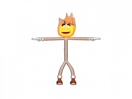
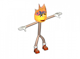
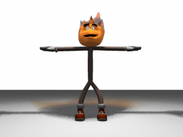
This is no tutorial but I couldn't resist... Here is an attempt/proof of concept, translating directly what I see in the drawing. Without a side view there is much to be desired from the profile view. I won't say this is the best way to proceed but it's the one I experimented with. I like the idea of using decals but there is something about having the geometry there to work with that appeals to me as well. Likewise I decided to pursue geometry as the base for the flame... not quite sure that works. It might be better to make the entire head partially transparent (i.e. like the flame) with a mesh underneath to hide whatever shouldn't be seen. I started breaking things so figured I had better post this before I no longer had anything to post. At the very last minute I added a Light at the head of the character. For better control of lighting it would probably be better to add the flames light independent of the character. Added: Forgot to mention that I borrowed gloves from Rabbit and Shoes from Edit out of the A:M Library. Doh, looking back at the rotoscope I see I forgot to add the characters teeth! Woody.prj


