-
Posts
21,632 -
Joined
-
Last visited
-
Days Won
114
Content Type
Profiles
Forums
Events
Everything posted by Rodney
-
Aaron has several more Art Tips online which I'll add to the list above eventually if there is interest. His latest is Art Tip 12: The Secret to Creating Clear Expressions S94VIlQyFWo Some key concepts include roughing in expressions and then tying them down with better detail. This translates well into computer animation when we establish the extreme poses first and then go back through the process of breaking down a shot, inbetweening and layering in additional information and detail. For those interested in digital animation techniques Aaron shows a brief but very powerful technique for rapid digital animation at the very end of the video by leveraging the power of compositing/layers. Perhaps the real news with this latest art tip is that Aaron and a few friends will be revamping his site and (like many other artists and animators these days) delve into the instructional realm by offering instruction. As it is often best to get involved early rather than later in such efforts keep an eye open for the initial offerings via the website.
-
Looking good John!
-
Nice one. That's a great test. I really like that. This is a hard one to critique without drawing over frames. Two immediate things come to mind... perhaps three... but I need to study what I think I'm seeing. I'll mention them and see what you think. 1. Full extension of the legs. This guy is really running fast and yet we don't much full extension of the legs (the knees remain bent throughout most of the sequence) Note that upon reviewing again I do see at least one section where his legs fully extend so you do have it in there. It would be good to see how much full extension there was in the original reference. 2. The guy seems to move backward at several points. This may be more of an effect created by the camera and relates to number 3 below. It's not so much that it looks off... it looks pretty good from here... but it may be stealing some smoothness of motion from the totality of the frames as they play together. To test this we might look for and track a specific shape on the guy and note how it changes shape and position from frame to frame throughout the entire sequence. For the sake of animation a little reality might need to be sacrificed for the greater good of visual clarity. This is one reason why fast moving shots in cinema are often presented in slow motion... to allow the viewer time to read the imagery. 3. Visual cues (references) that orient the viewer to where the character is in the scene. If this is a 50 yard dash then it might be good to have some lines and/or numbers on the track to clue us in to the runners location and speed. The start and finish is apparent enough but there is potential for loss of orientation as the camera tracks around. Something I really like about this sequence is how you've got that 'banana' shape that allows the perspective to change. I'm not entirely sure you planned it that way but you've got it going on in this scene! If you are curious it's similar to what Bobby was doing in these sequences. All in all I'm very impressed with this test. If it doesn't defeat the purpose of your test you should render it with motion blur on to see how that plays. Nicely done!
-
I'm not sure what normal is but it is safe to say that I've moved on to many different and more enduring crises. But to answer your question; from the lighting of myself on fire I am fully recovered.
-
Ooops. I typo'd the RBG thing. Heh... what a doofus I am. Thanks for setting me straight as that order will make a huge difference or result in many a mistake! Regarding the linear aspects of color: Perhaps I'm thinking of Linear Color Space? I'm still trying to make sense of that for better use of the EXR format, which I hope to exploit some day. Thanks Nancy, I've much to learn on the subject. Added: I should note that while I'm interested in all aspects of color and lighting my primary concern is what we can currently manipulate and control in A:M. It's interesting to note that in the color picker we have a means to convert values between RBG and HSL (Hue, Saturation and Luminosity). Unless otherwise advised I will now assume Luminosity is another term (or at least fairly equivalent term) for Lightness/Saturation.
-
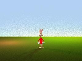
What actually adds the noise to the sky is roughness... heck nobody uses roughness do they... so I sometimes use it where surfaces look too perfect. I think it was set to 5% or so with the roughness scale set to 0%. The default ground plane is set to Off so that the ground in this scene is actually the bottom of the six sided box... again with a little roughness which interacts with the light to give it a sense of turf or grass. The 'trick' is similar to using sky domes as such. In this case the entire scene is contained inside a six sided box with the back side of the box mostly transparent (77% as I recall). This allows the default camera blue (or whatever color or surface or image desired) to show through to the camera. I believe what makes the noise really kick in is Reflectivity turned up on the back wall of the box. Why put a scene into a box? I'm testing that as an approach to controlling every pixel rendered and to more easily replicate stylistic shots.
-
Here for no particular reason is a lighting test that came out of the v18 renderer. I like the general look of the noisy sky and ground and might use that as a starting place to delve further. The ground is actually gray in color but is lit to the present colors.
-
Over in the 'Buying a Cafe' topic Steve was kind enough to share his settings for Sub Surface Scattering. I know there are several topics on settings but this is something I've longed to understand versus just occasionally reference. His settings were: SSS with diffuse color of 253, 227, 185 SSS half distances 3,2,1 SSS extend group to avoid SSS borders General if not naive assumption: The SSS diffuse color settings operate as R,B,G settings in that the first number represents how much Red, the second how much Blue and the third how much Green. True/False? No where close to reality? If true then I would assume Steve's settings have a majority of Red (253) mixed with a good dose of Blue (227) with a mid level Green (185) applied to create his character's skin. I'll note that it's reportedly a good practice never to use extreme values/full colors (0 or 255) when setting RBG values and further assume the same will be a good practice with SSS. Added: Unless I'm mistaken these values equate to roughly 99% Red 89% Blue and 73% Green. Thoughts? Favorite Links? Recipes? One of my favorite links of old was Matt Bradbury's exploration of SSS here. That was at the very early era of SSS in A:M so some things might have changed. From that exploration it seems a key concept for SSS is to let the diffuse color of the Group feed into the SSS half distance settings to achieve the desired color/effect. This is what Steve appears to be doing via his settings. For those new to the topic of Sub Surface Scattering please visit the forum dedicated to that subject: Sub Surface Scattering Forum
-
Thanks for that! It's been a while since I've used SSS and I really should be using it for my skin texturing. I'll say it is. Looking very good from here! You may hate it but you've done a great job with them. I would have guessed you had borrowed them from another model. Good on you for modeling them from scratch!
-
I don't know what the status of those is. They've been mentioned before, but I'm not sure who has them or if they are uploaded or what. ----------- I may be misrecalling but I believe Jason Hampton had the Anzovin videos hosted online at one point. Hosting of the files might have been problematic for him. Note to Jason or whomever obtained the files: If they can be made available they could be individually uploaded here in the forum. I'm the one who's supposed to be farther along on making them than i am. I'm glad you find them useful. Until they are all done I'll note that there are quite a few very informative, if not quite so slick, tutorials by many knowledgeable A:M users in the Tutorials section of the forum. If you are looking for somethign specific, ask, and someone will probably know if there is one already. Count me among the users that have thoroughly enjoyed these new videos. There are several supreme problems with implementing 'a complete course' primarily that of every completing the course. There is also the matter that even if available some folks just don't view the tutorials until they have exhausted their wits and patience going it alone. Robert's suggestion is not only correct but is the supreme solution for this problem. Even better... those that take the time to personally ask questions here in the forum not only get there questions answered they often get tailored responses and tutorials created for them. Asking here in the forum also serves several other purposes such as informing those with the talent for creating tutorials that there is a need for some information in that area to be published. There is also the matter of ever creating a complete course that covers all features --- nigh impossible because there are too many features to cover and the fact that things do change and improve over time which forces the more highly detailed tutorials to have a shelf life. This results in an interesting case where less information equates to more relevancy over all. Here is the crux of the matter: Most of us do not know what we need to know until we stumble over what we do not already know. This makes creating a complete course with all features in A:M impossible. But note... we won't let that stop us! Can we do better? Heck, yes! And if given the time this community will do that and more. The good news is that those that are in the process of creating the very same 'complete course with all features' will take the information gleaned from even the most insignificant question, example or tutorial and distill those elements into their own high quality tutorials. Thanks for your feedback and validation that as a community we are properly moving forward. Those that have spent the time creating content for the community will appreciate that. We all learn from each other and none of us goes it alone. Added: There is room in the over all picture for paid tutorials but it's got to be tough nowadays to make that profitable.
-
Seven minutes of animation is a considerable achievement. The majority never take a project all the way to completion and here you've got this success under your belt. Congratulations! It was fun watching you post progress on this short. There is a lot of work represented in the number of models and sets alone. Add in the music, voices and such and its easy to see this was big production. Not that I counted but I'd wager you approached having 100 models if we including those adapted directly such as the robot? As far as critical feedback... boy I can't wait to see your future projects because you had to learn a ton on this one. First time productions often suffer a little not in what is present in the production but what could be edited out and left on the cutting room floor. I'll head off on a tangent for a moment to see if I can put my thoughts in this arena into words... When I was in high school a very long time ago my art teacher critiqued drawings from my sketchbook with something akin to these words: "You draw very well but your drawings are seldom finished." I must admit that I was a bit too high minded to consider what she meant by that and certainly too wrapped up in myself to consider asking her to explain in detail. Specifically she was referring to elements of light and dark that allowed things in view to recede into the distance or to pop forward and further control the imagery's focus. Note that I thought I had put these elements into the drawings but was not listening attentively to grasp that I was not. So how might the lesson I learn translate into observation related to your short? Hmmm... bear with me here as I attempt to move forward. The music track was well done. It very impressively carried the story forward. The dialogue wasn't as clear and could have been 'bolder'. What do I mean by that? I'm not entirely sure but for what it's worth I'd say the dialogue came through as someone reading a script versus word emanating from a 'real' character. This is no great sin in an early effort but an area to watch to up the game for future endeavors. As I'm not experienced in this myself I'll just suggest the reading should be read in a more exaggerated way several times over and then (only if necessary) scaled back if overly enthusiastic. Several characters seemed to mumble a bit and this exaggerated vocal quality can help to differentiate between characters without any visuals at all. My memory recalls that the voices were largely interchangeable and I would guess that this is primarily because they were read by the same person. That's fine but if one person is going to read more than one part there will be even more need for exaggerated characterization in voice recording. Note that I thought the quality of audio itself was very good. Regardless... impressive work and you should be very proud of this effort. Back to the imagery... As I've mentioned the audio really carried the story forward and this is in great and grand tradition of every piece of quality animation I've seen before. Could it have been edited more tightly to push the imagery more? I think so. Now, I don't recall if there is a specific reason for the length of your short (such as a class project with specific requirements). The length of that audio alone will dictate what imagery you have to put forth. I suppose what I am saying is that with tighter editing there were a few composition/continuity gaps that could have been smoothed over. ***SPOILER*** A random example from memory which few folks might notice: As the robot approaches the ninja's that surround the captured elves the characters are arranged in such a way that no matter which way the robot approaches one of the ninja's are likely to see him. As the story proceeds however the robot moves all the way around to the other side (camera continuity-wise) and makes his presence known by tapping one of the ninja's on the shoulder. The scene works but could have been more direct and clear if the editing kept the sequences objective in focus. Note that I assume the objective to be that of the robot sneaking up and suddenly making his presence known. This is a case where perhaps 'less is more' because similar to an earlier sequence where the robot disappears and reappears and the audience gets that he has not disappeared but simply has moved forward that sequence could work similarly and echo that by letting the story progress in the mind of the viewer. Example: Establish scene by showing elves surrounded by ninjas... Show robot moving forward toward them... cut away so that robot disappears.... show close up of hand moving forward to tap ninja on the shoulder... show startled reaction of the ninja. About four or five story beats and then off they go to escape and the pace quickens even more. Note the change in pace that you seem to have attempted... slow... slow... slow.. BOOM! Reaction time and the chase is on. Not only does this motivate the characters (very imporant!) it clarifies the story points while further informing the viewer. Anything beyond what is essential is either wasted effort or opportunuty for character performance. I drifted a bit there. Sorry. With regard to my teacher's advise "finish the work"... think of each shot as having a sole single purpose. Once that purpose is accomplished attack a new purpose. Minor example: When you show the elves at work near the beginning you might have shown them at a distance as a group (nice establishing shot) but then move the camera in closer to show what they are doing. If staying at the same camera distance too long the audience will begins to say, "okay, we've seen this before... am I missing something?" and they will begin to look for it. Anticipate what you can do with audience motivation by moving to (or purposefully hiding) another story point. Note that when I say 'purposefully hiding' this is to say that they will see something related to this later in the story but it's too early to reveal it now. For your story it might be a close up of a teddy bear or doll being put together by an elf but then later a dozen or more already completed with the elf still making more. That element of repetition but with some progression helps to tell a bigger picture than any shot or sequence can alone. Okay, I've droned on enough. In a big way you have done exactly what my teacher suggested to me in finishing the work. And you have added experience to your current skillset that can come only with actually doing the work. Revel in the moment and be justifiably proud of your work. Take a break if necessary because you've certainly earned it. With the promise of what I see in this short I'm already eagerly anticipating your next project!
-
Steve, I'm curious about the Sub Surface Scattering settings you are using. If it's not too much of a pain can you share them with us? It looks a lot like one of Nancy's tests from back awhile but it's hard to tell from here. Regardless... I like!
-
Congratulations Will! That is an great tribute which suggests that Animation Magazine is keeping their eyes on talented folks. Well deserved. Now... get back to work!
-
There was a recent change in v18 that altered (or should I say implemented) the Shift Y for adding masses to Spring Systems*. According to Steffen: *There are 137 references to 'mass' in the Tech Ref. Here is a reference from the 'Spring Systems' link above:
-

Holiday Image Contest Voting Now Live
Rodney replied to Jason Simonds's topic in Contests/Challenges
Yes indeed. Very nice! -
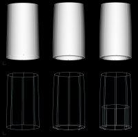
I'm loving these renders Steve! Looking very good! I'd like to suggest adding a slight extrusion at the base of this last guy's jacket/sleeves/pants to suggest thickness. It wouldn't have to be much and wouldn't even need to be further extruded inwardly (as in the example on the right) although that might work better in many situations.. Something like the one in the middle but with the inner ring moved closer to the edge would provide 'thickness' enough. The example of an object without any visible thickness is on the left. Looks like with the new speed and realtime improvements I'm going to have to do some experimenting with rendering!
-
Excellent idea. That is exactly what that area is there for. As far as birds go. Don't forget that there is that goose is your Library. He is very easy to modify. Just drag and drop into a Choreography window or double click to open in a Modeling window. There is an eagle and two other birds hiding Here.
-
Looks good from here. Nice texturing. As far as the sound goes... perhaps there is something wrong with my computer but I'm not hearing any sound. I don't doubt that it might be something on my side because I've had some issues with sound of late. Perhaps someone can confirm. Edit: Got the sound to work. Nice. If it was a little longer it would be very relaxing. Keep it up!
-
Hi Jeff, It's great to see you again. The first thing that comes to mind is that you might have your render setting set to render with options from your Camera and are changing the settings in the Render Panel instead. The thing to check here would be the setting under Tools/Options on the Render Panel where it gives us the option to use "This dialogue" or "The Camera". If yours is set to 'The Camera' then that's a likely culprit and you can either set it to "This Dialogue" or adjust the settings in your camera. If not we'll have to dig further to find out what is going on.
-
It's whatever you need it to be. I simply tend to ponder these things. For instance, I can easily see the vessels klien flowing from the head to the navel which would form a slightly more natural connectivity. It could connect to other parts of the body as well depending on any given 'deeper' meaning or frivolity. Such is the eternal yet short-handed interpretive nature of symbols and allegory. Regardless, I'm not trying to read too much into this. I'm simply examining and contemplating what is there in the presentation to see. One thing I often consider is how we as creative types can broaden or narrow the viewers ability to interpret a given presentation. Having the flow move both ways would be an example of broadening and opening the interpretive nature whereas a one way flow specifically directs the viewer to one particular interpretation of the scene. Through layering (or further clarity through simplification) we affect the interpretation viewers have of our scene. It's a very interesting concept and is executed well which results in a fascinating animation that really draws the viewer into the cycle/sequence of imagery.
-
In my estimation it's even more than that. The responsiveness of v18 combined with the new aspects of the Onion Skin toolbar equate to better animation workflow IMO. It's subtle changes like this that seriously enhance our ability to animate and convey stories.
-
That's kind of scary... but cool at the same time. Nicely done Serg! Edit: I'm not sure if there is a deeper meaning but I can't help but wonder if the 'flow' shouldn't be going in the opposite direction? (i.e. out of the arse and into the head versus the other way 'round) Perhaps you could get two different flows going both directions?
-
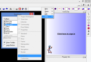
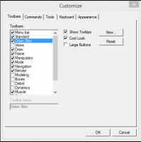
I'm not sure about what you are seeing at this point Mark but... Can you right click (command click) on the toolbar and go to View/Toolbars and add to your toolbar menu there? Edit: The dragging and dropping of menu items to the Toolbar does seem to be broken. I can select but cannot move/drag and drop onto the toolbar/menu. That seems ripe for an A:M Report. or perhaps not. Added: As far as the Onion Skin toolbar is concerned if you go to the Toolbar tab (first tab) you should also be able to select the checkbox to turn it on.
-
But that's the thing of it... and where confusion comes in... the latest release is not free for current v17 users. As subscribers we've already paid to use it via our subscription.


