Rodney
-
Posts
21,649 -
Joined
-
Last visited
-
Days Won
119
Content Type
Profiles
Forums
Events
Everything posted by Rodney
-
Here's something to put on your radar. Not long ago I said, "The time is coming and now is that rendering (as we know it) will be obsolete." or something to that effect. This site is an example of the moving in that direction. Although this is not a renderer as we know it the site does purport to encode media with a hands off approach. What does that mean to you? If you've already rendered a file and need it converted to another format you don't have to spend time rerendering or searching for proper programs and codecs if you can drag and drop the file and get the conversion done while you do other (more important) work. Concerns about security? You shouldn't be too concerned if all you want to do is share your media with the world. What is the worst they might do with your media? View it? Duplicate it? Distribute it? You could only wish you had that kind of pull. Encoding.com does have an API and is being used by some up and comers in the digital art realm. RGB Notes (currently in Beta) is using it to convert uploaded media seamlessly behind the scenes for online viewing. While there are paid plans, there is a free 1GB plan that allows 50 simultaneous uploads and 50 encodes. Perhaps not for everyone but well worth putting on your rainy day radar: http://www.encoding.com
-
Yes, a visual programming language with drag and drop will take away a lot of the pain. Python can be excruciatingly difficult to debug. I spent over three hours one day debugging code I'd typed in directly from an example only to find I'd made, on average, at least one mistake in typing per line of code (out of several hundred lines of code). The error was often a comma instead of a period or an incorrect indentation. As I recall that one was a version of 'Break out' and I never did figure out the bug that prevented the player from dying so... the player remained immortal throughout the game. The fun part for me has been playing with image sprites and image sprite sheets. Things like that I can use even outside of python gaming. I'll have to look into some of the games development tools you mention as well as some I looked at in the past. Back then I had absolutely no clue as to how to put together a game. ... not that I have much of a clue now either. I am thrilled to see you working on a game. More power to you!
-
Nice one Dan! I'm going to guess that's more than Python going on there. Pygame is mostly old news but that's what I've been experimenting with lately. Looking very good! Great character and smooth animation.
-
I may have solved the mystery. The Shortcut Key listing (in German) in both 32bit and 64bit directories is dated 7/7/13. When I renamed them and Exported again I get the Listings in English. Apparently the Listings were there already and didn't get written over when I hit Export? At any rate, this appears to be a false alarm regarding the German shortcuts being spit out of the Exporter.
-
Hmmm. So if you were going to use the word 'void' in German you could use the word 'leer'?
-
ooo.... Mark... I like those special characters for keys on the Mac listing!
-
And here is what I was after in the first place... a two page listing of currently assigned keyboard shortcuts. The text size is a bit small but I really wanted to get them onto a two page spread. Keep in mind that if you (or I) have changed any shortcut keys or added to them, A:M will export that customization in the listing. KeyboardShortcuts__Assigned_Keys__2_pages.pdf
-
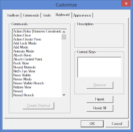
Edit: Apparently a false alarm with regard to A:M spitting out German shortcut key listings. However, you may have a German Shortcut Key listing in your installation directory. Now here is a learning opportunity. If you want to learn some snippets of the German language, v18 is currently spitting out the german words for A:M shortcut keys. In the attached I've translated all but one which I think is 'SPACE'. For those in the know what say you all... does "LEER" translate to "SPACE"? At any rate, if you wish to get a shortcut key listing in German go to Tools/Customize and on the Keyboard tab click the Export button. The shortcut key listing will be saved in the A:M installation folder (ex: C:\Program Files\Hash Inc\v18.0) as an html file named KeyboardShortcuts Added: PDF version Disclaimer: A:M spits out better formatted html than MS Word so don't use the attached for html purposes. KeyboardShortcuts.html KeyboardShortcuts.pdf

-
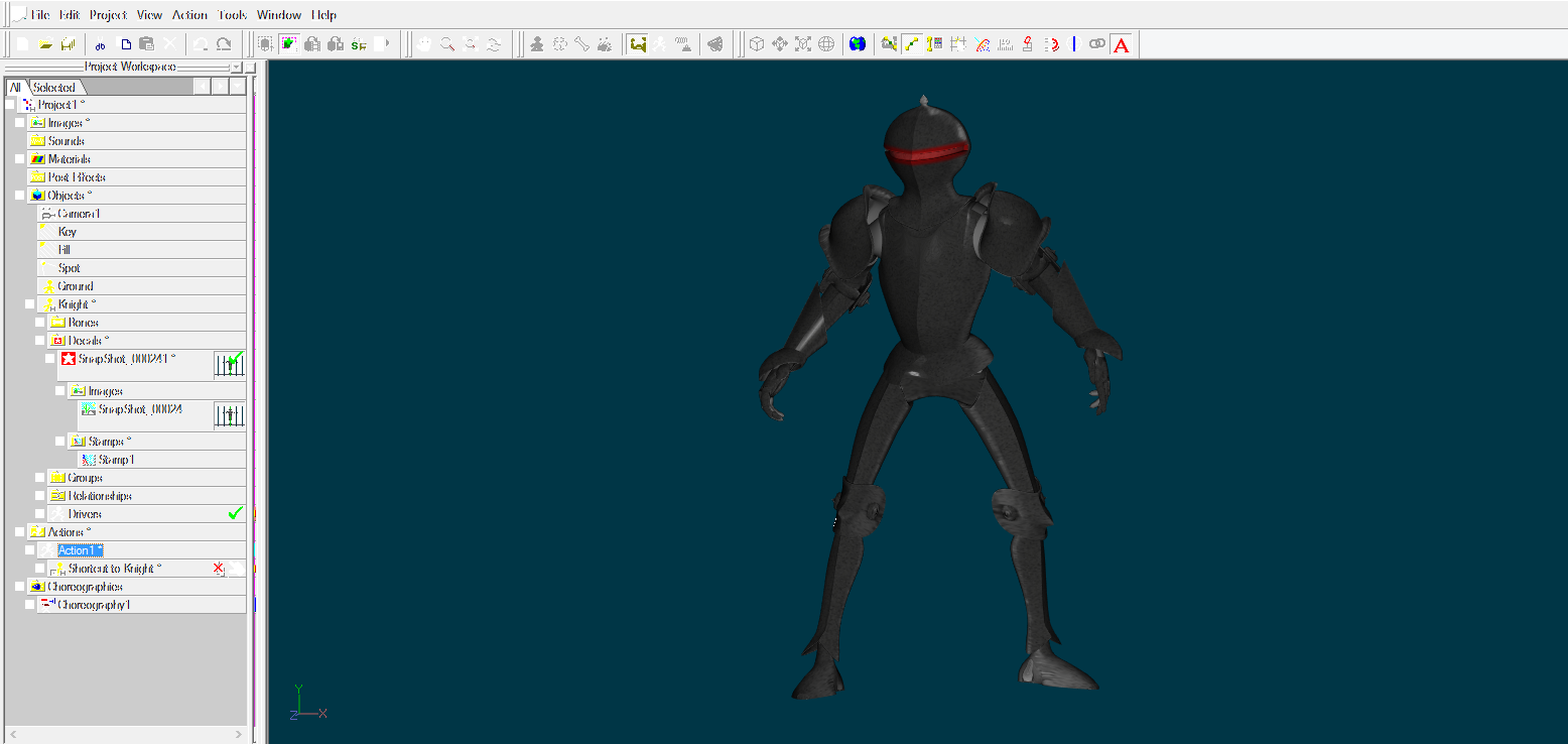
This isn't really snapshot related but I figured I would use the imagery created with it to make a banner. My all-A:M pipeline for the Special Projects area is almost complete.
-
I heartily agree. One thing we can also do is use A:M's own ability to layer in imagery (multiple decals stamps, layered patch images, etc.). The last rendering really only consisted of three 'layers' (a color, a displacement and an ambiance image). And while I did use another program to put them together they could almost as easily have been created in A:M. Layering is really the key to any detailed rendering whether that layering be surface, lighting or other contributing influence. Awhile back I developed a methodology for drawing and painting over models in A:M while still using another program (any program really) but it's something of a hack. Now that A:M has these new tools (providing a round trip from capturing an image of a model to pasting it back onto the model again) I may have to dust that off and see if there is still anything worth pursuing.
-
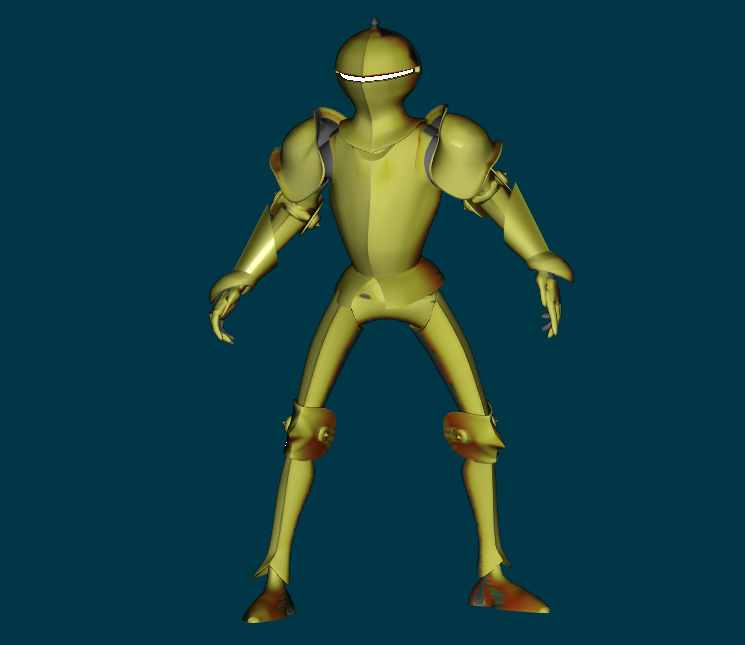
More random texturing, lighting and rendering...
-
If it does it is too well hidden. Back in the v11 timeframe it had quite a few other options (and it was easier to save custom colors) but the color picker hasn't been the same since.
-
More messing...
-
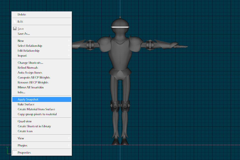
And here is a shot from inside the Decal Editor/Viewer. Note that the grid lines (or rather the spaces within the grids) are saved by the snapshot tool as part of the alpha channel transparency and it probably would have been wise for me to flatten the image before painting. Another alternative would be to turn off the gridlines within A:M.
-
Then going in and painting on that decal/snapshot takes it to the next stage: (Example here is with only the front snapshot applied)
-
Thanks Gerald, you've provided an excellent addition to this exploration of the snapshot tool... and outlined it clearly and concisely too! Folks may use this more than they do the standard method of applying a decal. I find that having a setting of 1.0 creates a perfectly aligned decal (of the same/screen view). Here's a shot of what it looks like in the Right Click menu:
-
Thanks Nancy, There are a lot of benefits to using that approach. I'll have to run a few tests and see what I can see. A downside is that using the image swatches I can use any external program. The downside of the image swatches of course are many but there are a few benefits. I'll have to see if I can duplicate them (or similate something similar) with materials. I do wish that the transfer process from surface could take multiple patch surface colors and patch images with it. This recalls to mind Anzovin's old tool 'NodeCloner' as it allowed the copying of Attributes from one Material to another. My long term thought is that it might be worthwhile to create an external program for viewing materials (and or Libraries) but it may be better to set everything up in one instance of A:M and use that to drive changes to things going on in another. Hmmm.... you've given me a lot to consider.
-
It's been quite awhile since I had the book out of the box but my memory says that the first edition has a little more A:M-centric examples (in the book and on the accompanying CD). Both editions cover the same basic information and you won't go wrong with either.
-
We made an initial attempt to collect Hair materials to put in the A:M Libary but it didn't go anywhere. Perhaps particle hair was too new and everyone too shy to post their efforts. (The forum didn't accept .mat files back then as uploads either... and it does now) If there is interest we have a dedicated forum for Materials (The Materials Laboratory) so we could shake off the dust and start posting our hair materials there. It goes without saying of course that there are quite a few gems to be found searching through The Materials Lab Hair section.
-
Manuel, Most Definitely! If the rig is set up right we can move controllers around in real time to layer in any animated movement. The one thing that isn't evident on the video is some sort of menu that the animator is looking at to recall what motions and screen locations control what aspect of animation. Most of these type of controllers in A:M use Nulls as the means to move around an area of the screen to manipulate the character. Also, to facilitate realtime playback most of the menus are created using splines rather than images. For the film 'Tin Woodman of Oz' and 'Scarecrow of Oz' the characters were rigged with a facial rig that allowed such movement but mouse motion wasn't used as far as I know. The animators just worked the controls over time. If you haven't picked it up much of these techniques are based on Jason Osipa's facial animation techniques which he developed while using A:M. He later went on to adapt those techniques to other software. IMO Jason's book "Stop Staring: The Art of Facial Animation" is a must have for character animators. Here's a review of (I believe) the second edition: http://www.parkablogs.com/content/book-rev...tion-done-right There are several Face Rigs featured in the Rigging and Constraints forum. Well worth investigating!
-
Very impressive Steve.
-
Now that is entirely too cool. You always amaze Mark. Are you planning to drive it via a force? I could see how a force might push it initially but not sure how it'd reset unless the direction of the force's direction and/or intesity was animated as well. Too bad we didn't have that idea for TWO. That contraption would have been great for Ku Klip's workshop.
-
If you save a few basic shag materials in the Libary you don't have to mess with the Shift/Creation of Shag Hair. I think all of the default 'Hair' materials in the library are still Shag materials.
-
Thanks Gerald, I'll keep looking. I have a vague recollection that the values are stored a file within the installation folder that isn't directly accessible. There'd only be one or two files that could be. Over the years I've moved toward using my own system of color swatches but would like to use the Surface properties if I can. The difficulty in maintaining custom colors was one of the reasons I moved away from that.
-
Thanks everyone. I had a very nice birthday. I think we've started a new tradition this year... on my birthday I buy things for everyone in the family... It's rather amazing how that works.